Similar Posts
This is the third part of an ongoing serial. (Part 1, Part 2)
Panel icons and wall frescoes play very different roles in our liturgical experience. Panel icons are personal and engaging. They convey a vibrant life and reality, and they draw our complete attention into the bounds of their space. Frescoes, on the other hand, lend to the whole of the church a sense of the full presence of history, the completeness of the church through time. They sanctify the space by their presence, and they do not require mental engagement to have this effect. Panel icons reveal the vibrant movement and life of God’s Kingdom actively approaching us, while frescoes reveal the unchanging stillness of the cloud of witnesses silently waiting for us to join them.
Everything about a panel icon is personal and vibrant. The board itself is sensual, the kovcheg depression carefully carved out, the battens dovetailed into the back. We want to pick it up and turn it around, feel its warmth and stability. The craftsman who made it has left his personal touch visible for all to see. Then the board is gessoed and polished to flawless finish, and covered with gold. There exists no richer surface than this, and nothing is more beautiful in a candle-lit church than the dim light playing off the soft gilded edges of the kovchegs. The individual brushstrokes are visible on good icons, and even the thickness of paint can be seen when light reflects off the surface just so. The human touch of the iconographer, hand-ground pigments laid on stroke by stroke, is never far from our mind when looking closely at an icon. Such materials and techniques have been developed by iconographers precisely because the living richness of the icon helps to express the living presence of the saint and to invite communion.
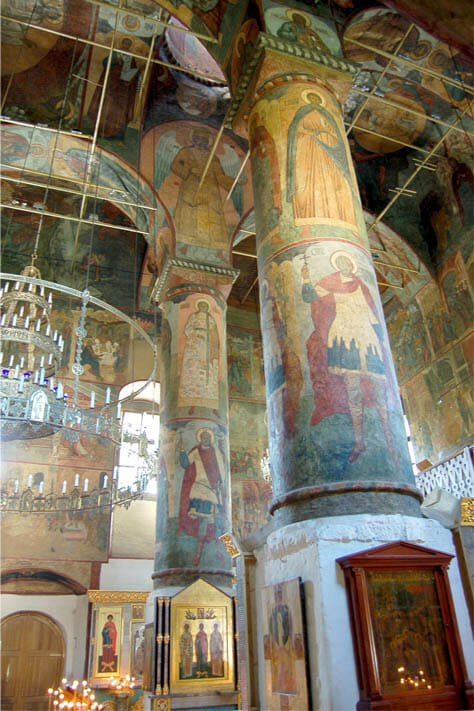
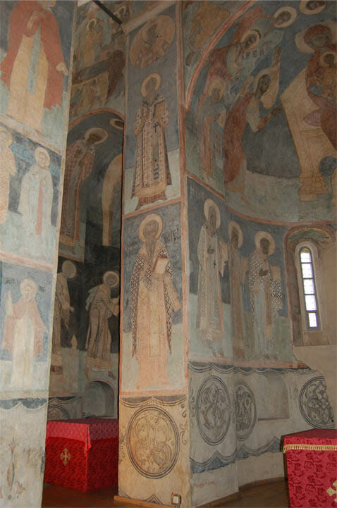
In contrast, frescoes bear an awesome stillness. The cold hard ethos of the masonry and plaster is in no way changed by the invisibly thin layer of pigment. The fresco itself is made of plaster, it is part of the wall, smooth and cold. It is not inviting to touch, and the hand that made it seems far removed from our experience. The frescoes in old churches seem almost like a geological phenomenon. They are so ancient and timeless, so inevitable, that to hear the name of the painter who made them is like hearing a pagan myth about the gods who made the mountains.
In addition to the isolated panel icon and the great fresco cycle, the Orthodox Church provides a third mode of iconography. The iconostasis is essentially one great panel icon, so large that it dominates our visual experience. Individual icons hanging on walls are not very effective for corporate worship. Immensely engaging to an individual standing close by, they lose their power at a distance. To a worshipper participating in the liturgy, a multitude of small panel icons hanging on the walls has limited impact. Their purpose is for individual veneration. But in our corporate worship, the Church does not limit our liturgical experience of icons to quiet frescoes. In the iconostasis, the Church developed a means of placing very large panel icons directly in front of the worshippers. The ornamented structure of the iconostasis was a key development. It unites the icons with a richly decorated framework whereby the iconostasis impacts our eyes and mind as though it were one single icon – all of Heaven engaging us at once.
In Byzantine times, great churches were sometimes decorated with mosaics. Mosaics are unsurpassed in richness and vibrancy, while also having much of the stillness and solidity of frescoes. (Note that ancient mosaics, unlike most modern examples, used marble rather than glass for the flesh tones, providing a calm matte surface to contrast with the glittering draperies and backgrounds.) In a way, mosaics share the ethos of both panel painting and frescoes. But mosaics were never affordable for most churches, and just as their use waned historically, iconostases grew up in their place. I do not believe this is accidental. The church must have recognized that frescoes get rather lost in the dim light of churches, and she developed the iconostasis to replace the more engaging mosaics. But this is nothing to lament, because the ultimate solution is perfect. The iconostasis rightly dominates our corporate experience of worship – it is a complete and perfect statement of doctrine manifest in icons large enough for all to see. Meanwhile, the frescoes witness from all directions with a godly stillness that is the perfect example for our own life in the church. Lastly, enshrined icons are scattered about the nave, inviting personal attention and private devotion, an essential complement to corporate worship.
Because the iconostasis visually dominates the experience of liturgy, its proportions and style are of special significance. An excellent iconostasis can transform a bland space into a very good church, and a bad iconostasis can ruin an otherwise worthy building. Recent centuries have produced a parade of unlovely iconostases, some monstrously over-decorated, others timidly lacking in substance. In each case, the sin against beauty proceeds from a fall from Tradition and an acceptance of foreign ideas.
The historical origin of the iconostasis was the marble templon screen of the Middle Byzantine Period. These consisted of a row of columns supporting a lintel. A curtain was hung from the lintel and closed during the consecration. In the 11th century, icons began to be added in a row along the top of the lintel. Later, icons were set between the columns. Whereas the barrier was originally meant to indicate the holiness of the altar by separating it from the nave, a new artistic theology emerged. By means of icons, the screen would unite the congregation to the mystical reality of the altar by revealing the Kingdom of God. What was once a means of separation became a means of union.
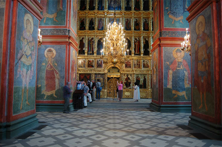
The Russian church developed the iconostasis into an extraordinary artistic achievement, perhaps unmatched the world over for how firmly it grasps hold of our attention and how high it lifts our hearts. The Russians dispensed with the marble framework of the screen and placed the icons touching side by side, tier upon tier. Their screens grew to incredible size, encompassing all the theology of Old Testament and New in one awesome vision. No one need be told that the altar in such a church is holy. The towering wall of saints and angels standing over the gates constitutes a heavenly vanguard to proclaim it. The unchurched tremble to approach such an iconostasis, and even the faithful fear to pass through it, for the sight of heaven made visible is both joyful and terrifying. The awesome power of a medieval iconostasis cannot be imagined by those who have not seen one, and for those who have, the desire to see the physical altar table itself is all but extinguished.
While the theological authority of the iconostasis lies in its icons, the screen itself and its raised solea have a certain ceremonial power. The richness, beauty, and scale of these structures lend honor and majesty to the liturgy. They hearkens back to the raised dais beneath a kingly throne, and the tapestries that hung around it. The richness of the screen heralds the importance of the altar and of the moment when the priest emerges with the gifts. The larger and more beautiful the screen, the greater its ceremonial power.
In medieval Russian screens, the theological authority of the icons and the ceremonial power of the structure were kept in balance and mutual support. The ornamentation of the structure closely harmonized with the icons and integrated them together. Later, with the rise of Baroque taste and its theatrical mindset, the ceremonial impact of the screen was seen as more important than the icons. The woodwork of the screens sprouted elaborate architectural elements around ever-smaller icons. The new forms emphasized a writhing movement in carved foliage and twisted columns. Simultaneously, the iconostasis was raised up on a high dais of several steps, so that the lower tier icons no longer met the worshippers’ eyes. Such ornamentation separated the icons rather than uniting them, and the iconostasis lost its integrated theological expression.
In recent times, another fashion has attacked the majesty and dignity of the iconostasis. The overblown and ineffective iconostases of the 19th century left many doubtful as to their usefulness at all. Some suggested a return to the more open screens of ancient times, but the results have sadly missed the mark. In the modern spirit of compromise, many 20th century iconostases have been designed to attempt to strike a balance between a templon screen and an iconostasis. This compromise is usually manifest as a flimsy screen with a few icons and a lot of holes to see through. Unfortunately, such screens perform neither the role of a templon screen nor an iconostasis. Because they are still partially open during the consecration, they do not provide the veil of mystery (the curtain) that was the purpose of the templon screen. And because they leave holes between the icons, the icons do not visually integrate and work together as a theological whole. On the contrary, the partial blockage of the view is visually chaotic and only adds to the impression that the iconostasis is ‘in the way’. For the iconographic vision of the Kingdom of God to be effective, it must wholly replace the physical vision of the altar, not compete with it for our attention.
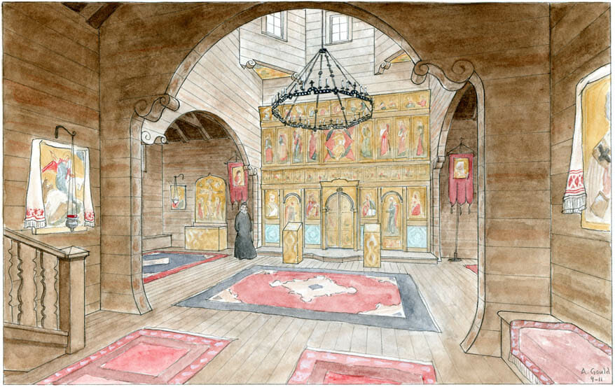
A good iconostasis can be surprisingly simple. The surviving medieval Russian screens consist almost entirely of icons. Usually, only a simple horizontal board separates the tiers, and nothing separates the icons side by side. The doors themselves are icon boards, not icons mounted in frames, and likewise the top of the screen is crowned by icons with flame-shaped tops. Any wood that is visible around the icons should be ornamented in a way that harmonizes with the surface of the icons. Simple decorative painting works well, as does carving used with restraint and sobriety. If the icons have large areas of gilding, warm golden-colored wood can blend well with them even without any decoration. If funds permit extensive carving, it should be small in scale and painted or gilded in the tradition of older Greek iconostases. Large areas of unpainted carved wood were never normative for an iconostasis until recently, and such decoration does not always harmonize well. In particular, high relief, prominent columns, complicated arch shapes, and dark-colored woods are frequently poor choices in an iconostasis design.
We should not be afraid to allow the icons themselves to serve as the ornamentation for the screen. Likewise, we should not be hesitant to build a tall iconostasis. The virtue of the iconostasis is its integration of many icons as a theological whole. Its meaning is greatly enhanced by multiple tiers, and the experience of the iconostasis is strongest when the icons are quite large. If the design of the screen is restrained and sober, it will not be imposing or oppressive no matter how tall it rises. Of course, there are some church buildings that look better with a shorter iconostasis, and this requires careful architectural judgment. But in America, so many of our churches are low and uninspiring, without architectural power of their own. Perhaps these are an opportunity to allow a tall iconostasis to redeem the beauty of God’s holy temple.


[…] This is the fourth part of an ongoing serial (part 1, part 2, part 3) […]