
Similar Posts
This is the eighth part of an ongoing serial (part 1, part 2, part 3, part 4, part 5, part 6, part 7)
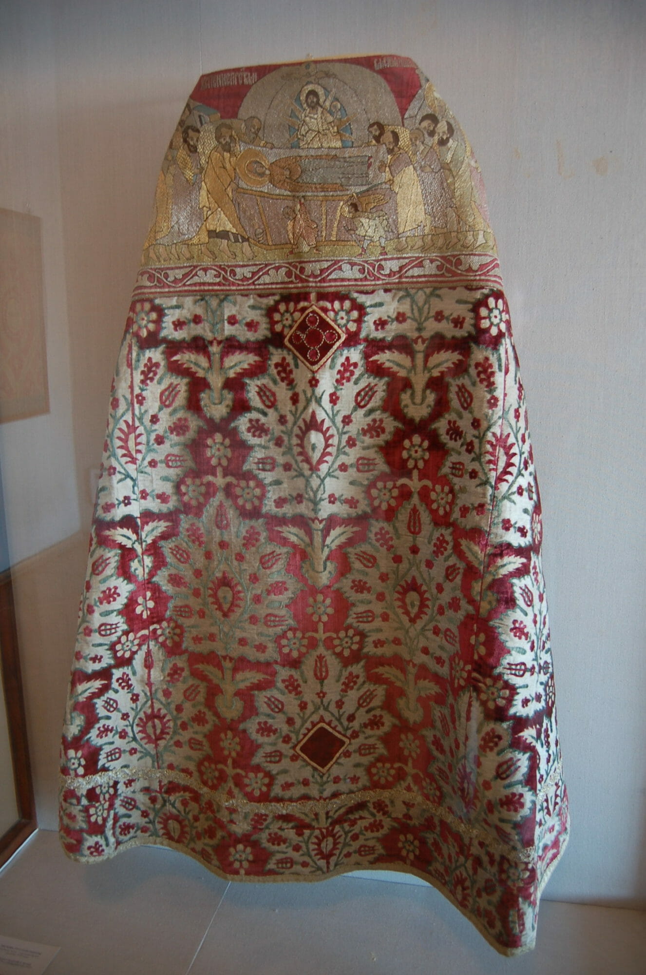
Russian Phelonion, 17th century, Ottoman fabric
In the New Jerusalem, there is no distinction between indoors and outdoors. It is a city as well as a garden. The sun does not shine by day, nor the moon by night, for the Lamb is the light of the city of God. (Rev 21) Therefore, the church can also be compared to a natural landscape. The architecture comprises the trees and stones, the lamps the stars in the sky, or perhaps fireflies nearer the ground. The word ‘choros’, which now refers to the liturgical space under the dome, comes from a usage in ancient Greek poetry to refer to a forest clearing where lovers meet for trysts. The space under the dome is indeed a bright clearing, a meadow for love trysts between God and man. In a forest meadow, beauty of a special sort can be seen. There are flowers, butterflies, and songbirds. These creatures exhibit a brightness of color and iridescence unique in the landscape. God in His wisdom saw fit to bestow this beauty only upon the most delicate, fleeting, and short-lived creatures, perhaps so they do not overpower the more subtle coloration and patterns of His wider creation.
The aesthetic qualities of vestments are closely akin to these delicate creatures. The bright colors, satin luster, and energetic patterns of fine vestments can indeed rival the wings of a butterfly or the petals of a flower. How appropriate, therefore, that vestments are also the most fleeting of liturgical arts. Fine vestments are so costly to make, so easy to damage, so soon to wear out. And they are never meant as permanent elements in the design of a church, but come and go like flying birds. Vestments cannot be admired hanging still. They must be worn to reveal their beauty. As a vested priest moves about the church, through sunbeams and candlelight, he shines with a scintillating light, different from every moment to the next. What an astonishing metamorphosis! A priest in a black cassock always looks the same. The cassock reflects no light and reveals no movement. It is a garment designed for the dignity and constancy of the priestly office. But fully vested, the priest emerges from the iconostasis like the New Adam, a vision of mankind transfigured.
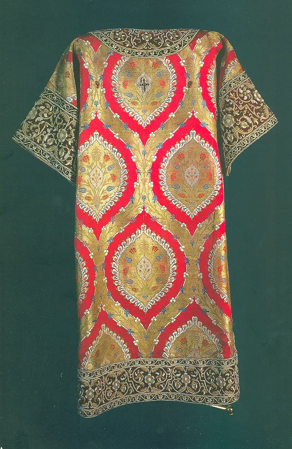
Sakkos of Patriarch Nikon, 1653, Ottoman Fabric
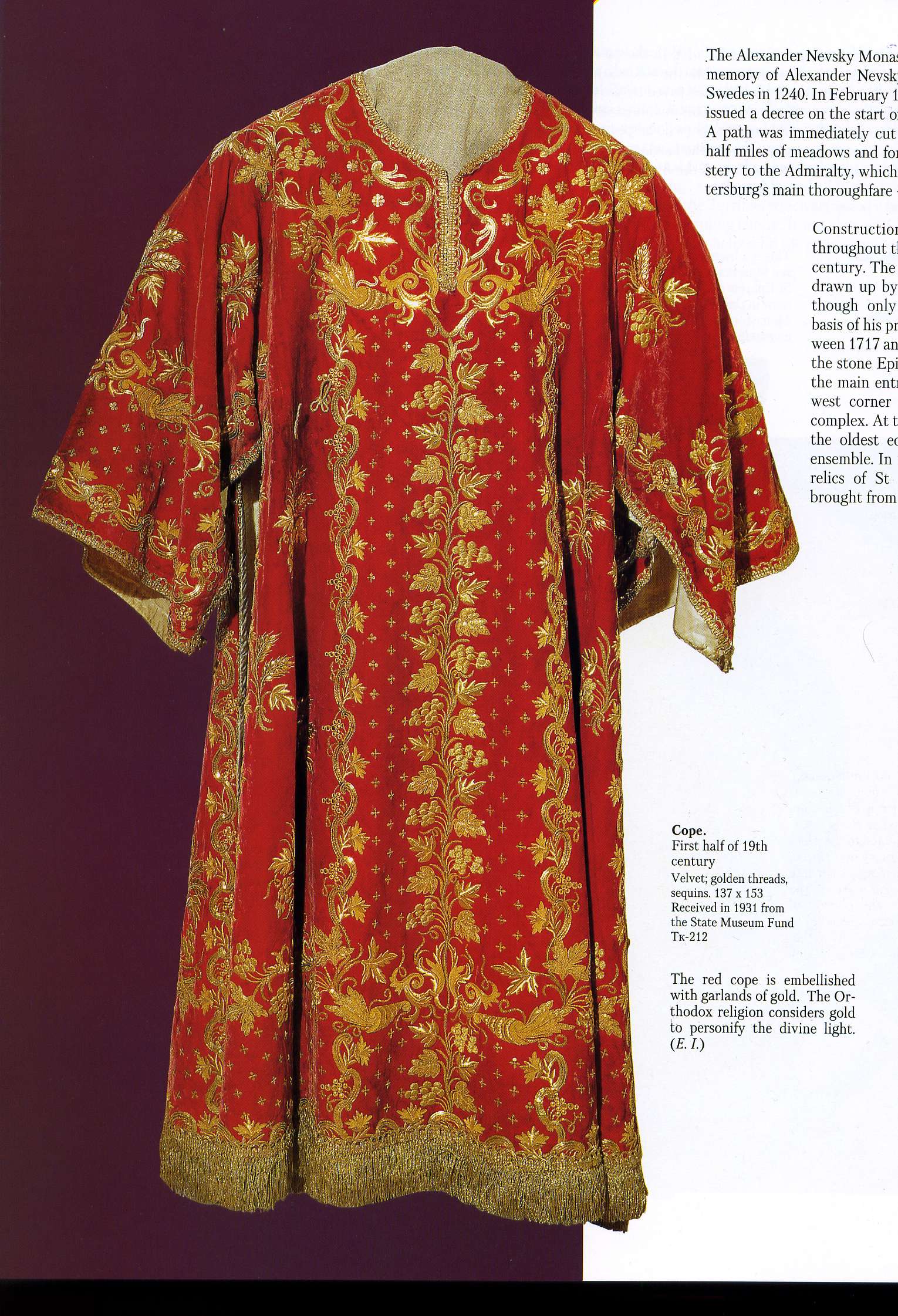
It is hard for us today to imagine the beauty of medieval Orthodox vestments. A few Byzantine vestments survive in museums, and they are astonishingly unlike the monochrome vestments in use today. The richest Byzantine vestments were primarily peacock-blue in color, and completely embroidered with radiant icons in thread wound with silver and gold. Many more examples of 16th and 17th-century Russian vestments survive. They were made of spectacular damask imported from the Ottoman Empire or from Italy. The Russians chose these damasks because they were the richest fabrics the world had ever seen, and they were not ashamed of their foreign designs, which often bear Islamic motifs. Russian noblewomen took these fabrics and added to them collar-pieces embroidered with icons and pearls, and even sewed small metal icons to the fabric, like spots on a butterfly wing. In those days, there were no ‘liturgical colors’ as we understand them today. The Typikon calls for vestments to be either light or dark, and in practice the richest vestments were worn for high feasts, regardless of color. How beautiful that, following the example of butterflies and flowers, Orthodoxy allowed for this freedom and informality in her richest art.
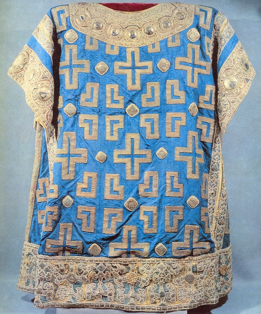
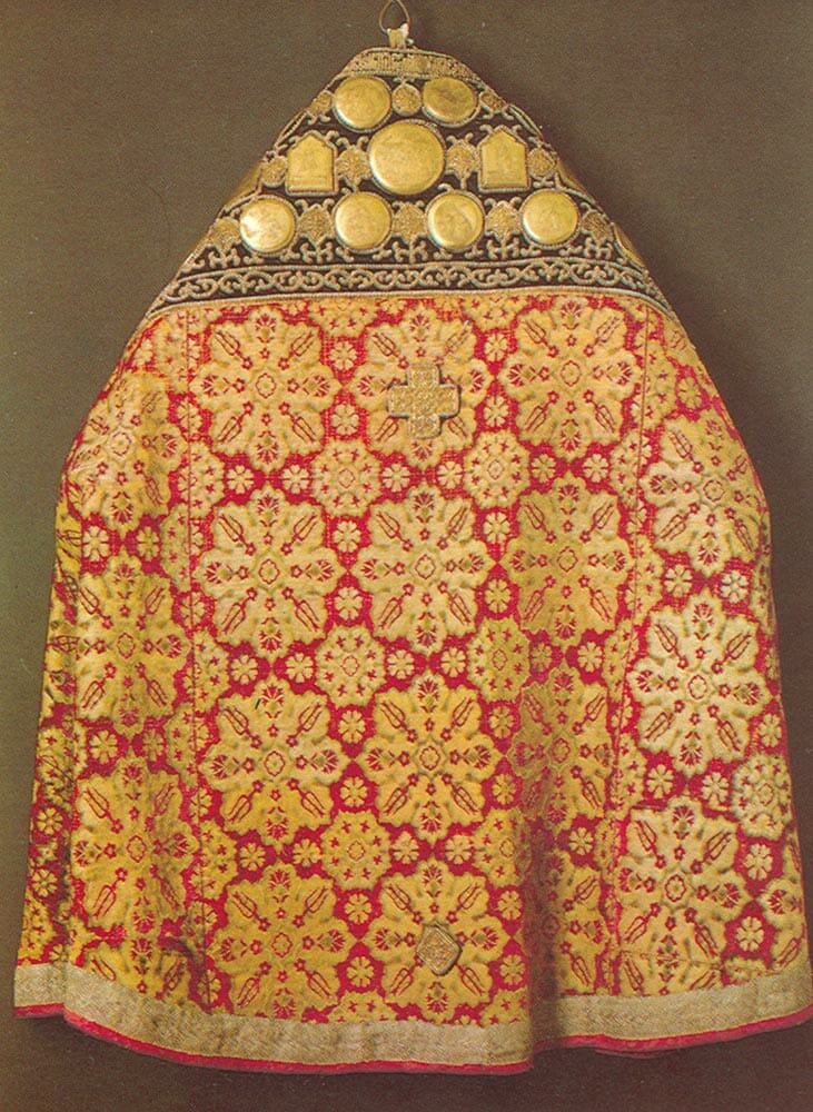
Sakkos of Metropolitan Alexei, 1364, Byzantine fabric
Much changed when the Russians imitated the Western schedule of liturgical colors. It became expected for a Russian cathedral to have exactly matched sets of everything in every color. This was an inevitable development in a changing artistic context. A medieval church was cluttered with mismatched furnishings of every age and style, and the old vestments were a part of this organic richness. The new Neoclassical cathedrals were rigorously ordered in their design and colors. Nothing was permitted to be asymmetrical or out of place. The scale of these cathedrals was vast and the architecture displayed bright colors alien to the old palette (St. Isaac’s Cathedral in St. Petersburg has columns veneered in malachite and lapis lazuli). The old polychrome vestments were out of place in this rigid aesthetic. A cathedral like St. Isaac’s demanded an imperial order to liturgical ceremony, with deacons lined up in matching rows like the well-dressed soldiers in Napoleon’s modern army.
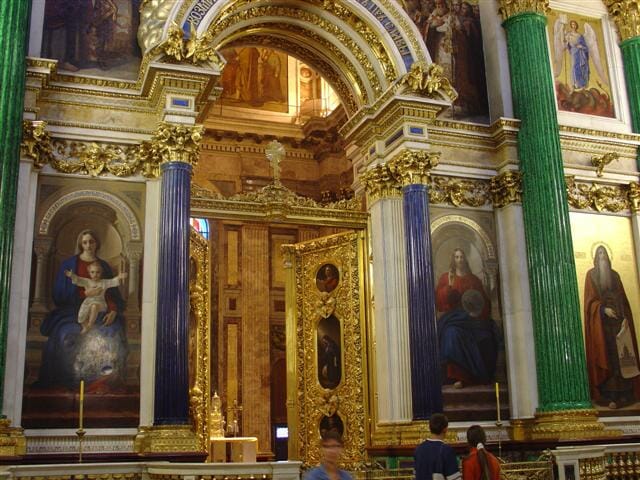
St. Issac Cathedral, St. Petersburg, Iconostasis with gemstone columns
NeoClassical Style Sakkos, early 19th century Russia
Nowadays, as the older Orthodox aesthetic experiences a revival, we ought to be mindful to coordinate vestments to the visual context of our churches. The Neoclassical jewel tones found in modern vestments are not consistent with the subdued and delicate palette of medieval-style iconography. In particular, this palette has neither emerald green nor violet. An iconographer renders green as a light grayish green that one might call sage. Purple in icons is always a somber reddish purple, never the amethyst violet of modern synthetic dyes. Blue may be a deep cobalt blue, or a sea-like transparent blue-green, but it is never the harsh electric blue of some vestments. The jewel-tones of modern vestments are possible only because of synthetic dyes, and they were prized in 19th century Russia for how they complemented the bright colors of Neoclassical architecture and painting. In a church painted with good traditional iconography (meaning icons that actually follow the colors of the old examples) most modern green, blue, and violet vestments are disharmonious. Such churches would do well to use polychrome fabrics of more historical appearance.
To revive the old freedom in vestments would be a great blessing for modest parishes, which cannot afford matched sets in many colors. And to revive the use of polychrome fabrics would be such a fitting complement to the revival of traditional iconography. Thankfully, such fabrics are still made, but one must know where to find them. Interior decorators still furnish European mansions with the sort of textiles that were woven for European aristocrats in the sixteenth century. And this fabric, still made in Italy, England, and Turkey, is the very same that was used for Orthodox vestments. It is often pure silk or cotton, and infinitely more beautiful than the ecclesiastical polyester currently in widespread use. Such fabric is more expensive, but if a church needs only two or three vestments with simple servers’ robes that need not match, then these materials can be affordable.
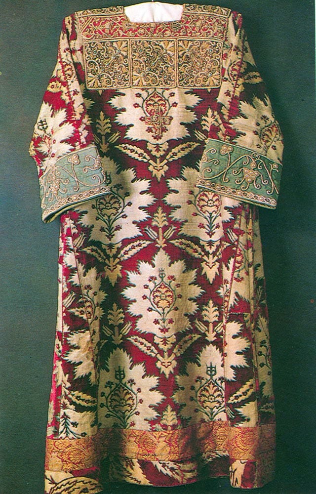
Phelonion, 1652, Russia
Sticheron, Russia, 1635
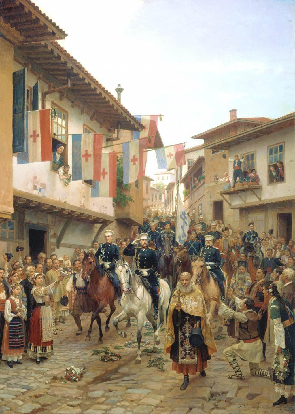
Grand Prince Nikolai Nikolaevich Enters Trnovo in 1877 (Painting by Nikolai Dmitriev-Orenburgsky, 1885) Note the mismatched colors in the priests’ vestments. Each priest wears his most beautiful vestments regardless of color.
[…] https://orthodoxartsjournal.org/an-icon-of-the-kingdom-of-god-the-integrated-expression-of-all-th…Friday, Apr 12th 8:00 amclick to expand… […]
It is really a breath of fresh air to see these vestments. I am really enjoying one of the main impressions running through your pieces, of how beauty does not equate a kind of aesthetic purity, nor is it outright chaos, but it is found in the “breathing” space that handles a type of layering and accident within a traditional and liturgical framework. This is a very balanced and human view of church art. The vestments here really shame what we see in most churches now!
Thank you very much, Andrew, for this enlightening article. It seems to me that the vestments pictured – so obviously hand-made – have a sort of unique and reverent quality of “warmth” to them. Beautiful!
A wonderful piece – with remarkably beautiful vestments. Thanks Andrew!
[…] few readers have sent in links to this particular article written by Andrew Gould and found on the Orthodox Arts Journal. The article — part of a larger series on the “the integrated expression of all the […]
This article warms my heart. Having everything matching smacks so much of interior design that it kills the soul. I’d prefer church fittings and fabrics to be made with love, care and prayers than to be a perfectly matching set with no hint of humanity. I can’t stand a lot of the modern fabrics. They look synthetic and act synthetic. If we understood that we didn’t need different colours for different times, then we could manage with a minimal amount of good quality, well made and hand made things.