
Similar Posts
(Editor’s comment: Symeon van Donkelaar is a Canadian iconographer. I find his work fascinating as it is an exploration of the flatter and more stylized threads of iconography, Coptic art, early Medieval Spanish art as well as what was developed in Central and Northern Europe before the Gothic period. Lines are bold and highly calligraphic. Color is frank and contrasted like a puzzle. Clothing is abstracted towards simple geometry. Rather than aiming at post-modern angst and the sense of teetering one gets from the work of Todor Mitrovic or the more illustrative tendency of Nicholas Saric, two artists who also explore the flat and hieratic tendencies in iconography, Symeon’s icons rather embrace a simple buoyancy. It is the type of joyful play we find in early Coptic art, the best of Ethiopian iconography or even the transparent innocence of a good folk icon. The large black pupils without irises give a child-like sense to all the figures. Symeon makes all his own colors from local materials and so we were happy to let him tell us a bit of his process as we simultaneously discover his particular approach to the icon. Symeon’s work can be found on his website: www.localcoloursaints.com/)
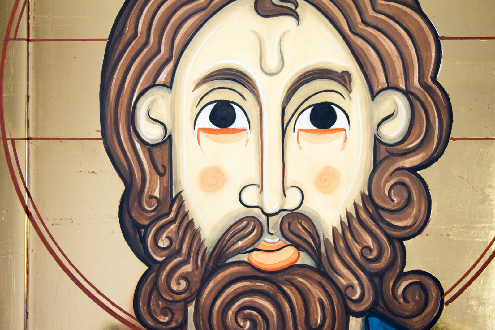
Detailed image of Christ the Pantocrator from the local colours of Conestoga, in Ontario, Canada
Local Colour Icons from Conestoga
By Symeon van Donkelaar
Fifteen years ago, when my family and I moved to Conestoga, which lies just north of the city of Waterloo in Canada, I had no idea the effect it would have on myself as an iconographer. Today, all the work created in the Conestoga Iconographic Studio is centred around the pigments I collect from where we live—the ochres coming from the river banks, the black from fired cherry-stones, and the blues from a yearly harvest of woad. Making use of these natural colours from the village has added an additional creative process to painting for me, and has provided rich feedback for the work. But, most surprising to me has been the way that this local colour continues to inform the vision of what I create, making this place one of the great influences in my work.

The beautiful landscape of Conestogo
It’s been an adventure to realize how much a place can inspire the vision of an icon. Finding a one-inch strip of ochre pigment amid a landscape of several miles took seven years, and learning how to process it into bright colour is something I’m still learning about. I’ve come to understand how the sacredness of the world, to which an icon witnesses, is strengthened in being informed by the colour and qualities of its paint. More and more I find myself relying on a triad of teachers when I make an icon—its materials, my hands, and heaven’s messenger. All three of these inspire, but I’ve found that the voice of the materials is amplified when working locally.
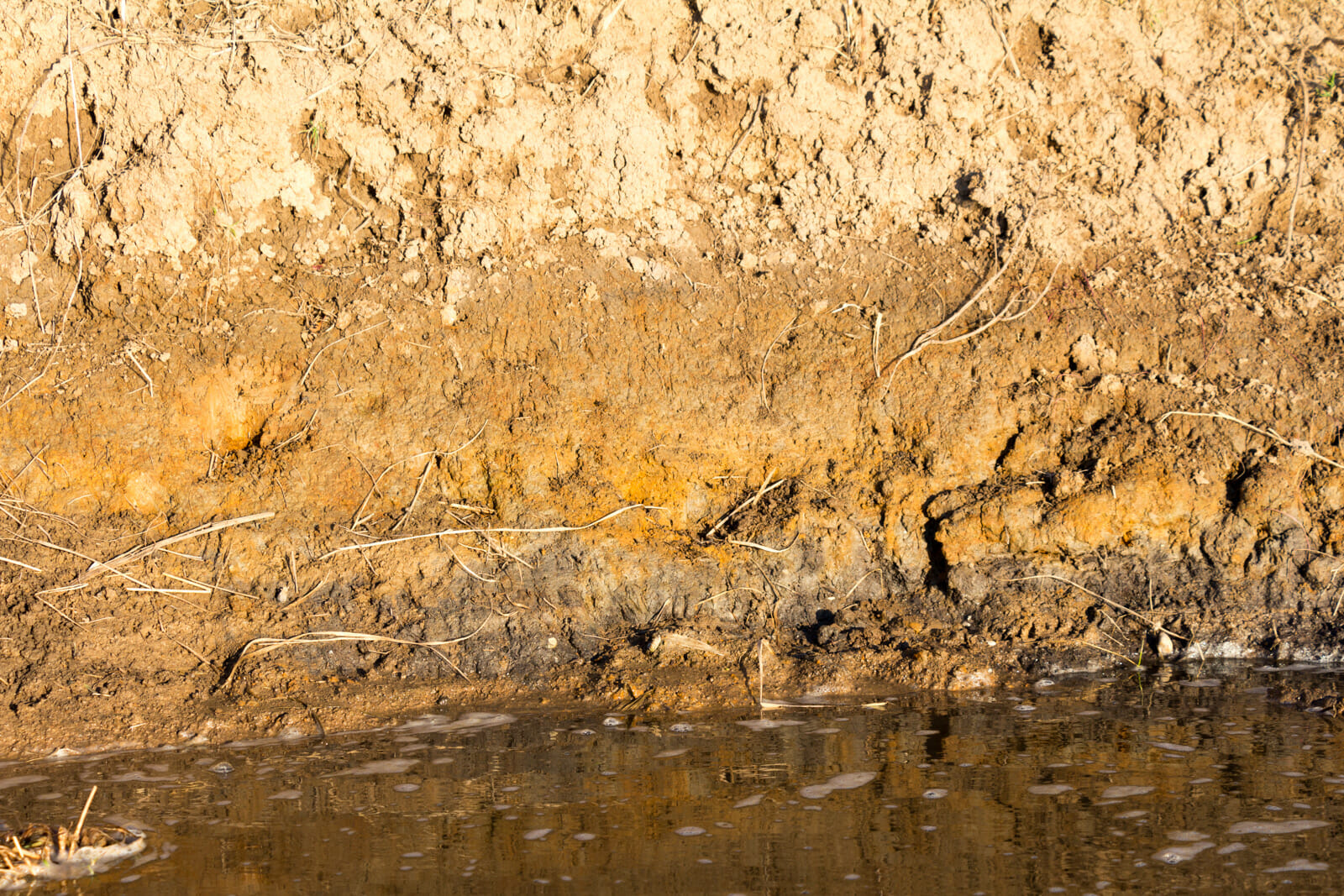
A thread of ochre along the bank of the Conestoga River.
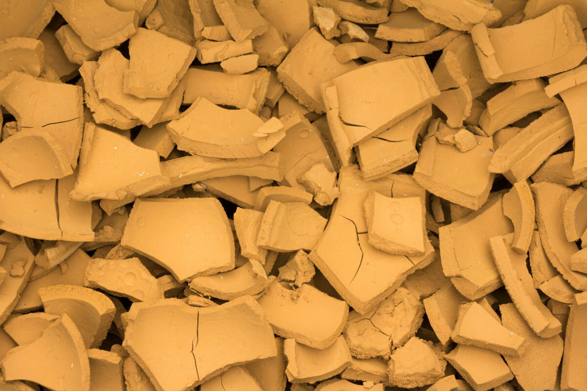
The refined ochre pigment from the local colours of Conestoga.
The colour palette that any iconographer uses is foundational to the heavenly vision he or she is presenting—bright colours inviting the experience of participation in the heavenly choir’s shouts of adoration, and more muted tones instilling the peace that passes all understanding. But within all these visions, the aim is to always present a sense of harmony in the chosen colours. There are many theories utilized to insure harmonious hues in any art form, but throughout my time working with the local colours of Conestoga, I’ve found that there is also a deep, natural harmony that has been given to the land itself. In the same way that a scientist can see all the creatures in a place’s ecosystem as balanced, I’ve found that the colours of a place’s soils, rocks, and plants offer an equally harmonious vision for the artist. A place’s unique harmony in the hues of its earth is something I’ve come to call its, ‘local colour’ and I’ve come to rely on it in creating a colour palette.
When creating a palette that is limited to the pigments from one place, a harmony from those local colours informs the vision of that icon in a profound way. This most often happens in my day-to-day work, drawing colour from the earth around the studio to create paint. But, I’ve also had opportunity to find pigments in places across Canada (with a few additional opportunities in the United States and Europe as well). Deep in the Rocky Mountains, up in the northern tundra, across the prairies, and on the rocky shield the land’s ochres bestow a unique sense of place in their local colours. When these places provide a colour palette, the landscape gives testimony to the beauty of the created world.
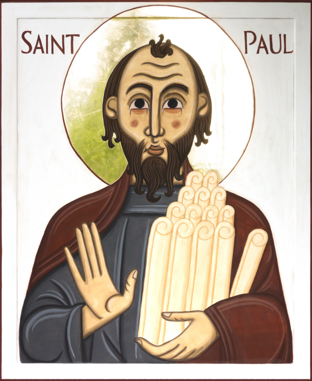
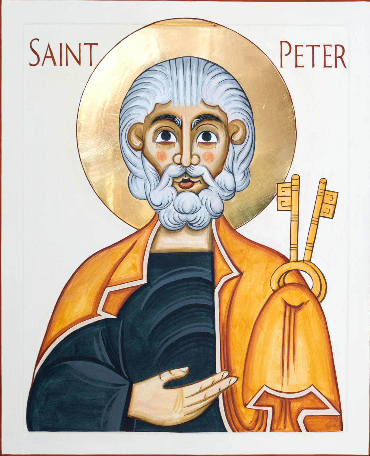
In every place to which I’ve made pilgrimage for local colours I’ve been offered a palette with a distinct harmony and vision. Take for example two icons, both created by my hand around the same time. The first icon is of St. Peter from the local colours of Conestoga, Ontario, and the second is of St. Paul from Londonderry, Nova Scotia. Each was made using only the colours provided by the earth from these small villages in Canada. The brighter and less opaque palette given by the Conestoga landscape engages us with a more fraternal experience of the saint, while Londonderry’s muted and solid colours invite a more solemn prayerfulness. While different, both form an appropriate portal to heaven, one seen distinctly through a community’s landscape.
When these colour palettes are then used to make an icon, I believe that these earthy colours become a wonderful example of the ‘material piety’ of which Carrie Frederick Frost recently wrote, giving to a handful of earth a beauty that, “… honours things, preserves things, and makes them beautiful.” Reconnecting with our material world as something worthy of love is important. I believe that this lack of material piety is at the heart of our environmental crisis because we are no longer connecting to the creation with wonder and love. I’ve found that local colours have given me the chance to love the landscape through my art.
Beyond its hue, these pigments also have equally unique properties in the kind of paint they create. Unlike most modern pigments and paints, which are created with uniformity and compatibility in mind, these raw earth pigments have a lot of dissimilarity in their make-up. But rather than experiencing this as imperfection, it’s been my experience that it is, in fact, the source of a complex beauty—one that challenges the notion of control an artist exercises in making work. The local colours I use have taught me the folly of the, ‘blank canvas’ metaphor—a perspective that promotes the artist as creating ex nihilo. There is a pride in this mindset that is incompatible with participating in the sacred arts. I’m grateful that the strong personalities present in these pigments have lead me to be much more of an orchestra’s conductor in the process—relying on the unique timbre of each instrument to enrich the composition.
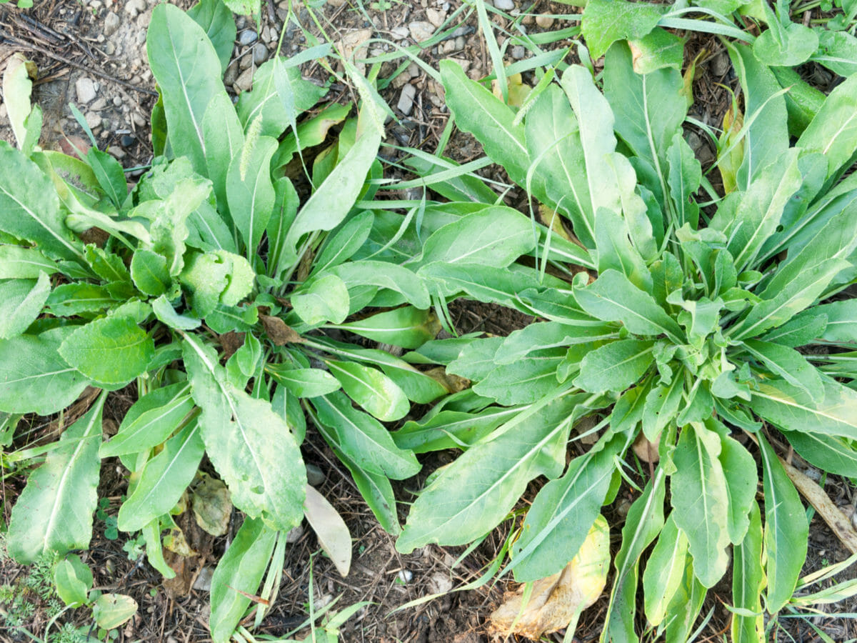
Woad plants growing in the field.
These physical characteristics are so rooted in their colour that I often think of them as having distinct personalities. The red ochre I burn from the river’s clay here in Conestoga is a little treacherous, promising a bright red but always pulling toward black as I paint with him. Whereas the woad blue harvested each year from our garden is a little vain, preferring to be presented by herself rather than mixing with others. While this personification is playful, it does remind me to listen to each pigment as I work with a receptive ear.
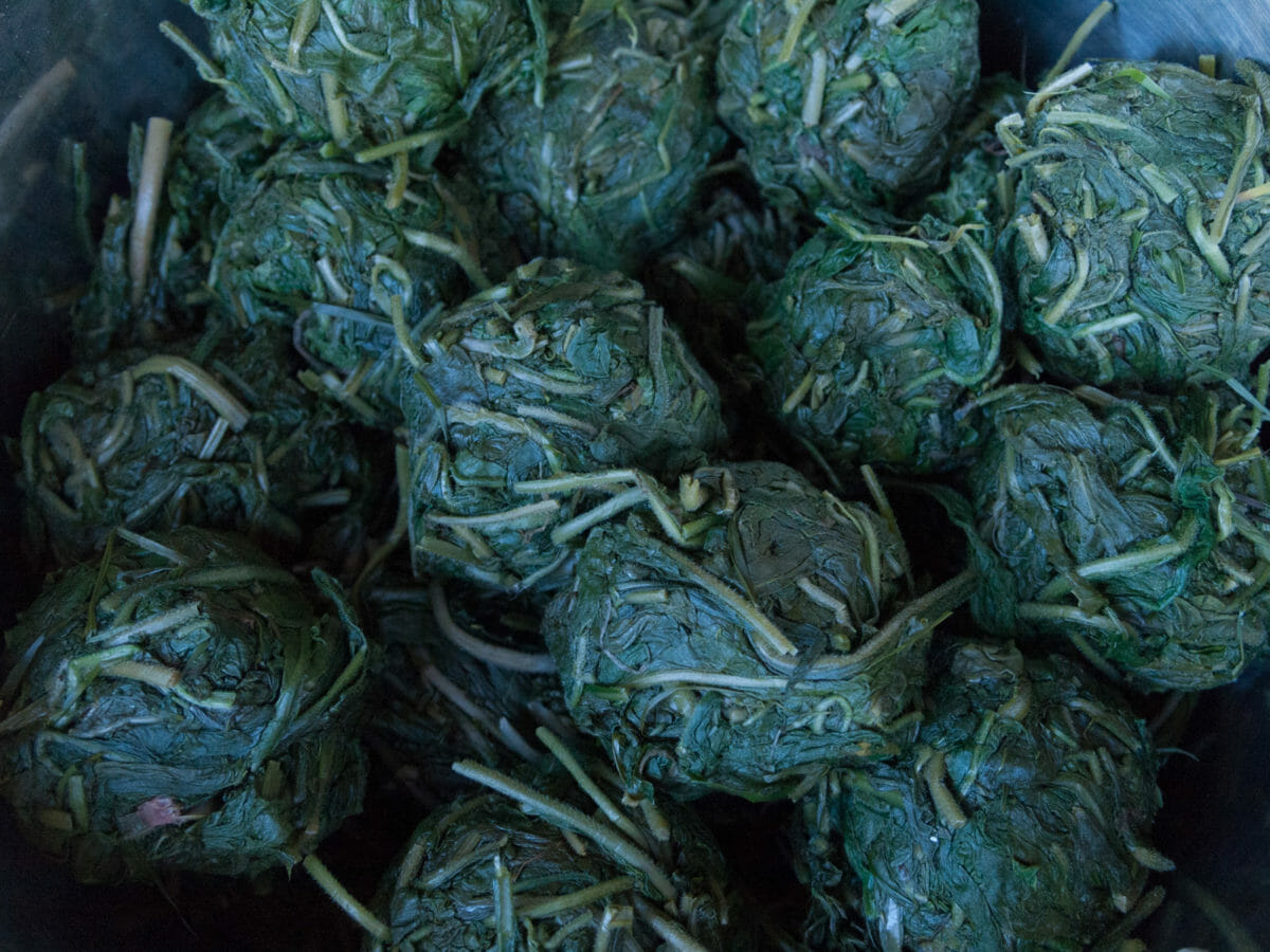
Leftover woad balls during our annual harvest.
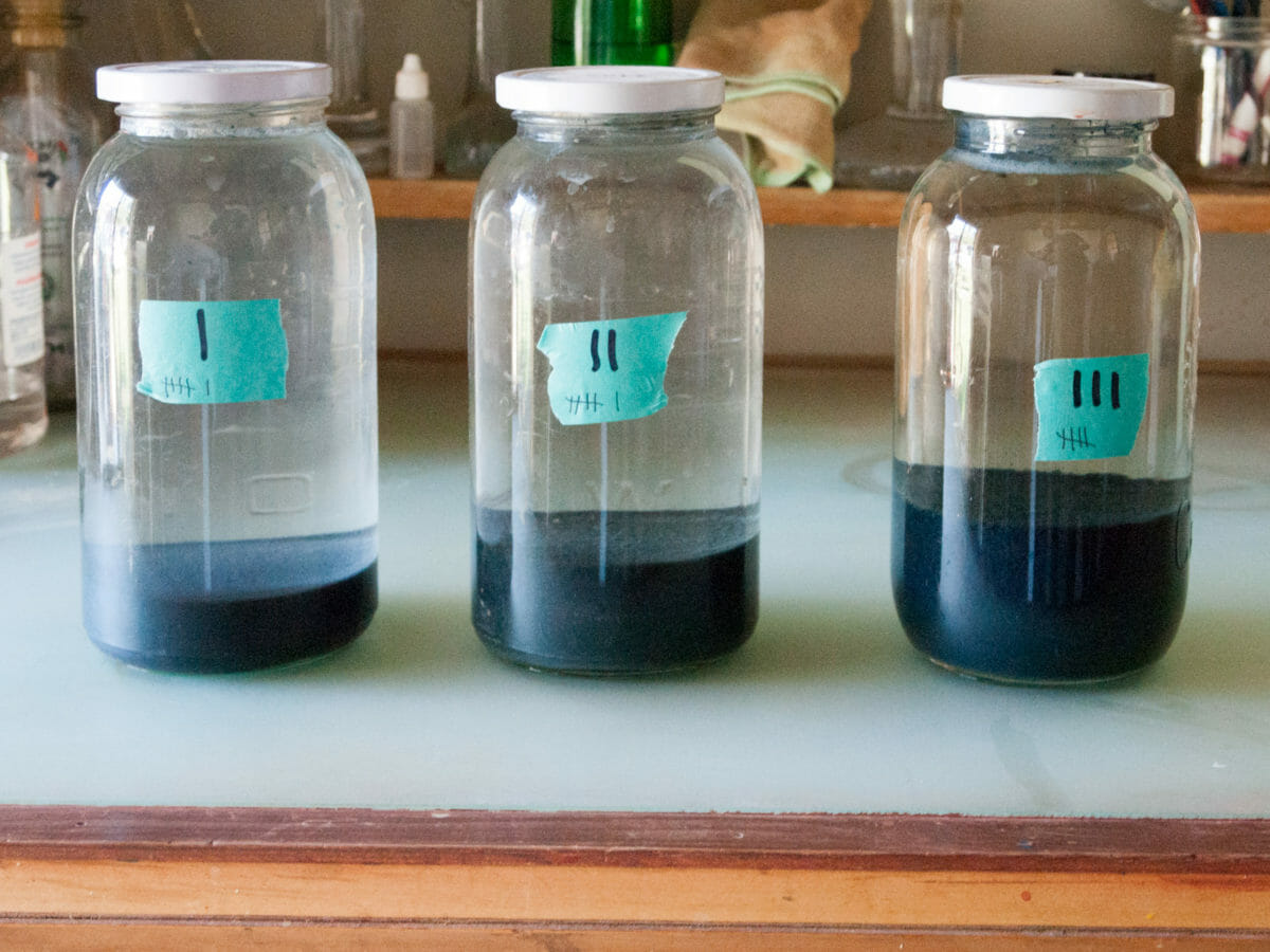
Woad pigment settling in jars during cleaning.
The strong personalities of these local colours can be seen in the studio in another stylistic element of my work. The earthy pigments used are very complex in their structure—a characteristic that is best seen when applied in wide swaths of colour in an icon. In such spaces, each pigment is best applied across enough space so that its variations and textures can add a complexity and life. A single rock or soil profile often provides intensity to its paint because of the presence of a variety of particle sizes and multiple hues, in its pigment. As an aside, this priority to broad, coloured space also bestows on the icon a flatness that is in tune with much of the art and design we witness today in North America.
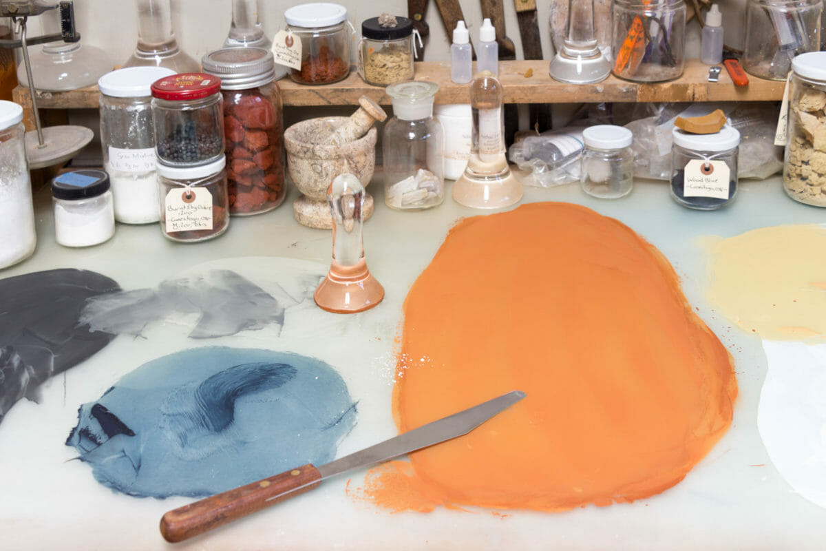
The local colours of Conestoga on my studio grinding table.
Lastly the use of local colour in an icon offers something to ponder in our celebration of Christ as God incarnate. In his work, Treatise on the Divine Images, St. John of Damascus (+749) writes, “I will not cease from reverencing matter through which my salvation was worked.” Given that the subject of his treatise was icons, I wonder if the matter being reverenced could be profitably thought of in terms as specific as a landscape’s local colour? Can a place like Conestoga be entrusted with a revelation of the Divine?
In a similar way that a priest offers the elements of bread and wine for the experience of Christ’s body and blood in the Orthodox liturgy, an iconographer in using local colours can offer the elements of soil and rock for the experience of life eternal. As we pray before a holy icon, it brings us into a relationship with those saints who are in Christ and have never died. In both cases, this change does not obliterate the material offering, but fulfills it in the deepest possible way—changing the wheat of the field into the bread of life and using a rock from Conestoga to paint a window to heaven. I can think of no better offering to make as an iconographer than the local colours from the beautiful landscapes of the places we live. And, on those occasions when I feel especially inspired, I wonder if every place on earth might have the potential to reveal a unique vision of our Lord Jesus Christ.
The little village of Conestoga has been a blessing to my family and my work in many ways over the years. Because of it, I’ve come to see the local colours of many places, and feel blessed to use these in my studio’s work. These local colours are beautiful, and have informed the vision for the icons I create. My hope is that more iconographers and artists will begin to use local colour palettes in their own practices, thus using the wonder of creation to offer a vision of its Creator.
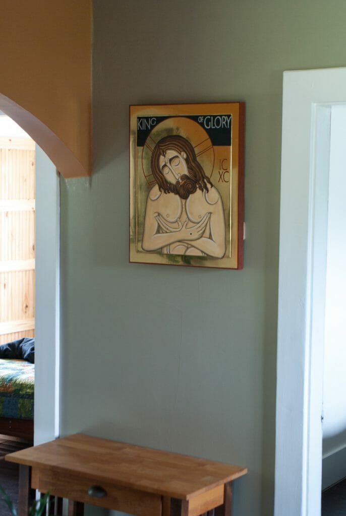
Love ‘The King of Glory”……..!!xx
[…] I’m deeply appreciative that the Orthodox Arts Journal published the article, and also for the beautiful editor’s comment that Jonathan Pageau wrote introducing myself and my work to the community. You can read the article here: https://orthodoxartsjournal.org/symeon-van-donkelaar-local-color-in-icons/ […]
Dear brother, what a wholehearted exegesis straight to the point. I myself have been harvesting the benefits of “limited pallette” in my everyday work (I work mostly on a large scale Orthodox Church interior projects, much less so panel icons); Until now, I didn’t know that somebody living today- could bring things to this lvl…
Also compliments to editor’s intro – in a very few words, you explained the state in which the contemporary “copticstyle” iconography currently is.
Thank you, Symeon, for sharing your beautiful way of craft-life with us. In this age, almost everything is de-sacramentalized. The appearance and meaning of things are separated from their material reality. This is especially true of icons (I’m referring to printed icons particularly, but also icons painted poorly or from industrial materials). How refreshing it is to read about your process, wherein the materials, rather than the artist, are ‘in-charge’. There is godly humility to that which we can all learn from.
Some years back I was at a workshop led by the remarkable iconographer Ksenia Petrovsky, . We were sitting outside on a hillside on a break when Ksenia noticed the soil on the bank beneath us and immediately began digging a clump of the reddish ochre clay. She said would take it home and filter and process it because to seemed to have interesting attributes. It is good to hear of another person recognizing the bounty of the earth.