Similar Posts
It is well to remember that a picture- before being a battle horse, a nude woman, or some anecdote- is essentially a flat surface covered with colors assembled in a certain order.
– Maurice Denis, ‘Definition du Neo-traditionisme’, Art et Critique, 1890.
In the icon …Colors are colors; red is red. Colors do not imitate the colors of the object… It remains itself, color as color.
-Leonid Ouspensky, ‘An Iconography Lesson with Leonid Ouspensky’, 1974
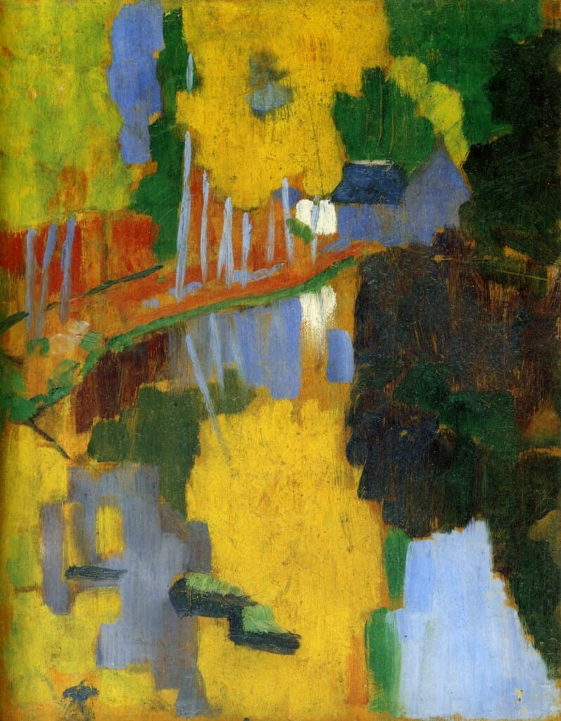
Paul Sérusier, The Talisman/Le Talisman, 1888. Oil on wood.
This painting is generally considered to be a major landmark paveing the way towards pure abstraction. In this work, painted under the supervision of Paul Gauguin, we find a raw example of the implementation of Maurice Denis’ pictorial theories.
Serusier was a member of the symbolist group Les Nabis, along with Denis, Pierre Bonnard and Eduard Vuillard.
The Autonomous Art Object
In the short and matter of fact statement of the symbolist painter Maurice Denis (1870-1943), we find the kernel of what would become one of the most crucial theoretical dicta in the development of modern art: the autonomy of the art object based on its inherent properties. When it comes to painting, this means that if it is ever to live up to its maximum of aesthetic and expressive potentials, it is essential that it retain the integrity of its pictorial flatness. In other words, painting is not to be confused with mere naturalist illusionism, but is primarily a “symbol” of states of mind or spirit, an interpretation or re-presentation of the Real. This doctrine played an instrumental role in the shaping of formalist aesthetics and the various forms of abstraction or non-objective painting in the 20th century.
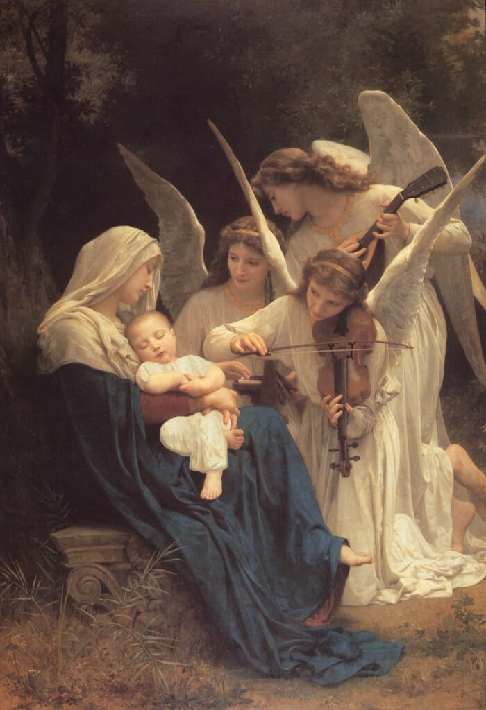
William Bouguereau, Song of the Angels, 1881. Oil on Canvas.
Here we have the kind of academic painting seen by the avant-garde as vacuous naturalism.
In the search for the “essence of things,” or “subtle perceptions,” clues were found by the pioneers of abstraction in folk,[i] “primitive”[ii] and medieval art.[iii] The icon was then “discovered” as a prime example of non-mimetic, expressive form and color, pictorial “flatness,” and therefore “autonomy.” It became a model to some painters of the possibility of arriving at a pictorial language transcending naturalist-illusionism, capable of conveying more subtle dimensions of reality. In the icon, the modernists found an example of how they could perhaps come up with an alternative symbolism for their “new religion” centered on art. Some sought, as Franz Marc would say, to make of their paintings “symbols that belong on the altars of a future spiritual religion.”[iv] But the hoped for future religion, the Utopia, never came. The altars were never built, only their “symbols” remain as evidence of false hopes.
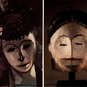
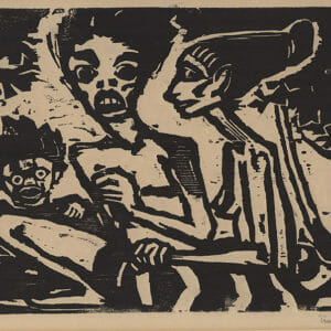
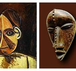
Some examples of Primitivism in early Modernism:
- 4-Matisse, Portrait of Madame Matisse, 1913. Oil on Canvas.
- 5- Emile Nolde, Family,1917. Woodcut.
- 6- Picasso, Head of a Woman, 1907. Oil on Canvas.
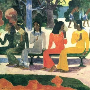
- Paul Gauguin, We Shall Not Go to the Market Today, 1892. Oil on Canvas.
- Natalia Goncharova, Icon Painting Motives, 1912. Oil on Canvas.
There [Vologda], I saw farmhouses completely covered with painting- nonrepresentational-inside. Ornaments, furniture, crockery, everything painted. I had the impression I was stepping into painting that “narrated” nothing. A few years later I saw a large Impressionist exhibition in Moscow, some of which aroused a good deal of controversy, because the painters “treated objects carelessly.” But I had the impression that painting itself had here come to the fore, and wondered whether one could not go a long way further in this direction. Since then, I looked at Russian icon painting with new eyes, that is to say, I “acquired eyes” for the abstract element in this kind of painting.[vi]
The lubok folk prints highly esteemed by Kandinsky and others of the Russian avant-garde:
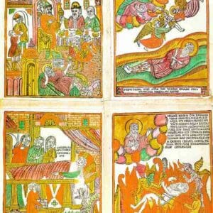
- 9-Lubok Print: Lazarus, (Russian), 19th Century.
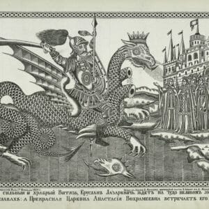
- Lubok Print: Glorious, Strong and Brave Knight, Eruslan Lazarevich,(Russian), 1863.
In his Reminiscences, published in 1913, Kandinsky also refers to the Russian farmhouses of Vologda and their interior furbishing. In particular, he notes the folk pictures or “lubki”, some of which borrow elements from icon painting, and the devotional “red” corner of the house, all of which also remind him of the impact church interiors had on him:
In these magical houses I experienced something I have never encountered again since. I still remember how I entered the living room for the first time and stood rooted to the spot before this unexpected scene. The table, the benches, the great stove…the cupboards, and every other object were covered with brightly colored, elaborate ornaments. Folk pictures on walls: a symbolic representation of a hero, a battle, a painted folk song. The “red” corner (red is the same as beautiful in old Russian) thickly, completely covered with painted and printed pictures of the saints, burning in front of it the red flame of a small pendant lamp…When I finally entered the room, I felt surrounded on all sides by painting, into which I had thus penetrated. The same feeling had previously lain dormant within me, quite unconsciously, when I had been in the Moscow churches, and especially in the main cathedral of the Kremlin.[vii]
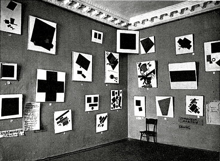
Kasimir Malevich, Gallery Instillation of The Last Futurist Exhibition, 0.10.
The “red” corner of Suprematism.
Notice the non-objective “icon”, the Black Square, hung up high in the corner.
But Kandinsky was not the only one within the Russian avant-garde to be inspired by the “red” corner and the icon. Some would even dare to take their outward form ironically, turning it into a propagandist vehicle for their revolutionary ideology. Perhaps the closest we get to an “altar” of the “future religion,” as envisioned by Marc, is the “icon corner” of Malevich. In 1915 a group of Russian painters, organizing themselves under the banner of a new movement called Suprematism, held an exhibition in Petrograd titled, The Last Futurist Exhibition, 0.10. The highlight of the exhibition was the painting Black Square[viii] by Kasimir Malevich, the leader of this movement of abstract or non-objective art. The painting was hung high up on the corner of two adjacent walls. Thus, the Black Square automatically became the center of attention, the focus of reverence. The choice of using the corner rather than a regular wall was calculated and the implication must have been obvious.[ix] For most, if not all, in that context would have known that in the homes of traditional Orthodox Russians, only the family icons were to be hung on the prayer or “red” corner in the fashion Malevich hung his painting. Therefore, Malevich was breaking with the past, the old symbols of the Sacred and of Tradition. The old icon was removed and a new one, inaugurating a new stage in art and civilization was put in its place. But this one was “autonomous,” an “icon without figures,” as the art critic Donald Kuspit has called abstraction.[x] Malevich, along with other pioneers of abstraction, hoped to offer a new art, with a far richer and greater depth of spiritual possibilities, independent from the constraints of the past and the “shell” of Nature. They searched for “the spiritual”, the sacred in art, and arrived at abstraction. We, on the other hand, have looked at the corner of abstraction in search for the Sacred, but instead have turned back to the icon.
So for the modernist mentality, painting might have been “liberated” from the constraints of the tired, stifling, vacuous and no longer viable conventional approach of the academy. Nevertheless, it now found itself subjugated to another tyrant: subjectivism. But I think the story against abstraction has been told many times. It hardly needs elaboration. Those of us coming from the perspective of Tradition – which is not to be confused with mere convention, or reactionary conservatism – would not hesitate to say that: “… abstract art is not an iconography of transcendental forms, but the realistic picture of a disintegrated mentality.”[xi] Nevertheless, although I agree with the statement, it would be disingenuous for me to solely relegate my discussions about modern art to utterances of disdain towards abstraction, since in fact, it was partly through Modernism that I found the icon. Paradoxically if we look closely, we will be able to see some unexpected convergences between the icon and Modernism, since as the former was being revived, the later was already having its major impact in the reshaping of aesthetic standards and expectations.
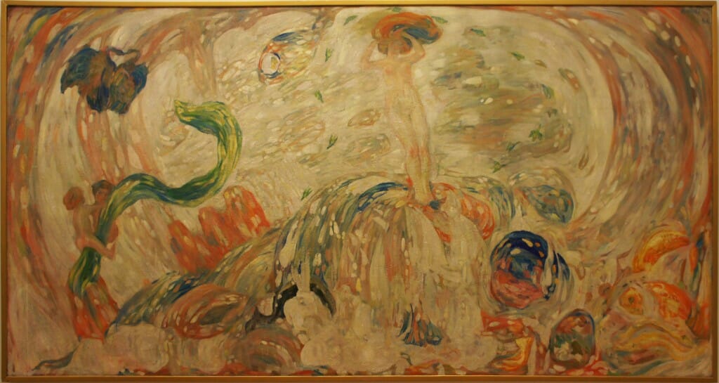
N.D. Millioti, Birth of Venus, 1912. Oil on Canvas.
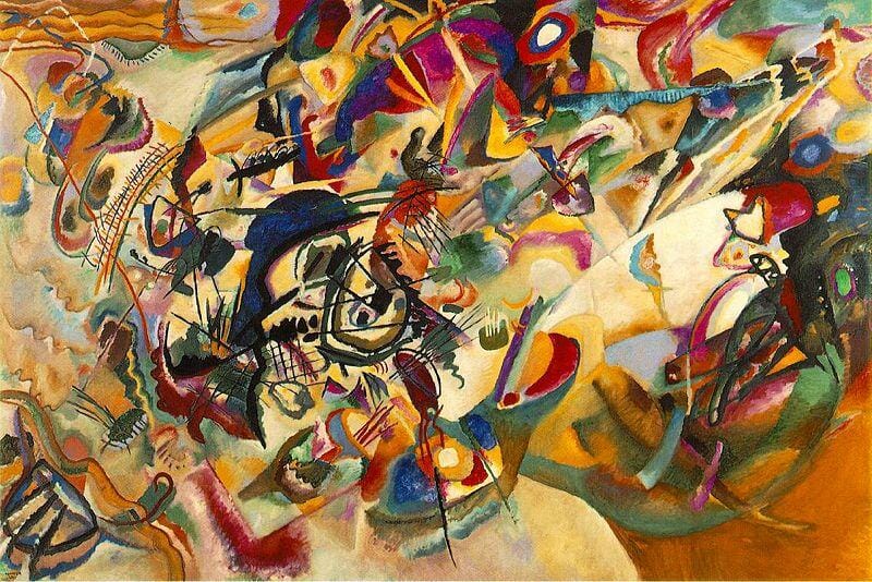
Caption: The symbolist N.D. Millioti was the teacher of Leonid Ouspenky, around the time of the collapse of the Academy of Arts, started by Tatiana Lovovna Sukhotine-Tolstoi. Although not purely abstract, this symbolist work has a lot of similarity with Kandinsky’s Composition VII painted only the year after.
Convergences
The irony is that, although some would not like to admit it, the modernist avant-garde, in its appreciation for medieval, folk, “primitive” art, and disdain for naturalism, in a sense prepared the ground for the revival of the icon in the 20th century. It would not be an exaggeration to say that it trained, expanded our way of seeing and changed our expectations of what could be considered an “acceptable image” to Western eyes allured by the magical “accuracies” of post-renaissance painting. As is well known, Paris served as the main center of dissemination for the modernist ideas just briefly mentioned. It would be a bit naïve to think that Leonid Ouspensky and Photis Kontoglou would have been buffered somehow from these currents of thought, as they sought to define their attitudes about art in their formative years. The first, it is good to remember, lived in Paris from 1926 until his death in 1987, and studied under the symbolist painter N. D Millioti.[xii] While the second, after leaving the Athens School of Fine Arts in 1915, lived in Paris for a period of time before returning to Ayvali in 1919, and in his oeuvre, in addition to traditional iconography, we find works with folk and “primitive” tendencies.[xiii]
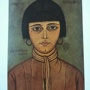
- Photios Kontoglou, Maria Kontoglou, 1928. Egg-tempera. Caption: This work is a good example of Kontoglous “folk” inspired work with some similarities with the naive portraiture of the French painter Henri Rousseau. Unfortunately this photo does not include the frame, which is in fact decorated with foliate and star motifs, details that, as professor Zias points out, “link the work to the popular, folk tradition.” Also notice the fact that the face is starkly frontal, there is minimal and subtle rendering, all is predominantly flat, as if pressed against the pictorial plane.
- Photios Kontoglou, Far from Civilization, 1957. Egg-tempera. Caption: A clear example of Kontoglous playful “primitive” tendencies, which reveal his connection to this particular facet of the modernist artistic milieu.
In The Progeny of the Icon, by Kari Kotkavaara[xiv], we learn more about the historical context of Ouspensky’s, L’ Icône, vision du monde spirituel, a brochure explaining the icon, published in 1948:
His first French text, L’ Icône, vision du monde spirituel, emerged more or less immediately after the Second World War in reply to two different revivalist ideologies which had matured in the inter-war years. The first of these had been advocated by émigrés who – as members of the Icon Association[xv] – were in pursuit of a revived Old Russian imagery; while the second had been put forward by French Catholic modernists who admired El Greco, Fra Angelico and – last but not least – the serene images of Byzantium.[xvi]
These two groups would in fact cooperate in the 1930s and 1940s in the organization of various group exhibitions of revivalist sacred art. One of the most important admirers amongst the French of things Byzantine was the devout Catholic Maurice Denis who, in addition to his earlier involvement with Les Nabis (Prophets) symbolist group in the 1890s, would go on to play a major role in the articulation of the ideas surrounding the revival of “art sacré” in Paris. In 1919, together with Georges Desvallières, he founded the Ateliers d’Art Sacré, Studios of Sacred Art, from which he worked on commissions and prepared many artists for the decoration of places of worship.[xvii] One of the aims of the “art sacré” movement was to renew French religious art by combating the proliferation of bad taste, or kitsch, coming out of the Paris quarter surrounding the Church of St. Sulpice, hence the so called “Saint-Sulpice style” of mass-produced devotional paraphernalia and plaster saints. In this regard there is an interesting parallel between the “art sacré” movement and one of the current dilemma the liturgical arts of the Orthodox Church confronts today: the ever-growing proliferation of mechanically reproduced icons.
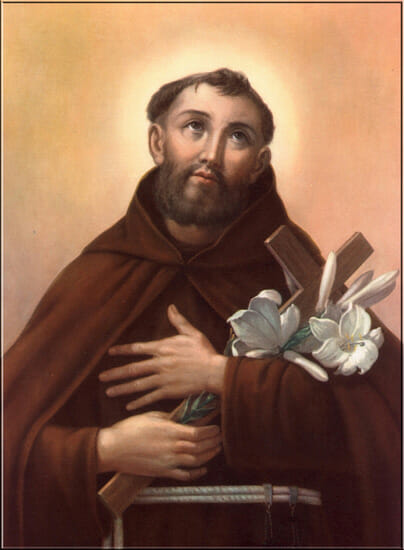
“Saint-Sulpice Style” devotional card, St. Fidelis Weninger (+1622).
This is the kind of aesthetic the “art sacre” movement resisted and tried to move away from.
Notice the academic naturalism reminiscent of the William Bouguereau painting above, although much less masterful.
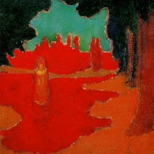
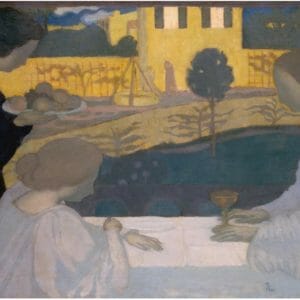
- Maurice Denis, Spots of Sunlight on the Terrace, 1890. Oil on Cardboard. This is perhaps one of most abstract of Denis’ works, from his early Les Nabis period. 17- Maurice Denis, Martha and Mary, 1896. Oil on Canvas. Caption: The application of Denis’ pictorial and symbolist theories at the service of an obvious religious theme.
- Maurice Denis, Martha and Mary, 1896. Oil on Canvas. The application of Denis’ pictorial and symbolist theories at the service of an obvious religious theme.
That liturgical and rational Byzantine art to which we owe the marvelous mosaics found in Rome, Ravenna and Milan, is also the source, lest we forget, of those admirable formulas which Christian iconography has utilized ever since, for better or for worst, to set forth the mysteries and represent sacred history.[xix]
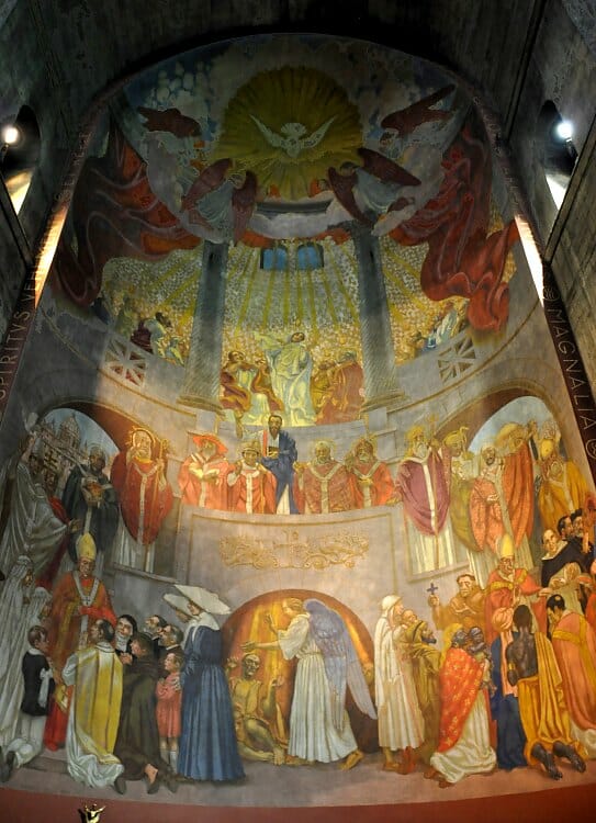
Maurice Denis, Pentecost, 1934. Apse fresco in the Church of the Holy Spirit, Paris. Built in a Byzantine style, between 1928-1935, that evokes the Haggia Sophia of Constantinople.
Here Denis synthesizes his pictorial ideas of “art sacré.” Notice how the composition is somewhat “abstract” and flat at the top, the upper room; the middle zone with the Fathers of the Church is predominantly frontal, hieratic; in the bottom zone, the figures appear from diverse angles. There seems to be a progression, top to bottom, from flatness to volume, which can be interpreted as symbolically corresponding to the divine/incorporeal and human/corporeal spheres. Everything is kept within shallow space, the architectural setting itself being symmetrical and frontal. However, the figures appear ordinary and rather heavy. The work in general lacks a sense of the otherworldly grace, and the transfiguration of nature, evident in Byzantine art. Denis might have appreciated the “admirable formulas” of Byzantine art, but this was outweighed by his overwhelming reliance on the Renaissance.
He also goes on to express his enthusiasm for the “supernatural compositions” of Byzantine works, which seem to gratify his longing for harmonious, classical order:
It is impossible for us to conceive of a Christian subject without evoking various ones of their symmetrical, well-conceived and mysteriously simple, truly supernatural compositions. It is because of their “rightness” of expression that they have survived the long vicissitudes of the ages.[xx]
Denis did not only speak of the “admirable formulas” and “‘rightness’ of expression” that Byzantine art had produced, but also of its “‘definitive interpretations’ of the Gospels and the Doctrine, i.e. sacred pictorial formulas which lay at the root of all Christian art…”[xxi] In the same article, Denis summarizes his ideas about the Christian image as follows: “To insuperable spiritual beauty corresponds perfect décor; astonishing correspondences point to truth from on high: proportions express concepts; harmony of form and logic of dogma coincide.”[xxii] This passage is paralleled by Ouspensky in a more laconic manner when he says, “For the Orthodox Church the image is, as much as the word, a language expressing its dogmas and teachings.”[xxiii] Ouspensky also seems to be speaking a similar language as Denis, when he points out the “astonishing correspondences” between prayer, the icons’ simplicity and their harmonious, “supernatural composition”: “The icon is the path and the means, prayer itself. From thence come the icon’s majesty, simplicity, calm movement and the rhythm of its lines and colors, flowing from perfect interior harmony.”[xxiv]
Yet for all his appreciation and enthusiasm for Byzantine art, Denis’ art did not succeed in capturing its hieratic sublimity and spiritual grandeur; very often remaining quite sentimental, lacking vigor in its tendency towards the decorative.[xxv] He considered the Byzantine icon from outside, unable to grasp its spirit, the metaphysical reality from which it arose. Nevertheless, his ideas rippled across the various movements of early modernism, which later tended to neglect him as he turned “ultraconservative”, or “dogmatic” in his involvement in the “art sacré” revival.[xxvi] Be that as it may, he influenced many within the “art sacré” movement, some of which came in contact with sectors of the Russian émigré[xxvii] community also working towards the revival of the sacred art of the Orthodox icon, amongst whom Ouspensky is to be numbered. It is hard to think of Ouspenky as unaware of his immediate artistic milieu and his writings as not being a reply, albeit even unconscious, to the theories of “sacred art” current at the time. Without a doubt, both Denis and Ouspensky, and the communities they represented, longed for a rejuvenation in liturgical art, and agreed in one thing: a laying aside of the “Saint-Sulpice style” aesthetic and a return to the authentic Christian image.
When it comes to Photis Kontoglou, although he is generally spoken of in light of his staunch opposition towards Modernism, which is unquestionable, it nevertheless would be simplistic to overlook how the modernist milieu could have affected his pictorial ideas during his formative years in Paris. In the short essay The Painter Photios Kontoglou: Reflections of Byzantium in the 20th Century, Nikos Zias, professor of History of Art, University of Athens, points out the stylistic parallels between Kontoglou’s work and modernist aesthetics, which is worth quoting at length:
As for style, the foremost features are lack of perspective (and consequently the lack of a third dimension) in works, the absence of a single light source, and the use not of tonal gradation, but of colour contrasts that often serve to complete one another. Some of these aesthetic principles-though springing from different premises-coincide with the principles of modern art. In Byzantine art the use of colour, for example, is often close to that of Impressionism. On the other hand, the handling of the design, so that it becomes expressive of the message behind the figures while remaining indifferent to anatomical accuracy, and of the landscapes and architectural features, likewise indifferent to naturalistic reality, seem to be close to the style of Expressionism. The intensity of colour, which replaces the illusion created by tonal evocation of a third dimension, can reasonably be compared with the techniques of the Fauvist School. And the transcendence of unity of space and time has its equivalents in Surrealism. In a variety of ways therefore, while Kontoglou adopted these techniques and styles of the past (without, it should be noted, slavishly copying them), he was at the same time approaching the modern aesthetic ideas that were shaking conventional academic standards and realism, and in this respect it is possible to see his sojourn in Paris as formative.[xxviii]
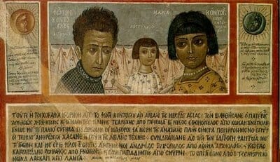
Photios Kontoglou, Photios, Despina and Maria.1932-33. Wall Painting.
This segment, depicting the artist with his wife and daughter, is a detail of a group of large walls painted by Kontouglou at his house in Athens. The work is “Byzantine” in style, but its themes are secular. Among other subjects depicted, such as sailors, artists and philosophers, we can find “A Brazilian Savage” and “A Javanese Savage.” In other words, this work can be seen as a synthesis of all the trends we’ve touched on, pictorial flatness, medieval, folk and “primitive” stylistic forms in Modernism.
Perhaps this description can even be used to describe the work of Ouspensky, since it also springs from the same aesthetic principles. Therefore, it seems to me unquestionable that in both Ouspensky and Kontoglou we find a convergence between their pictorial ideas and that of modernist painting, although as Zias cautiously points out, “springing from different premises.” That is, it goes without saying that they rejected the tenets of modernist subjectivism, utopianism, occultism, and its general rejection of Tradition. Nevertheless, they can be seen as having profited from the reassessment going on at that time of traditional medieval pictorial forms, folk and so called “primitive” art. Which is to say in short: the general rejection of naturalism amongst the avant-garde. The problem was that the modernists considered these pictorial principles externally, as “autonomous” forms that could be exploited in a search for “originality” or a more “authentic aesthetic” in an age disillusioned by materialism and vapid academism. They knew that a painting was more than illusionism but failed at grounding their abstractions on a Reality above themselves. In searching for the “spiritual” they mistook the sub-rational complexities and psychic morass of the self, for the supra-rational apprehensions of the nous guided by the Spirit, which is the source of all true spiritual art, or rather sacred art.
Relative Autonomy
But can we really speak of “autonomy” when it comes to the icon, since as we know it is primarily a liturgical object, one amongst many other components which make up the Great Work of Art of Church cult? No! Yet, I would like to posit the possibility of a relative autonomy. This might sound strange to some, but perhaps the words of Ouspensky himself can help us understand what is meant here. In Zias’ passage he mentions Fauvism and Matisse, the leader of this movement, comes to mind as one of the modernist painters who looked at the icon as a prime example of the best painting ever produced. Ouspensky’s views on Matisse and modernist painting were informally expressed in one of his classes, which comes down to us in documented form as the interview, An Iconography Lesson with Leonid Ouspensky: Excerpts from an interview with Chantal Savinkoff. Therein Ouspensky is asked by the student: “In your opinion what influence does iconography have in Western non-orthodox milieu?”[xxix] To which he replies:
Let us speak of Matisse. Matisse was mad with admiration when he went to Russia. He was completely bowled over; he said: “This is where artists should come to learn to paint.” He went so far as to give icons to his students to copy, but he focused on the externals of the icon, on its colors. In the icon, matter is not violated, it is matter as God created it. Colors are colors; red is red. Colors do not imitate the colors of the object, do you understand? It remains itself, color as color. It is in that sense that there is a relationship with modern art.[xxx]
Maurice Denis could hardly have disagreed with Ouspenky’s statement: “Colors are colors; red is red.” Ouspenky might at first appear to be in favor of aesthetic autonomy, as understood in Modernism, but he rather speaks for the relative autonomy of the pictorial principles of the icon. Before mentioning “color as color” he notes how Matisse did not fully understand the icon since he “focused on the externals.” Therefore, the “autonomy” he gives to red pertains to its freedom from the constraints of naturalism, nevertheless it still remains, in its inherent properties as a color (“matter as God created it”), guided and at the service of a theological inner message, overlooked by Matisse. In its relative autonomy an icon could never be “without figures” or abstraction. In fact, the “non-objective” tendency of abstraction, its rejection of the “shell” of Nature, has a dualistic tendency and in this sense actually becomes, in its distortions or deformities, a “violation of matter,” rather than the re-presentation of its transfiguration by the Spirit.
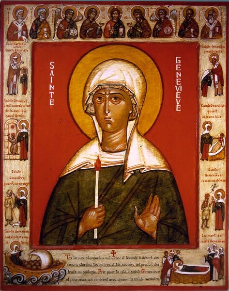
Leonid Ouspensky, St. Genevieve of Paris, 1984. Egg-tempera on gessoed wood.
This is an excellent example of how what appears to be simple, folk, or naive – can I even say “primitive”?- to the standards of academic naturalism, is in fact a work of a master iconographer having an acute awareness of the relative autonomy of the icon.
In line with Ouspensky, we can then say that not only color, but also all pictorial components of the icon should have a relative autonomy, and be free from the “violation” or unnoticed infringement coming from: superficial aestheticism, which is relegated to taste alone and disregards the theological message to be conveyed; romantic purism, which rejects any contemporary “non-traditional” products in craftsmanship; one sided spiritualism, which avoids speaking of the icon as art or in aesthetic terms; and crass naturalism or academism, which includes not only illusionist standards but also the slavish copying of old icons. The relative autonomy of the icon calls us to become more aware, attentive, of the ontological status of the icon as an art object within the great liturgical symphony of Church cult. If this fact is ignored I fear that the icon will only contribute to cacophony rather than harmonious arrangement. For it will cease to be considered as an artifact requiring masterful skill in its making, by which we mean not solely superficial technique, but mainly acute aesthetic discernment, a lucid command in the arrangement of the inherent properties of its pictorial principles, based on spiritual insight into the metaphysical significance they are to convey. Neglecting relative autonomy will only give us another version of the “Saint-Sulpice style” in our churches, which I’m afraid is already with us. It is often emphasized, and rightly so, that a spiritual life is crucial in the practice of icon painting and that an icon is not just aesthetics. Nevertheless, I believe that Ouspensky never lost sight of the importance of having a command of the pictorial principles of painting based on their inherent properties, otherwise he would not have been so acutely aware that, in a sense, with the icon there is a “relationship with modernism,” but one in which there is no compromise with Tradition.
[i] The Russian avant-gardist Alexander Shevchenko (1888-1978) expresses his fascination for the primitive in religious terms, beginning his pamphlet Neo-Primitivism: Its Theory, Its Potentials, Its Achievements, published around 1913, with the words: “We who hold neo-primitivism to be the artist’s religion…” Then, he goes on to disdain naturalism, upholding the “lubok,” the folk Russian woodcut print (which Kandinsky also held in high esteem, see below), as an example of primitive and naïve simplicity: “A simple, physical copy of nature can no longer satisfy us…Naturalistic painting does not exist for us…We are endeavoring to find new paths for our art, but we do not reject the old forms altogether, and of these we acknowledge above all primitive art, magic tales of the ancient Orient. The simple innocent beauty of the lubok, the austerity of primitive art…” Alexander Shevchenko, “Neo-Primitivism,” As translated from the French by eds. Charles Harrison & Paul Wood, Art in Theory: 1900-1990, Blackwell Publishers Inc., Oxford UK & Cambridge USA, 1992, p.105.
[ii] The German expressionist Emile Nolde (1867-1956) in a text of 1912, in mentioning Raphael and classical sculpture, disdains naturalism and exalts primitivism as full of expressive power, immediacy and vitality: “We do not care for Raphael, and are less enthusiastic about the statues of the so-called golden age of Greece. Our predecessor’s ideals are not ours…In our own time, every earthenware vessel or piece of jewelry, every utensil or garment, has to be designed on paper before it is made. Primitive peoples, however, create their works with the material itself in the artist’s hand, held in his fingers. They aspire to express delight in form and the love of creating it. Absolute originality, the intense and often grotesque expression of power and life in simple forms- that may be why we like these works of native art.” Emile Nolde, On Primitive Art, in eds. Charles Harrison & Paul Wood, Ibid., pp.101-102.
[iii] In a review of Alexander Nagel’s, Medieval Modern: Art out of Time, London, New York, Thames and Hudson, 2012, Elizabeth Williams writes: “While one might at first thought expect medieval art to have served as a foil against which modern art could differentiate itself, Nagel shows in fact that modernist responses to arts of the middle ages were significantly nuanced. In some instances, artists and critics even posited the medieval period as an ideal model. To cite just one example, Nagel elaborates on Bauhaus artists’ interest in the unifying nature of the Gothic style (Chapter 18: “Cathedral Thinking). He shows that this group of 20th century artists was fascinated by the arts of 14th and 15th century Europe, in which architecture, metalwork, and other arts were united in styles transcending individual media or regional identities.” Elizabeth Williams, Not Ruled by Time and Space: Comparing Modern, Medieval and Contemporary Art, in booksandideas.net, 18th March 2013, http://www.booksandideas.net/Not-Ruled-by-Time-and-Space.html
[iv] Wassily Kandinsky and Franz Marc, eds. and authors, The Blaue Reiter Almanac; Documentary Edition, ed. Klaus Lankheit, N.Y., 1974, pp. 164-65, 173. (italics in original) As quoted by Roger Lipsey, An Art of Our Own: The Spiritual in Twentieth Century Art, Shambala, Boston & Shaftesbury, 1989, p. 64.
[v] Wassily Kandinsky, Concerning the Spiritual in Art, Dover Publications, Inc., N.Y., 1977, p. 57.
[vi] M. Bill, ed., “Interview Nierendorf-Kandinsky,” in Kandinsky, Essays über Kunst und Künstler, Bern-Bümpliz, 1963. Translated and published as “Interview with Karl Nierendorf” in Kandinsky: Complete Writings On Art, eds. Kenneth C. Lindsay and Peter Vergo, Da Capo Press, Inc., N.Y., p. 806.
[vii] Wassily Kandinsky, “Rückblicke”; “Komposition 4”; “Komposition 6”; “Bild mit weissem Rand”, Kandinsky, 1901-1913, Verlag “Der Sturm,” Berlin, 1913. Translated and published as “Reminiscences/Three Pictures, Ibid., pp.368-69.
[viii] Kevin Kinsella notes: “It is not by chance that Malevich himself called his Black Quadrilateral (often referred to as “the Black Square”) ‘the icon of my time.’” Kevin Kinsella, Painted into a (Beautiful) Corner: Malevich at the Gagosian,in Bomblog, Apr 28, 2011. http://bombsite.com/articles/5029
[ix] As Philip Shaw says, “Malevich himself regarded his minimalistic geometrical forms as the secular equivalents of Russian icons, a form of painting which aspires to present the divine as pure or unmediated reality. This idea is corroborated by a comment from the diary of the artist’s friend, Varvara Stepanova, dating from 1919: ‘If we look at the square without mystical faith, as if it were a real earthy fact, then what is it?’” Philip Shaw, ‘Kasimir Malevich’s Black Square’, in Nigel Llewellyn and Christine Riding (eds.), The Art of the Sublime, January 2013, http://www.tate.org.uk/art/research-publications/the-sublime/philip-shaw-kasimir-malevichs-black-square-r1141459, accessed 10 December 2013.
[x] Donald Kuspit made this comment in around 1993, during one of his classes I attended while studying at the School of Visual Arts, N.Y. City.
[xi] Ananda K. Coomaraswamy, Figures of Speech or Figures of Thought, Second Series. London: Luzac, 1946, p. 248.
[xii] Lydia Alexandrovna Ouspensky tells us: “In In 1929, on the initiative of Tatiana Lvovna Sukhotine-Tolstoi, an Academy of Arts was opened in Paris, at which many well-known artists taught. Ouspensky enrolled…In its initial form the Academy, after only a short time, collapsed because of financial disasters. But a group of students continued working, mainly under the leadership of N.D. Millioti. In the Academy Ouspensky met two people who were to play an important role in his life — his first wife, also an artist, and Georgii Ivanovich Krug, the future Monk Gregory.” Lydia Alexandrovna Ouspensky, Leonid Alexandrovich Ouspensky1902-1987: A Short Biography. http://www.gsinai.com/rw/icons/ouspensky_biography.php
Of N.D. Millioti, who is also referred to as Nicolas Millioti or Nokolai Milioti we learn: “The painting, Birth of Venus (1912) by Nikolai Milioti (1874-1962), marked the beginning of the development of abstract painting, along with numerous similarities to Wassily Kandinsky’s work of the same time period.” Cathy Locke, “Symbolist Painters- Exploring a world Beyond: The Russian Symbolist Painters,” in Musings on Art, http://cathylockeartblog.com/russian-symbolist/
[xiii] See the “Chronological Table of Kontoglou’s Life and Work” in the catalogue for the exhibition, Photis Kontoglou: Reflections of Byzantium in the 20th Century, Foundation for Hellenic Culture, N.Y., Apr 1997, p. 71.
[xiv] Kotkavaara provides us with a treasure trove of historical data and obscure information, from which to draw a broader picture of all the cross currents happening at the time of the revival of the icon, in the émigré Russian community of the early twentieth century. In this regard he has served us well in writing this paper. However, he goes a bit too far at times, in what appears to be a modernist tendency from his part, when he makes biting comments against what he calls “neo-patristic” thinking (into which he misreads a caricatured form of “neo-platonism”), as if the patristic mind was a thing of the past, or something other than the mind of the Church. He seems to betray an ideological stance against the theology of Vladimir Lossky and those around him. But, in any case, his research can proof useful, once we sidestep his opinion and focus on historical facts.
[xv] The Icon Association is also referred to as the Icon Society, founded in 1927 by the Old Believer and patron of the arts Vladimir Pavlovich Ryabushinsky (1873-1955). Leonid Ouspenky, Gregory Kroug, Sister (in fact Mother) Joanna and Pimen Sofronov, are counted among its members. The Icon Society was established “with the goal of disseminating information about icons, helping iconographers find orders for their work, and helping parishes finance the adornment and frescoing of their churches…The Icon Society engaged in a great deal of educational work. They published books, scheduled lectures, and arranged art exhibits where traditional icons were exhibited along with paintings of contemporary masters.” Irina Yazykova, Hidden and Triumphant: The Underground Struggle to Save Russian Iconography, Paraclete Press, Brewster, Massachusetts, 2010, pp. 87-88.
[xvi] Kari Kotkavaara, Progeny of the Icon: Émigré Russian Revivalism and the Vicissitudes of the Eastern Orthodox Sacred Image, ABO, Findland, 1999, pp.245-46.
[xvii] An interesting detail in this history is provided by Irina Yazykova regarding Julia Nikolaevna Reitlinger, another member of the émigré Russian community and icon revivalist. Julia, who later was tonsured taking the name, Mother Joanna, in fact studied at the Ateliers d’Art Sacré with Denis. Yazykova says of Mother Joanna: “She herself sought something of greater simplicity and depth and for several years she visited the atelier of the well-known French painter Maurice Denis, who tried to create a new form of religious art. Yet his painterly approach didn’t satisfy her either.” Yazykova, Ibid., p.73.
[xviii] Maurice Denis, “Connaissance des Arts,” p.12. As found in BBC biographical capsule of the artist: Maurice Denis- French Painter (1870-1943). http://h2g2.com/approved_entry/A23643209
[xix] Maurice Denis, “Notes sur la peinture religieuse”, in Théories 1890-1910, Du symbolism de Gauguin vers un nouvel ordre classique, Paris 1912, p. 30-43. This is our translation of the French passage in p. 38 of Denis’ text, provided by Kotkavaara in n.172, Ibid., p. 249.
[xx] Denis, Ibid., p.38. Our translation of the French passage provided by Kotkavaara, p.250.
[xxi] Kotkavara, Ibid., p.250.
[xxii] Denis, op. cit., p.33. Our translation and our emphasis in italics, from the French passage in Kotkavaara, Ibid., p.250-51.
[xxiii] Leonid Ouspensky, L’ Icône, vision du monde spiritual, Quelques mots sur son sens dogmatique, Melanges de l’Institut Orthodoxe Francais de Paris, Léonide Ouspensky de la confrérie Saint-Photius professeur d’iconographie à l’Institut. Editions Oecumeniques Setor, Paris, 1948, p. [5]. Kotkavaara’s brackets on the page number of the French text. Our translation from the French passage in Kotkavaara, Ibid., p.250.
[xxiv] Ibid., p.22. Our translation from the French passage in Kotkavaara, p.250.
[xxv] Perhaps part of the problem was that, although he emphasized flatness, he preferred the blurred edge, soft form and atmospheric color, which gave his paintings an emotive quality, as if he made a correspondence between the ethereal and the “spiritual.” In his pursuit of the grandeur of Byzantine art, he would have benefited from exploring the intellectuality of the geometric articulation of form and precise line. In short, Denis was given to the painterly manner, while Byzantine art is generally more linear.
[xxvi] This sentiment regarding Denis is expressed by Chipp: “For a few years, until he turned ultraconservative like others of the Nabis and began to apply doctrinaire religious interpretations to the idealist principles of Symbolism, he wrote some of the most perceptive articles on the ideology, history, and formal characteristics of the subjectivist movement.” Herschel B. Chipp, Theories of Modern Art, University of California Press, BerkleyLos Angeles and London, 1968, pp.53-54.
[xxvii] Generally speaking, although there was much cooperation in the organization of exhibitions, as the files of the Icon Association demonstrate, the Orthodox remained aloof towards their Catholic counterparts in the revivalist movement. Yet, a public example, in the form of two articles, showing the level of rapprochement between the two camps, in terms of theoretical ideas, happens after World War II: “It was not until after the Second World War- when a group of Dominicans rose against their colleagues (Maurice and his followers) – that V.P Rjabušínskij (having just resigned the presidency of the Icon Association) published two articles in Russian in which he revealed an appreciation of the older Catholic theorists (paying particular attention to their wish to reinstate the medieval, neo-Platonic aesthetics).” My emphasis in italics. Kotkavaara, Ibid., p. 248.
[xxviii] Zias’ essay bears the name of the catalogue and exhibition which it introduces. Nikos Zias, Photis Kontoglou: Reflections of Byzantium in the 20th Century, Foundation for Hellenic Culture, N.Y., Apr 1997, pp.16-17.
[xxix] Chantal Savinkoff, “Une leçon d’iconographie avec Léonide Ouspensky: Extraits d’un entreitien avec Chantal Savinkoff,” Paris, February 1974. In The Orthodox Messenger, Special Issue, “Life of the icon in the West,” No 92, 1983. Our translation from the French text. http://www.pagesorthodoxes.net/eikona/iconographie-ouspensky.htm
[xxx] Savinkoff, Ibid.

Hi Fr. Silouan,
Very interesting article. I’d enjoy reading a follow-up note that would go into detail examining maybe a portion of one icon to articulate the ways in which color is operating both autonomously and representationally. I would benefit from a little more insight into how this actually functions.
with your prayers,
baker
Dear Baker,
I’m glad you found the article interesting.
God willing I’ll put something together along the lines you’re requesting in the future.
Meanwhile, I would just like to point out the example given in the article. Compare the Ouspensky icon of St. Genevieve with Bouguereau’s “Song of Angels” and the “Saint-Sulpice Style” card of St. Fidelis. Let’s focus on three details of the Ouspensky icon: the halo, St. Genevieve’s green garment and the red background.
In Ouspenky’s icon the radiance or glory of the saints countenance is symbolized by an a halo of an ocher color. Ocher acts on its own as light. The halo is obviously flat without any illustrative or illusionist attempt at depicting light as in the card of St. Fidelis.
Also, notice St. Genevieve’s garment. The application of the green color is translucent without much modeling, only linear definition.
We can even see the graininess of the pigment in some of the puddled areas. Overall the effect is direct, flat, without attempting to conform to a naturalist standard of representation. The green color pops out, or “pulls” up, from the red. The ocher halo “pushes” back a bit, not much, into the red color field. Now, look at the Bouguereau painting and notice the blue garment of the Virgin. The first thing you see is an illusionist depiction, only then do you consider the blue color as blue, on its own merit; but this is a secondary concern here, the most important thing is accurately capturing “the sensation of light” on a garment.
In the icon the illusionism does not get in the way, color has more of a direct impact and stands on its own. This is obvious with the use of red for the background in Ouspenky’s icon. It symbolizes the uncreated light and the fact that “God is a consuming fire.” Therefore, the color red here both represents light but does so on its own inherent qualities, as to value and chroma (intensity).
Light in this icon is not conveyed by tone as much as with color, for in fact as Hans Hoffman once said, “In nature, light creates the sensation of color; in a picture, color, creates light.” So the icon is pictorially less “sensational,” in both senses of the word, or rather, “sentimental,” than the religious paintings we have compared it with. This use of color and pictorial flatness is part of what gives it its iconic power. I hope this helps to clarify things.
In Christ,
Fr. Silouan
Thank you, Fr. Silouan.
Yes that is helpful.
So, from my understanding of your explanation, it seems like different iconographers’ use of color will result in different degrees of autonomy of color. For example, green in a garment like St. Genevieve’s by Leonid Ouspensky that you mentioned retains quite a good deal of autonomy, while another iconographer (or indeed sometimes the same iconographer) on a different icon will sometimes make use of several more layers of modeling in fabric, resulting in a relatively more ‘plastic’ appearance (rather than the sheer translucent field of color used for St. Genevieve). Correct?
So, is it fair to say that there is a correlation between more modeling resulting in less autonomy of color or is that an unfair distinction?
Also, sometimes I have wondered whether more autonomy of color (which I am very attracted to personally) as described above has the risk of resulting in a lowered ‘incarnational’ impression in the depiction of saints. To put it dumbly, if they start looking more like a cartoon or diagram they seem less in-the-flesh?
If you get around to revisiting this topic I’d love to hear your reaction to these thoughts.
With your prayers,
baker
Hello Baker,
I’m glad that was helpful.
Yes, there would be different degrees of autonomy.
And when you mention degrees it reminds me of the idea of “degrees of ascent.” That is, the uplifting or anagogic function of the icon as I’ll touch on below.
There are two extreme poles in icon painting: on the one hand, abstraction/autonomy; on the other hand, naturalism/illusionism.
Either extreme will tend to shatter iconicity if they occupy a central place. The first forsakes nature in search for things intelligible the second over emphasizes sensation. The opposites are resolved in the incarnational aesthetics of the icon. In the icon we don’t have a tearing apart of sense from the intelligible realm, but rather an affirmation through anagogic pictorial forms of the “continuum of conginiton,” that is, the noetic apprehension of things intelligible through objects of sense.
As you mentioned, the icon is incarnational and so pure abstraction, as just mentioned, can be interpreted as dualistic, since it undermines the importance of corporeal Nature, the fact that what we apprehend by the senses, although fallen, is good and ultimately grounded in divinity. Yet, a crass illusionism, which is concerned solely with the surfaces of beautiful bodies, would strip the icon of its anagogic function, that is, the fact that its pictorial language is meant to uplift us into an awareness of Nature in its transfigured state. Therefore a tension must always be maintained between the two poles, hence relative autonomy. A concept that is clearly incarnational.
Some schools will lean to one extreme more than the other without suffering shipwreck. The Russian schools are generally more abstract in tendency than the Greek schools. So it’s a matter of temperament, one tendency is not better than the other. Rather, the two complement each other nicely and attest to the rich variety within Tradition. If your tendency is towards the abstract side I wouldn’t worry about it. Just take a look at the amazing Mozarabic, Celtic and Romanesque manuscripts. I wouldn’t dismiss these examples as “less incarnational” because they’re less “plastic.” There is room to emphasize different theological points by different styles. The fact that they are more diagrammatic and geometric makes them even more anagogic in my opinion, determined more by nous rather than the senses, unfolding the intelligible perhaps more lucidly. These are styles that look at nature from the perspective of universals rather than particulars, analogically pertaining to immutable being rather than transience. See my article “On Noetic Vision” about this point.
Modeling doesn’t necessarily mean less autonomy. Your thought reminds me of Gauguin who told his friend Daniel de Monfried, ” …beware of modeling. The simple-stained-glass window, attracting the eye by its divisions of colors and forms, that is still the best.” And I agree. So in other words, it can be said that the icon is to be arranged as if it was a stained-glass (in fact, it functions optically like one, as light passes through the color and bounces back to the eye from the gessoe), an arrangement of color fields conforming to the picture plane. But within these fields you will have restrained modeling, kept in check by hieratic frontality, geometry, linearity, etc.. You can model form in ways that its complexity becomes resolved in simplicity (As Brancusi would say), into essential abstract shapes, thereby maintaining an emphasis of pictorial flatness. The key I think is to be careful about exaggeration, the tendency of “poking holes” on the picture plane by excessive modeling.
In Christ,
Fr. Silouan
Thank you very much for this further explanation. That’s very helpful to me.
In your last paragraph of this most recent comment response I find the friction point where different iconographers may diverge, as I understand it, IMHO. Some iconographers (Let’s say of the Paris mid-century school) compose their image primarily in the manner of a stained glass composition with modeling operating in a secondary and restrained role. Other iconographers (not to put words in others’ mouths, but two masters whom I know right now emulate the work of Arch. Zenon) seem to compose their image primarily as sculpture shot through with light, making use also of graphical ‘stained-glass’ type composition in a secondary role.
In the latter school, ‘poking holes’ on the picture plane doesn’t seem to be a thing to avoid as it seems to be in the former school.
Hmm. It is starting to sound like I am being controversial and trying to pit one iconographic school against the other. Hopefully not. I would however like to clarify for myself what are the priorities in place for the contemporary iconographer – which objectives are primary and which are secondary.
Obviously both must be present –
1. graphical composition on the picture plane
2. trueness to the physical world (observed in anatomical proportions and modeling)
Perhaps different iconographers may swap priorities # 1 & 2, but I suppose the masterpieces of iconography accomplish both. They are the left hand and right hand on the piano perhaps.
with your prayers,
baker
Now I have finally read your both of your “On Noetic Vision” articles, and the second one (Archetype and Symbol III: On Noetic Vision, Continued…) addresses exactly what I’m looking for. Thank you, Fr. Silouan.
with your prayers,
baker
A further area of interest to explore could possibly be that between the two poles as you describe them of “gracefulness of classical ‘naturalism'” and “severe abstraction” there is not only the question of aesthetic, philosophical and theological leaning, but also the matter of pastoral care.
The iconographer is a pastor to his or her epoch (and hopefully one or two following if the materials hold up), using visual language to communicate the truth of the Church not just in perfect theological format, but also with an emphasis that will comfort his/her people (Isaiah 40:1).
with your prayers,
baker
I think what your saying touches on something I’ve noted elsewhere:
“Tradition does not mean conservatism, formalism, or an academic mechanical copying of stagnant and ossified ancient forms. Rather, it is a living, ever renewing and overflowing stream, having an immutable origin, but touching time and shaping culture. It has been called the “life of the Holy Spirit in the Church.”73 As the Spirit moves were it wills, so does Tradition. Being Inseparable from Truth, it requires no external criteria. No form can limit it or stand above it, no one culture can usurp its place. Its relevance is eternal. Yet there are cultural, artistic forms more lucid than others as symbolic conveyers of Tradition. Hence, whatever is suitable in a given extra-ecclesial civilization can be incorporated into iconographer’s work, for, in fact, its suitability attests to the fact that it already conveys Tradition, although not to its full potential. Incorporation into more lucid forms removes the dust of superfluous elements and makes up for what was lacking. When the Spirit wills, changes can and do occur in the mode of manifestation of Tradition.”
This is from the article “In Search for the Sacred Image.” You can find the full text here:
http://luvah.org/five/in-search-for-the-sacred-image.html
Dear Baker,
Yes, as you put it, the two tendencies are the left and right hand on the piano, or the two sides of the incarnational aesthetics of the icon. Objectives vary according to temperament. So each iconographer will balance the two extremes according to what it is that he is trying to convey, articulate, interpret, emphasize, or bring out (ex-press) of the subject (prototype) he’s re-presenting. The problems begin when schools take one tendency and set it up in an exclusivist or absolutizing manner, thereby becoming ideological. Perhaps this can be seen to amount to a kind of dualism (abstraction/spirit vs naturalism/matter). This undermines and compromises the complementary tension, or rather, the balance, of the two extremes based on an incarnational model: “Union without confusion or division.”
In Christ,
Fr. Silouan