
Similar Posts
Editorial note: The following letter/article, which will be posted in two parts, is a response to a friend’s question concerning the problem of style in icon painting, in particular as it relates to one of my icons of Ss. John the Theologian and Prochoros.
****
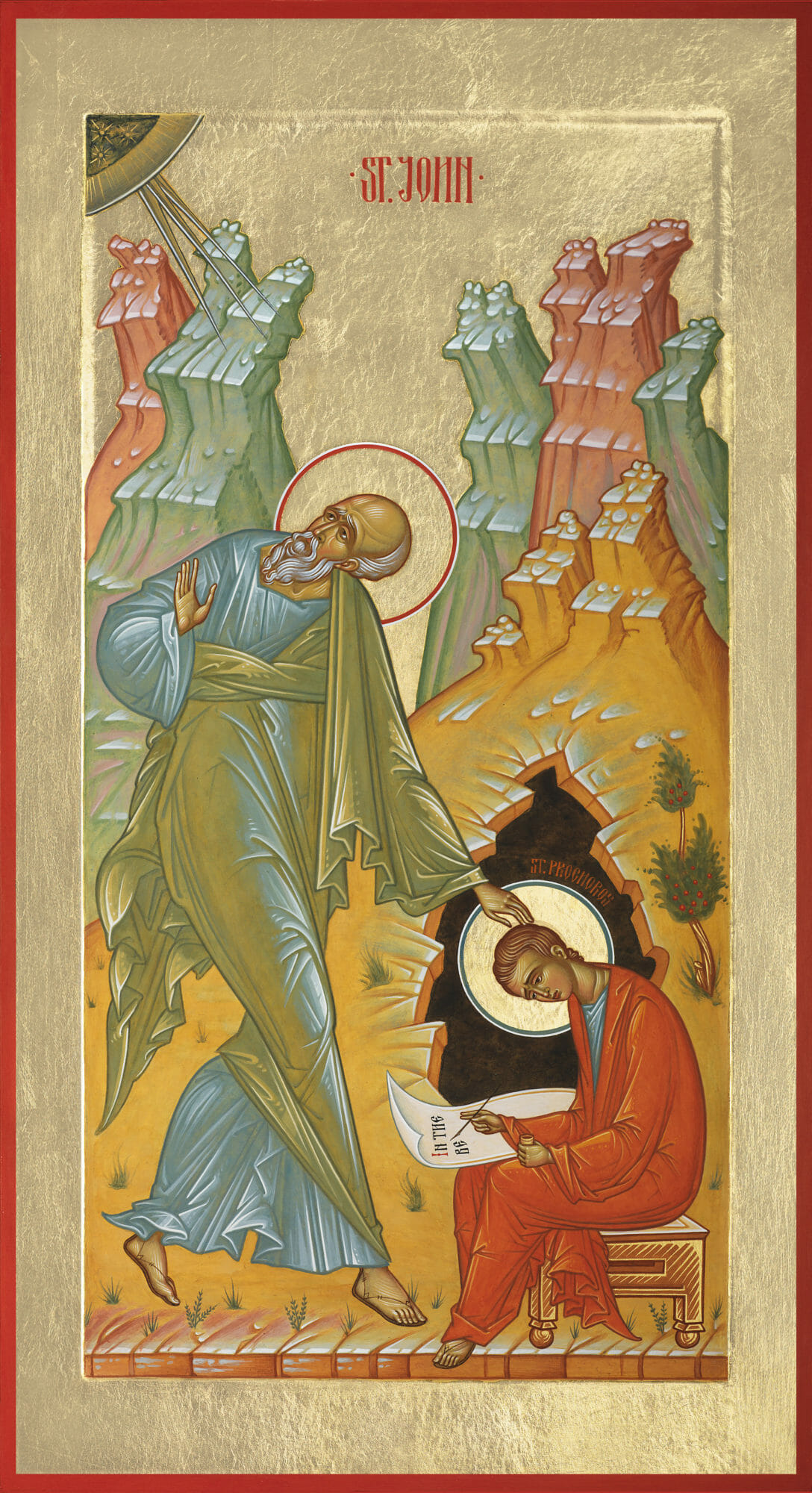
Ss. John the Theologian & Prochoros, 2019. Egg tempera and gold on panel. 11 3/4 x 21 1/2 in.
The style is the man himself.
– Compte de Buffon
The terms “style” and “stylization” are a bit slippery, definable in various ways, as we’ve discussed recently, when considering some aspects of contemporary icon painting. Some might regard stylization as a neutral feature of the work, others use it as a term of disparagement, while others still hail it as the evidence of artistic excellence. This ambiguity makes it a bit difficult to write a few things, as you requested, about stylization in my icon of Ss. John the Theologian and Prochoros. I often think of this work as perhaps almost too conventional. Yet, not quite sterile in style. The challenge was to work within the given parameters of the commission, which at the time felt too restrictive. Nevertheless, the restrictions became the workshop of tensions giving birth to its unique stylization.
Styling
But what do I mean by style in icon painting? Let’s call it an embodied meaning, the synthesis of thought and feeling in form. We can also consider it as a visual rhetoric, meant to communicate more than just a story or documented facts of the faith, as you have suggested before. To these we can add Eric Fernie’s more general and straightforward definition: “Style is a distinctive manner which permits the grouping of works into related categories.”[i]
Thinking broadly—without being exhaustive—I suppose you could subdivide stylistic analysis into four major categories: historical periods, cultural conventions, pictorial systems or infrastructures, and personal expression or signature. Although conceptually distinct, all of these facets always coinhere in a given painting; they’re inseparable, hence the ambiguity and difficulty in speaking of a specific style. Since the seventies, however, the discipline of stylistic analysis has been challenged, called into question and virtually discredited as an authoritative mode of art historical inquiry. Nevertheless, in spite of criticism, as Fernie points out, “…following the principle that all available evidence should be used, style and its analysis remain among the richest seams of exploration for the art historian, and relevant to every aspect of visual culture.”[ii]
But the methodologies of art history need not concern us at the moment. I’ll be speaking as a painter, who takes it for granted that his primary task is the implementation and manipulation of form. For him the question of style is an unavoidable component of the creative act. Every pictorial decision is one of style, whether this fact is engaged consciously or not. I will begin by taking style and stylization as neutral terms, designating—as stated at the outset—the distinctive manner of execution, the personal signature or mode of expression. Hence, for the purposes of this discussion, the last of the four categories just mentioned will be our main concern.
As Oscar Wilde put it, echoing the sentiment of Comte de Buffon, “… one’s style is one’s signature always.”[iii] In other words, even if the work is not signed, it will be identifiable as being from the hand of this or that painter. Anonymity only goes so far. The painter cannot avoid betraying himself. The work is the evidence. This is the case whether or not the painter works in only one or many styles. And as he works he’s always in conversation, never in isolation, even when alone in his studio. Every nuance of form counts and fits into a larger context, a historical horizon of manners, a continuum beyond the painting itself. How is the painter engaging with this horizon? There is a level of self-consciousness in the act of painting, making it terrifying. The painter paints with thousands of masters looking over his shoulder, critiquing his style. How will he contribute to the interaction of manners? Will he speak naturally—freely and with his own voice? The question is whether we’re dealing with authentic manners or merely self-conscious and artificial mannerisms. Signatures, after all, can also be plagiarized.
As an entry point, in discussing the icon of Ss. John the Theologian and Prochoros, I’ll focus on two stylistic features that stand out as most apparent: the elongation of the figure and color, not only in the landscape, but in particular the way St. John’s garments are rendered. I will naturally be touching on other compositional aspects as these features are addressed. All of this will in turn help to open up further our general discussion on the problem of style and stylization.
Elongation
The purpose of elongation, as I see it, is to instill the figure with a sense of weightlessness, exaltation, elegance and gracefulness. It implies a body transcending its own limitations. It can therefore also suggest, in its predominant verticality, aspiration towards heavenly things. It is definitely not to be seen as a denial of the body’s concrete existence. In fact, although subtle in tonal range, there is enough rendition of volume in the figure of St. John to give us a sense of a palpable body under his garments.
We can think of the consequent exaggeration and distortion of elongation — its restructuring of the body — as a way of arriving at intensity of feeling. And I think it was Cézanne who said something like, “A work of art without feeling is not art.” But feeling in this case—expression—is made more potent by the manifestation of thought or idea through nuance and refinement of line and form, rather than by the aggressive manipulation of strokes and the dragging of thick paint. Thus, mind and heart coalesce in gracefulness of form to give a sense of exaltation in the posture of the figure. This exaltation arises as if from a sudden surprise, at the instant of illumination. St. John’s surprise is conveyed by his raised right hand, as he turns to look above and behind his shoulder to the triune radiance.
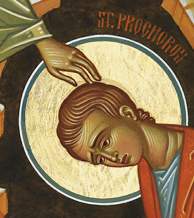
This instant of illumination becomes simultaneously the moment of transmission. Hence St. John reaches out with his left hand to touch the head of St. Prochoros, his disciple and attendant, to impart to him the words he hears from above, as if shining forth from the divine darkness in the upper left corner. St. John’s delicate touch, just reaching and gently touching the head of St. Prochoros, can almost be heard, as the sound of a dropping needle. Herein is a silence that speaks melodiously. As in the empty spaces of Chinese paintings that are nevertheless full of palpable presence.
The theme of transmission is clearly conveyed through the thrust of the diagonal running from the upper left-hand to the lower right-hand corner of the composition, passing through the left arm of St. John and carried down the curving shoulders of St. Prochoros to the tip of his quill, as he writes: “In the be…” The unfinished sentence, from the first verse of St. John’s Gospel, enhances the sense of capturing the event as it unfolds in the fleeting moment. Furthermore, the diagonal thrust is echoed throughout the composition, not only by St. John’s prominent right leg, which parallels his left arm as he steps forth, but also by the rhythm of the mountains in the background. In this way the landscape appears animated, participating jubilantly in the event as a living witness.
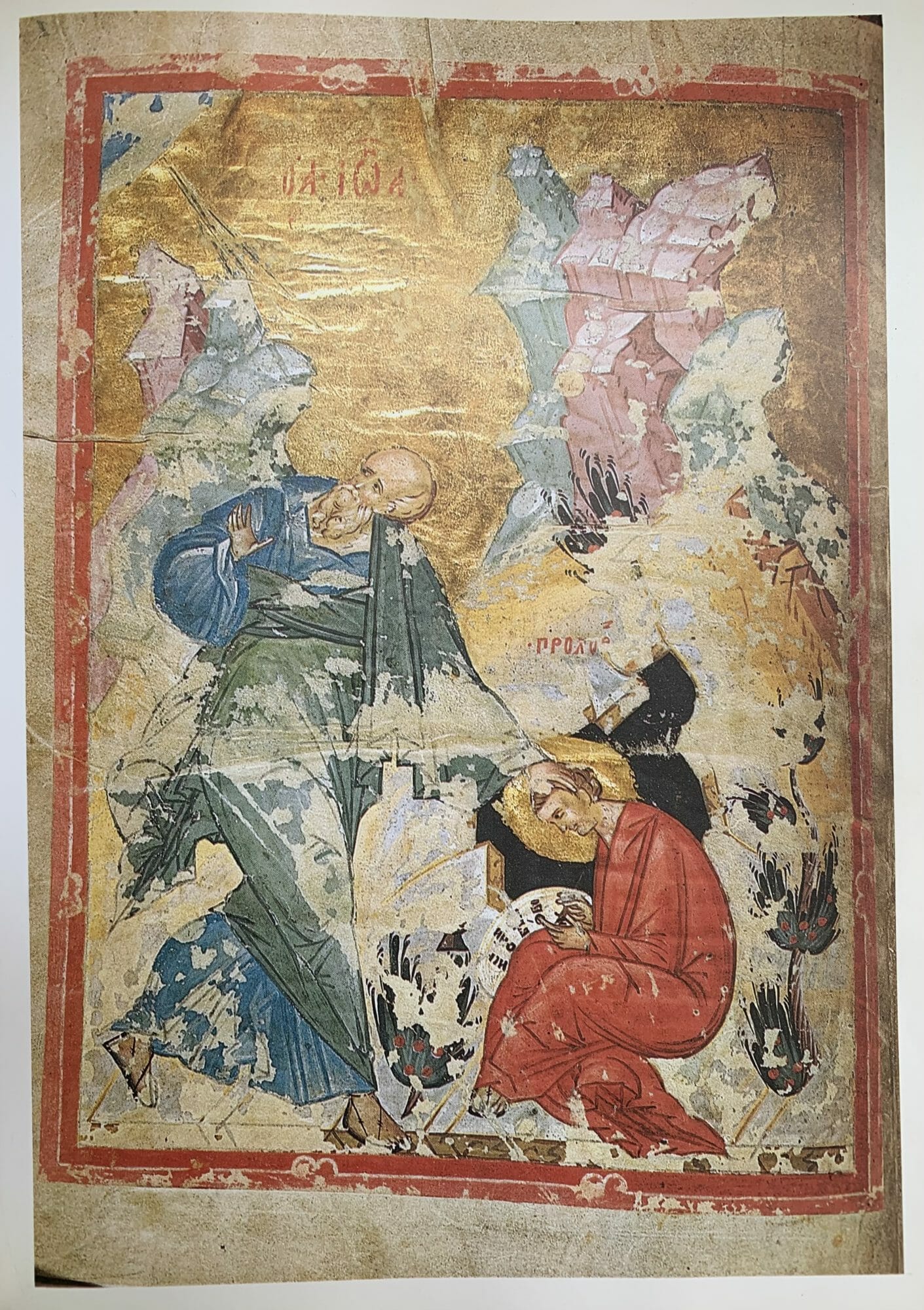
Lectionary, St. John and St. Prochoros, F. 1v. Historical Museum, Moscow, ms 364, Moscow, mid-15th century. Parchment 11 5/8 x 9 in.; miniature 10 1/8 x 7 7/8 in.
Color
The Gospel words “In the beginning…”, as the culminating telos of the diagonal, signal a new reality bursting into existence, an inauguration of renewal of life and joy, through participation in the uncreated light of the Logos, conveyed by the festive and bright colors of the composition. The palette leaning primarily towards pastel hues, is partly indebted to a 15th century Russian manuscript illumination, which served as the conceptual springboard for the icon. But although pastel in range, the color here veers away from pale monotony, retaining richness and vibrancy. The task was to strike a balance of color fields that locked together harmoniously to create a general glow, generated not only by the unique pitch of the hues, but also the yellow ochre underpainting, which comes through the translucent application of the paint. Moreover, the underpainting helps to tie the gold background with the image. Color is used as an abstract arrangement, not so much to represent, but rather to present the phenomenon of light. The words of Hans Hofmann come to mind: “In nature, light creates the color. In the picture, color creates the light.”[iv] Hence the overall effect is one of color as light, conveying a festive ambiance.
It seems to me as if the bright red garment of St. Prochoros, the richest color in the composition, communicates in its own way—in its pictorial integrity and chromatic energy—the new reality of life and joy just mentioned. St. Prochoros, as the culminating vessel of reception burns, so to speak, as a coal of divine presence, clothed in a garment of glory, overcoming the darkness of the cave behind him. I don’t necessarily have to “read” the red garment as symbolically or semiotically doing this, although it also functions in this manner. The color works in a way that harmonizes with the theme at hand, seamlessly. I would say that in this case we have, as you articulated recently, the synergy between the visual and semiotic.
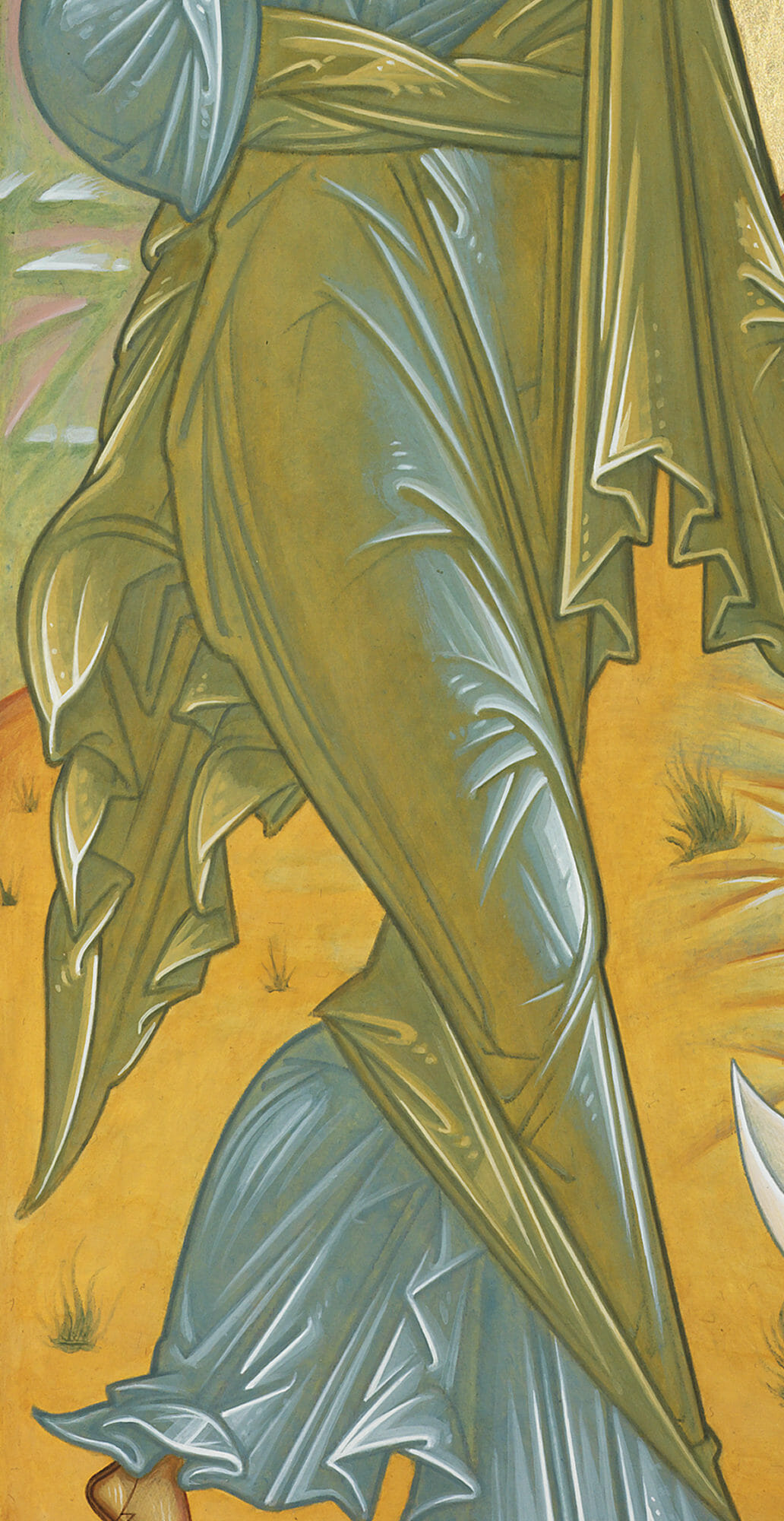
One last point on color to consider is the complexity of the highlighting on the garment of St. John the Theologian, in particular his right leg. What we have here is a kind of cangiante technique, often used in the rendering of garments. Cangiante is grouped by some, along with sfumato, chiaroscuro and unione, as part of the four canonical systems of painting developed in the High Renaissance, but a version of the technique is also to be found in icon painting. It involves the transition from highlights to shadows by the alteration of color hues, rather than merely darkening a single hue with drab, black or brownish tones. In this way richness of hue is maintained throughout, along with the complex interplay of complementary, cool and warm color relationships. This technique can result in renditions with an iridescent effect, at times resembling shot silk.
In the case of the himation on St. John’s right-hand leg we have a subtle chromatic shift, from a cool blue highlight, to warm green-yellow in the shadow areas. The yellow ochre underpainting is particularly more evident along the lower portion of the leg, functioning as reflected light, bouncing from the landscape environment. The overall effect is one of luminosity, as if St. John’s leg was radiating light. The Theologian becomes lightning, so to speak. It could be said, therefore, that in this depiction St. John manifests his role as a transmitter of light. Thus, as with St. Prochoros’s garment, meaning and form coinhere. The garments become an inseparable extension of each saint, revealing aspects of their unique roles and personalities. The style or manner of handling form becomes the channel of manifestation.
Elongation II
Returning to the question of elongation, beside it being implemented deliberately for its own sake, we should also bear in mind that it can also result, along with any other form of distortion, from practical compositional concerns — as a way of harmonizing the totality of the picture plane. But this seemingly random consideration can also serve to underline aspects of the theological content of the iconology. Hence the icon we’re discussing — one of four depicting the evangelists — called for elongation, since the spaces meant for them, within the Holy Doors of an iconostasis, are strongly vertical in format. This constraint is capitalized on as an occasion for drama in the figure of St. John the Theologian, who stands dynamically, as if caught in the midst of movement, simultaneously stepping forward and looking back to the divine radiance behind him. However, the other Evangelists sit still, deep in contemplation, each writing their unique version of the Gospel. In their case, verticality comes through primarily in the structure of the buildings, lending the composition a sense of stability and calculated order, befitting the theme of stillness. The fact that St. John is the only Evangelist caught in movement, as if lightning striking the earth from the heavens, helps to makes the point that his Gospel is of a different order, standing out from the Synoptics in its lofty mysticism and theological depth.
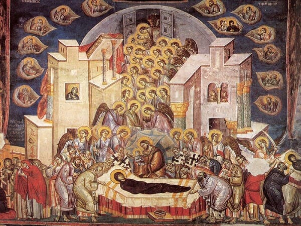
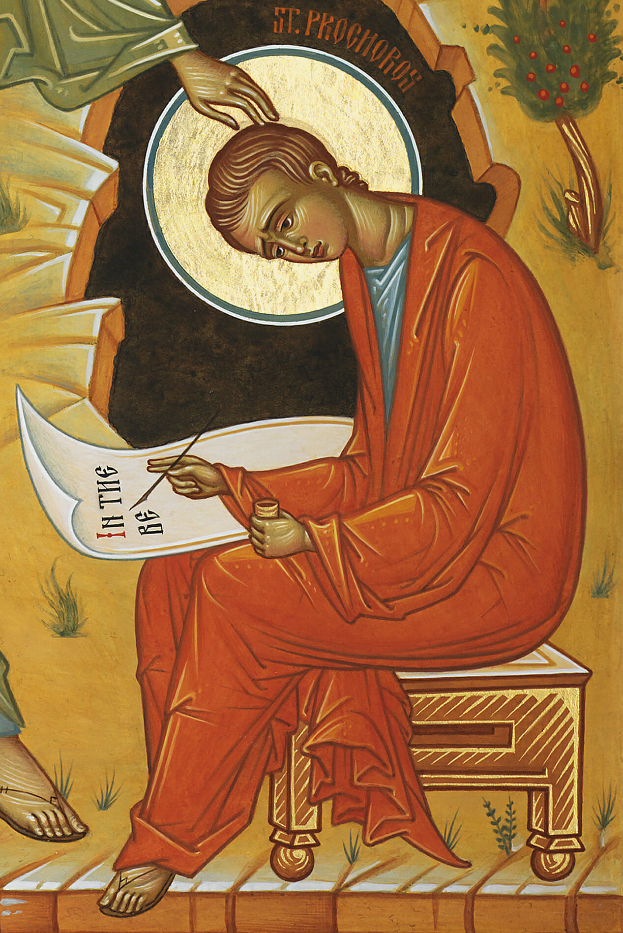
Dormition of the Theotokos, Church of the Holy Theotokos Peribleptos in Ohrid. Fresco painted around 1295 by Michael Astrapas and Eutychios.
As you might have noticed, although I use elongation throughout my work, I tend to temper its use through a “classical” logic of form in the treatment of limb relationships. Even if I’m working from Russian examples, my propensity is to bring the human figure to a more familiar sense of naturalistic harmony and concreteness. I can only take abstract distortions so far. What I’m searching for is a sense of refinement and elegance. I have found it very difficult to work against this tendency of mine. Similarly, although the icon of Ss. John and Prochoros has a strongly shallow spatial environment, I generally veer away from excessive flatness and compression of form. Yet I also tend to hesitate from giving the figure an excessively bulky and heavy sense of corporeality, as can be seen in some of the figures in the fresco of the Dormition in the Church of the Holy Theotokos Peribleptos in Ohrid, painted around 1295 by Michael Astrapas and Eutychios. Many of the figures in the Ohrid frescoes, and those within their vein, seem to me at times as too massive and awkward, lacking in gracefulness. The ideal balance for me is the mean between these two extremes: refinement of abstract form and concrete corporeality. I try to work within this tension at all times.
I’ve only touched on some of the formal components contributing towards the icon’s stylization. More could be said, but this should suffice to give a sense of the unique manner in which I’ve handled the narrative theme. However, we should be careful not to confuse our formal analysis with mere “formalism.” What we’re after is much more than an aestheticism satisfied with the pleasantness of surfaces. Therefore, more needs to be said about the problem of style as the manifestation of participation.
To be continued…
Notes:
[i] Eric Fernie, “Style,” in the “Glossary of Concepts” section of Art History and Its Methods: A Critical Anthology, ed. Eric Fernie (London, UK: Phaidon Press, 1995), 361-364. On style also see Jaś Elsner, “Style,” in Critical Terms for Art History (Chicago, IL: University of Chicago Press, 2003) 98-109; Meyer Shapiro, “Style,” in Theory and Philosophy of Art: Style, Artist, and Society (New York, NY: George Braziller, 1994) 51-102.
[iii] See Oxford Reference: https://www.oxfordreference.com/display/10.1093/oi/authority.20110803100539148
[iv] Hans Hoffman, Search for the Real (Cambridge, Mass: M.I.T. Press, 1979) 67.
Dear Fr. Silouan,
Thank you so much for sharing your ideas on this theme and your icon, which made for a fascinating read. Looking forward to the next episode!
Kindest regards,
Johanna Kouwenhoven
This is so fun. I love hearing you describe your artistic aspirations, aims, and approach, Fr. Silouan. So delicious! After reading I’m curious what the original question was your audience put to you. Perhaps you will divulge that in Part II?
If I could pinpoint the decision in this icon that feels the most ‘mannerist’, I would locate it at the narrow cross-section of St. John’s form that occurs just above his overlapping knees. In my assessment, that is a surprising place for his garments to so tightly cling to his form. It is a gesture I might expect to find on an angel once in a while, but not on an elderly man. I’ll admit this passage of the composition makes me feel a little dizzy as I look long at it.
I also think St. John’s hip (greater trochanter of the femur) is well above the halfway mark of his full height stature. Can you comment on that?
Hello Baker…The question had to do with the perceived restrictive and negative side of stylization in traditional iconography. In other words, how expecting or pursuing a recognizable “icon” style ultimately hampers icon painting. The question served as an opportunity to write down my general thoughts on style, its positive and negative implications in icon painting.
Interesting observation about the overlapping knees and how this can be seen at times in the depiction of angels. I take the fact that this passage of the composition makes you feel a little dizzy as evidence of success in the implementation of form. Yes, St.John might be elderly, but in his purity, role as evangelist — messenger of the Good News — and as a “son of thunder”, he is also indeed “angelic”. It could be said that the heights of his lofty theology lifts us up to the heights of contemplation, rendering us spiritually “dizzy”. So the aesthetic impact carries the theological meaning — form embodies thought.
As to your observation about the distorted treatment or exaggerated placement of the hip…I would actually say that this detail, along with the overlapping knees, coming together in the implementation of elongation, help to induce the feeling of dizziness you describe. Hence form becomes embodied feeling. You can call it expressive deformation. Style, then, becomes embodied thought and feeling.