Similar Posts
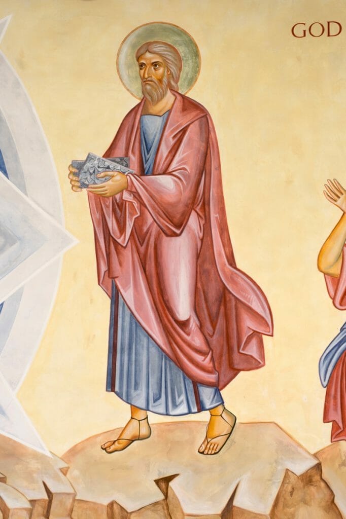
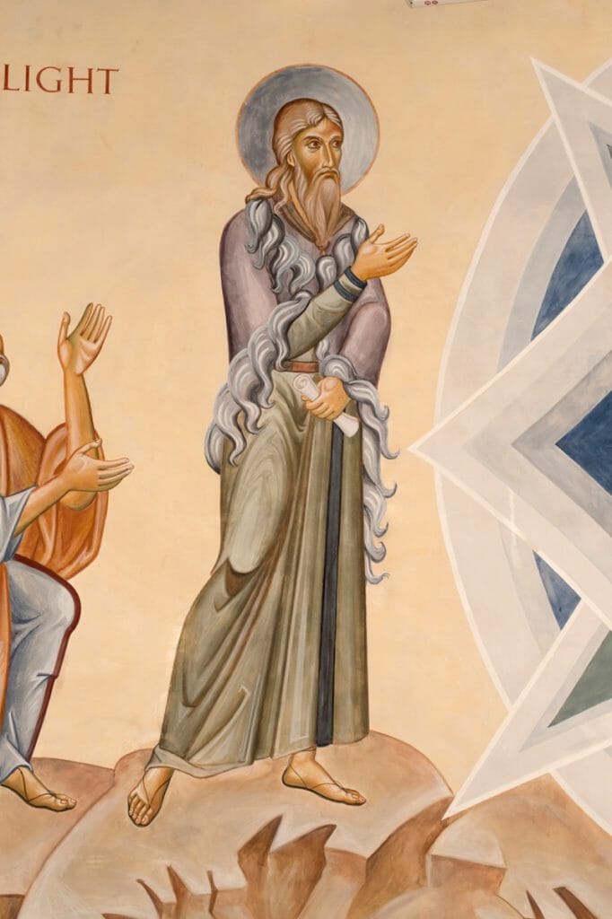
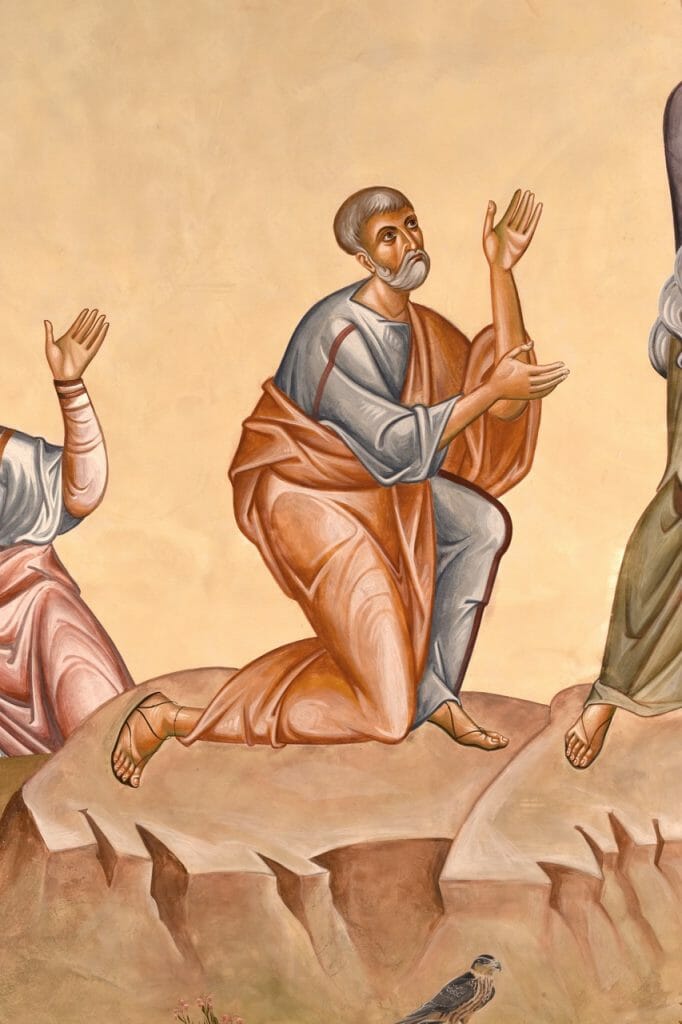
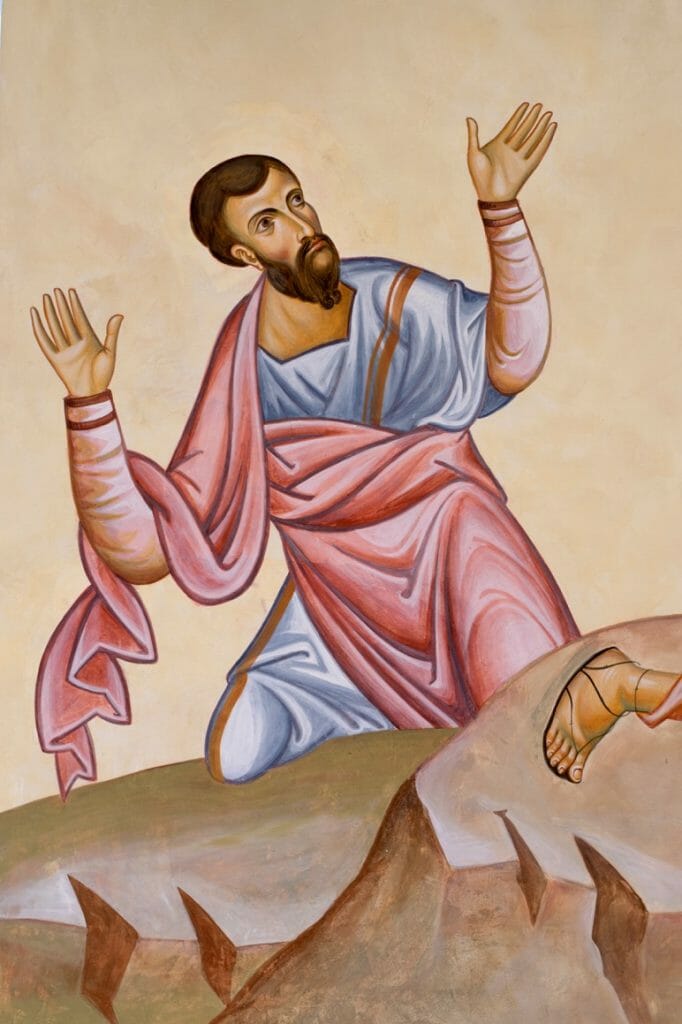
The Transfiguration Secco for Lancaster University Catholic Chaplaincy
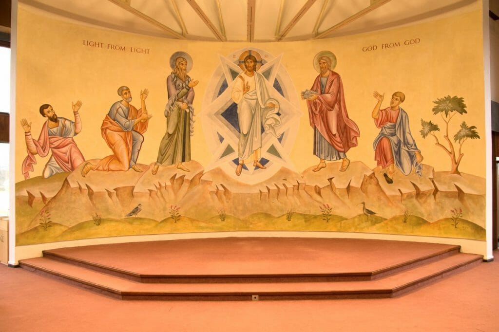
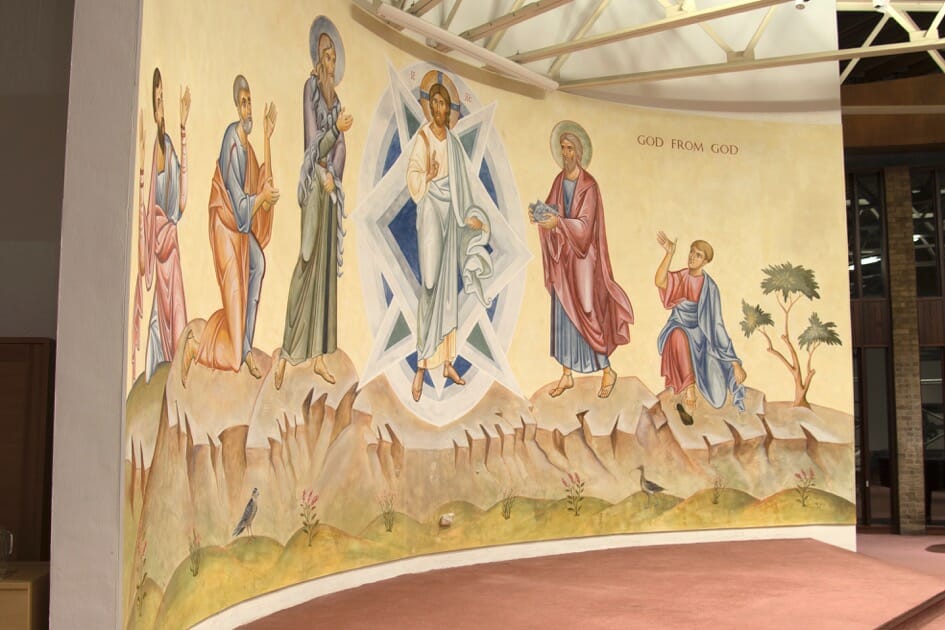
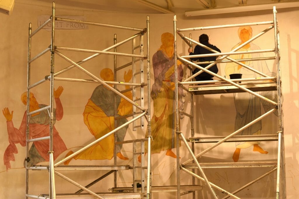
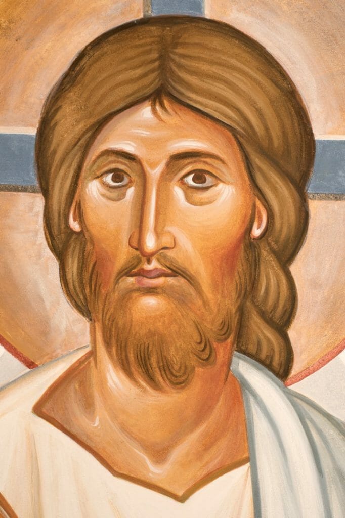
Early in March my assistant Martin Earle, myself, and a former student from the Diploma in Icon Painting that I teach, Fran Whiteside, completed a secco wall painting of the Transfiguration. It took us just twelve days compared to the twenty months we had just spent on two large, but nevertheless smaller mosaics, so it was a refreshing change!
The theme
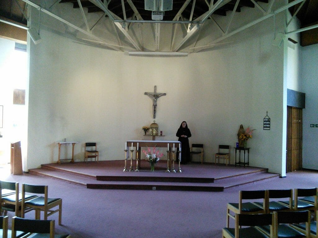
This Roman Catholic chapel at the University of Lancaster, U.K. was made in the 1970’s, when white walls and little figuration was the mode. So the first thing that the new chaplain, Fr. Philip Conner, wanted to do was to transform the east wall. Having seen a fresco of the Transfiguration that I had painted for a parish in Leeds, he immediately knew that this was the most suitable subject for the chapel.
There were three inter-related themes he wanted conveyed: deification; participation; and creation transfigured.
Like many Christians in the West whom I meet, Fr. Philip was discovering the need to re-emphasize deification, the call to union with Christ. Too long in the West has salvation been understood in legalistic terms. He felt that the icon of the Transfiguration was the most powerful way of reviving awareness that union with Christ through the Holy Spirit is our ultimate calling. We therefore wanted the wall painting to give the congregation a sense of being participants in the Lord’s Transfiguration, and not just spectators.
We also wanted to affirm that all creation – animal, plants, and even rocks – are intended, in their own particular way, to partake in Christ’s Transfiguration. They could shine with divine and uncreated light just as did Christ’s garments in that glorious event.
The design
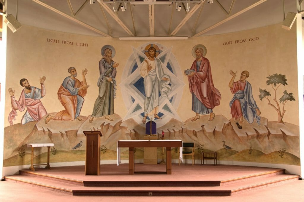
The wall measures 34 x 16 feet (10.5 x 4.8 metres) and is landscape in orientation. Usually of course this subject is depicted on vertical, portrait surfaces, with Christ, Moses and Elijah above and the three disciples below. So the design presented a challenge: all six persons needed to be side by side.
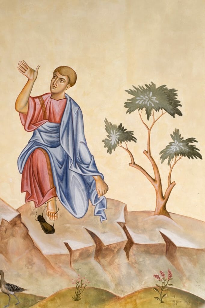
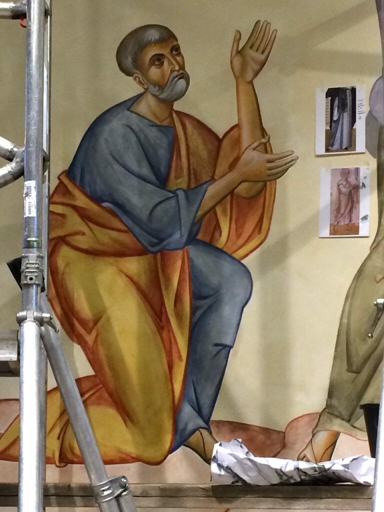
In order to retain emphasis on the transfigured Christ, and to merge the scene with the congregation, I decided to step the figures down as the image progresses towards to the ends: Christ, Moses and Elijah are standing, while Peter and John are half kneeling, and James is a little lower still.
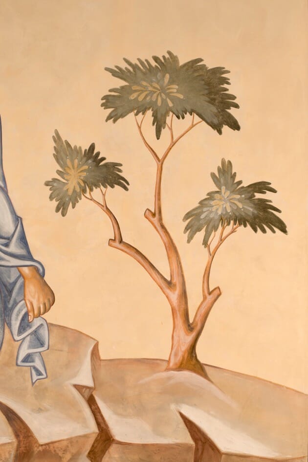
To retain visual harmony I included a tree to balance James. But this was also to recall the bush that Moses beheld, burning without being consumed. What Moses was seeing on Mount Tabor was the fulfilment of what he had witnessed on Sinai. The burning bush prefigured Christ’s human nature burning with His divinity without being consumed.
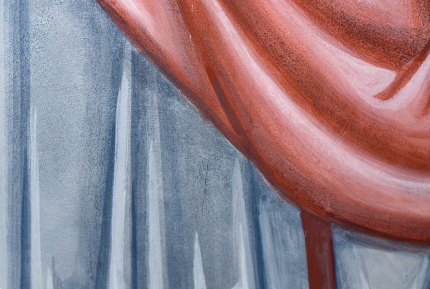
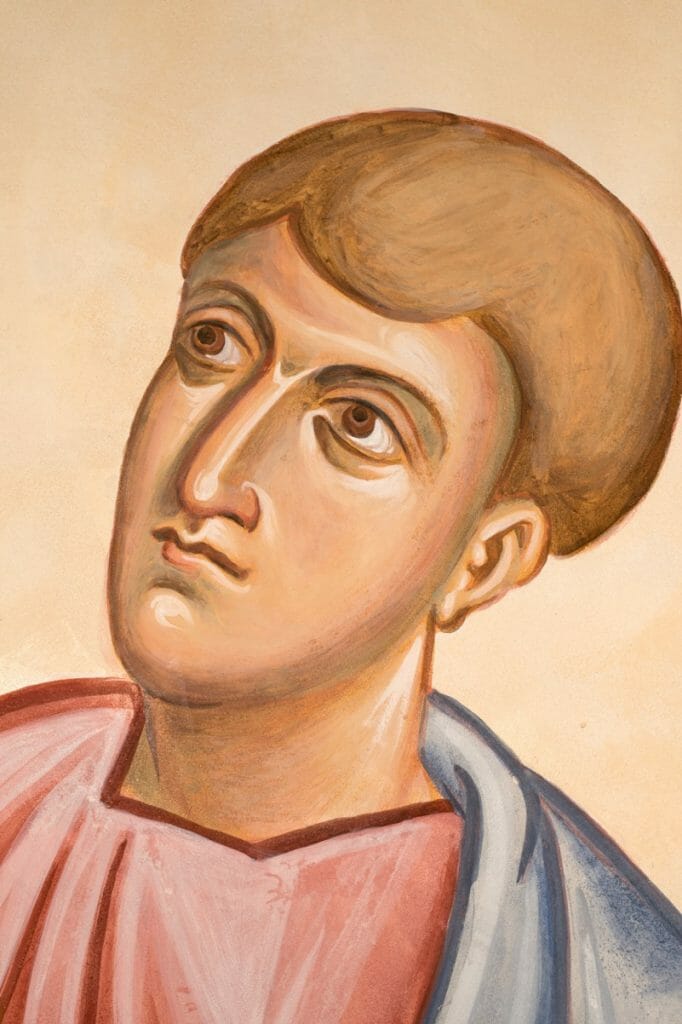
I included blue – the colour of the skies and therefore of heaven and divinity – in all the garments to suggest the disciples’ participation in the Lord’s divinity. I also wanted all the colours to have a slightly silvery feel, to suggest light within everything.
Fr Philip asked that the text from the Creed be added, “God from God, Light from light.” The aim of this was to help viewers connect the Creed to the mystical experience of the Church.
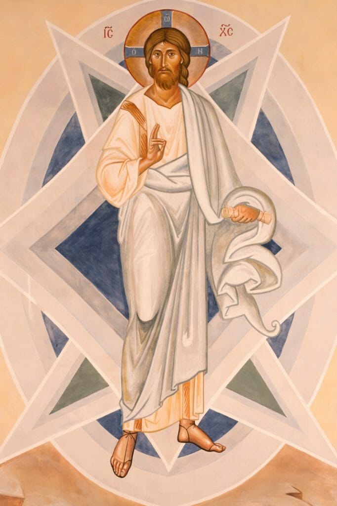
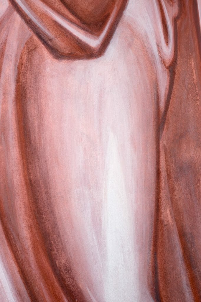
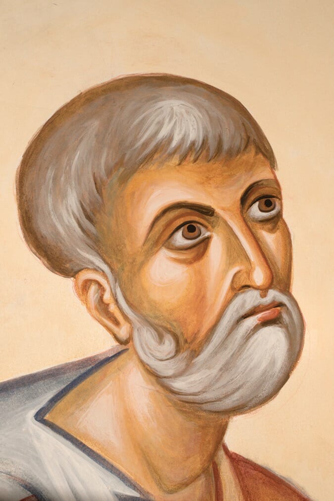
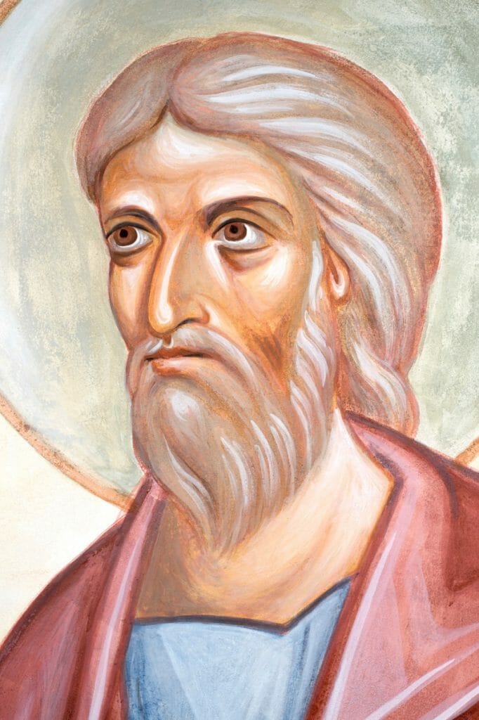
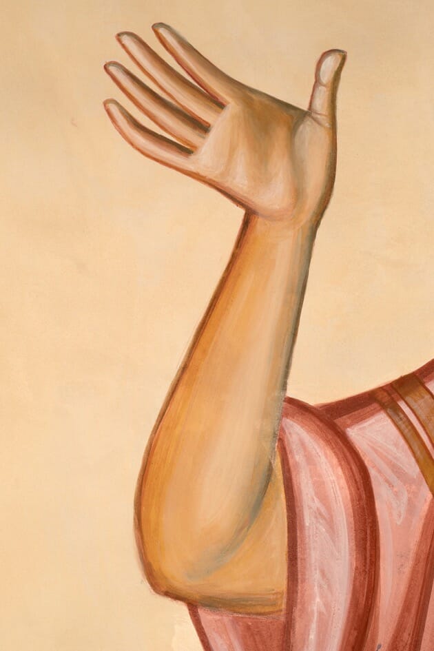
Transfiguration is the transformation of the created material world, not its dematerialization. I was therefore keen to model the figures and mountains, and not reduce them to flat areas. The icon tradition abstracts form; it does not deform it or reduce it to pure colour. One comment in the visitor’s book put it aptly: “What a transformation! What a Transfiguration! Ours is an incarnational religion, so the visual aspects of our churches should speak to our senses – this certainly does, raising the heart and mind to God!”
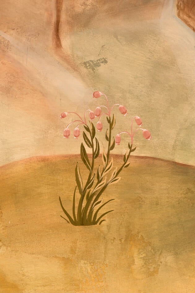
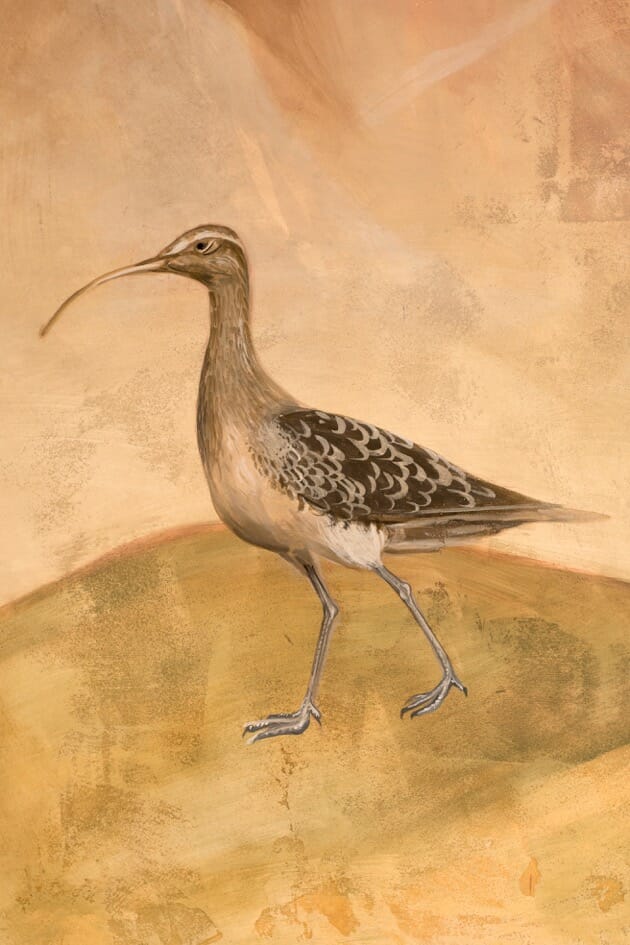
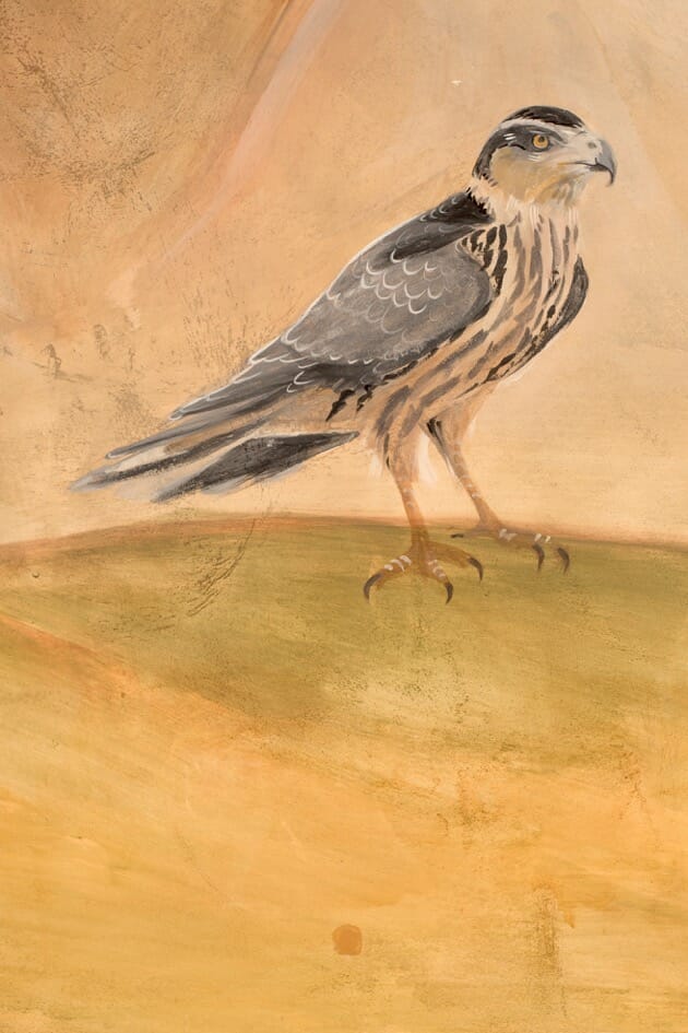
The Orthodox liturgical texts of feasts very often use the word “today” – “Today Christ is transfigured”. In divine time there is no compartmentalisation into past, present and future. In order to help the congregation to connect the event in Palestine with their day-to-day experience at the University of Lancaster, we therefore included local flora and fauna: bog rosemary, the hen harrier, and curlew.
Technique
I usually use the fresco technique on walls (pigment and water applied to fresh lime plaster), but in this instance practical considerations led us to use secco (application of paint with a binder to a dry wall). We used casein as the binder in this case. Casein is the main protein in cow’s milk. To make the casein, we added ammonium carbonate (lime water can also be used) to casein powder dissolved in water. This produces a very strong and water resistant glue, which we then diluted with water for use in paint. Other ways of making casein are described in my book, “Techniques of Icon and Wall Painting”.
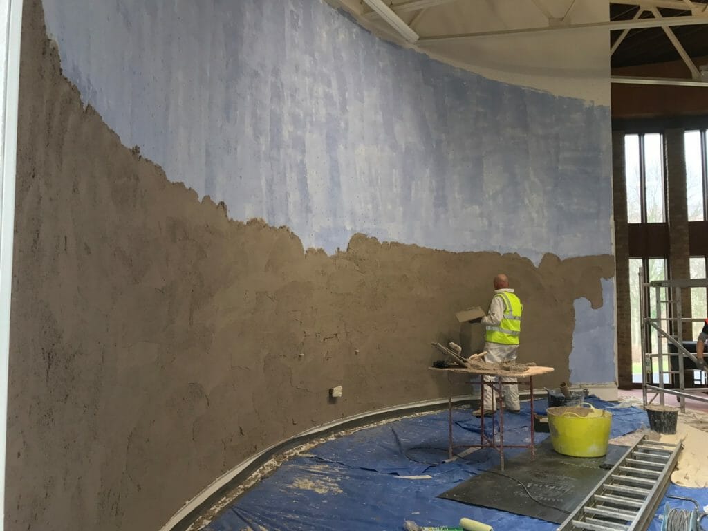
The original surface of the wall was an uneven cement render, painted with a standard domestic emulsion paint. To create a more permanent and even substrate I had it re-plastered in lime plaster, the surface left with a slightly rough surface. This added tooth maximises the paint’s long term adhesion.
I used the membrane technique to build up the paint layers. After the mainlines were defined, the middle tones were applied to each area as a translucent layer.
The form was then developed as a monochrome, generally in a darker tint of the membrane.
The highlights were then added,
and if necessary, glazes applied to unite everything. Sometimes washes of a neighbouring colour were added to shadows in order to link the two areas and add interest – for example a little red was washed into a neighbouring blue garment.
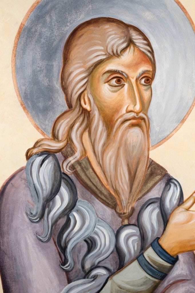
To model the flesh, I used a cool green (terre verte) for the more distant areas and a warm English red for the near. Cool colours recede, while warm colours advance. This system has two main advantages. One can model form without having to darken the painting. Secondly, green and red are complementary colours, and as such heighten each other’s intensity. Near to each other they create a joyous effect.
I hope you enjoy looking at the images!

Absolutely incredible! Thank you for including so many photographs — being able to see all the details is wonderful. I can’t even imagine painting on such a grand scale, but you’ve done a marvelous job with this!
Very beautiful, Aidan. It’s interesting that you chose to do this in Cassein paint – a medium I rarely hear of for iconographic usage. How do you find it behaves, and under what circumstances do you think it’s the best choice?
Thank you, Andrew. Casein is waterproof and more robust than egg, and therefore it was a common traditional choice of medium for secco, along with animal glue. Many people use acrylic from the tube nowadays, but one is then limited to the pigments that are available off the shelf. Admittedly, one can, like Vladimir Grygorenko has done, use just the acrylic medium and add pigments. With casein, one use whatever pigments one wishes, and mix them in with the casein medium that is made fresh every three or four days. I suppose also I chose casein because I prefer to use natural materials.
You do have to be careful not to lay up casein too thickly,since it is so strong that might pull off the wall as it dries. Also, painting on a non-absorbent wall one has to be careful of dribbles.
Casein leaves pigments slightly less saturated than egg, which actually works quite well on a wall since you don’t want colours to shout out loud.
The next medium I want to try is Keims.
Inspiring work. The use of local fauna is a lovely detail that I especially enjoyed. Thank you for including so many images to view.
Thanks be to God! Well done, Mr. Hart! Thank you for your work!
Breathtakingly beautiful. I too am interested in your use of cassein paints – plusses, minuses, rationale etc. But, again, thank you for sharing the beauty that God has worked through your hands.
Hello Rev. Lawrence. You can read my reply above to Andrew about casein. There is more detail about secco in my book “Techniques of Icon and Wall Painting”.
Beautiful results Aidan and team, to change a dead space to a living vibrant one.
Thankyou for the detailed article and pictures.