Similar Posts
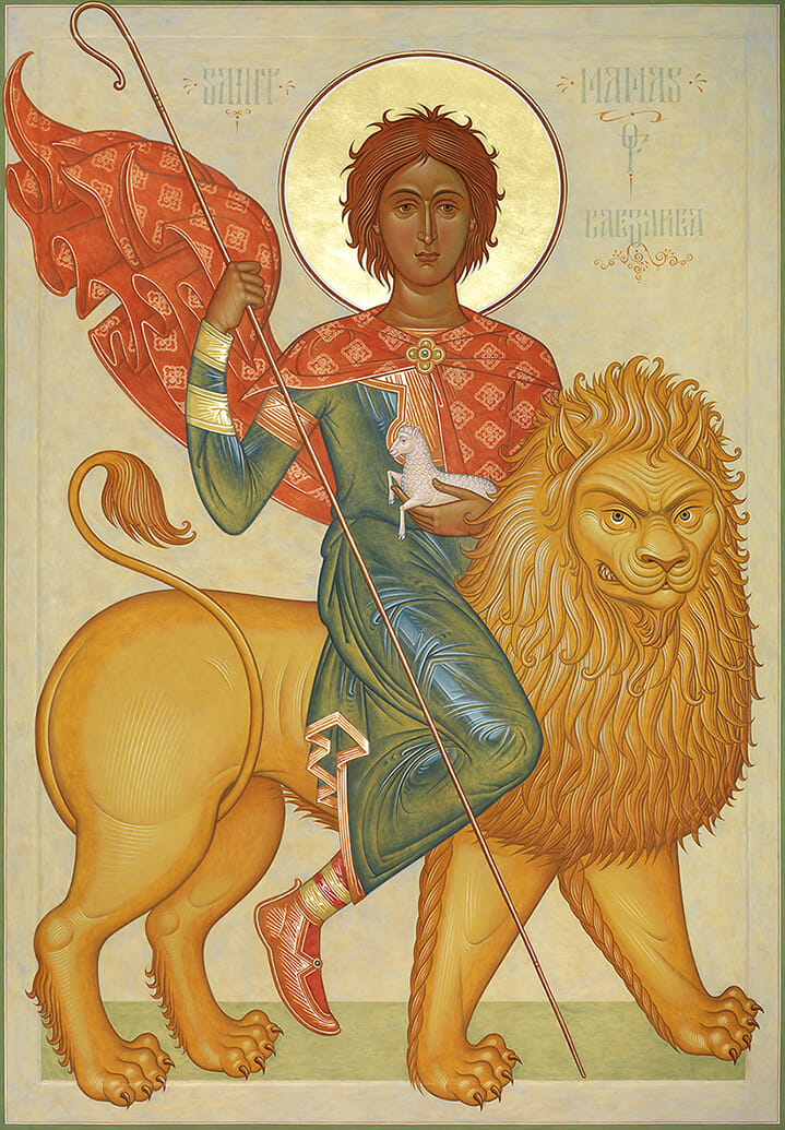
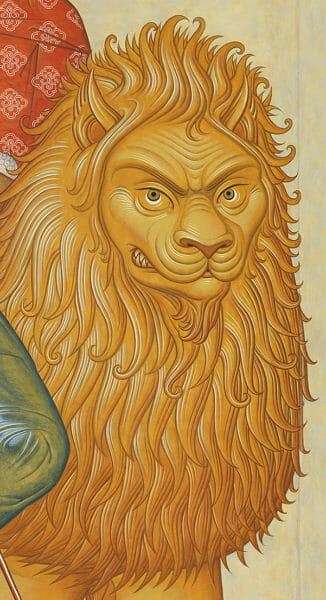
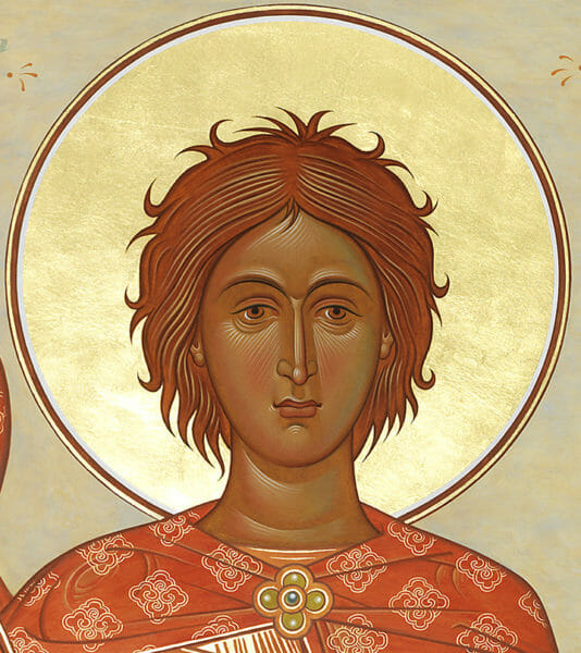
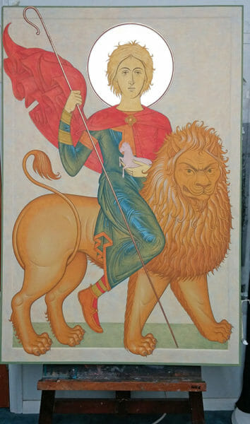
St. Mamas of Caesarea by Fr. Silouan Justiniano. Egg tempera on wood, 46 in. x 31 in.
One has to know technique, but one also needs to know art. An icon should be like a ‘painting’, like a prayer written with beautiful letters…There are many craftsmen, but few real iconographers. Make an icon, a beautiful icon, not like a worker, but like an artist.
‒Elder Sophrony[i]
Elder Sophrony’s statement might sound a bit strange to those who have been accustomed to hearing that the icon should not be treated as a “specimen of aesthetic art.”[ii] Nevertheless, it is to be taken very seriously as suggesting a healthy and liberating approach to the practice of contemporary icon painting. That is, only if we wish to cast aside stifling methods that relegate the icon to perpetual lifeless regurgitations.
This issue of method leads me to take up a suggestion, albeit hesitantly, proposed by Andrew Gould. Last year, in a previous post in which I discussed an icon of St Mary of Egypt and St. Zosimas I had just finished, he commented: “Someday, Fr. Silouan, it would be most interesting if you would speak of your techniques of craftsmanship whereby you achieve this refinement and beauty of brushwork that looks so unlike anyone else’s work.”[iii] Kind and humbling words, but I don’t know if I can actually explain how I arrive at my results. A lot of it is not even up to conscious calculation. Nevertheless, I’ll give it a try in this post. To do so I’ll discuss some of the technical aspects behind the aforementioned and an icon of St. Mamas of Caesarea (martyred ca. 275) I recently completed. I’ll mainly focus on the following topics: the use of gold, drawing and interpretation, color and paint handling, ornament and symbolism. But first a few remarks on method.
Method
As with most iconographers working on portable icons, I prefer to work with egg tempera. But, what is my technical method? How do I particularly handle the medium? What “school” do I follow? Well, I have not had a change to go to “icon painting school”. What I know comes from ignorance, but, ironically, my advantage is my disadvantage. In all honesty, part of me is drawn to the nuances of technique, since it’s a necessity; while another part of me recoils, finding it a bit of a drudgery ‒ a shackling nuisance. What good is it if it just leads to inhibition? What good is the recipe if the meal ends up unappetizing? It’s good to remember that technique is ultimately a tool, rendering different results from different hands. Style is the man.
Today I find the right line and tomorrow it escapes me. Today the work is praised as triumph, but tomorrow it’s disdained as failure. Today I master the medium and tomorrow it masters me. There are no guarantees. So a discovered technical “secret” of the Old Masters, or the use of an “ancient technique”, does not guarantee a good icon: slaving away to imitate, and it only ends up looking fake. “Antiquity” only takes you so far. The key is how the tool of “Antiquity” is handled; the spirit, the mentality that guides it. In fact, the key is to forget that you’re using a tool, just as you forget you’re using the pencil as you write. Once the sentence is done there’s no need to fixate on the pencil. Once the stroke is dragged the brush is put aside. Once you look at the prototype proceed from within.
As Shih-T’ao puts it, “Thus, he who is unable to liberate himself from methods winds up inhibited by them.” [iv] So the method we’re after is the “non-method” stringing together all icon painting methods.
Gold
Be that as it may, for a while now I have been relying mainly on painted backgrounds and halos rather than gilding. When used, I relegate gilding to the halos and assist details on garments and objects. I aim at a subtle painterly effect, mainly via the use of oil gilding and gold paint, made with gum arabic and genuine 23k loose gold leaf. Part of it has to do with the fact that I do not particularly like the process of gilding. I’m more interested in painting. But, more importantly, I find that relying on excessive gilding can run the risk of absolutizing one pictorial attribute of the icon above all others. Indeed, gold is an important symbolic element, but it can also turn into a facile gimmick and cliché ‒ kitsch in iconographic academism.
It’s not uncommon to find garish gilding interfering with the painting passages and the icon’s overall harmony. In some cases the virtuoso gilding is so immaculate that it actually turns into a distracting mirror, leaving behind the painting itself in its uninspiring mediocrity. Also, it’s good to bear in mind that nowadays we find “gilded” and shiny metallic surfaces everywhere. Gold is no longer mainly or solely associated with courtly power or the sacred sphere of liturgical splendor. Although gold definitely retains its inherent symbolic properties, it cannot be isolated from the associations we bring to it from our immersion within our immediate cultural context. Hence, some gilded icons are so shiny that it makes you wonder if they’re in fact meant to live up to the standard and compete with the “pristine” look of non-liturgical luxury products. So the irony is that under these circumstances gold runs the risk of being associated more with glitzy consumerism than the Uncreated Light. Perhaps this is another example of how profane simulacra tends to insinuate itself into the realm of liturgical art. In short, the presence of gold does not guarantee the pictorial and theological efficacy of an icon.
So there’s no doubt that, if effectively used, the symbolism and brilliance of color itself can serve as an equivalently powerful substitute. Van Gogh’s approach to color comes to mind: “I want to paint men and women with that something of the eternal which the halo used to symbolize, and which we seek to confer by the actual radiance and vibration of our colourizing.”[v]
Drawing and Interpretation
Who draws enough as to be able to say a thousand words with just a line? Who draws enough, becoming one with the rhythm of Nature, as to reveal its hidden treasures? The challenge is to enter into the prototype and to “draw out” the mystery that it contains. As Henri Matisse says, “I believe study by means of drawing is most essential. If drawing is of the Spirit and color of the Senses, you must draw first, to cultivate the spirit and to be able to lead color into spiritual paths.”[vi]
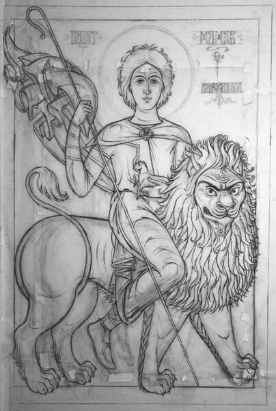
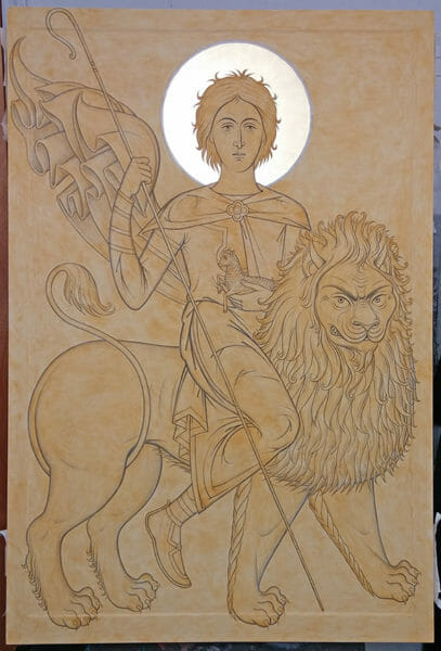
The drawing for St. Mamas was done free hand, with vine charcoal on tracing paper, without projecting the prototype or squaring the paper. This was particularly challenging since I wanted the icon to be very large, one of the largest I’ve worked on so far. Throughout the constant revisions of the process the format was gradually altered. It took many hours of revision to arrive at a satisfactory articulation of the image. This can be seen in the pentimenti of the drawing. By the time the drawing was completed I had taped together at least four large pieces of tracing paper in order to increase the scale and resolve the proportions of the composition.
This process is crucial as a way of interpreting the image. It enables the draftsman’s stylistic temperament, his personal feel for line and form, to come through more readily than if the prototype was traced. Moreover, for the drawing to work correctly it has to be articulated according to the specificity of the scale and format intended for it. The format determines the shapes and their proportions, the rhythm and overall directional movement of the lines. In other words, the format dictates and guides the process as much as the draftsman, with his predetermined mental image. The two components, the concrete object worked on and intellectual idea, organically come together in the give and take of the intuitive process that begets the image. This is necessary if the icon is to be an authentic and living interpretation of the prototype.
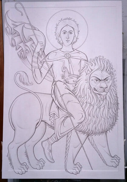
Upon completion the drawing was then transferred unto the gessoed board and reinstated with waterproof India ink. This allows for further refinement of line and the development of form through subtle tones. The inked drawing serves as the inner structure of the icon. It will be seen, to various degrees, through the colors applied on top, thus helping the articulation of form in the painting stage.
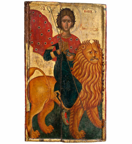
What particularly interested me, while working on St. Mamas’ icon, was the challenge of interpreting the lion, which features prominently in an account of the saint’s life popular in Cyprus. In the Cypriot hiagiography St. Mamas is described as a hermit who evaded taxation and lived in a cave, near the town of Morphou. Being captured by soldiers on their way back to town they encountered a lion about to devour a lamb. St. Mamas then subdues the lion as he protects the lamb and rides to town to everyone’s amazement. As a consequence of his bravery he was pardoned and exempted from taxes.
In the prototype the lion seemed too weak and comic in sentiment, I was looking for something more powerful, fierce and noble. Something more along the lines of the following description found in an old Chinese canon describing how to depict a lion: “With a form like that of a tiger, and with a colour tawny or sometimes blue, the lion is like the Muku-inu, a shaggy dog. He has a huge head, hard as bronze, a long tail, forehead firm as iron, hooked fangs, eyes like bended bows, and raised ears; his eyes flash like lightning, and his roar is like thunder.”[vii]
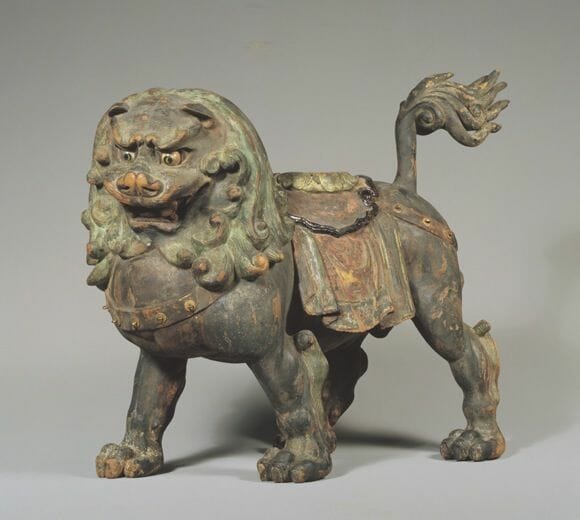
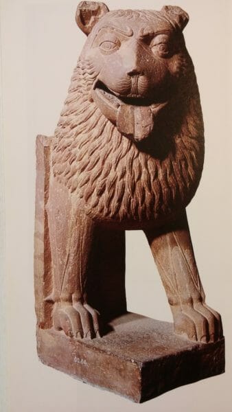
In truth, none of the lions in all the other versions of the icon that I found really satisfied me, although they clearly attested to the imaginative playfulness of past iconographers. Indeed, in all these lions we find the embodiment of individual idiosyncrasy, even if we deny that they’re forms of “self-expression”. They can be seen as unwritten “canonical” guidelines, the object of which has been “as much to stimulate imagination, as to define the manner of representation.”[viii] Be that as it may, my search for just the right kind of lion led me to consult not only Western Medieval, but also Assyrian, Indian, Tibetan, Chinese and Japanese references. Later on, to my happy surprise, I was to run into the following passage, which in a way reflects the kind of thoughts that came to mind as I developed my interpretation:
The artist’s lion need be like no lion on earth or in any zoological garden; for he is not illustrating a work on natural history. Freed from such a limitation, he is able to express through his lion the whole theory of his national existence and individual idiosyncrasy. Thus has Oriental art been preserved from such paltry and emasculated realism as that of the lions of Trafalgar Square. Contrast the absence of imagination in this handiwork of the English painter of domestic pets with the vitality of the heraldic lions of Mediaeval England, or the lions of Hokusai’s “Daily Exorcisms”. The sculptured lions of Egypt, Assyria, or India are true works of art, for in them we see, not any lion that could today be shot or photographed in a desert, but the lion as he existed in the minds of a people, a lion that tells us something of the people who represented him.[ix]
Over all, whether pertaining to the lion or the figure, what began to become apparent in the drawing process, was that I was leaning towards a classical standard of proportions and even a sense of corporeal beauty, albeit restrained by the geometric substructure of the forms. The variety of versions of St. Mamas’ icon that I found did not provide the kind of harmony, gracefulness of line and refinement of form that I was looking for. These qualities had to be arrived at intuitively through the creative process, by entering into the spirit latent in the prototype and the ideas to be found in works of Western Medieval and Oriental art.
Color & Paint Handling
It seems to me as if a line is more concrete to the mind’s eye than color. Color’s elusive, it must be seen in relation to other colors. Its interaction with other colors is magical, as if water turning into wine. Without a mixture in front of your eyes there will be no palette conception realized. Yes, it bears symbolic content, but color also conveys feeling, a general ambience. So what will be the mood of the icon? What will be its color light?
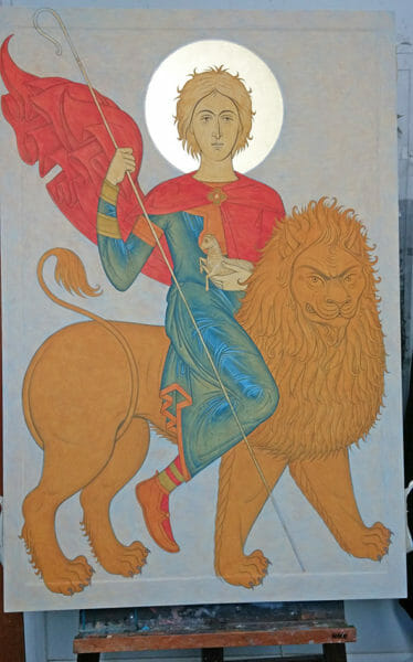
Once the underdrawing in ink is done an imprimatura (first paint layer) of Carpathian yellow ochre is applied on the entire surface of the panel. This layer of transparent color provides a warm mid-tone that will come through all the other colors, depending on their level of transparency. The imprimatura also provides optical unity to the whole work and in subduing the brightness of the white gesso helps in establishing the values and chromatic relationships.
After the imprimatura the local colors are applied within their designated areas. I prefer to apply them in floats, that is, broad puddles, but they can also be brushed in multiple layers of transparent strokes perpendicular to one another, until the area reads as a cohesive “color field”, yet having nuance when closely inspected. Thus the local colors should not be applied completely solid or flat, in such a way that it drowns and obliterates the imprimatura ‒ the paint layer should be able to “breathe”. In other words, the colors should be thought of and treated as translucent “veils”, rather than thick “coats” of paint. To achieve this is better to proceed slowly, with color that is considerably diluted with water, working up slowly to the right level of paint film density.
In the icon of St. Mary of Egypt and St. Zosimas, mentioned above, the imprimatura can be seen untouched in the golden horizon of the landscape. It also comes through slightly in the passages of azurite blue towards the top. This is what gives the atmospheric effect to the whole background. Moreover, since the imprimatura is a warm tone it optically functions as a complementary color when juxtaposed to the cool blue, causing a slight optical vibration or a very subtle scintillating effect. All of this is further enhanced by the specific way the paint was handled as to produce different levels of pigment sedimentation and texture. So the blue was applied gradually, first with semitransparent floats or glazes that faded into the horizon, and then with a dry brush, in the areas needing more opacity, such as the very top. Hence, what we’re dealing with is a constant juggling act of opacity and transparency, glazes and dry brush handling, light and heavy coloring.
The highlights tend to be opaque, while the shaded areas transparent. Nevertheless, in some cases, the lighter areas can just be untouched imprimatura, as just mentioned, while the darks lean towards opacity. Whatever might be the case, it is always important to leave the mid-tone passages untouched. In other words, there should always be different levels of paint film density, arrived at gradually, in order to allow light to freely pierce through the various layers, reflect from the gesso, and bounce back to the eyes. Keeping to this principle contributes to the overall luminescence of the work.
These principles where also applied to the icon of St. Mamas. A detail to notice in particular is the treatment of the blue-green garment. In this passage I used what can be called the “negative highlighting” technique. Instead of developing the form in the usual way, by adding white to the local color in three stages, I begin in reverse, by establishing the most prominent areas to be highlighted in dark color on top of the imprimatura. Once these were clearly defined, in a sequence of geometric patterns, then a couple of steps of bright highlights were applied on top. The key is not to lose the initial dark areas. Part of them should still border between the bright highlight and the imprimatura. The rest of the form is developed in darker shades with glazes, until the volume and overall tone of the garment reaches balance. This allows for the imprimatura to come through in many places enabling the garment to appear luminescent, with a golden glow, at once concrete and atmospheric. The imprimatura in the blue garment at times acts as a reflected light, a mid-tone reflecting the color of the lion; in other places it appears as if the garment is transparent and we can see the body of the lion through it.
Symbolically “negative highlighting” implies a transfigured body. We should bear in mind that the imprinted image of the Lord on the Holy Shroud is a negative. It does not follow the standard practice of highlighting in portrait painting. Hence, the most prominent areas of the Lord’s body, the ones that impressed themselves most strongly on the shroud, appear dark rather than light, as if burned unto the cloth. It appears as if the Uncreated Light of the Lord at the time of the Resurrection burned his image unto the cloth, paralleling the effect of a photographic negative. Likewise, when we depict a garment with “negative highlights”, it’s implied that the light of the deified saint has imprinted itself unto the icon, as the Lord imprinted his image unto the Holy Shroud. But, since the icon is a “border” between the Kingdom of Heaven and our temporal existence, there are also bright highlights on top of the negative imprint. This in turn suggests the living presence of the saint here and now, as he interacts with us in time. The icon then becomes as if a door through which the saints passes, as the Lord passed unhindered with His transfigured body through the shut doors after the Resurrection.
In the icon of St. Mamas, I opted to for a predominantly mid-tone palette. The primaries red (cinnabar), blue (azurite) and yellow (lemon ochre), set the predominantly bright and joyful ambiance of the composition. Given that I avoided stark contrasts the overall effect of the icon can be seen as suggesting diffused light. This is strengthened by the somewhat cloudy application of the color, especially in the background, in which can be seen a lot of the imprimatura coming through upon close inspection. Also, the inscriptions have been painted in subdued tones. This keeps them visually behind the saint as if inhabiting the atmosphere of the background. I found that in this case the standard use of red letters and borders was not applicable for the overall chromatic and tonal thrust of the composition. Overall, when it comes to color in an icon, I think it’s important to keep in mind a very pertinent statement by Hans Hoffman: “In nature, light creates the sensation of color; in a picture, color creates light.”[x]
Ornament
When articulating form in an icon I always bear in mind the constant tension, the “push and pull”, between flatness and volume, negative and positive space. It’s important to always remember that what we’re dealing with is a flat surface, a picture plane. I aim towards the middle path, preferring things to be neither too flat, nor too volumetric. A strong geometric substructure in the composition and forms help to keep things in check.
Another way to subdue excessive volume is the use of ornamental pattern on garments. In the icon of St. Mamas I used a cruciform pattern on the cape in order to achieve this pictorial effect. While enhancing the decorative appeal of the icon, it also helped in strengthening the sense of flatness, without completely obliterating volume and weight in the passages in which it was applied. I would also include under the category of “ornament” the golden fringe of the blue garment, the bands on the chest, right arm wrist and bicep of St. Mamas, and his golden shoes.
Moreover, ornamental pattern also symbolically contributes in suggesting the transfiguration of human form. This symbolic function of ornament is not only evident in the Orthodox icon but also in the sacred art of the East. Alice Boner, speaking of the use of decorative patterns in the sacred art of India, could just as well be speaking of the Orthodox icon:
Ornaments are not simple embellishments to enhance the attractiveness of divine figures. They do that, of course, but have at the same time a more important function by shifting emphasis from anatomic form to geometrical or decorative patterns. They help transfiguring human forms into something beyond. Adherent draperies enclosing human forms, floating scarves surrounding them, girdles, necklaces, armlets, wristlets, ankle rings and garlands encircling limbs create an independent pattern of lines that plays along and across their movements, partly concealing their physical appearance. Resolved into abstract ornamental patterns, human figures are divested of their material character and transferred, as it were, into a subtler state of being.[xi]
The principles discussed by Alice boner in regard to Indian sacred art can also be seen implemented in this mosaic icon of St. George. St. George the Great-Martyr, late 12th cent. Monastery of Xenophontos, Mt. Athos.
Symbolism
The symbolism of ornament finally brings us to an interpretation of the overall symbolism of St. Mamas’ icon. This might not at first seem to be pertinent to our look into method, but it’s in fact an integral part of it, since it fuels and is the source of all formal considerations. In short, meditation upon the symbol intuitively and consciously guides the pictorial conception.
The icon of St. Mamas, among other things, represents the soul’s attainment of dispassion; or the purified nous in authoritative command over the soul’s faculties. In St. Mama’s tender and youthful countenance we find an image of the soul rejuvenated from sin: “thy youth shall be renewed as the eagles.” (Ps. 102:5) He rides a lion representing the incensive power of the soul (seat of anger, repulsion), which has been subdued, turned away from misuse in vice. Although subdued, the lion still looks at us with a severe countenance in vehemence. This signifies that in dispassion the faculties of the soul are not completely obliterated but rather used correctly, stirred in the right direction towards virtue, that is, “according to nature”. Thus the incensive power uses its anger as a weapon against the demons, to repulse temptation and the passions, rather than to attack our neighbor. As the Holy Apostle says, “Be angry and sin not.” (Eph. 4:26)
Since every symbol in its multivalence bears both a positive and negative implication, then the lion is also to be interpreted as both the Devil, who “prowls around as a roaring lion looking for someone to devour” (1 Pet. 5:8), and Christ, the Lion of Judah: “Judah is a lions cub; from being a shoot, my son, you have grown up. He bows down and slept as a lion and a cub; and who shall rouse him.” (Gen. 49:9) Moreover, in the lion’s golden color we find a solar symbol, Christ as the Sun of Righteousness, who transmutes of the soul from the heavy lead of sin and corruption, into the radiant gold of immortality and deification.
St. Mamas holds a shepherd’s staff on his right arm, a sign of practical virtue and authority over vice and evil thoughts. Thus he becomes the personification of the nous as hegemon. Speaking of the symbolism of the right arm St. Dorotheos of Gaza says, “They say the right arm is strength and hands are received for action [practical work], as we said elsewhere. The right arm, therefore, is the strength of the hands. So they [the saints] offered the power of the right hand, that is the practice of good works, for they received the right hand for the sake of the good.”[xii]
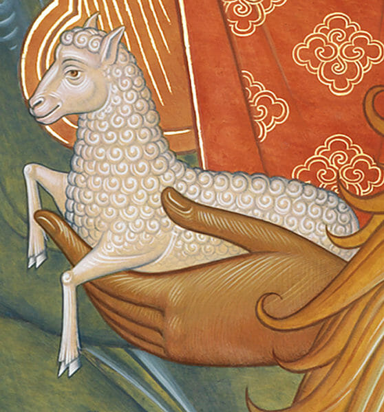
The left arm hold a white lamb by the belly and waist. This signifies the overcoming of the misuse of the desiring power of the soul (seat of attraction, appetites) and the repose of the left hand, that is, inactivity in the vices of intemperance and lust. The desiring aspect is now directed in intense longing towards the Lamb of God to which it has attained and now protects, through the white purity of temperance and chastity.
The red cape unfurled by the wind and bearing a cruciform pattern suggests the activity and acquisition, by those who bear the Cross in martyrdom, of the Holy Spirit, who descended in Pentecost as tongues of fire upon the Apostles with a sound “as of a mighty wind” (Acts 2:2); and Who like “The wind blows where it wishes, and you hear the sound of it, but cannot tell where it comes from and where it goes.”(Jn. 3:8)
Finally, in the coexistence in the icon of the lamb and the lion we are reminded of St. Mama’s re-attainment of the paradisiacal state, he has regained the primordial beauty in divine likeness and now, as Adam before the fall, dwells in peace and harmony with all creatures: “The wolf shall feed with the lamb, the leopard shall lie down with the young goat, and the calf, the bull, and the lion shall feed together; and a little child shall lead them.’ (Isa. 11: 6) As he gazes at and through us, in a state of serene contemplation, he inhabits the “new creation” (2 Co. 5:17) of the eschaton, as if inviting us to attain to the fulfillment of Isaiah’s prophecy, “‘The wolves and lambs shall feed together, and the lion, like the ox, shall eat chaff; and the serpent, the ground as bread, they shall not injure, neither destroy in my holy mountain,’ says the Lord.” (Isa. 65: 25)
Conclusion
So here end my reflections on method, amounting to nothing but vague and garbled explanations, hoping that they will at least lead some to aspire towards the “non-method”, containing and transcending all methods. In this way we will be able to reach the “spring of things”. For in the words of Ruskin: “That virtue of originality that men so strain after is not newness (as they vainly think), it is only genuineness; it all depends on this single glorious faculty of getting to the spring of things and working out from that.”[xiii]
Notes:
[i] As quoted in Sister Gabriela, Seeking Perfection in the World of Art: The artistic Path of Father Sophrony, Essex, Stavropegic Monastery of St. John the Baptist, 2014, p. 169.
[ii] D. Sahas, Icon and Logos: Sources in Eighth- Century Iconoclasm, Toronto, 1986, p.15.
[iii] https://orthodoxartsjournal.org/a-new-icon-of-st-mary-of-egypt-and-st-zosimas-notes-on-form-symbolism/
[iv] Shih-T’ao, Enlightening Remarks on Painting, R. E. Strassberg (ed. & tran.), Pacific Asia Museum Monographs, Num. 1, 1989, p.63.
[v][v] V. Van Gogh, The Letters of Vincent Van Gogh, Mark Roskill (ed.), Fontana, 1983, p. 286.
[vi] H. Matisse, “Letter to Henry Clifford, Vence, 14 Feb. 1948,” in H. B. Chipp (ed.), Theories of Modern Art, Berkley, UC Press, 1968, p.140.
[vii] As quoted by A. K. Coomaraswamy in “The Aim of Indian Art”, Studies in Comparative Religion, Vol. 9, No. 1, Winter, 1975.
[viii] Ibid.
[ix] Ibid.
[x] H. Hoffman, “Search from the Real and Other Essays,” in H. B. Chipp (ed.), Theories of Modern Art, Berkley, UC Press, 1968, p.537.
[xi] Vāstusūtra Upaniṣad: The Essence of Form in Sacred Art, A. Boner, S. R. Sarma, B. Baumer (eds.), Delhi, Motilal Banarsidass Pub., 2000, pp.25-26.
[xii] St. Dorotheos of Gaza, “Commentary on St. Gregory’s Hymn,” Discourses and Sayings, Kalamazoo, Cistercian Publications, 1977, p.229.
[xiii] As quoted by A. K. Coomaraswamy, op. cit.
Stunning icon & insightful article!
Thanks Rhonda! Glad you found it insightful.
I have really enjoyed seeing your icons here and it’s so nice to hear more details about your process. Thank you! I have a few questions. From the description of your drawing process it wasn’t clear to me if you had a predetermined scale for your board. It appears to be 2:3. Did this come before or after the drawing? Also, did you build this board? Many American iconographers use plywood (or even particle board!) because joined solid wood boards are costly and not easy to make yourself. When I was in Russia I got the sense that plywood was rarely used, if at all. Also, I haven’t heard of using waterproof India ink to paint the first lines on. Why do you prefer this to painting the lines with a dark color? Finally, was the learning curve for using gum Arabic for gold assist very steep? My iconography partner tried it but I don’t think she liked it very much. I have been using aquasize and pressing on gold leaf. I find that I get mixed results and am interested in other techniques. Thanks again, Father!
Hello Amy,
Although I wanted the drawing to be large I did not know initially the specific measurements to aim towards. So I just put up the largest sheet of paper I had on the wall and began. As I worked it became more clear and extra sheets were added to increase the proportions. Hence the scale was found gradually, throughout the process, as the drawing called for it. Once I got to the scale that ‘felt’ right I stuck with it, arranging the compositional elements based on its restrictions. So, rather than beginning with restriction, I arrive at the restriction of the rectangular format. Nevertheless, however we get there, the format, the borders, are always to be taken serious as crucial determinants of composition.
I don’t go through the trouble of making my own boards. Once the cartoon is done I take the measurements and order the custom size gessoed board from a craftsman that specializes in making icon boards. I get linden or poplar with oak braces across the back.
I use ink since it’s the most practical for my purposes right now. There’s no need to temper a pigment. I just jump into the process by diluting the ink with water to get the shades that I need. This enables you to get very subtle shades and transitions. Using a tempered pigment would not allow for the same kind of subtlety subtlety, plus it would introduce other factors to the equation (texture and color complexities) that I don’t want to add to the batch. It’s just simpler with ink. But, I have considered it, and will definitely explore the use of a dark color for underdrawing in the future.
The gold paint made from gum arabic is just a kind of watercolor and is best made at home. In art stores they sell it as “shell gold” in little ceramic tablets, but it tends to be a bit glittery in consistency, so I don’t find it useful to my purposes. Its simple to make. The key is to follow the instructions carefully, make sure the gum arabic has a thick honey consistency, and take the effort to grind the 10 sheets of loose gold leaf very thoroughly. Here is a link with the instructions: https://www.naturalpigments.com/art-supply-education/technique-shell-gold-painting/
Instead of aqua size I recommend you use Mixton – 3 hours gold size. It’s a Lefranc & Bourgeois product. You can use mineral spirits to thin out the size, in order to get finer lines, but not too much as to make it runny. Sprinkle talcum powder (Johnson&Johnson baby talcum) on the surface before applying the gold size. This prevents gold from adhering to surrounding oily painted areas.
I hope this clarifies things a bit and helps.
Fr. Silouan
Thank, Fr. Silouan, for taking my suggestion to heart and divulging your technique! I must say, your approach is satisfying to me in its unexpected simplicity. As someone who is far more comfortable with drawing than with painting, and who rarely attempts anything more than watercolor, your conception of a painting as essentially a colored ink-drawing is most appealing.
Each one of your icons is an astonishing masterpiece, Fr. Silouan, but this one surely outshines the rest. It is undoubtedly the finest lion I have ever seen in all of art, and that is saying a lot. Ruskin would not have thought it possible. If only their were a critic like him alive today, who could give this icon worthy praise.