
Similar Posts
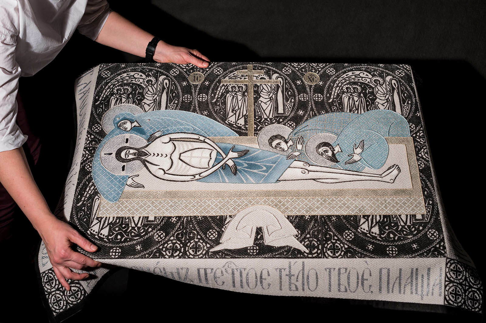
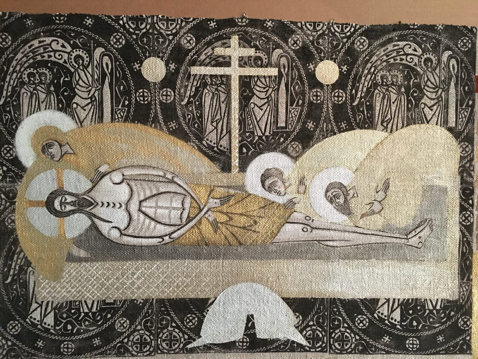
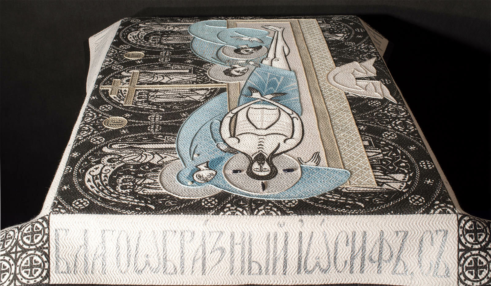
Epitaphios. Lamentation. 2019. Linen, hand woven fabric, 102 x 76 cm (40 x 30 in). Oil and textile paints, pearls and decorative stones, cords. Lino and stencil prints, embroidery
Foreword
In 2021 I attended a conference on “The Art of Embroidery in the Orthodox Church,” at which a speaker presented a thesis that church art is unchangeable, because it is based on church doctrine and therefore the only choice an iconographer or embroiderer is given is to choose between styles. This idea hit a nerve, both artistic and theological, and this article is my response.
Having discussed this matter with many people, both colleagues and clients, it appears the predominant category of style today in our profession has become truly symbolic. A preference for style both serves to identify a professional and is also the most precise way to define one’s work. The first question a person looking at a new icon may ask will most likely be some variation of the question, “What is your style?” No one asking what the artist has put into the image, nor how it was conceived in its theological basis and crafted in its production.
Instead, today church artists are taught to take the whole body of art, from all periods, as a repository of ready solutions and simply adapt them for personal use, adjusting for the artist’s selected “style.” The problem with this approach, of course, is that an artist’s role is thereby reduced only to one of skillful replication. In this sense, the artist no longer is a professional, handling visual means and working with meanings, competent to present a well-known image in a whole new way.
Talking about church art we no longer mention artistic categories like composition, color combinations, lines, rhythms and even the purpose of an artist’s work. I believe it is because many of us were imbued with the idea of impersonality of church art. It goes like this: “In the past there were great artists such as Andrey Rublev, Theofane the Greek and Dionisius, but we are their inexperienced disciples. We are little and weak, so we only allow ourselves to copy works of the masters, but never “say” anything.”
Perhaps this is the reason why such value is given to techniques and materials, – iconographers are always happy to talk about them. Some professionals share their discoveries with great enthusiasm, others are jealous to keep them secret. Describing their work, iconographers only talk about the technique, whilst the theological meaning of the subject is never mentioned. How exactly one reads the image and what accents were set to reveal a particular iconography type is never spoken about. I believe that it happens because most parish priests, commissioning icons and other images, mainly order replicas from old models, forbidding even minor artistic elaboration. Implying iconography as an impersonal type of art, most clients insist on eradicating creativity, requiring the iconographers to show exclusively technical perfection in execution.
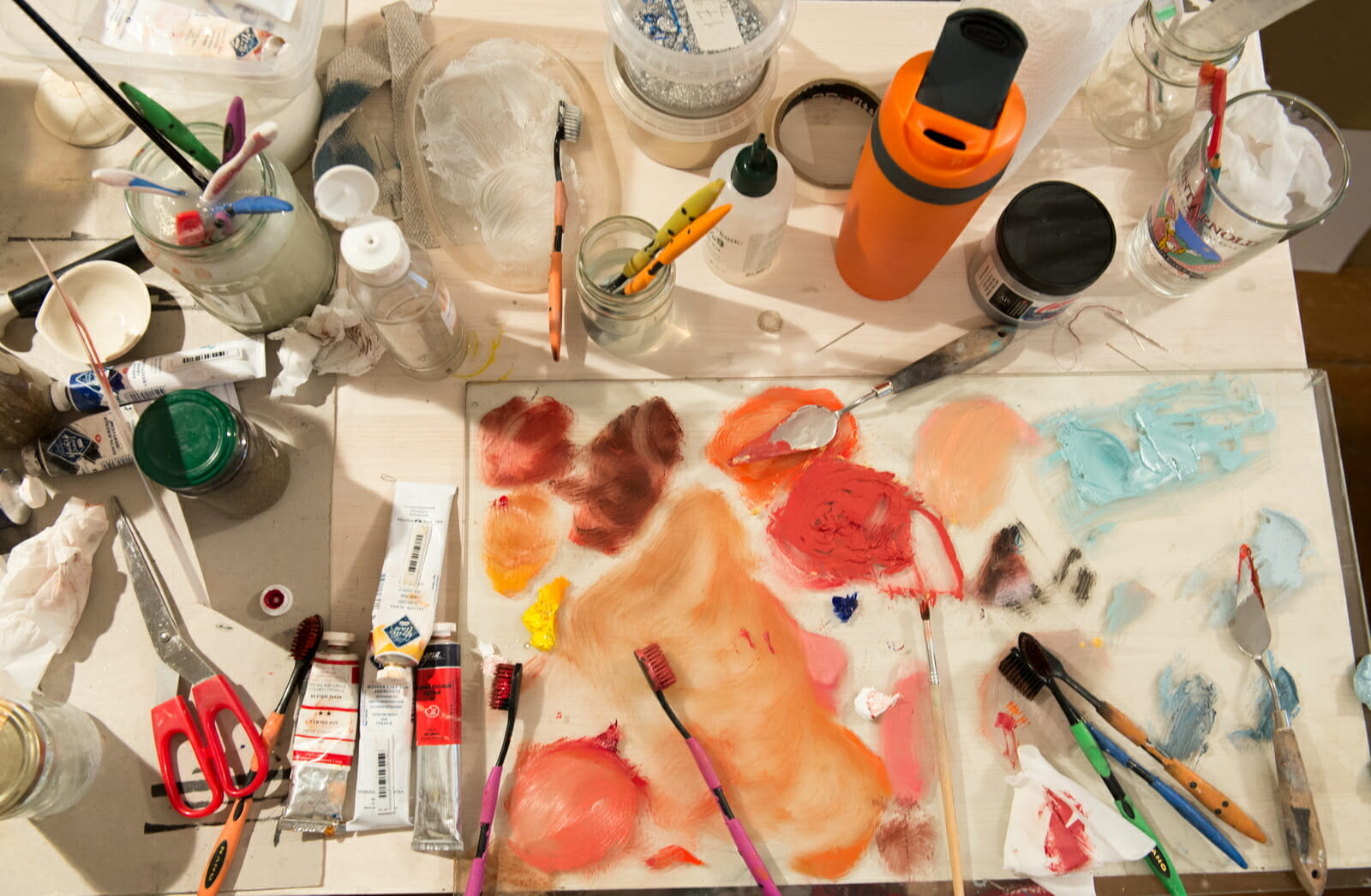
A process.
This formal excellence, now favored by most parishes and private clients, looks very unusual in the historical context of church art and the traditional understanding that images were produced to appeal and to affect a spiritual sense deep within the viewer. Made with expensive materials, contemporary church icons and other objects mainly demonstrate the availability of financial resources, while also testifying how well the iconographer or the embroiderer had mastered a certain skill or technique. Yet the question remains: is this desire for perfection and focus on outward splendor intended to show iconographers’ skills, rather than to reveal Christ?
In this push towards the centrality of “style,” we somehow forgot that visual artwork is a message, a statement. What distinguishes a statement from a mere stylistic replication is that a statement is designed to awaken our response and empathy. Nowhere is this more true than when depicting Christ, the Theotokos, the saints, the stories of the Gospel and other Biblical stories, and the doctrines of faith – the essential subjects of iconography. Looking at the image of the crucified Christ, we must above all feel compassion instead of admiring the excellence of the background gilding. In any traditional art the meaning of the statement has already been laid down by all previous generations of theologians and artists. But this does not at all mean that we cannot continue to meditate on the image today and thus that church art is not “unchangeable,” as the speaker suggested. It is as natural as rediscovering meaning every time we read the gospel, say prayers, or hear church chants and hymns.
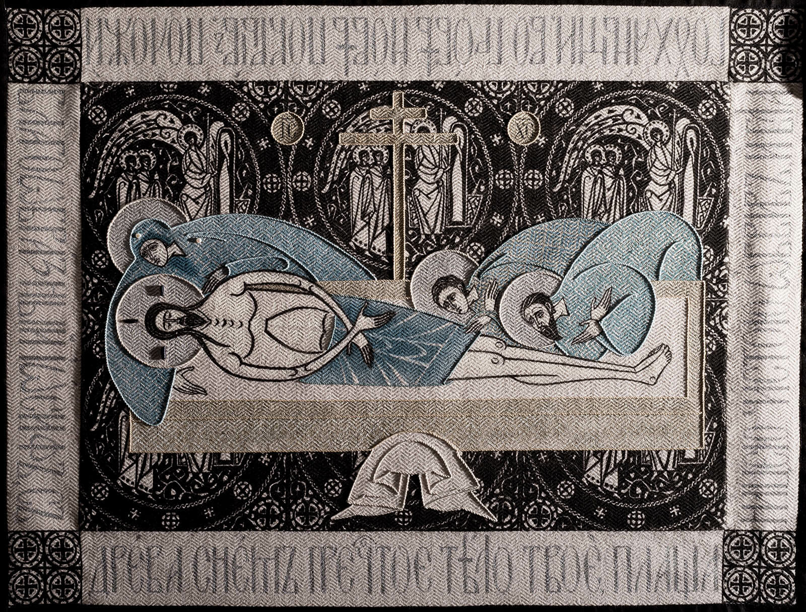
To illustrate this point, I want to present my experience of working on the Epitaphios of the Lord and address some typical questions an artist needs to answer in the process of creating an image. Among all these questions and answers, I feel that the one about style is of very minor importance. Equally, the very concept of style is not like fashion, something that an artist can try on, checking whether it suits the artist or not. Style is instead an expression of meditation on the image. Most basically, what matters is not style but what the artist puts in the piece; style is just the outer cover or shell of the piece itself.
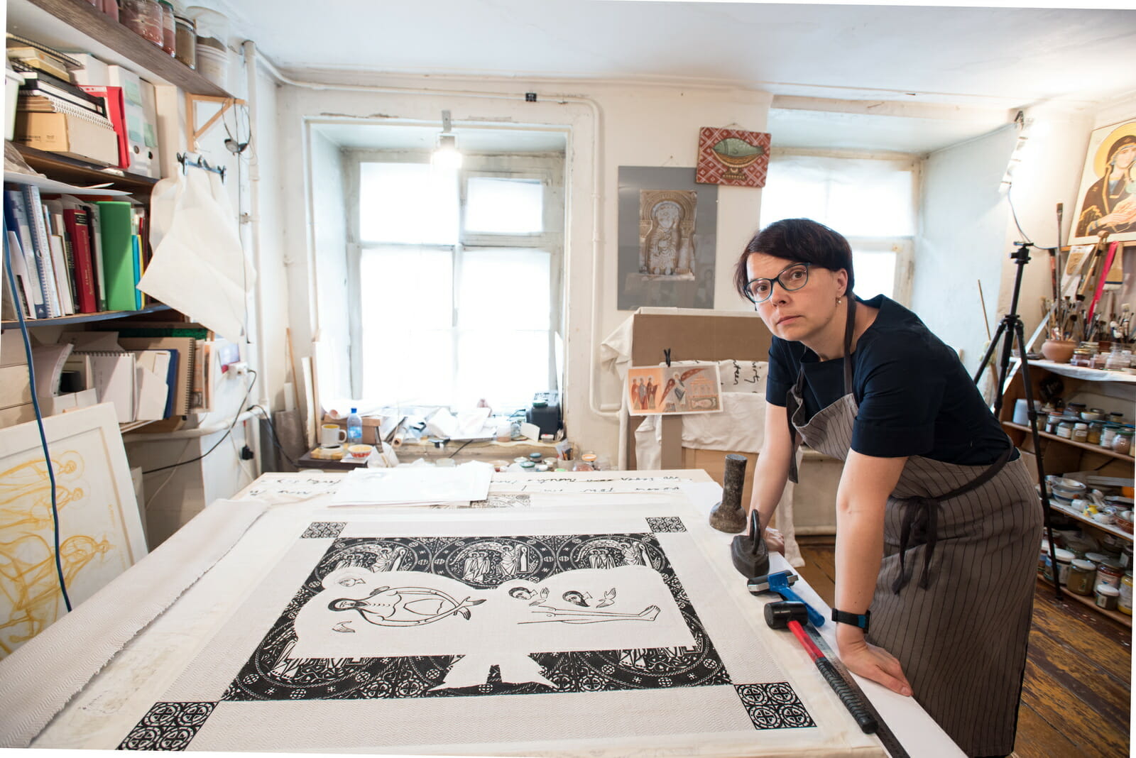
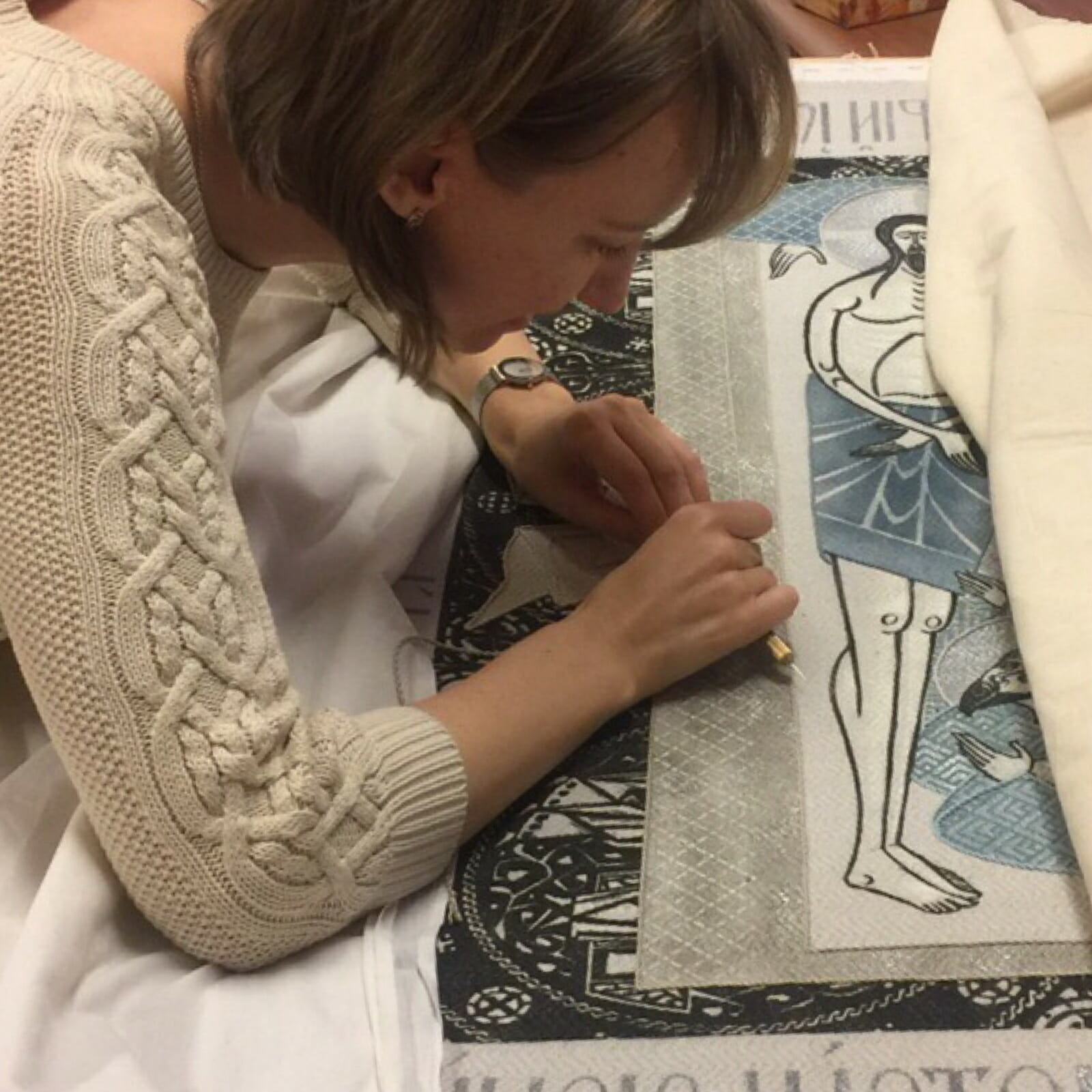
I need to confess right from the beginning: I work principally as an icon painter, and I do not do embroidery. Nevertheless, in working on my Epitaphios I already had extensive experience of work with embroiderers who made a number of items for our parish in Saint Petersburg on the basis of my drawings and under my guidance.
The Research
I began my research for the Epitaphios in two areas. First, I had to understand the iconography. I discovered that the Epitaphion as a liturgical item appeared to be a late tradition, so I began collecting pictures of examples, arranging them, according to their types, to begin thinking which should become my model. Initially I leaned towards using a model from the earliest tradition, the model actually most directly connected with the liturgy; the one in which angels with ripids stand by the sides of the coffin. At a certain point, however, I realized that this model would not be very clear to people who come to the service on Good Friday. For us, who live in the 21st century, the Deposition is envisioned more as a historical event, and this is how I decided to depict it.
It is impossible for me to replicate an existing piece exactly because there is a meaning behind the lines, spots and shapes the original iconographer used, it’s crucial to understand this meaning — the meaning for the medieval artist and the meaning for today’s iconographer. What an iconographer of today perceives and understands in the medieval model can be used in a contemporary work. What the iconographer does not understand should not be simply used without understanding: it is essential to think for yourself.
Thus, it has always been important for me not just to study traditional iconography by redrawing it but also to comprehend the material with which I work. While doing so I am wondering what was important for the artist who created the model, and what is important for me today. And of course, I thought about how the Epitaphios would be perceived by the worshipers during Holy Week.
Looking at icons we are used to seeing them quite briefly – only to identify the subject. Yet, every particular work of iconography has many nuances. How an artist presents a well-known plot and what accents the iconographer places in the work becomes the message of the artist to the beholder. This is of course why it is so interesting to look over images with the same subject. Iconography is the art of nuance, and the inexhaustible variability of church art is built on the fact that every artist places accents on something different. I am most certain that in earlier times viewers were better able to look at icons and feel all these nuances more so than they do now. Greater familiarity with a subject and the different representations of it offers the possibility of greater understanding.
A sketch for an Epitaphios.
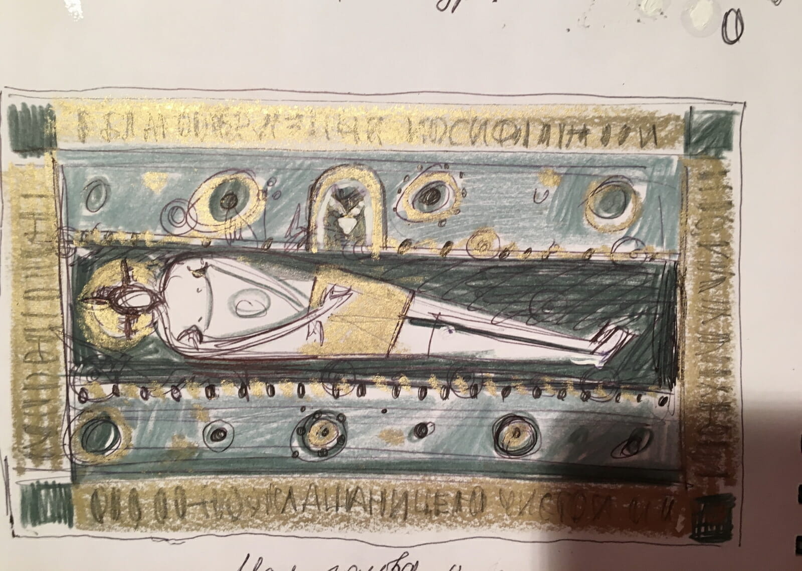
I started from making little sketches, lots of sketches, to understand the main differences between different kinds of Epitaphios.
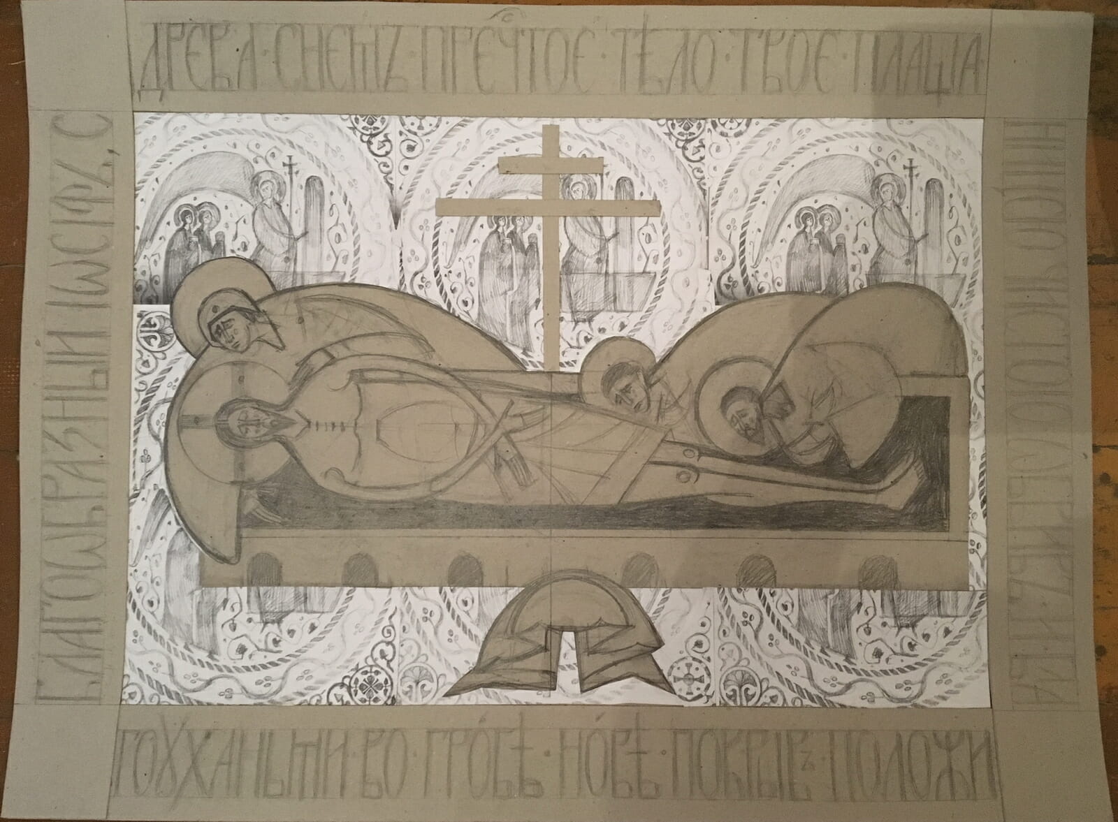
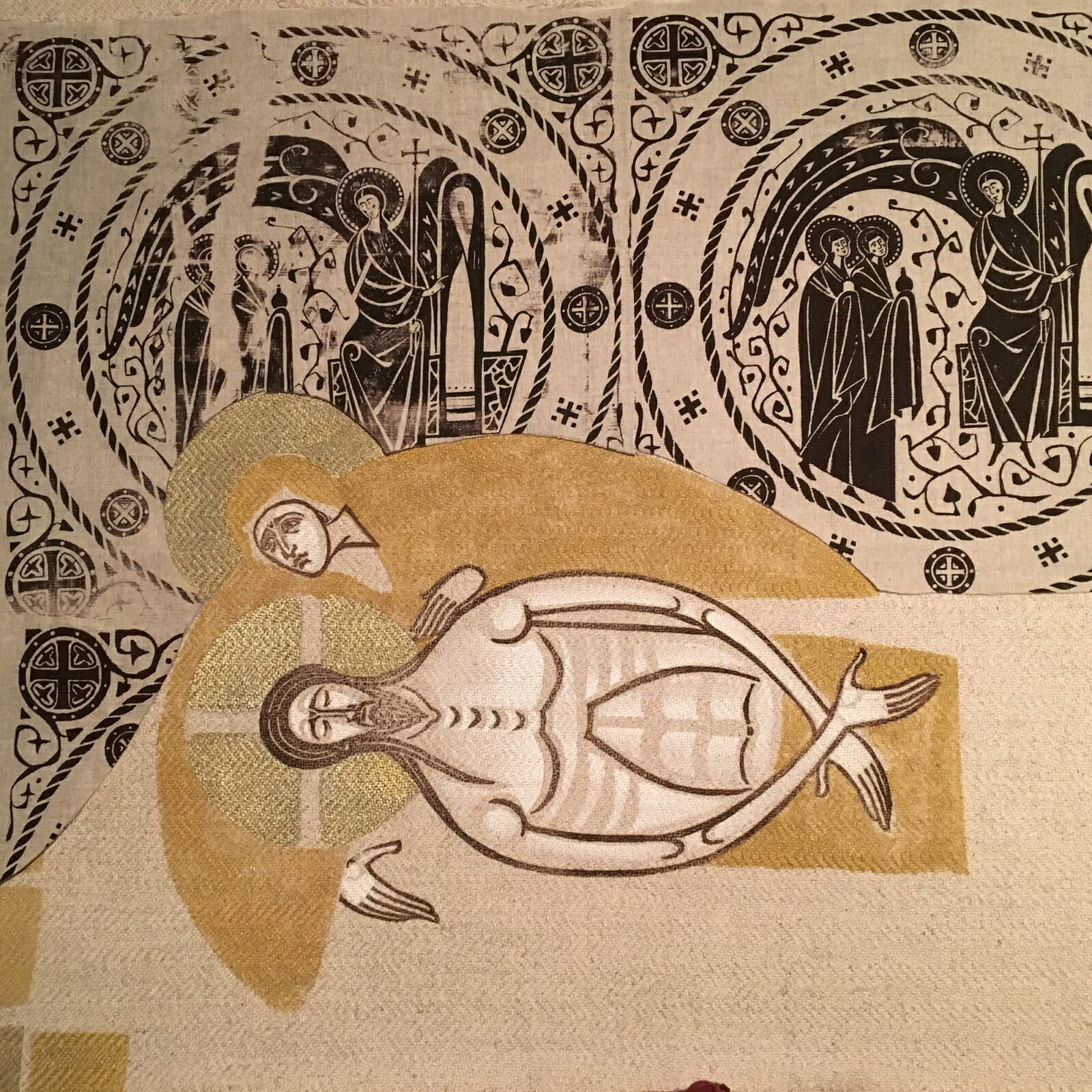
Little by little I understood what I wanted. I wanted the body of Christ to be incorporated into the fabric as much as possible. Practically, I saw that I did not want to turn the body of Christ three-quarters as it is often depicted in the Epitaphios; thus, I combined the frontal position of the face and body with the position of the arms in profile. For similar reasons, I wanted to keep the arms rounded, ready to embrace the viewer. Step by step I discovered and envisioned what I felt should be in this image. I wanted all the mourning figures to be over the coffin, bending over Christ, hanging over him, trying to look into the coffin to comprehend what had happened in the death of Christ. I think this portrayal is easily comprehensible today, as we also bow over the coffin when someone dear to us passes away.
A sketch
On the other hand, in the second part of my research, I was also thinking about this image as an artist . For me the ratio of shapes of figures to the background, and, accordingly, the interrelation of fabrics in the embroidery was important. From studying other embroidered objects, I knew this aspect of the art — how the fabrics relate to each other — has always left me with the most vivid impression of embroidered work. Very often the effect of this interrelation arose from a combination of seemingly incongruous pieces; sometimes it resulted from a dramatic shift of scales.
I believe that no other art gives such an opportunity to work with different scales as embroidery. The visual language of embroidery is quite different compared to portable icons, and of course I really wanted to take full advantage of its expressive features.
Therefore, the first thing I began to think of was the base fabric, the background fabric on which the embroiderers would work. I began researching, keeping in mind that I had no obligation to choose a fabric already made; I knew that I could make one the way I wanted.
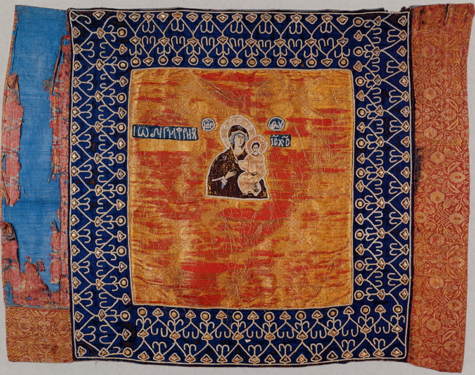
Visiting museums, I have often been fascinated by the Oriental fabrics, sometimes used for church vestments in the past. Most of them had patterns replicated at extremely large scales.
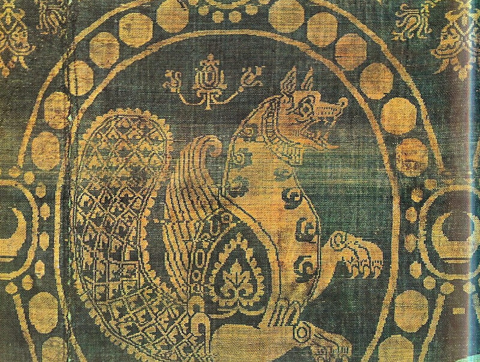
I also decided to use a large scale and chose a veil from the Historical Museum in Moscow as a starting point.
Then I remembered that for medieval artists it was common to use oriental fabrics with oriental plots, but should I copy a pattern if I were free to make my own? The answer was obvious: of course not. But what would the background be if I could choose it freely? Should it be an animal, a pattern, or a plot? I wondered what kind of plot would correlate with the composition of Lamentation.
I knew that in any case the plot had to be connected with Resurrection. Yet I didn’t want to make a repeating pattern with the figure of Christ, although there are many historical examples of fabrics where patterns were made with the figure of Christ or the Mother of God.
It became quite obvious that I should draw a plot with the Myrrhbearers at the tomb to represent the Resurrection.
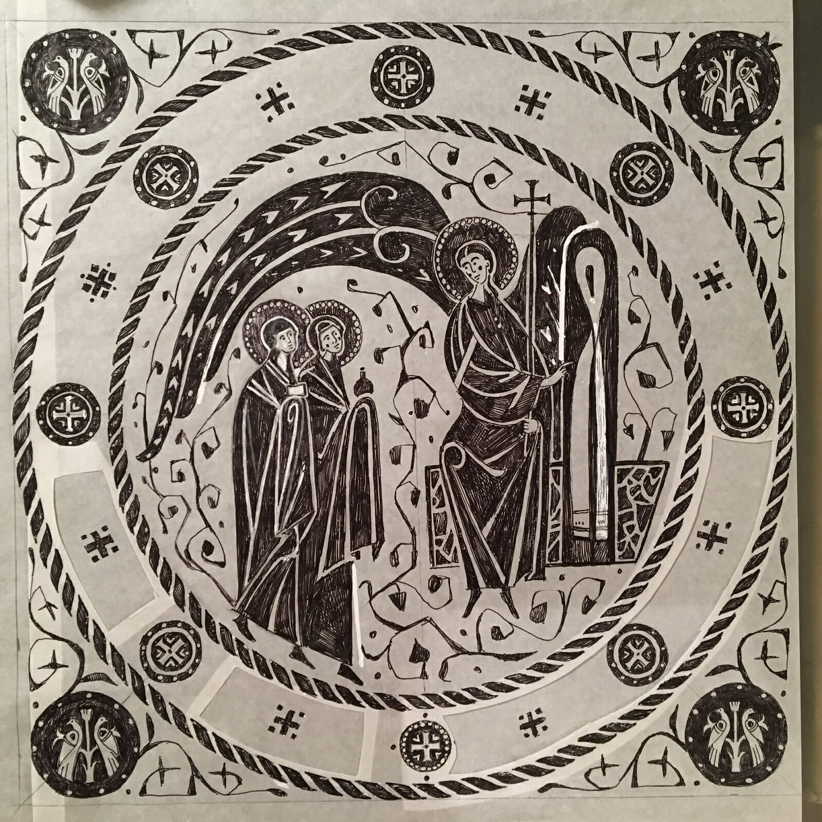
An Appearance of an Angel to the Holy Women. A sketch for a background.
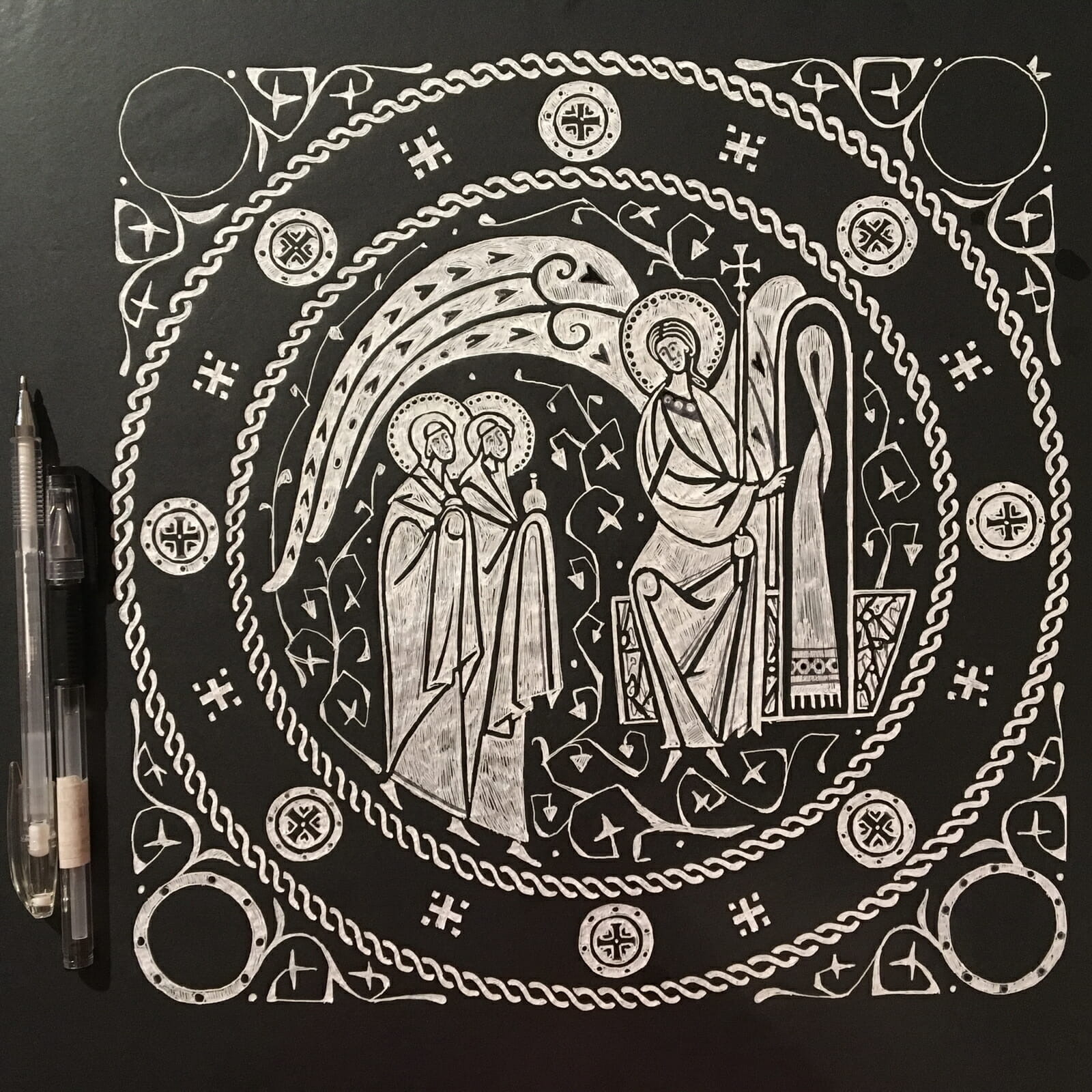
An Appearance of an Angel to the Holy Women. A sketch for a dark background. A Variation.
From this flowed the main idea behind the composition of the Epitaphios. In thinking about the background fabric, I figured out how to juxtapose the two subjects: figures mourning for Christ in the foreground (the most traditional subject for Epitaphios) and Appearing of Angel to the Myrrhbearers for the background. These two images are the best to reveal the events of Holy Week concluding with Easter. Christ is dying for us, and after death He resuscitates , descending into hell as life triumphant. Now, after His death each of us lives in the hope of Resurrection, and that appeared to be the main idea I wished to portray, while meditating on fabric design.
The main sketch for the Epitaphios.
Right after discovering this theme of the Myrrhbearers, I needed to face another straightforward question: how to separate the subjects on two fabrics. This separation involved two aspects. In terms of scale, the Appearing of Angel to the Myrrhbearers needed to be a smaller scale pattern while the Mourning needed to be large. In terms of color, I needed to juxtapose the subjects through their contrasts and in terms of tone, the background had to be dark to reveal the light silhouettes of the figures.
Proof printing on a dark background.
Proof printing on a light background.
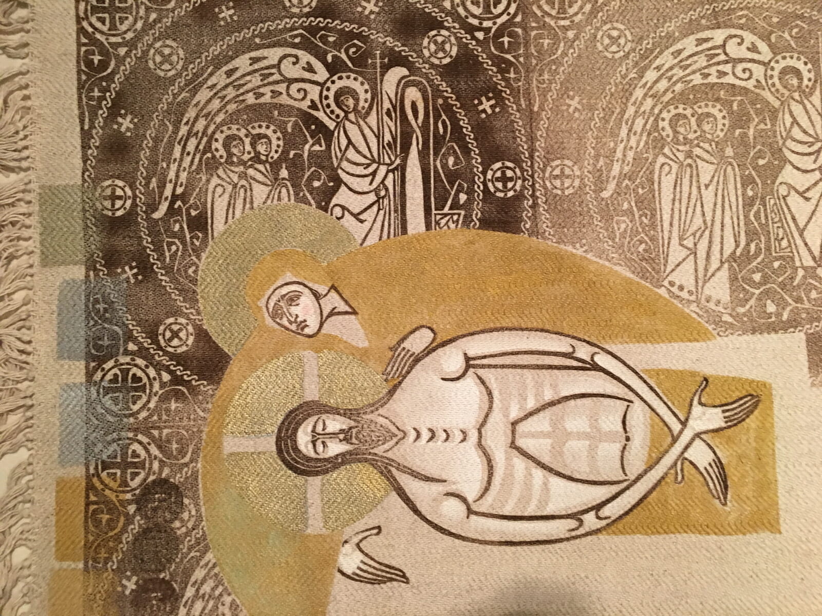
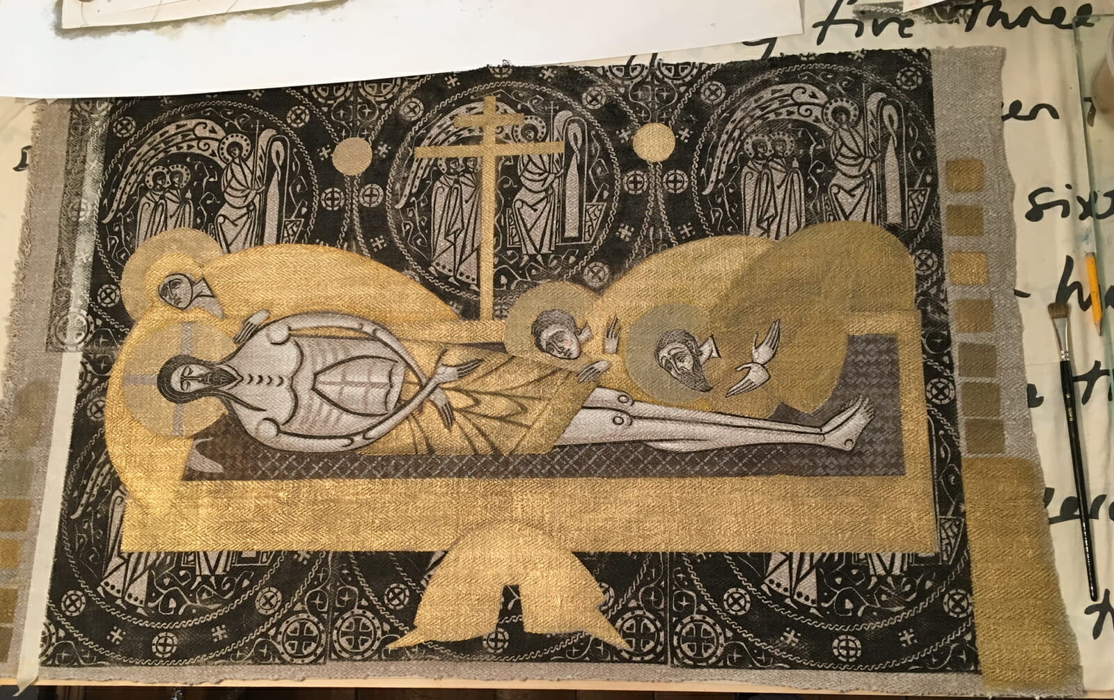
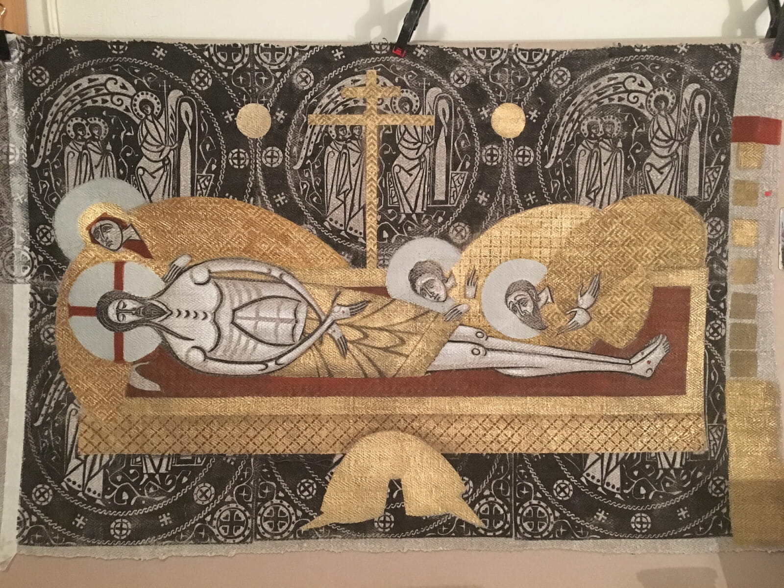
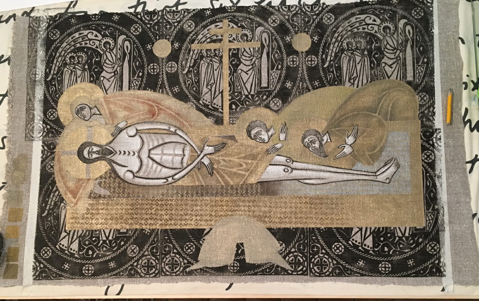
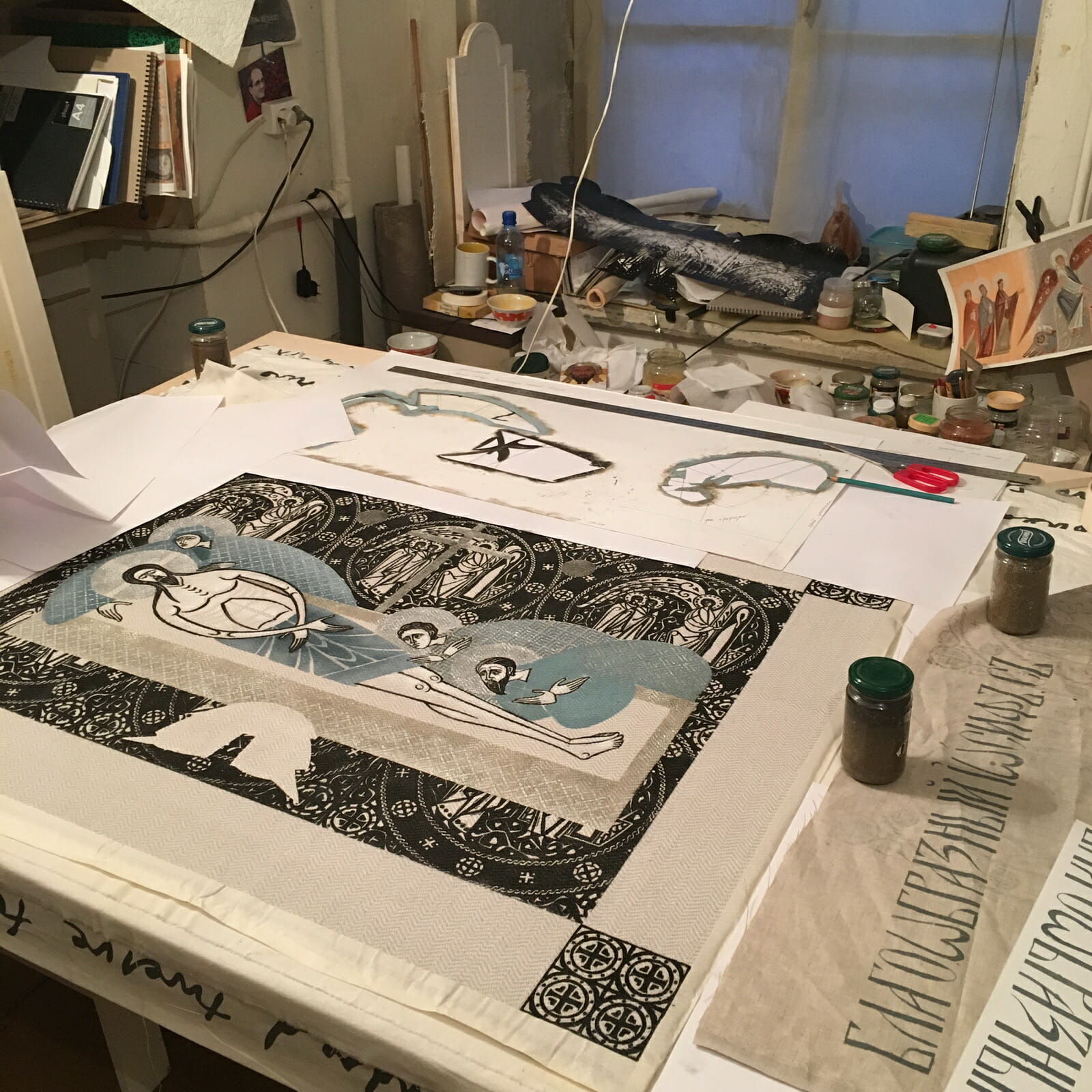
The Mother of God not only embraces Christ with her arms, She does it with the dynamics of Her whole body, and it is in this movement that her grief for Her son is expressed. If we consider the plasticity of the image, gestures and movements, the ornamental circles of the background helped me to converge everything in rounded shapes to highlight the figure of Christ.
Everything is ready for printing the background. The central part is covered with a stencil repeating the outline of the main composition.
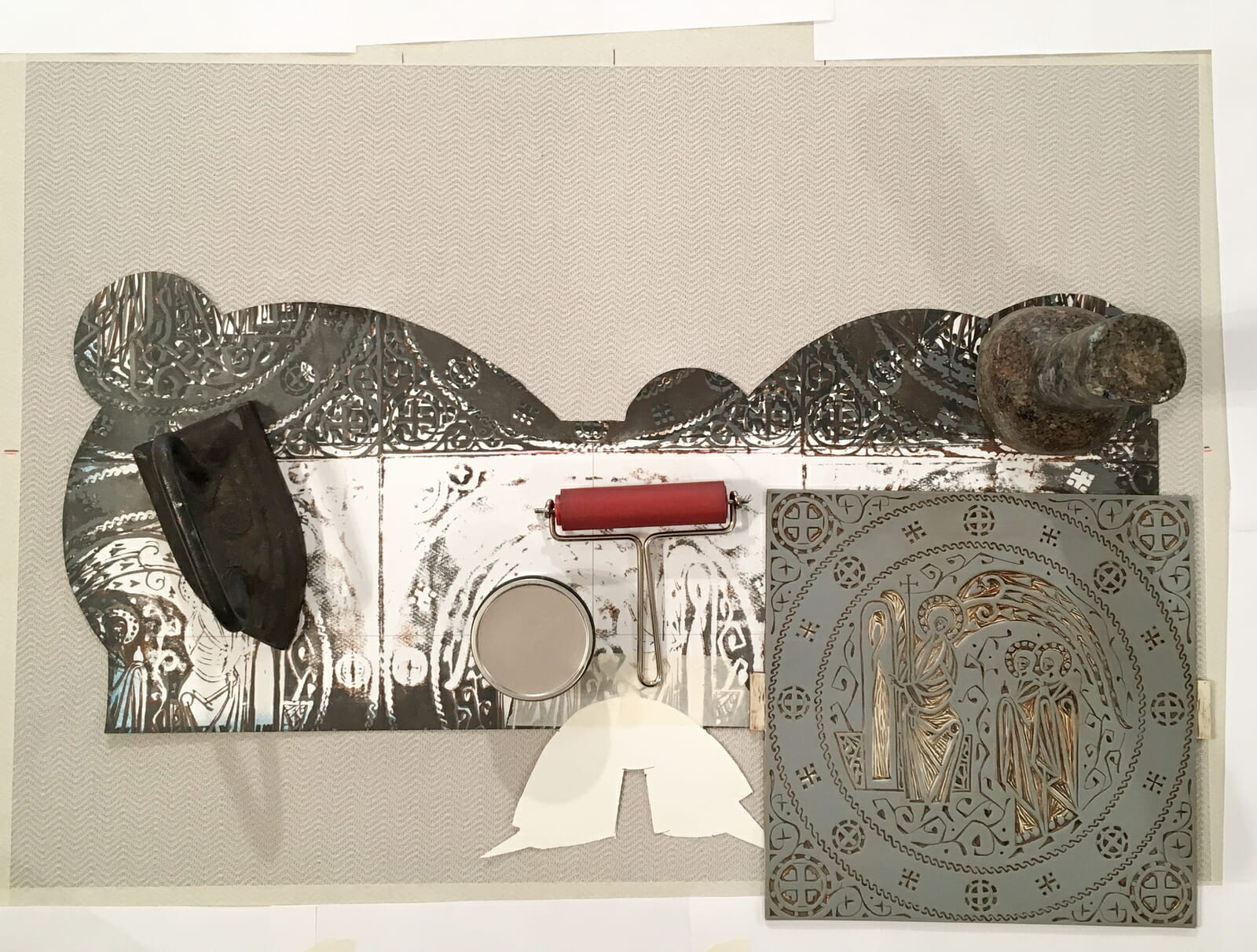
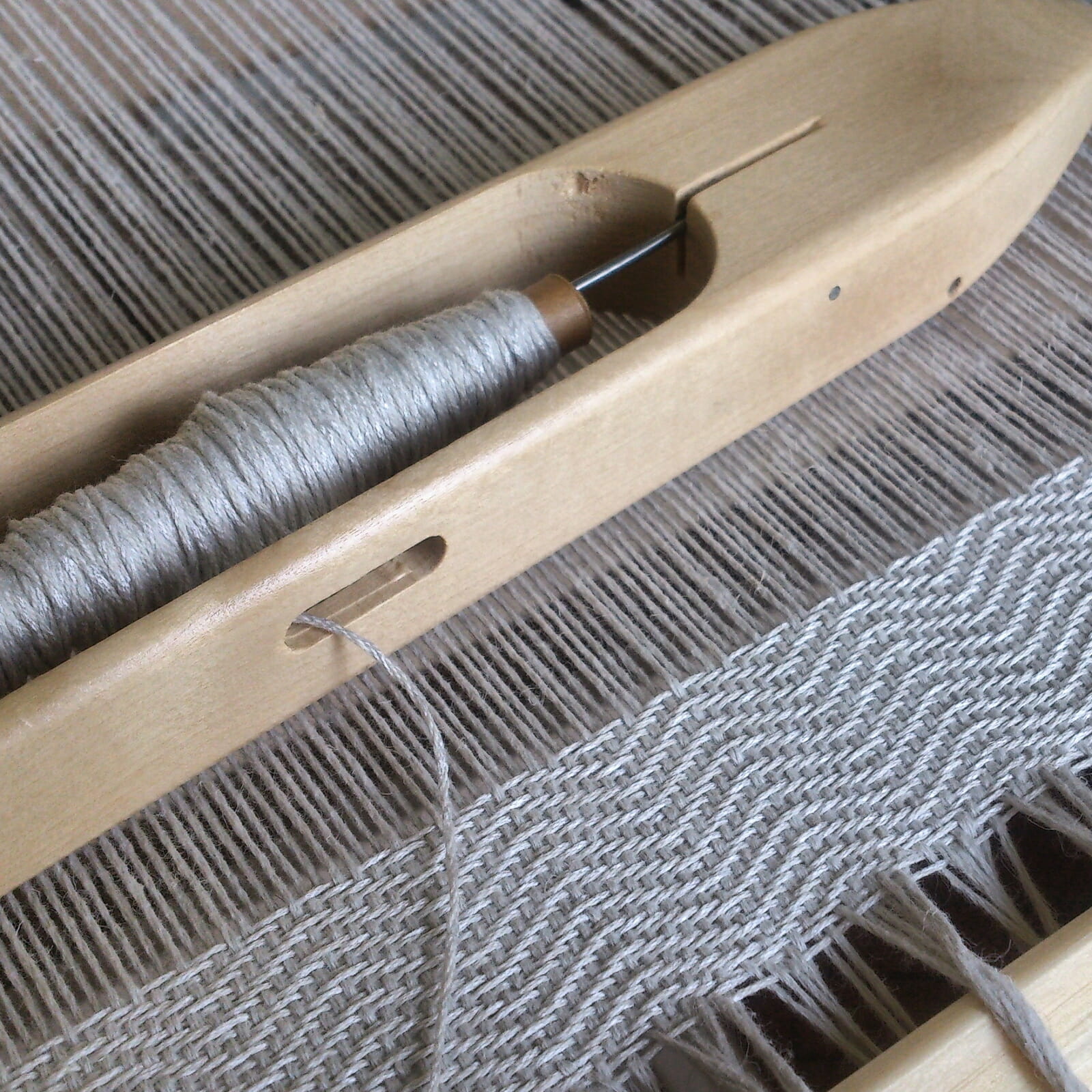
For printing the Epitaphios image I used a linocut matrix and paper stencils. I intentionally chose this modest technique for implementing my plan. It was crucial to show both that technique matters, and yet it is secondary. Technique cannot exist without an artist, while an artist can handle any technique.
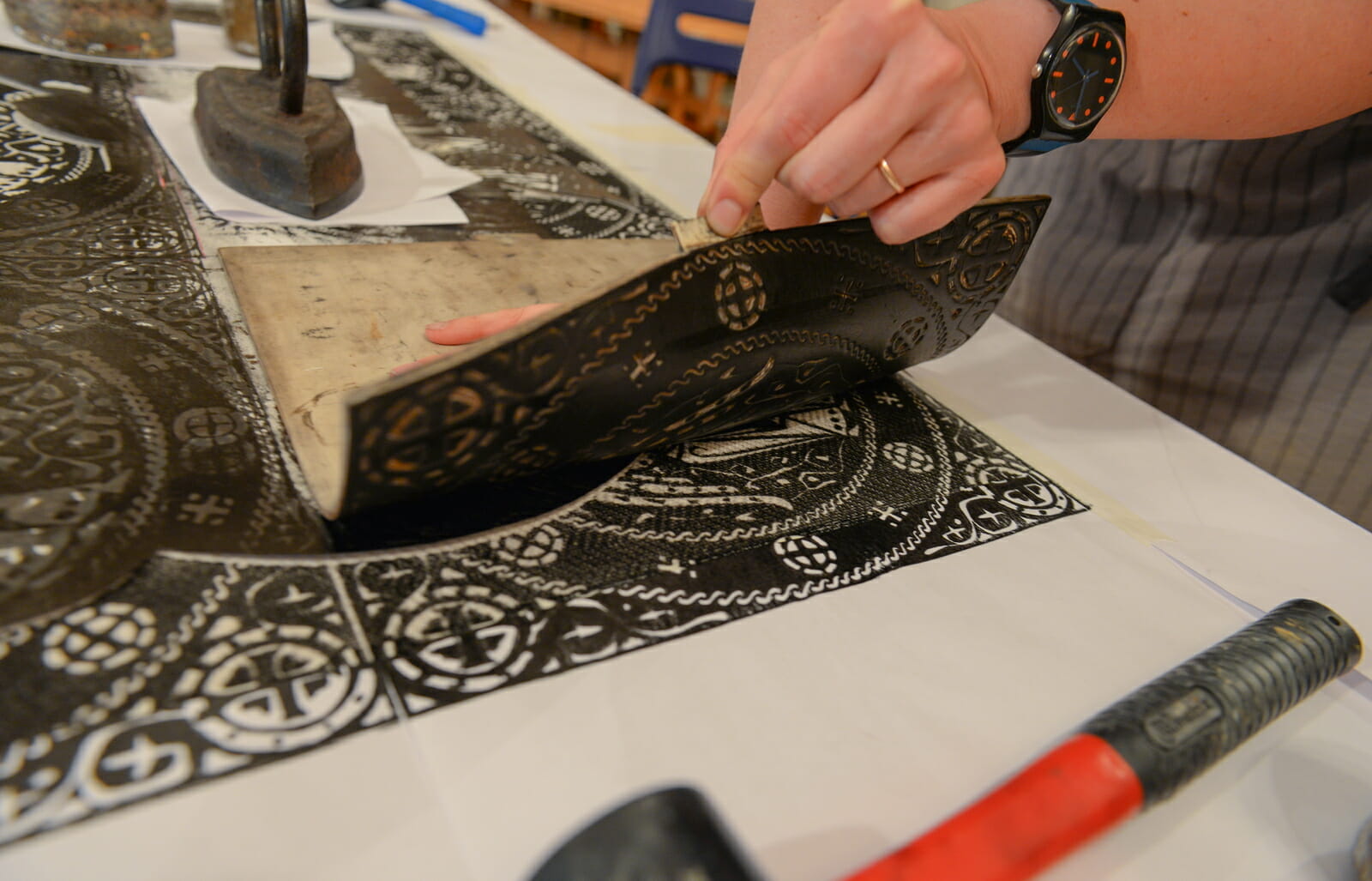
Printing background with linocut.
Today the only way church fabrics are decorated is with embroidery. It’s an extremely time-consuming process and a very expensive one. Most parishes receive their embroidered items as a donation because paying a fair price for this level of labor is impossible for many churches. I wanted to create the image with a simple medium, to make it precious without the need to use expensive materials . Before I began working on this Epitaphios I had accomplished several minor projects on fabric and had a clear idea of the process, even if I was not fluent in the technique of printing on fabric. But I already understood its capabilities and knew that I could make a pattern of any complexity and print any design on the main fabric.
A strong advantage of stencil printing versus embossing (when I print with a linoleum block) is that the stencil is fixed, but part of it can always be lifted up, and I can see if the color matches and change it if necessary during the printing process. I am thus not working blindly but have the ability to constantly correct the work in progress.
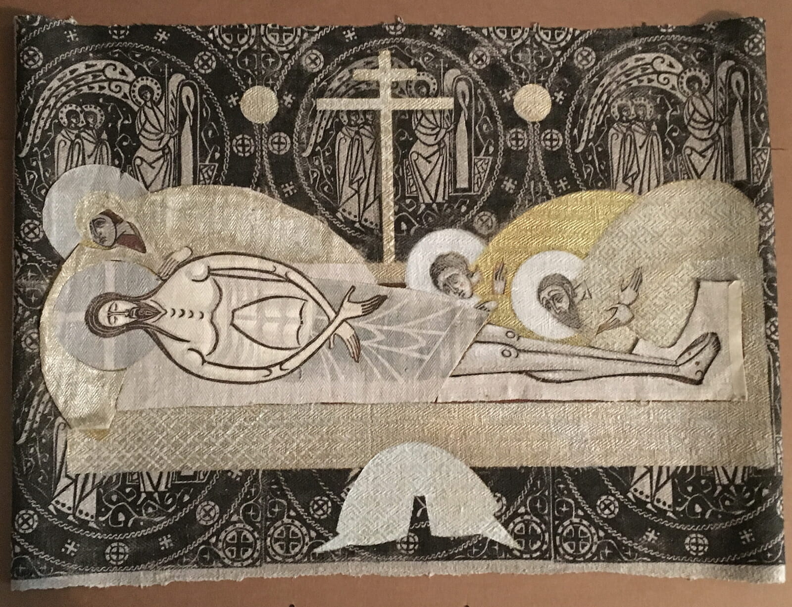
At the end, I used a linoleum block to print all the body parts (faces and hands) and made the garments, backgrounds and haloes with stencils.
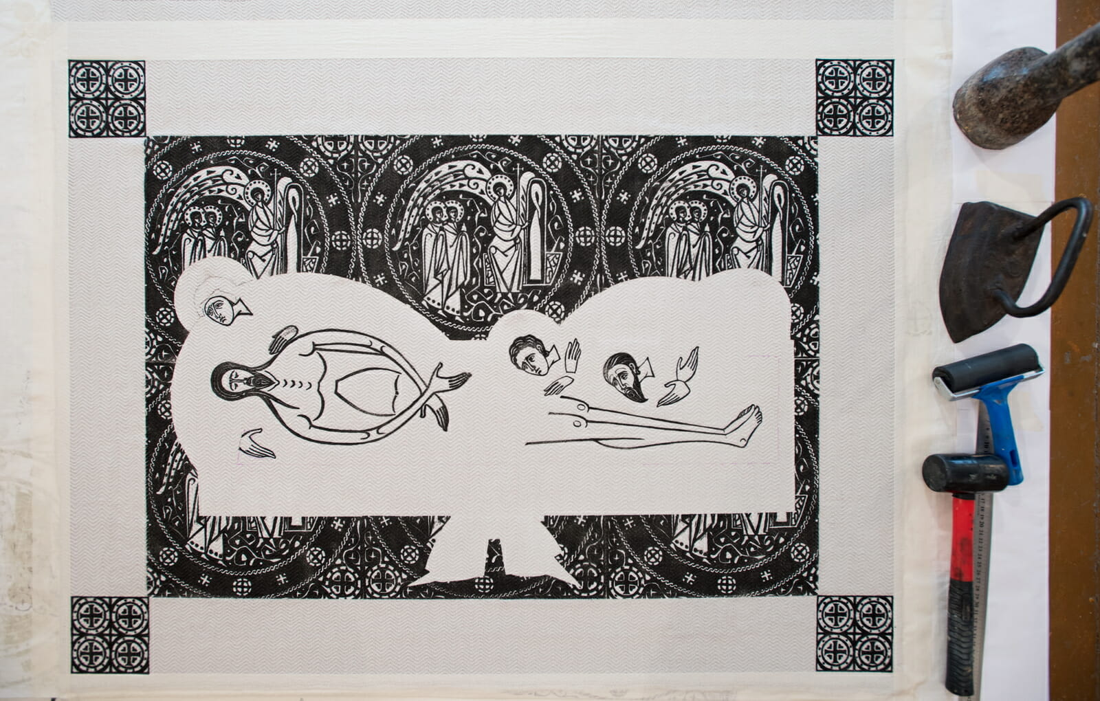
Linocut printing is done.
I understood how to combine these two techniques, and I like the freedom the two in combination give. The same image can be implemented with great variety differing in color, but also in characteristics of the patterns.
Today many contemporary church artists strive to approach church art through the use, as it seems to them, of some correct or “canonical” technologies, which they suppose guarantee authenticity and canonicity in themselves. For instance, they may use of natural pigments or gold in an icon or use medieval drawings and stitches and the right way of completing them in gold work. Few today care about the very essence of what is depicted, and as a corollary few apply to the icon the well-known artistic principles by which any work of art is made. Icon and goldwork, according to this view, are too sacred to be considered from the perspective of artistic expression.
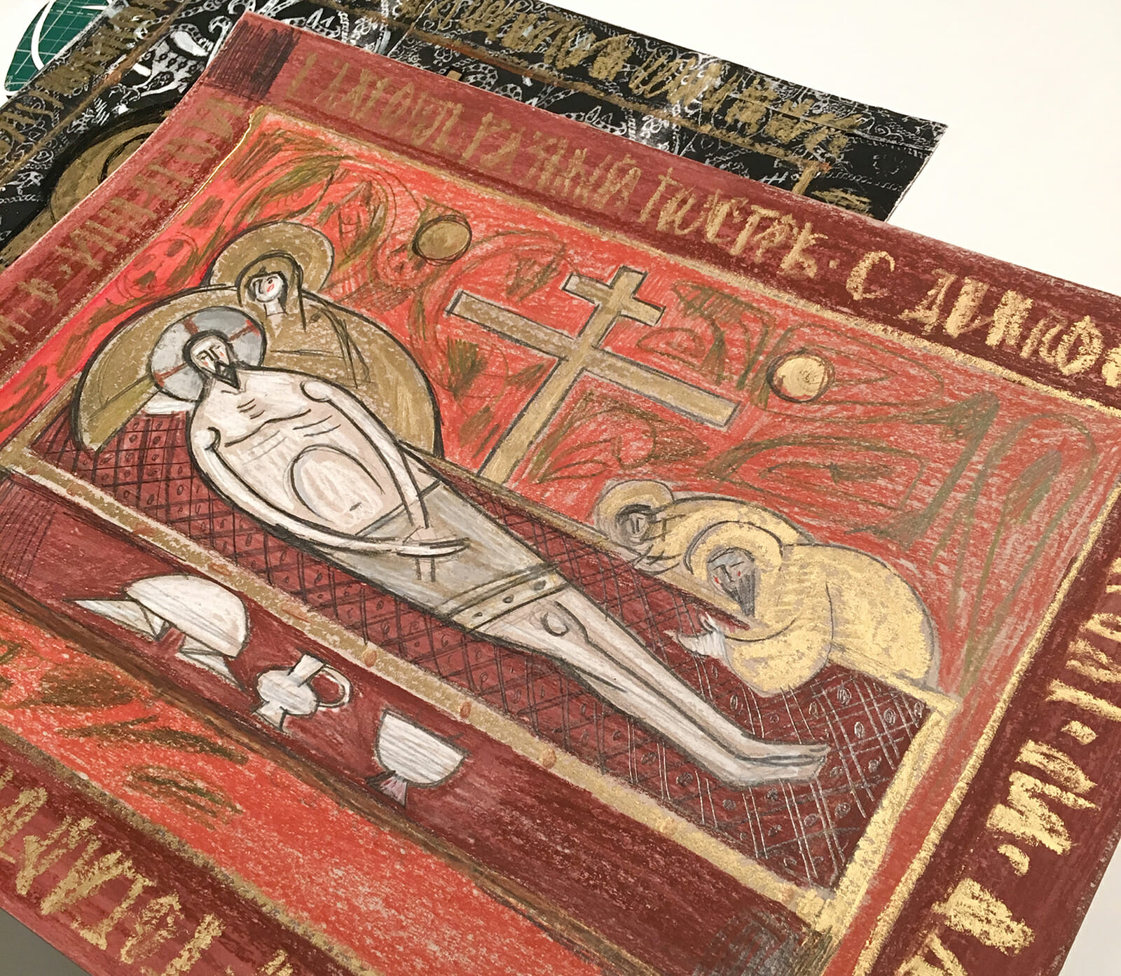
A colored sketch.
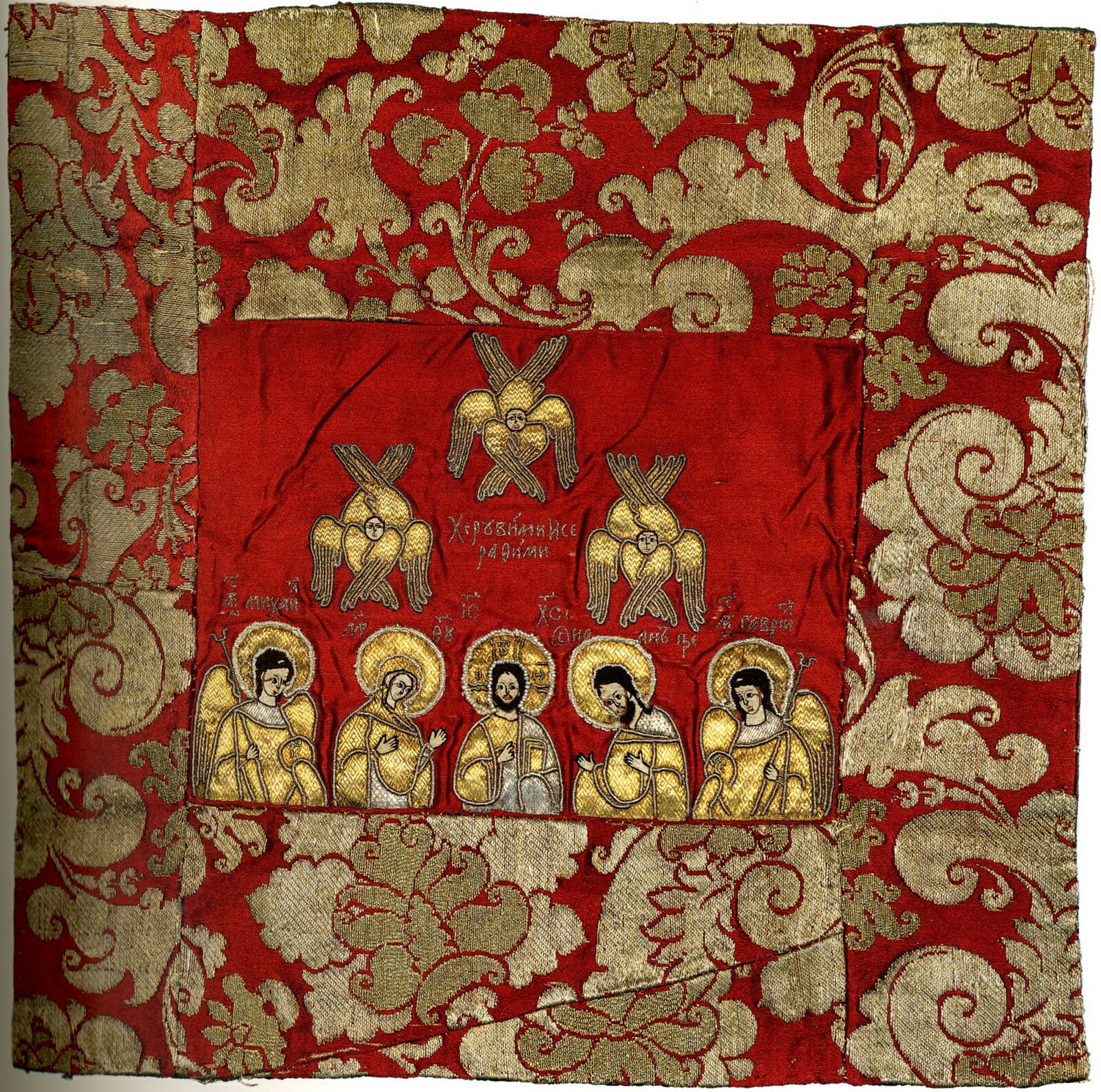
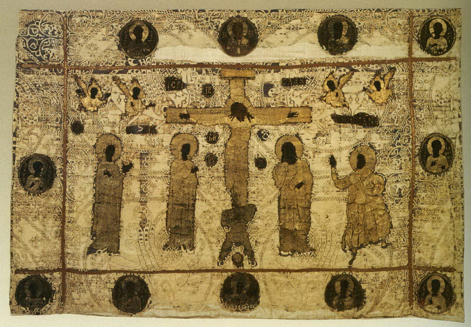
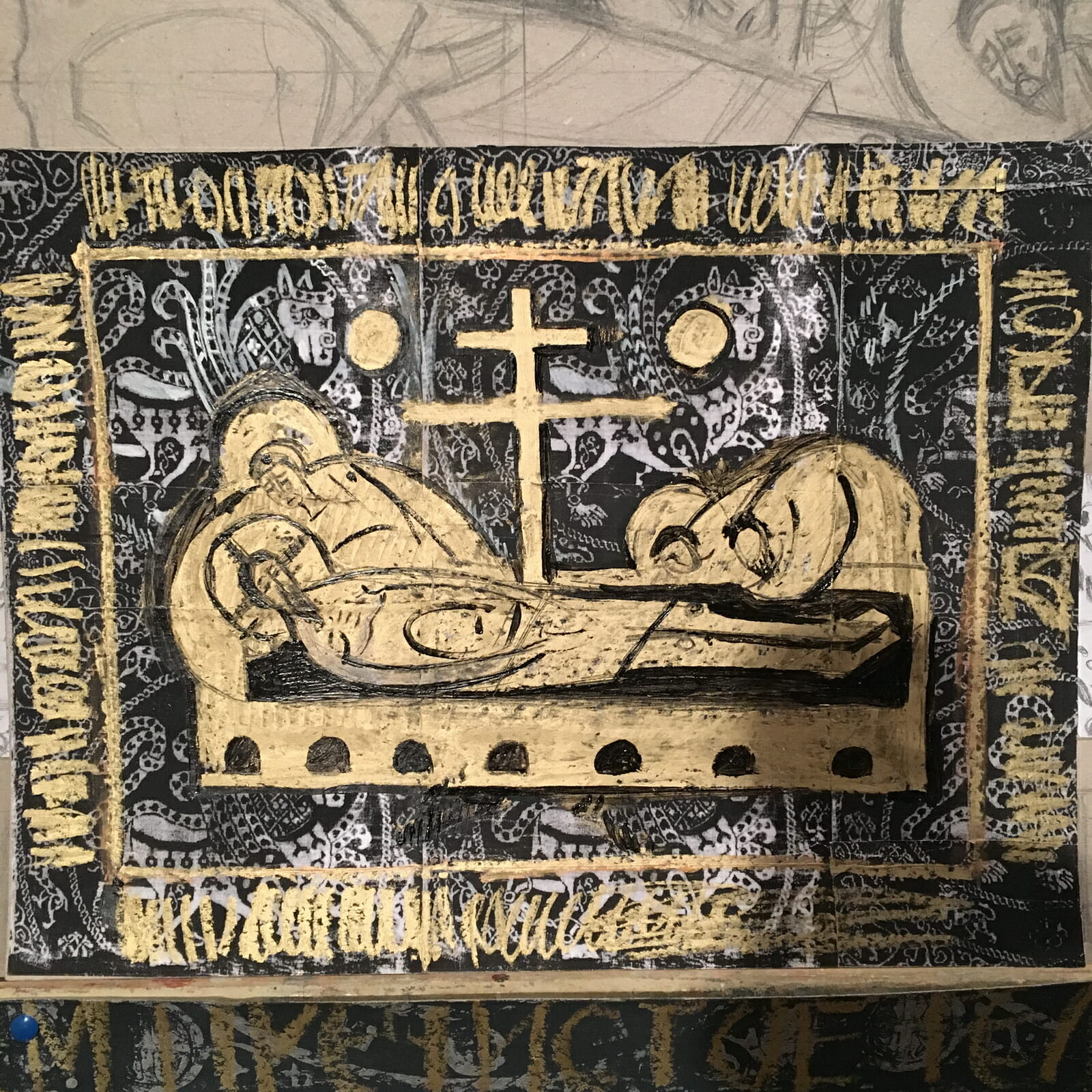
To begin a work, an artist needs a concept. My idea for this epitaphios was taken from a medieval epitaphios depicting the crucifixion of Christ, kept in the State Historical Museum (Moscow, Russia), with solid, monolithic figures against background patterns. This was my concept.
Searching for color options #1
Searching for color options #2
Yet developing the concept, an artist needs to be able not only to focus on patterns and make decisions, but also to abandon ideas.
Searching for color options #3
Searching for color options #4
Initially I planned to make a more discreet color combination. At the end I decided to print it with black, and not in dark blue, dark red or purple, since black gives the most piercing mournful mood. I did not succeed in making a version with golden figures, although initially I planned to make this Epitaphios in color and in its overall solution as close as possible to the model in the State Historical Museum – an idea I abandoned to focus instead on the Deposition .
In this Epitaphios everything is built on a comparison of two plots. I used a geometric motif from a real oriental fabric, but filled it with a different content: Resurrection awaits us after the grave. We will be resurrected to a new life, as Christ was resurrected. Christ gave us this hope, and I simply reflected this hope in the drawing of the shroud. I would never be able to play with surfaces like that in an icon, but in fabric it is possible and it is very interesting to use these possibilities. But how to separate these two plots? At this point, the work needs to be very subtle, so that both plots do not climb into your eyes at the same time, do not confuse, do not flicker, just as Good Friday is separate, yet connected to Resurrection.
Searching for color options #5
How to accomplish this and resolve the tension between the two plots? The Epitaphios uses a large image of Lamentation and a small Appearance of the Angel, colored fabric and black and white. Perhaps not everyone reads the background fabric in this way in viewing the Epitaphios, but that was the trick. A person may not immediately see this, and then, after a few years, suddenly, looking at a long-familiar shroud, read this content afresh. It seems to me that it is good if the understanding of the image is not revealed itself immediately but only over time. For my part, I would really like to be the person who understands all that the Gospel tells about the Lamentation, and who can suddenly see it all very clearly on the Epitaphios on Good Friday .
And I really like to think that each person will read this image differently. I knew that the decision to focus on the Myrrhbearing Women was a good decision, but when I started working on these compositions, I did not realize at that point how everything would begin to make sense. The fabric on which the Epitaphios is printed is the woven fabric in which the body of Christ was wrapped, and the same fabric is depicted once again in the foreground, in front of the tombstone on which the Savior lies. And in the plot with the appearance of the Angel to the Myrrhbearing Women, in the open grave we can see the same Epitaphios abandoned.
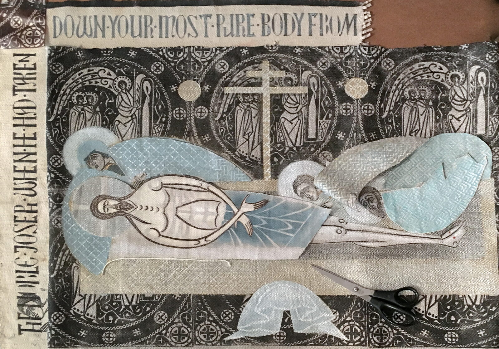
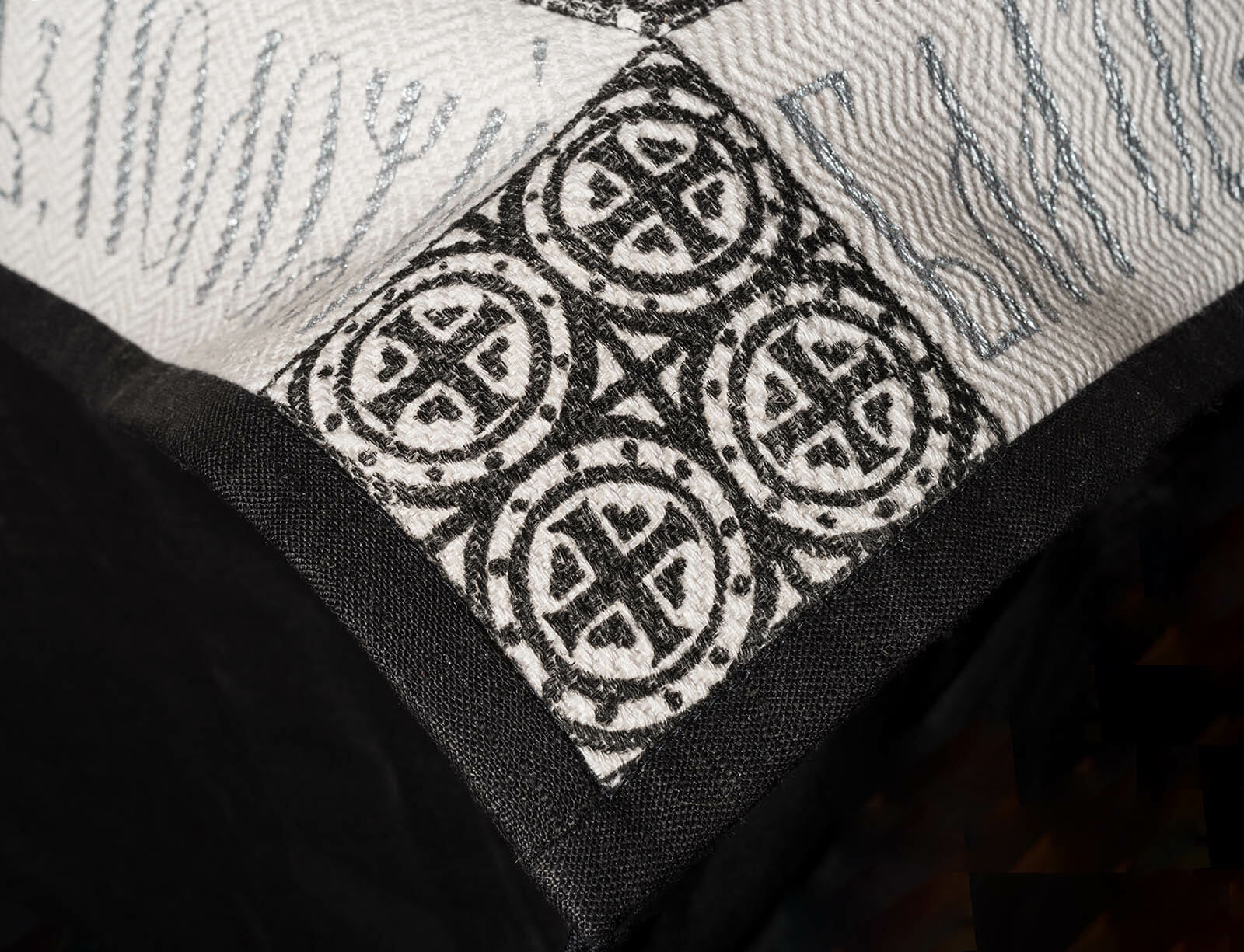
Trying a border with text.
At the same time, I needed to visually detach the centerpiece of the image from the border with the text, and therefore I decided to leave the border light as it did not interfere with the mournful impression of the section which is bent. Traditionally text is framed by an ornamental stripe. But I quite consciously refused any ornaments, which are now embroidered in such abundance on church objects. I don’t do anything I don’t understand. I do not understand why an ornamental band is needed, what purpose it is supposed to serve. Why further decorate all this already decorated precious embroidery, which was done stitch by stitch with such love and care? Instead, the whole jewel is in the center, and nothing should distract us from it.
The very task of fitting the text pattern into the designated space is problematic; one cannot simply make an enlarged photocopy from a book and trace it. This task is even more difficult than making the middle part and requires an artistic vision as well. It too often happens that iconographers repeat certain approaches, considering them traditional. Here, it is common to think that text and pattern can’t be used without one another, but they can. It’s fully acceptable to put only text without a pattern. It is also acceptable to leave empty space and to find a proportional area for text within that space — and very often this will be more than enough.
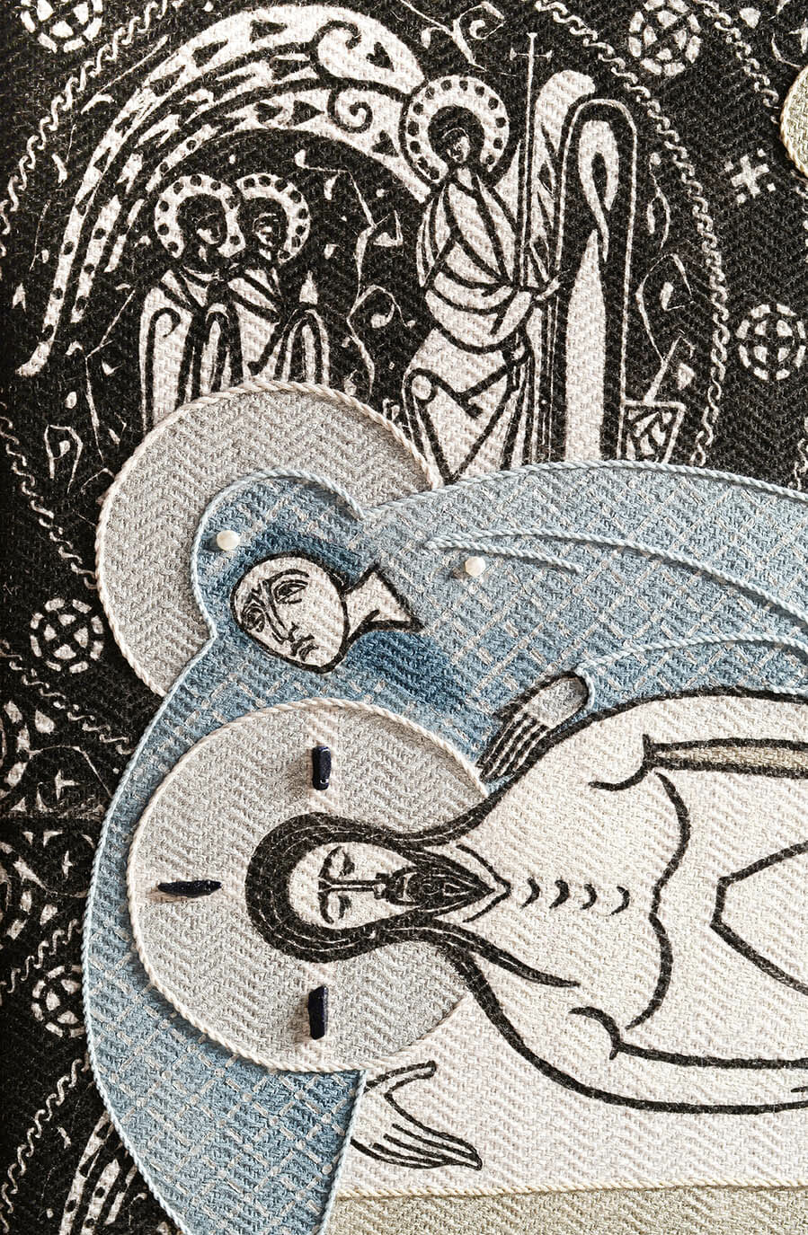
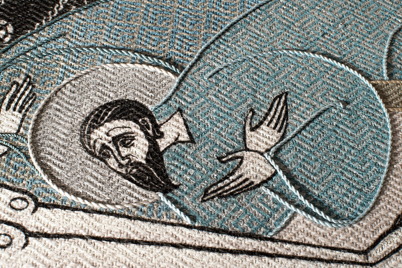
A fragment with the Mother of God.
Conclusion
Is it possible to use this research and work experience as a ready recipe for all iconographers? Definitely not. The creation of any object results from a series of thoughtful decisions, in which the earlier decisions determine the subsequent ones and everything is tightly interconnected. In short, the path to the final image is a path, on which the artist asks questions and seeks answers for these questions. Only if the artist proceeds in this way will the image have at least some power of artistic statement.
An image that an artist has thought through on different levels can be perceived and understood. In contrast, if a work is simply copied, whether we like it or not, will still show a gleam of the message intended by the author who conceived the model, but it will never be as bright as the original. An artistic work must have an inner core, and providing this is a professional duty of an artist.
Is it important to name the style and technique of this Epitaphios? It seems to me it is not. It is much more important how artistic techniques arrange accents, giving this piece multi-level perception, so that it will reveal itself differently to every person. As with any work of art, this Epitaphios has greater parts and less advantageous ones. In making this Epitaphios, I wanted to show that it is not enough for an artist to have skills and techniques for copying models but that every work of art, to be art, must embody an idea, a thought. A church artist is not simply a machine for reproduction of old models; in fact, a church artist must think even more deeply than any other artist about the most effective ways of interacting with people entering a church. Otherwise, if there is no such dialogue, all the splendor and magnificence are no more than a plug in the iconostasis wall.
A handwoven fabric for the Epitaphios.
Work in progress.
Work in progress.
Sewing on cords.
An image of the Epitaphios.
A side view.
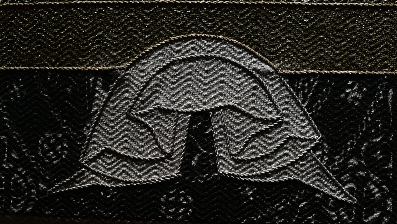
Joseph of Arimathea
A fragment.
Epitaphios. Lamentation. 2019. Linen, hand woven fabric, 102 x 76 cm (40 x 30 in). Oil and textile paints, pearls and decorative stones, cords. Lino and stencil prints, embroidery
This article was revised and proofread by John Gardner. See other work by Olga Shalamova at her website: Sacred Murals Studio: Iconography by Davydov and Shalamova
If you enjoyed this article, please use the donate button at the bottom of the page to support the work of the Orthodox Arts Journal. The costs to maintain the website are considerable.
Thank you, Olga, for this detailed explanation of your thoughtful process. I would direct anyone to read this in order to really understand what an artist goes through to create an original work. Your epitaphios is a touching expression of thoughtful, intelligent love.
I’ve always loved those old oriental fabrics with huge graphical patterns. The combination of this ancient motif with your very modern iconographic draftsmanship is like nothing I’ve ever seen.
My thanks also for this fascinating story of the development of this piece. I also love those huge repeats in old fabrics.
A moving documentation of both outer and inner processes of the creation of an artwork, which, in its completion gives glory to God. Thank you for sharing this, and for giving me, the reader, the opportunity to partake in this process.
Dear Deborah,
Thank you for your kind words. It was an interesting process, full of all kinds of discoveries for myself as well, and I decided to share them so others could see the road I walked. I am most certain, that if Christian artists make their images in a research process, they will gain a lot for themselves personally and creatively.
Thank you Olga, for sharing your process as well as your thoughts about the importance of meaning for the iconographer in the creation of an icon or sacred work and the de-emphasis on technique in favor of that meaning.
Kind regards,
Christine Simoneau Hales
Dear Christine,
Thank you. I guess it’s just time to say it. Time to shift the focus from the technique towards the meaning, the content.
One chooses tachnique to fit the content, not vice-versa
The Epitaphios is beautifully conceived and masterfully executed, Deborah. A lot of thought and experimentation went into your process.
Some elements stand out to me and are helpful in my analysis of the creativity question.
How much should an image be abstracted? I am interested specifically in the image of the Mother of God. Her head and the wrapping of her arm are touching. Though Her enclosing of the chest area of Christ points to Him- She seems to fall outside of the patterning and become a contemporary design element, and some impact is lost. I wonder how far the iconographer can push an image toward the modern and still have the viewer connect on a deep level.
The imagery of the Holy Myrrhbearers makes a strong background patterning, suggesting Divine Order. (I ask myself, why am I attracted to patterning? The ordering of the camp of the Israelites in Numbers comes to mind-Fractals-Divine Order.)
Color carries an emotional impact. I felt that the symbol involved in color use should be more active as a what-if. Red feels viscerally powerful -the blood of Christ- shown in the trial you presented on the ‘bed’ and the cross within His halo. I felt heartbreak in the red of the Mother of God’s garments. Pathos! The use of gold on Christ’s wrap bespeaks His Kingliness, though gold on the other figures weakens the statement.
Perhaps Traditional elements carry a core strength and are not to be sacrificed. It would be a good exercise for me to list those things. Where does artistic license have freedom; where does it hold to tradition? We feel the visual, some people more than others. Some are almost blind. Our job as visual interpreters is to wake up the blind. What can they take in, and how do they take it in? Recognition of shape? How far can the form be pushed and still be taken in as the thing? Color adds emotion. Order- there is comfort in an ordered pattern. (And circulating motion keeps the eyes involved).
Thank you for sharing your material and the photos of your process. They have helped me think more deeply about this question.
I am an artist and sometimes iconographer. The process of iconography seems to me limiting as to my ability to communicate what I feel. Imagery is a language, as is iconography. I feel stifled by recipes, though there is a hunger for portrayal.
Is an icon best left to Christ to fill after the fact, or can the iconographer move in freedom within the beauty of Christ and His Saints? Perhaps the Rublevs or Theophanes’ felt that motion as being One with the One, which was as a type, the conversation with Christ in the cave on Patmos.
Is the goal of Iconography to become One with Christ -rather than a maker of images?
Forgive me- in no way is this meant to offend.
Dear Claire,
Thank you for sharing your thoughts! I also love the questions you raise, – they need serious answers. It would be intriguing to be able to say, how overall abstracted should an image be, but there are several levels and aspects of this problem. First: it depends very much on the suggested function of the image, the role of the image in the environment, coordination with other elements of the same ensemble and it’s rank in subordination. Besides, it’s not one choice, the choices are made constantly during the whole working process in accordance with the materials and mediums used for the piece, – some suggest more abstracted approach whilst other invite us to lean towards more realistic interpretation, – it’s individual in every unique case and in every minute of drawing/painting process.
You also pose a dilemma about the acceptable level of contemporaneity of an art piece, and here I suggest taking into consideration all the criteria listed above and in addition to them to evaluate the very context of actual church or other kind of liturgical space. I’ve been to extremely contemporary places of worship, which being contemporary, yet provided me with a full sense of a prayerful and spiritually charged context.
These are actually the very elements you are asking about, – they are the points, where the artistic freedom is used: merging and melting the artistic solutions used in original sources (models) into a new piece of liturgical art, which combines the authorship of old masters with new ideas, letting the piece talk to us, instead of being a replica.
That’s the how you get released from limits in communication abilities, which iconography seems to be imposing on you. Our role is to learn how to be moved by the same intentions and goals as our predecessors, then we can choose means freely. It’s the goal which makes us choose the specific means, and it’s the functionality of the genre we should be guided by, not recipes for replication of old artefacts, which you mentioned.
Thank you again for saying your words. May God bless you in all your ministries!
With warmest greetings,
Olga
Thank you, Olga, for your thoughts, voicing the considerations and goals of an iconographer, and your experience.
I realize some of my reaction is from the point of view of a convert to Orthodoxy.
In the late ’70, I saw the beginning of a movement away from Tradition in the Episcopal Church.
An Altar covering made of fabric used in the Coronation of Queen Elizabeth was requested with eager expectation by the priest and the congregation. It was couched and embroidered with beige and gold bands and the pride of that congregation.
One day it was replaced by a beige, raw silk covering loosely embroidered with a small sheaf of wheat in beige, orange, and green. The loss of roots typified by these fabrics hit me at gut level.
It was just the tiniest tip of the iceberg that later emerged in the loss of that church’s Tradition. One could no longer feel Orthodox England’s foothold, though, at the time, I was at a loss to describe that. But it was felt. I think of the hymn, St Patrick’s Breastplate, being whisked into a dark hole.
I understand that iconography is a part of the Church where it occurs, and its goal is to enhance further its wholeness- a wholeness that magnifies the structure and becomes the Church’s statement of Presence, and yes, truly Orthodox Churches differ.
As an artist, I watch people detach when they come in contact with an image that is not within the scope of their reality. Usually, those are simple uneducated viewpoints that are based on what their eyes take in. Abstraction beyond a certain point, in shape or form, is an untruth in their eyes, and they run from it.
Again, thank you for your words and thoughts. They are appreciated!
Claire
Dear Claire,
I love reading your comments! And I also find it common, when people consider abstracted images as “decorative” or anyway, less “relevant”, than realistic ones. I guess it’s part our visual culture, inherited from Classicistic period, – people love recognizing what they used to recognize, and only very few of our contemporaries were educated to actually see colors and shapes, to evaluate composition and textures.
That’s our reality, but it should not stop us from doing what we are doing and using our visual instruments as they were used by our predecessors.
Thank you for your time and words!
With warmest greetings,
Olga