
Similar Posts
Editor’s note: This article is offered to us by Hierodeacon Herman regarding his design for a new liturgical book. This book represents one of the first significant applications of the Orthodox Illustration Project, sponsored by this journal. All the graphic ornaments used in the Hieratikon come from the Illustration Project, being drawn or edited by Scott Patrick O’Rourke, Andrew Gould, and others.
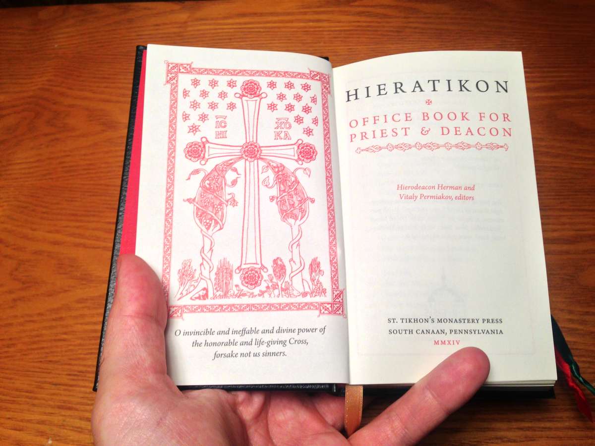
This month saw the release of a new liturgical book from St. Tikhon’s Monastery Press: The Hieratikon: Office Book for Priest and Deacon is a book containing the clergy’s parts at the daily round of divine services. There are other English-language hieratika that, like the present book, follow the Russian tradition. This new offering seeks to augment the varying strengths of those earlier publications.
The volume’s two co-editors, Dr. Vitaly Permiakov and myself, were faced with hundreds of questions regarding translations (with the triple concerns of accuracy, style, and familiarity), how to express ceremonial instructions in a manner at once succinct and sufficiently detailed, which saints’ memorials to include in the monthly calendar, which practice to describe when, even given the broad perimeters of the Russian tradition, several variant uses exist, and more besides.
Whereas Dr. Permiakov’s specific editorial role involved painstaking research of dozens of Greek, Slavonic, and Russian liturgical books and secondary sources, my task as co-editor included all aspects of the book’s design. In part this meant choosing the physical materials for the cover, paper, ribbons, and gilding. But there was also a host of decisions about dimensions, typeface, text size and weight, ink color, margins, illustrations, headers and footers, leading, kerning, justification… in short, everything encompassed by the art of typography.
Now typography is not a well-known word. For comparison, many people know something about calligraphy, and yet the vast majority of books we read are not written by hand, they are typeset. The printing press and moveable type ushered in a new mode of arranging text and white space on the page, one which inherited much from the canons of medieval calligraphers, but which came to develop its own methods of attaining beauty and harmony.
“In a world rife with unsolicited messages, typography must often draw attention to itself before it will be read. Yet in order to be read, it must relinquish the attention it has drawn. Typography with anything to say therefore aspires to a kind of statuesque transparency.”
Thus Robert Bringhurst opens his magisterial Elements of Typographic Style (p. 17), recognized by many as the subject’s best modern guide. His approach helps explain why so few people, even avid readers, are much aware of the typographer’s art: once well-set type has drawn the reader into the text, it must become invisible. If a reader is thinking about type, he is likely not actually reading. In much the same way, if someone is standing before an icon and analyzing brush strokes and pigments, or listening to chant and critiquing tuning and vowel shape, he is probably not praying.
Yet pigments, diction, and so much else are indispensable tools for the liturgical artist: with them he creates something whose beauty can draw the attention of the soul away from the unending churning of thoughts and into the realm of communion and silence in the presence of God. In the art of liturgical typography, the careful selection and judicious placement of letterforms on the page’s blank canvas serve not only as an external adornment of the sacred text but as the text’s mode very mode of self-expression, so that the words settle on the mind’s eye with grace and poise. Typography, in Broadhurst’s words (p. 24), must “induce a state of energetic repose, which is the ideal condition for reading.” This correlates well to the ideal state of prayer, bringing together attentiveness and stillness.
The project I began just over a year ago was a designer’s challenge borne of several demands in tension with one another:
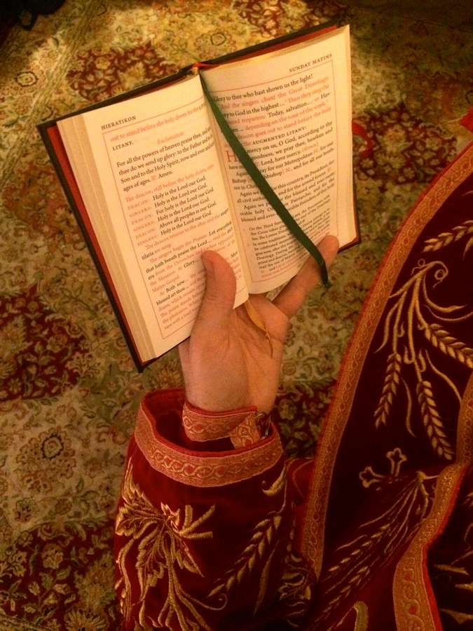
- The service book must be small enough to slip in and out of a priest’s or deacon’s cassock pocket. In the Russian tradition, no book other than the Holy Gospel itself may rest upon the holy table. Many priests use a lectern to the left of the holy table for their books, but a deacon, so often on the ceremonial move, has no such luxury: when his sluzhebnik is not in use it must go in his pocket.
- The type must be big enough to be clear and legible in dimly lit churches. And closely related to legibility is navigability: the reader must be able to find his way through this complex and multi-layered text, aided by subtle typographical cues such as small caps, drop caps, and inset paragraphs, all of which take up space, which is at quite a premium.
- While the overall aesthetic can be cozy and even dense, it must not be cramped or confined: the typography must be clean, elegant, and graceful, and this requires, among other things, white space.
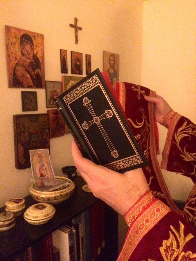
- In keeping with a long Orthodox tradition, the pages of a liturgical book, no matter how small, play host not only to text but to visual adornments as well: borders, decorations, icons, and crosses. Thus there is even more to fit in an already full book!
Let’s take each of these in order.
The book’s dimensions
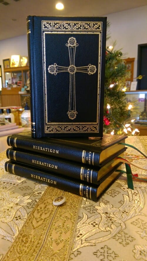
Given a set length of text, the smaller the pages, the more pages will be needed, and thus the thicker the book will get – and that is a problem for pocket-sized volumes. One can adjust for this by making the typeface smaller along with the pages, but only to a certain extent before compromising legibility. The Hieratikon is 6″ tall by 3.75″ wide, and this small frame for a very lengthy text pushes the page count up to 336. Other service books of comparable dimensions and length are thick and unwieldy, but the Hieratikon is printed on thin, 40# paper of high quality and durability, which keeps the volume quite trim. A near identical paper stock was used in the third edition of the Antiochian Liturgikon, which was printed by the same company, Dickinson Press, in Grand Rapids, Michigan, one of whose specialties is high quality bibles and prayer books.
Legibility and navigability
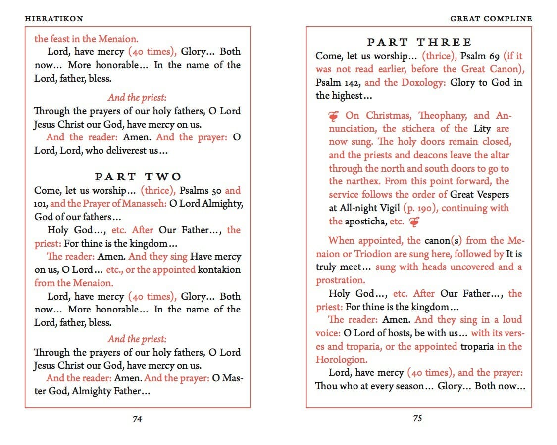
The Hieratikon is set in Arno Pro at 10.7 points. This is somewhat small for a book likely to be used in dim settings, but on the large side when compared to other pocket-sized books. This compromise seamed workable, since most of the texts read aloud from the Hieratikon are quite familiar, being repeated at almost every service. A book like the Triodion or Menaion, most of whose texts are read only once a year, would require a larger font. But those books don’t need to be pocket-sized. To help with legibility, the text is set in a slightly heavier, bolder, weight of the font called “small text” because originally intended for footnotes and captions.
Some pocket-sized service books make the text of prayers bigger but conserve space by making the text of rubrics smaller. This approach is problematic, though, because rubrics printed in red are already somewhat fainter than black, and because their content is less familiar than the liturgical texts themselves. For the ease in reading, the Hieratikon keeps prayers and rubrics at the same size. This is also better for the design, giving the type a more even and consistent texture down the page.
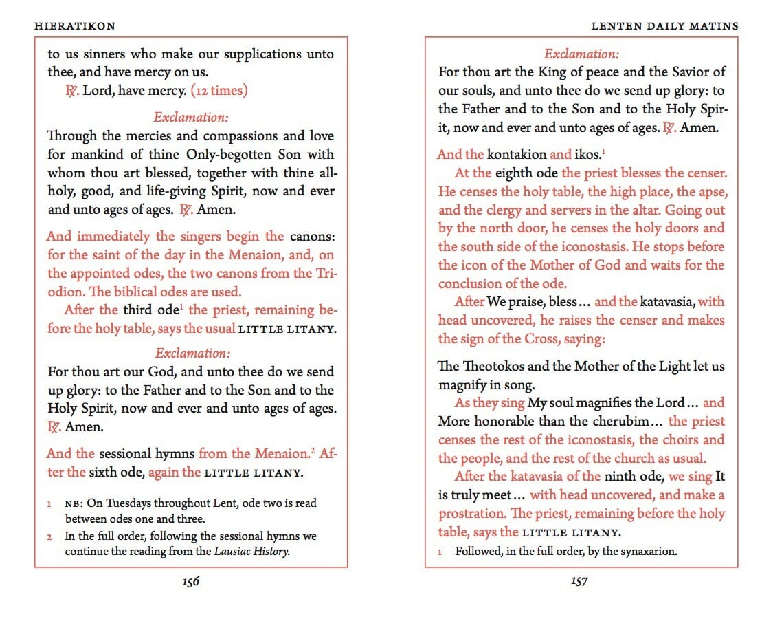
Navigability is effected by several means, such as:
- Drop caps introduce all litanies and prayers, as well as the opening exclamation of each office (“Blessed is our God…”). When a priest or deacon must find his place quickly, these large letters can help. If he knows his litany begins, “Have mercy on us,” he can ignore all dropped caps other than “H.”
- References to liturgical texts in the rubrics are printed in black, so that by scanning one can quickly review the parts of an office occurring between each priestly or diaconal part. When a priest’s or deacon’s part is mentioned in the rubrics, it is printed in black and in small caps.
- When part of a service occurs only sometimes – for example, three lessons at Great Vespers, or the Canon of St. Andrew at Great Compline – the paragraph describing it is set with wider margins and with decorative swashes at the beginning and end.
- Footnotes are used to provide details for occasional variants of the rite, or alternative practices, or other points of limited application.
To be continued.
For additional detail about the text and design of this Hieratikon, see this interview with HDn Herman.
The Hieratikon is available from Saint Tikhon’s Monastery Bookstore here
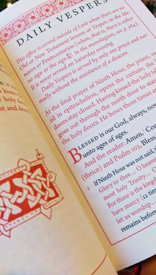
Could you also please explain your reasoning behind the use of thin red borders on the pages? It does have a striking effect, but the text sans border gives more white space and looks less cluttered. Is it similar to the reasoning of having a border around an icon?
I will weigh in on this interesting question. Certainly the red borders offer a similar visual effect to the border on an icon, or to the frame on any picture: they give a crisp boundary to the composition. My experience with older liturgical books, especially the beautiful ones printed by Anglicans and Roman Catholics in the early 20th century, is that small hand-held books such as this usually included borders on each page. But, of course, most books do not. So why would the borders be desirable specifically on this kind of book?
I would hazard to suggest that they are visually helpful here because the priest must be constantly glancing towards and away from the book. He does not read it continually page after page like one reads a normal book. So the borders help guide the eye to focus upon the page at a very quick glance. I think this is why the borders seem oddly comforting in this context. They seem to say, “this little bit of text is all you need to see right now. Don’t worry about all the other pages.”
Conversely, borders would probably be irritating in a book such as a novel, because they would seem to stop your eyes at each page and discourage moving along.
I have noticed in my years of liturgical research, that this is a widespread and common way of displaying a liturgical publication.
Interesting. However I noticed that in Russian practice the priest says all ektenias in front of the Royal gates when they are closed which seems to be at variance with your directions.
Thanks for this interesting article.
I feel I should point out one error: The fifth paragraph sources a quote to a “Robert Broadhurst” but the author’s name is “Robert Bringhurst.”
Best,
Thank you for pointing it out. The mistake has been edited.
Congratulations to all involved! Very nice layout and design!
I was curious as to why a new translation was developed rather than using one of the existing ones.