
Similar Posts
Definition of Apse: A large semi-circular or polygonal recess in a church, arched or with a domed roof and typically at the church’s eastern end. Via Latin from Greek hapsis ‘arch, vault’, perhaps from haptein ‘fasten, join’. In astronomy, either of two points on the orbit of a planet or satellite that are nearest to or furthest from the body round which it moves.
In this article I describe the design and technique I used to paint the apse for the Roman Catholic parish church of St Christopher’s, located at Codsall, in the West Midlands of England.
The apse is a wonderful invention. Church architects derived the idea from the Roman civic basilica, where the apse was designed as an acoustic amplifier and to drew attention to the significant person seated there, such as the magistrate. The only adjustment church architects needed to make was to place the apse in the east end of the temple.
The Roman basilica of Maxentius and Constantine, built 308-312.
Basilica Church of Saint Peter, Rome, built 318-322.
The church apse fulfils numerous roles. As well as being acoustic and symbolic, it swiftly came to play an important role in iconography and in ritual. Its semi-cylindrical wall and semi-hemispherical ceiling creates excellent acoustics, reflecting sound forward into the nave. Symbolically, it is the womb of the church, the place where Christ comes to earth and thence to the people through word and sacrament. Iconographically, since it wraps itself around the sanctuary it offers the perfect surface to depict the saints and angels assembled around the King of kings and His altar. Ritually, the apse’s semi-circular footprint creates space for movement around the sanctuary and focuses the eye on the Holy Table.
The etymology of the word is pregnant with inferences, in particular its probable root, haptein, to ‘fasten, join’. The apse, whether the church possesses a dome, is the sacred space in which heaven and earth are joined. If the church does have a dome, the apse usually bears an image of the Mother of God, the one through whom heaven and earth were joined in Christ. It may additionally depict celebrating hierarchs who, as apostolic successors, unite the present with apostolic times. If the church has no dome, as in the basilican design, the apse will usually show Christ in the centre, surrounded by saints, including the church’s protector.
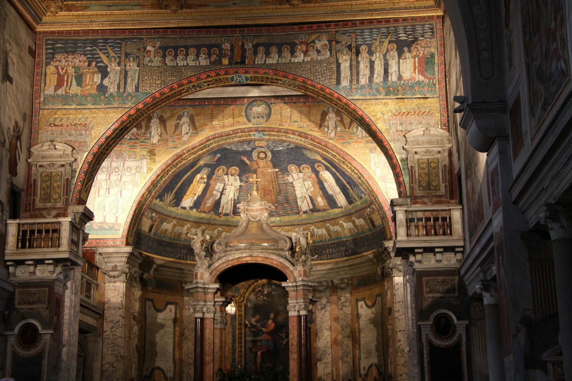
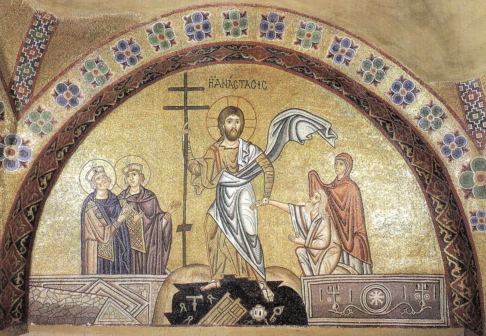
Roman apsidal iconography from the fourth until the twelfth centuries is particularly rich in theology. I have discussed the famous Ravenna mosaic of Sant’ Apollinare in Classe in this article, and hope to write another about the theological riches of Rome’s Santa Preceda’s mosaics.
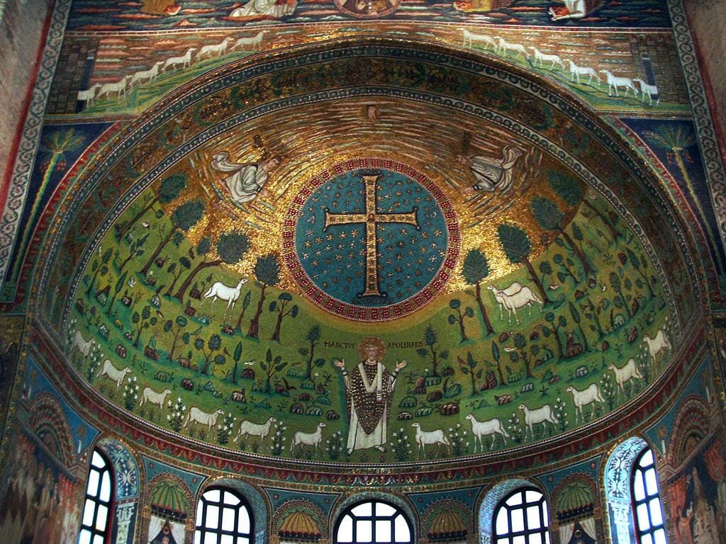
Church of St. Apollinare in Classe
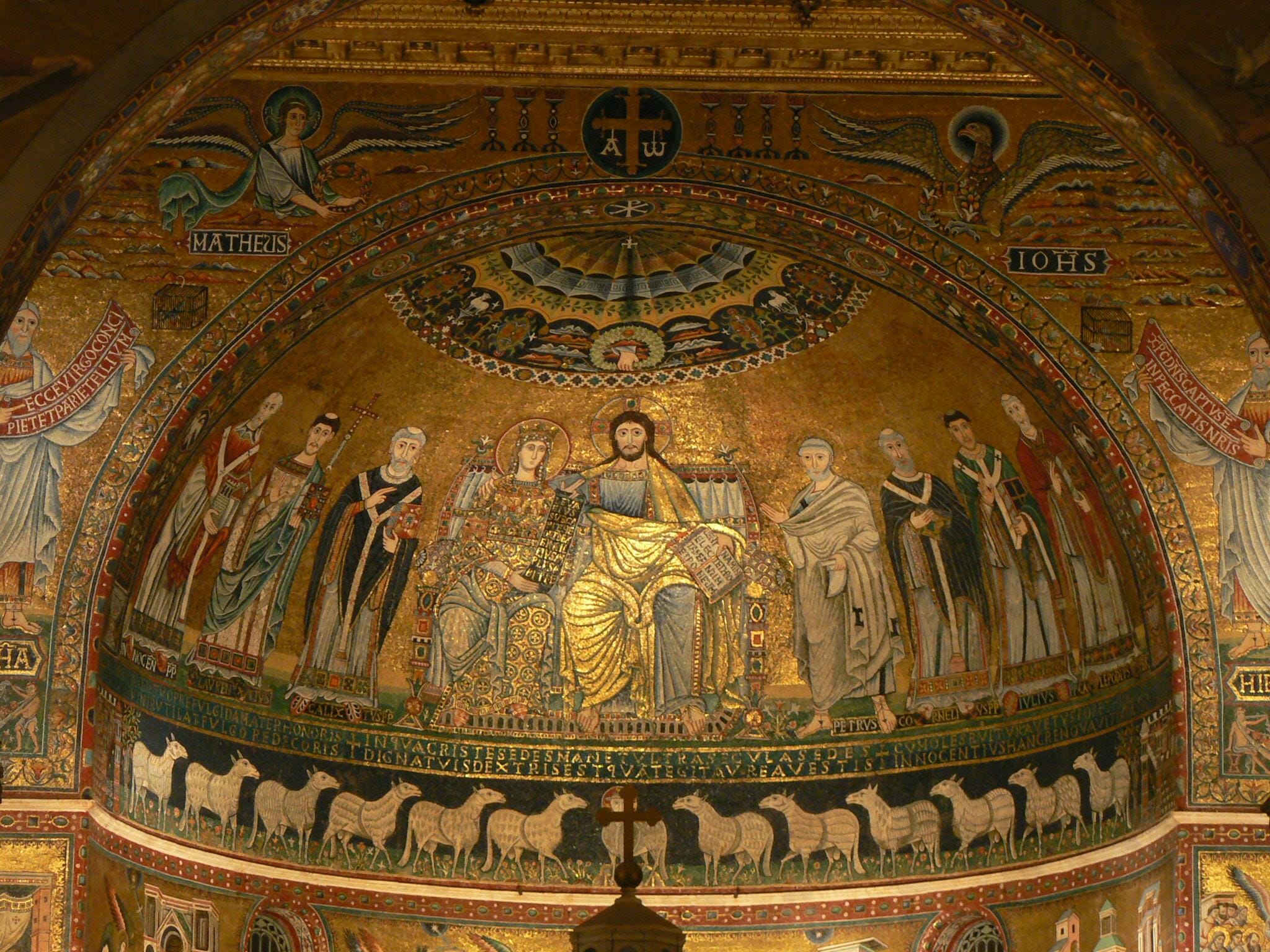
Church of Santa Prassede, Rome
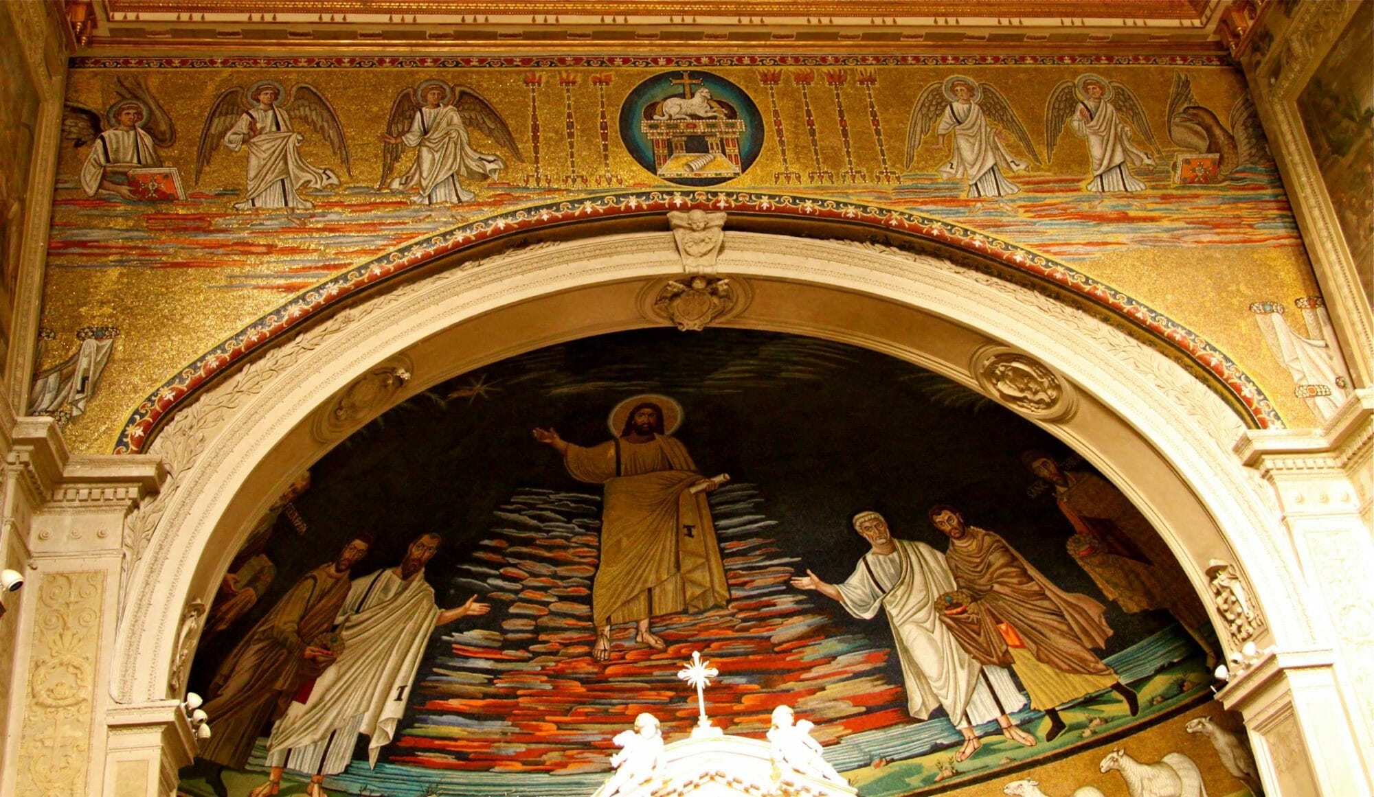
The meaning of the word apse in astronomy offers further insights: ‘Either of two points on the orbit of a planet or satellite that are nearest to or furthest from the body round which it moves.’ Similarly, early Roman apses often encompass extremes in a single image. As we discuss in more detail below, most of these, for example, include depictions of Bethlehem and Jerusalem either on the drum or on the triumphal arch. From these, twelve sheep emerge to represent the apostles, and in them, all of God’s people. The jewelled richness of these two representations tells us that they indicate not only the historical town and city but also the Alpha and Omega of God’s economy; the incarnation two millennia ago,. and the New Jerusalem to come. Apsidal schema in early Western iconography are therefore typically eschatological; they unite past, present and future in a single multi-layered whole. This is especially so if we include the scenes on the triumphal arch.
Because Christ will return ‘coming on the clouds of the sky with power and great glory’ (Matt 24:30), Roman apses almost invariably show Christ amidst brightly coloured clouds to suggest His glorious Second Coming, like the rising sun.
Church of Santa Maria in Trastevere, Rome
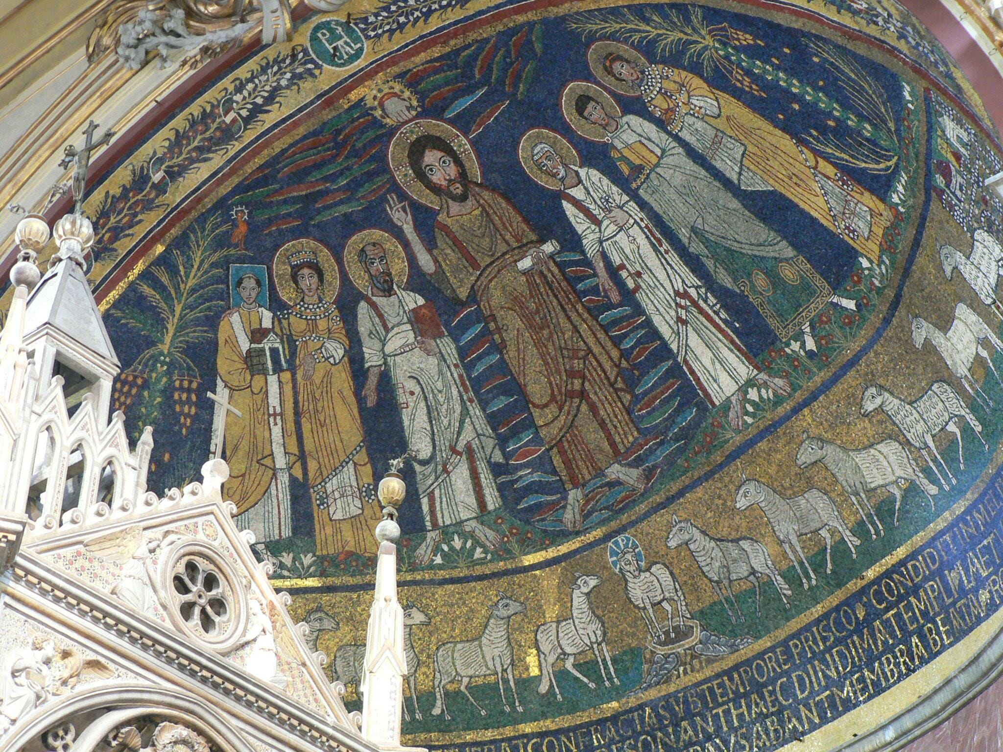
Church of Santa Cecilia, Rome
These were the images and associations in my mind when I visited St Christopher’s church to discuss possible designs.
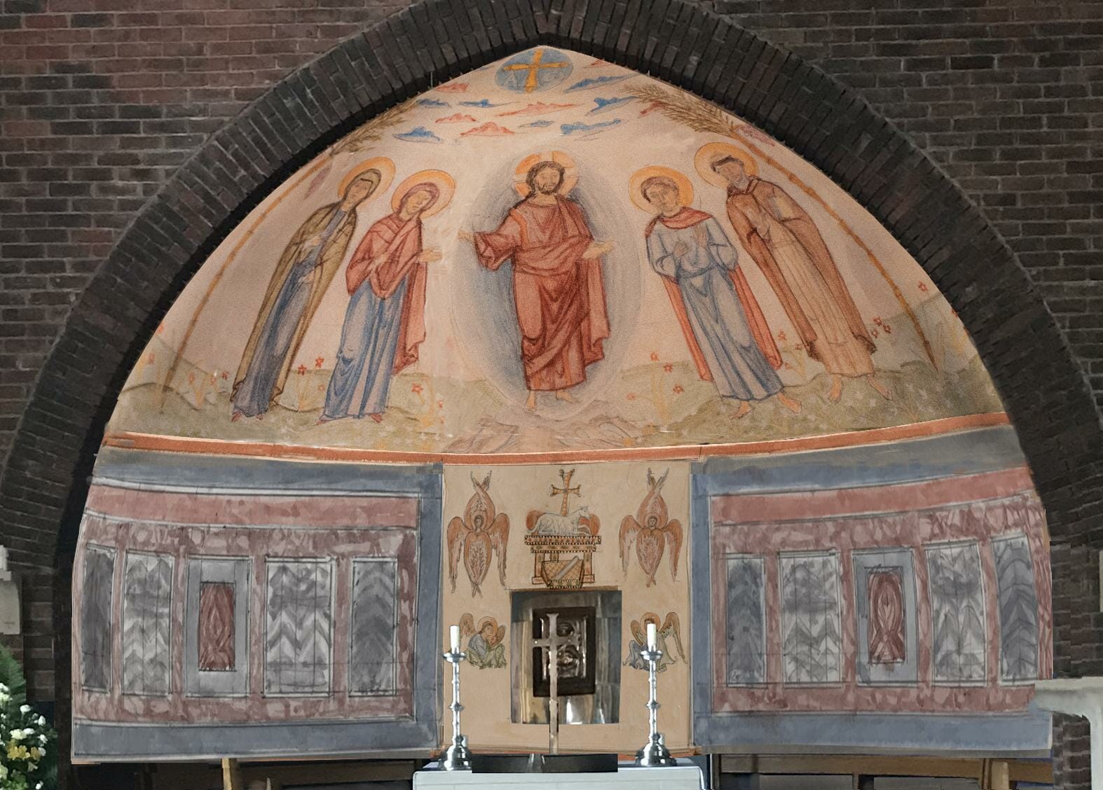
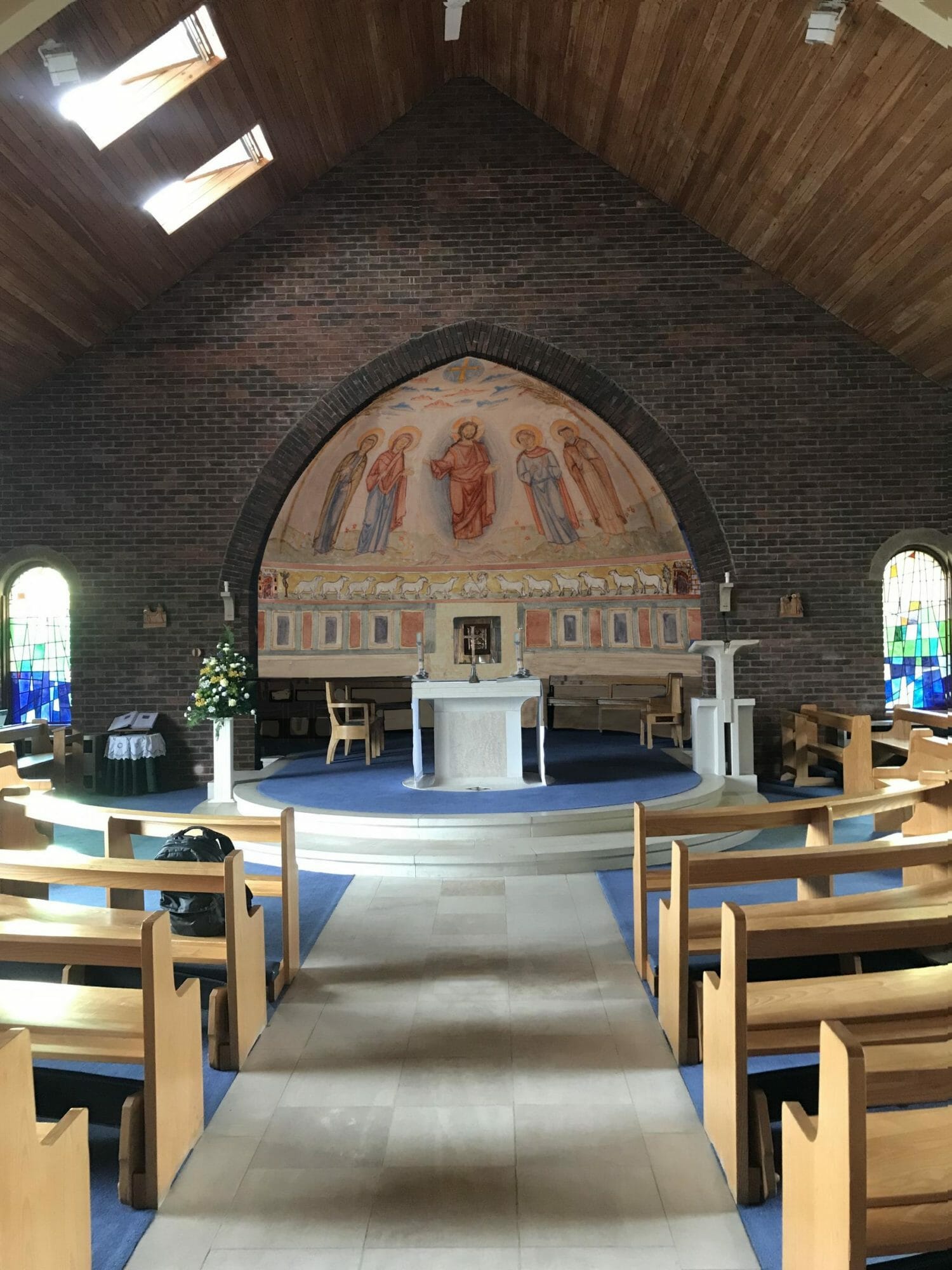
The church’s priest, Fr David Gnosill, had given an open brief, saying that he had seen another east wall painting that I had done for a church and wanted to explore a mural for the apse of his own church. It was clear something had to be done with the apse, which was painted a rather strange purple and mauve. Otherwise, the rest of the church was thoughtfully designed and made of high-quality materials. It is a millennium structure, built in 2000, with a rectangular floor plan and apse. Presumably to save costs, the apse ceiling was made conical rather than hemispherical. The church’s interior has exposed brick walls, a part-limestone and part-carpeted floor, and a high-pitched ceiling, lined with tongue-and -groove pinewood. The altar, font, and floor are of a cream limestone speckled with fossils. The bespoke furnishing is of ash and sycamore. The pews are curved, with the altar as the epicentre.
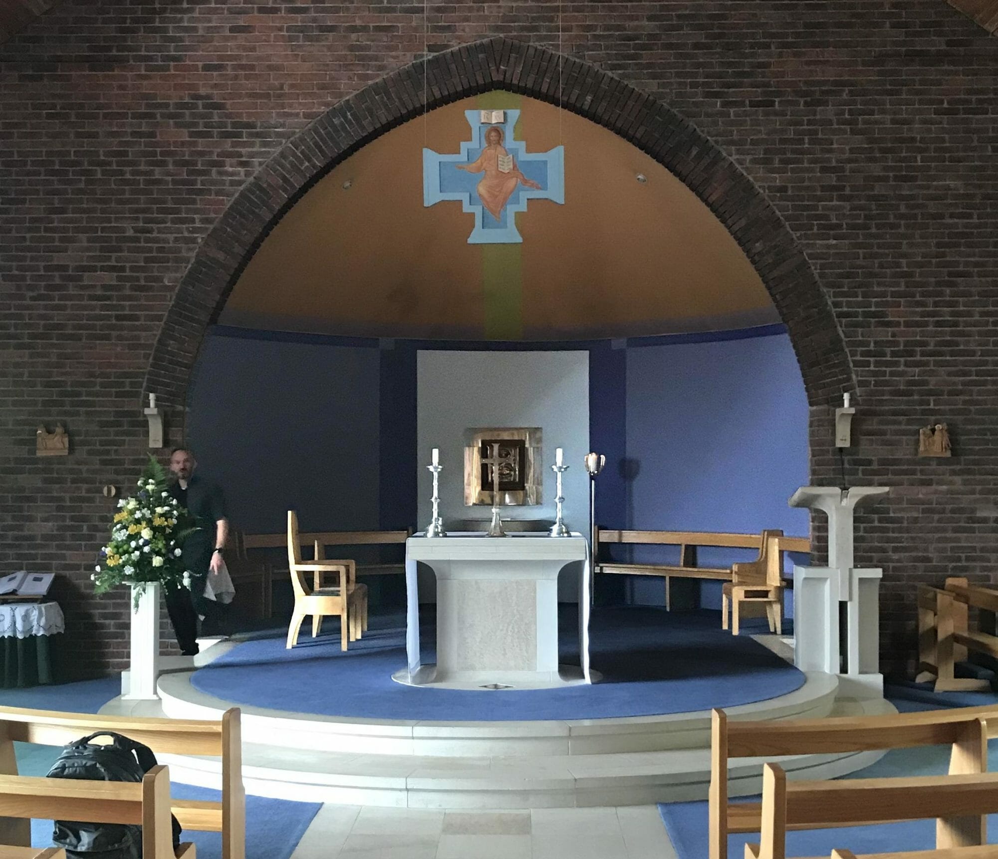
St. Christopher’s before.
The icon of Christ in Glory suspended over the apse was to be moved to the west wall to clear the view of the apse, and the two stained windows on the east end were non-figurative. Apart from two small Stations of the cross, this meant that the whole east end was bereft of any figurative imagery.
As the visual focus behind the altar and around the tabernacle, the design needed to fulfil four criteria: to harmonise with the existing architecture and furnishings; maximize theological content whilst maintaining simplicity; relate liturgically to the existing tabernacle and altar; and finally, apart from consciously read content, the mural’s aesthetic impact needed to help create a prayerful atmosphere. This is the enargeia or expressiveness that Fr Silouan writes about so elegantly in his recent OAJ article ‘Manners and Mannerisms: Thoughts on Style…’
At our first meeting, it was clear to Fr David and me that the wall painting should depict Christ in the centre flanked by saints. I was keen on four rather than two saints, to heighten the sense of the heavenly host, but we left this open. The default preference for church decoration among most contemporary Catholics and Anglicans, at least in Britain, seems to be for less rather than more! After the Second Vatican council, this all too often meant reduction to white walls.
This minimalist preference presented challenges at the parish meeting that was called some months later to discuss the design drafts. For fear of the imagery distracting them, some parishioners said that they preferred white walls to figures, while others were uncomfortable with change per se. Some cited questions as to cost: Can we afford it? During economically straightened times, should we be spending money of art? The remaining parishioners, mainly the younger members, were all for a figurative wall painting. I had encountered a very similar mixed response from the previous Roman Catholic parish for which I had executed a mural.
I am glad to say that now these two murals have been completed, the reticent members of both parishes seemed to have been converted! Nevertheless, the default preference of minimalist whiteness over figuration is a concern and needs to be addressed. But that is not the subject of this article.
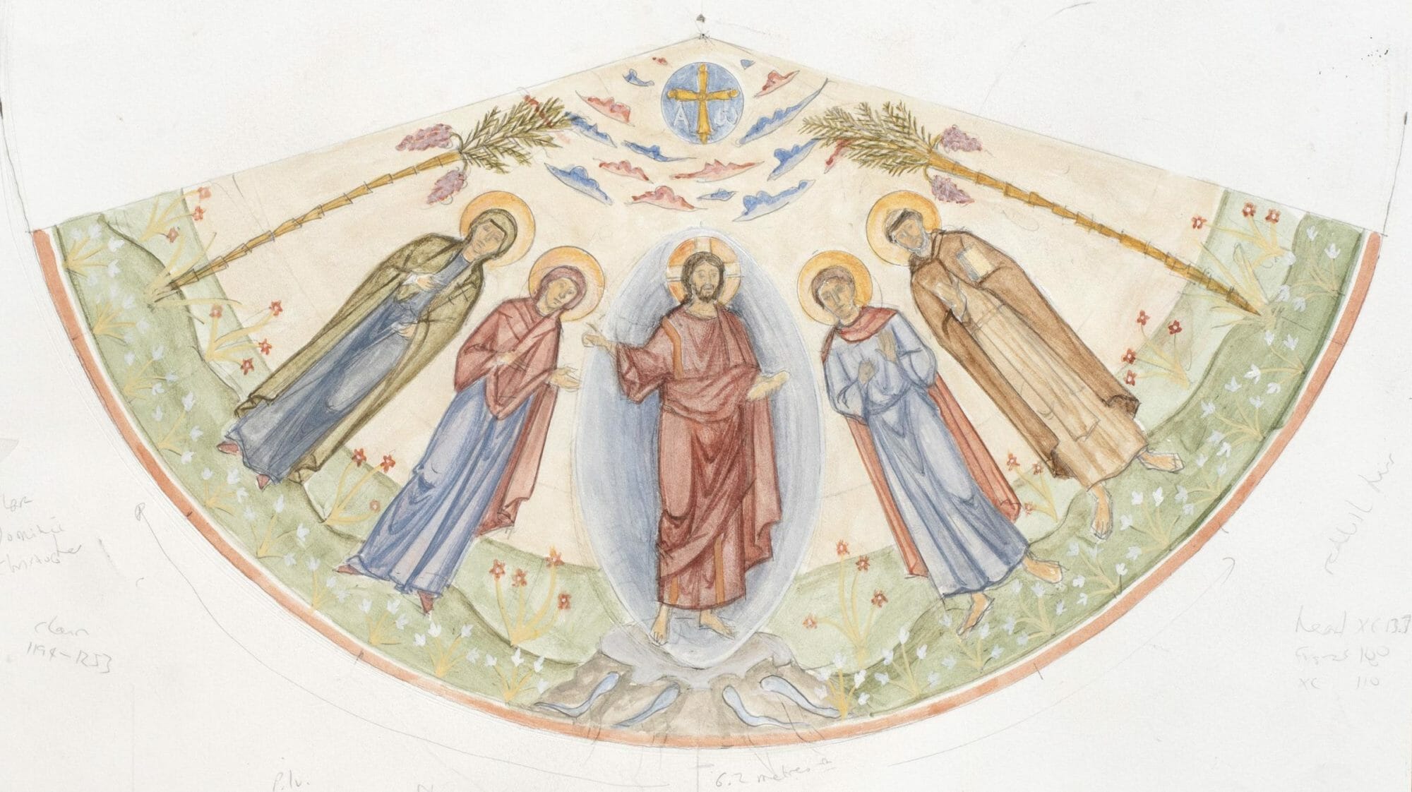
All major works for Roman Catholic churches in Britain first need the clearance of an Art and Architecture Committee. Committees can be fearful things, that sap spirit and leave a carcass. But this committee was very positive and helpful with its feedback. We discussed possible combinations of the sketch options that I had prepared, and we brainstormed other possibilities. My design for the apse proper presented few problems for the committee; all thought that it worked, and to my surprise, most members preferred five over three figures. It was the lower wall band that attracted the most discussion. If I recall correctly, it was they who suggested the Lamb and the sheep, which were incorporated into the final design.
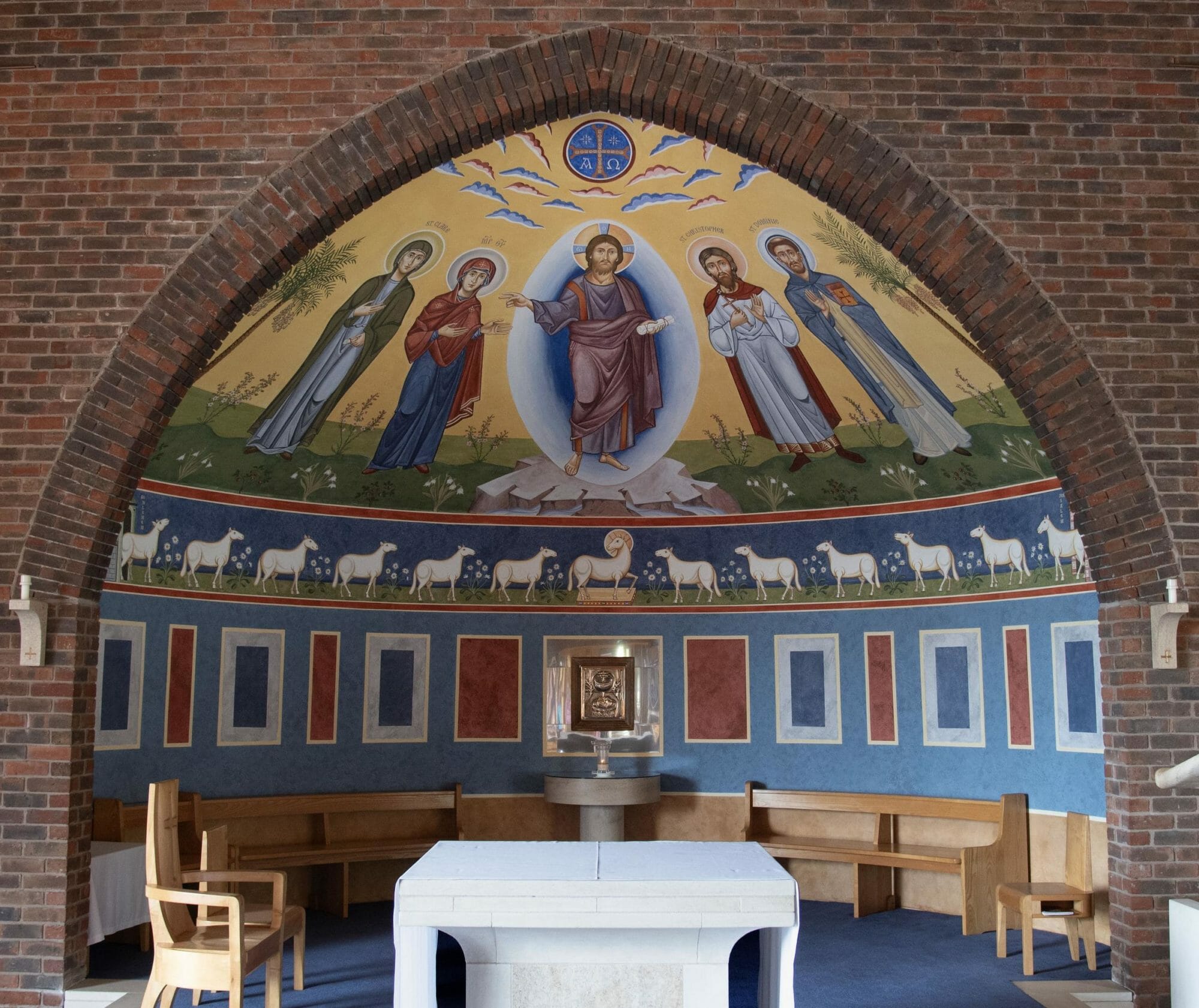
The final design.
What was agreed and eventually painted is the subject of the rest of this article: first, the theology and aesthetics behind the design, and secondly, the materials and methods used to paint it.
Christ
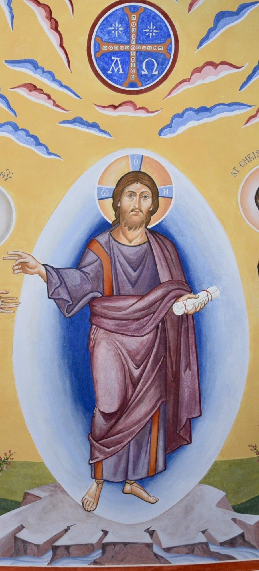
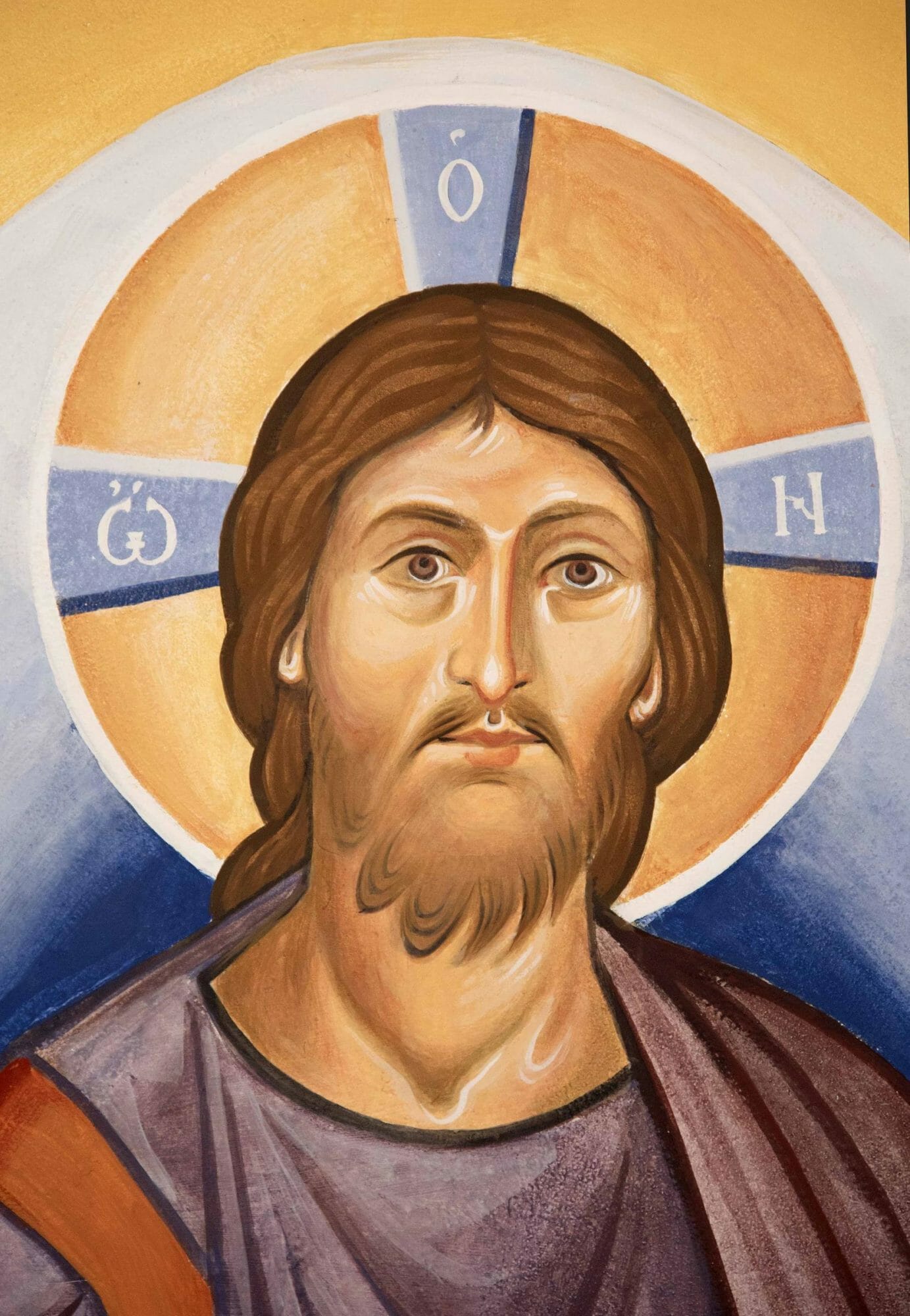
Although many elements were synthesised to make the design, the dominant theme is Christ as ‘the Alpha and the Omega, who is, and who was, and who is to come, the Almighty ‘
(Rev 1:8). It is pertinent that Christ counters the expected chronological order and first declares Himself to be ‘He who is’. He is present with His people in the here and now. And His saints, though they lived and died on earth in the past, are present with Him and among His people in the present. Christ has overcome the dividing wall of the past, which is death, and raised those from the past into the eternal present.
Christ comes out of the past into the present, but He also comes to us ‘out of the future’, to quote the late Metropolitan Kallistos Ware. This is why churches face east, towards the rising sun, and why the Creed ends with the words: ‘I look for the resurrection of the dead and the life of the age to come’.
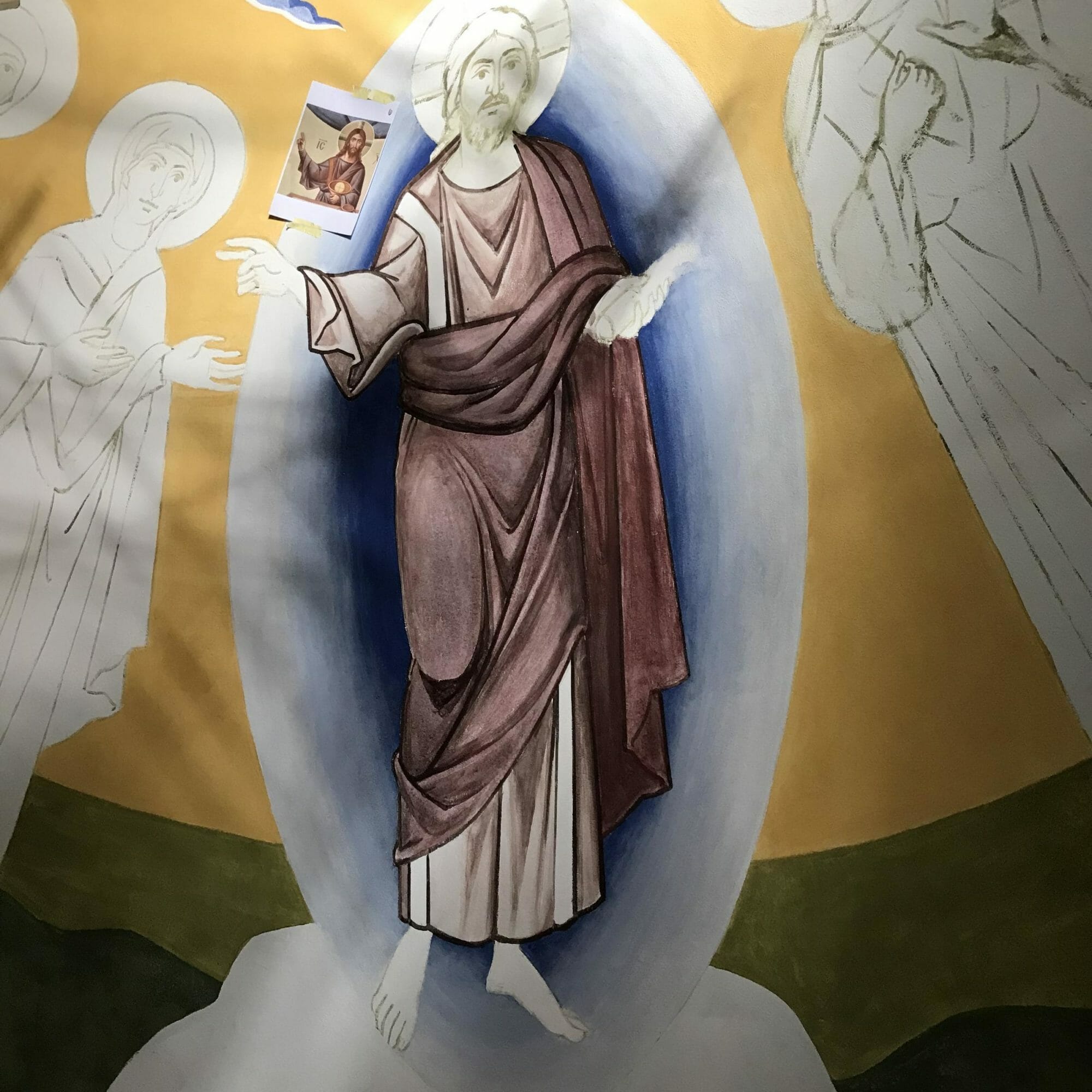
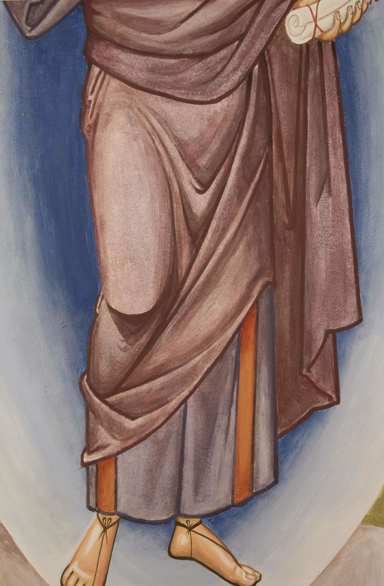
The mural depicts Christ in the royal purple, as the Emperor. He holds a closed scroll, for although He will judge the living and the dead, the scroll is not yet opened and so there is yet time for its contents to be changed.
He radiates a mandorla of light, and like that shown in Transfiguration icons, is dark in the centre and light on the outside. This is the opposite of what we would expect were this created light. Why? We know God both by knowing and unknowing; we know Him through His outgoing love and wisdom, while simultaneously acknowledging that according to His essence, He is beyond all that can be known by creatures. The light-filled darkness is our incapacity to ever know God as He is in Himself. As St Gregory of Nyssa affirms:
This is the true knowledge of what is sought; this is the seeing that consists in not seeing, because that which is sought transcends all knowledge, being separated on all sides by incomprehensibility as by a kind of darkness. (St Gregory of Nyssa, ‘The Life of Moses’)
The Saints
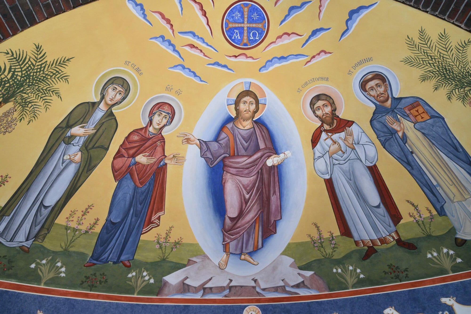
The Mother of God is to Christ’s right, and the church’s patron, St Christopher, is to His left. Either side are two Catholic saints whose relics the parish possess: Clare of Assisi and Dominic. The saints are shown with different coloured haloes. Although not common, such variation in halo colouration does exist in the tradition, such in the eleventh century mosaic at Resurrection mosaic of Hosios Loukas where the outlines are different, and the contemporary wall paintings at the Feodorovsky Cathedral in Petersburg, painted by the master, Archimandrite Zenon.
Hosios Loukas, Greece
Feodorovsky Cathedral, painted by Archimandrite Zenon
My experience of spending some time with three saints, all now canonised (Saints Paissius, Sophrony and Porphirios), affirmed for me that life in the Spirit purifies and preserves the uniqueness of each person. This is what I wished to affirm in the colouration of the haloes. It is as though different people give emphasis to different ‘wavelengths’ within the infinite richness of God as Light. In the words of Metropolitan Kallistos: ‘While Christ unites us, the Holy Spirit ensures our infinite diversity in the Church: at Pentecost the tongues of fire were “cloven” or “divided’.’’ (Kallistos Ware, in The Orthodox Church).
The Clouds and Radiant Cross
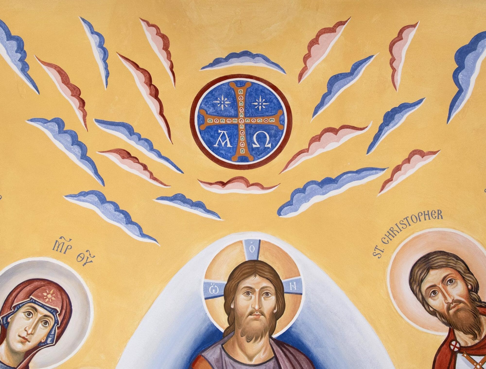
Then will appear the sign of the Son of Man in heaven. And then all the peoples of the earth will mourn when they see the Son of Man coming on the clouds of heaven, with power and great glory. (Matthew 24:30)
The mural’s sunrise-coloured clouds and jewelled cross show that the mural depicts Christ’s return in glory; the ‘sign of the Son of Man in heaven’ is traditionally understood to be the cross. Although not found in the iconography of the eastern Roman empire, these clouds are the norm in virtually all medieval western apsidal mosaics, as in the church of St Cosmos and Damian.
Sts. Cosmos and Damien, Rome
The scene shares many elements with transfiguration iconography, while also emphasising the eschatological element. The Gospels tell us that Christ was transfigured with light, but that He was also surrounded by thick cloud. The mural suggests this cloud both by the dark blue interior of the mandorla, as discussed above, but also by the sunrise-coloured clouds. Luke’s Gospel tells us that when Moses and Elijah appeared at the Transfiguration they were speaking of Christ’s coming departure (exodus in the Greek), which of course is His crucifixion, hence the jewelled cross’s inclusion in the mural. The palm trees either side of the mural recall Palm Sunday, but also the paradisiacal Kingdom to come. Finally, there is the precedence set by iconographic tradition that links the Transfiguration with Christ’s return in power and glory, most notably in the apsidal mosaic of Sant’ Apollinare in Classe.
The Four Rivers
A river flows out of Eden to water the garden and from there divides into four rivers. (Gen 2:10)
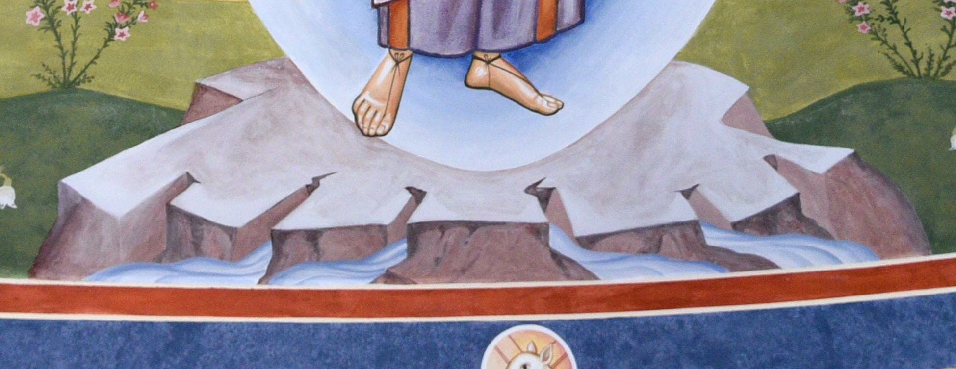
Below Christ, the mural depicts four rivers flowing from the rock. Christ Himself is the single river that flows out of Eden to water His creation. The division into four indicates that His grace sanctifies not just Eden but His whole creation. Genesis tells us that these rivers flow to the lands of Evilat, Ethiopia, and Assyria, while the fourth river, the Euphrates, flows through present day Turkey, Syria and Iraq.
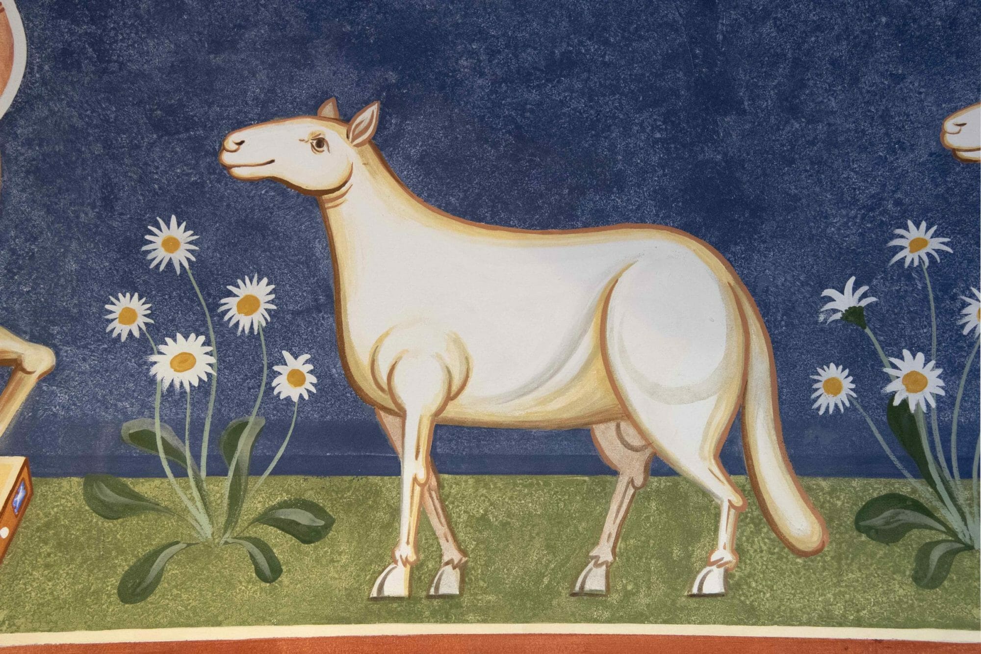
The Lamb and Sheep
On seeing the mural depicting Christ as the Lamb, I am aware that some Orthodox will quote Canon 82 from the Council of Trullo, held in 692, and reiterated in the Seventh Ecumenical Council:
In certain reproductions of venerable images, the precursor [John the Baptist] is pictured indicating the lamb with his finger. This representation was adopted as a symbol of grace. It is a hidden figure of that true lamb who is Christ, our God, and shown to us according to the Law. Having thus welcomed these ancient figures and shadows as symbols of the truth transmitted to the Church, we prefer today grace and truth themselves as a fulfilment of this law. Therefore, in order to expose to the sight of all that which is perfect, at least with the help of painting, we decree that henceforth Christ our God must be represented in His human form but not in the form of the ancient lamb.
The spirit of this canon is to ensure that the reality of the incarnation is affirmed in art by depicting the person of Jesus Christ as God made flesh. He can and should be depicted ‘in His human form’ rather than symbolically. However, the mural clearly affirms this in its large depiction of Christ, robed in His regal purple and radiant with light; the depiction of Christ as the Lamb is therefore subsidiary. Also, while fully embracing the iconodule canons of the Seventh Council, the Western Orthodox Church did not accept this particular canon that prohibits Christ’s depiction as a lamb, and St Christopher’s is a Roman Catholic church.
The Lamb is shown below the figure of Christ and directly above the tabernacle that holds the reserved sacrament. The jewelled pedestal distinguishes the Lamb from the other sheep, who represent the twelve apostles. This arrangement of the Lamb with sheep processing from Bethlehem and Jerusalem is common among many, if not most, Italian apses from at least the sixth century (such as sixth century Sant Apollinare in Classe and St Cecilia’s, 817-824), up until around the twelfth century (for example, in the Basilica of Santa Maria Trastavere). This sense of movement towards a goal gives these mosaics, and I hope also the mural, a sense of movement through time towards the age to come. The aeon within which we now live is therefore a procession or pilgrimage towards that to come. Like all pilgrimages, Christ is experienced in the present, in the process as well as in the end. Nevertheless, the pilgrimage is given its meaning and telos by the New Jerusalem that lies ahead. In Christ, the future processes back towards the present.
Bethlehem and Jerusalem
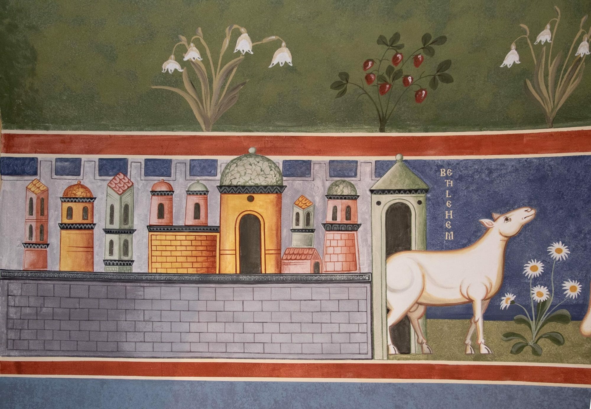
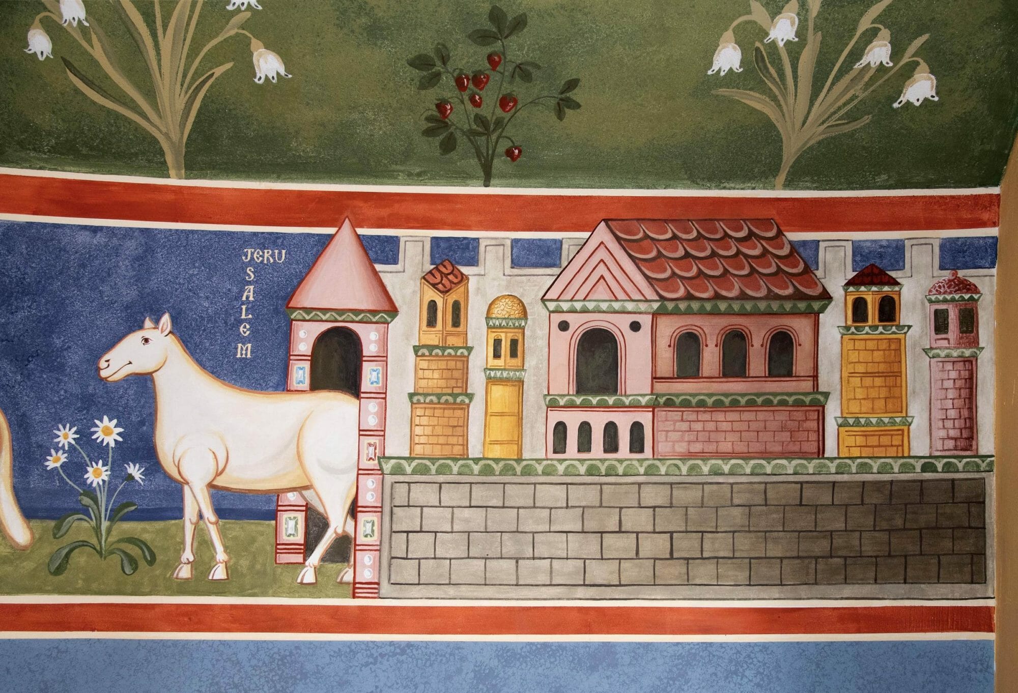
As mentioned in the introduction, most early Roman apses include depictions of Bethlehem and Jerusalem. These represent not just the beginning and the culmination of Christ’s earthly ministry, but also the beginning and telos of all creation, from the creation described in the book Genesis, to the New Jerusalem that ‘comes down out of heaven from God as a bride adorned for her bridegroom’ described in the last chapter of the Book Revelation.
The Plants
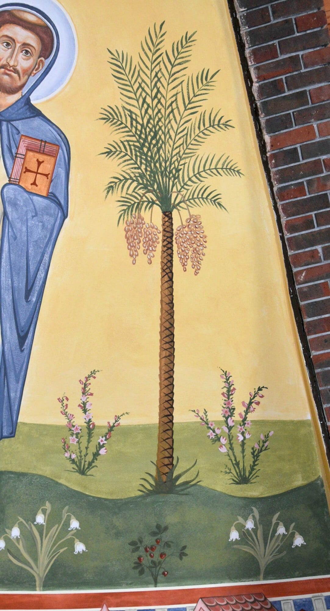
The flowers are local to the church. The heather on the uppermost layer is the symbol of Staffordshire County, while the snow drops and daisies were chosen as humble flowers common throughout Britain. The more exotic date palms are commonly found in oases, and therefore symbolise paradisiacal life amid the desert of a fallen world.
The Panelling
The stippled panelling in the lower echelon suggests stone revetments and reflects colours already in the church: the blue carpet; the red brick; and the buff limestone floor and altar. More symbolically, the revetments represent the mineral kingdom. Together with the plants and sheep, these show that Christ came not just to redeem the humanity but also, through His Body, to gather and return all creation into its intended glory—the mineral, vegetable and animal kingdoms as well as the human. In the words of St Maximus the Confessor:
And with us and for us Christ embraced the whole creation through what is in the centre, the extremes as being part of Himself, and He wrapped them around Himself, insolubly united with one another: Paradise and the inhabited world, heaven and earth, the sensible and the intelligible, having Himself like us a body and sensibility and soul and intellect… He recapitulated in Himself all things, showing that the whole creation is one, as if it were also a man. (St Maximus, Ambigua 41:91, quoted in ‘Man and the Cosmos’ by Lars Thunberg, 1985, page 90).
The materials and technique
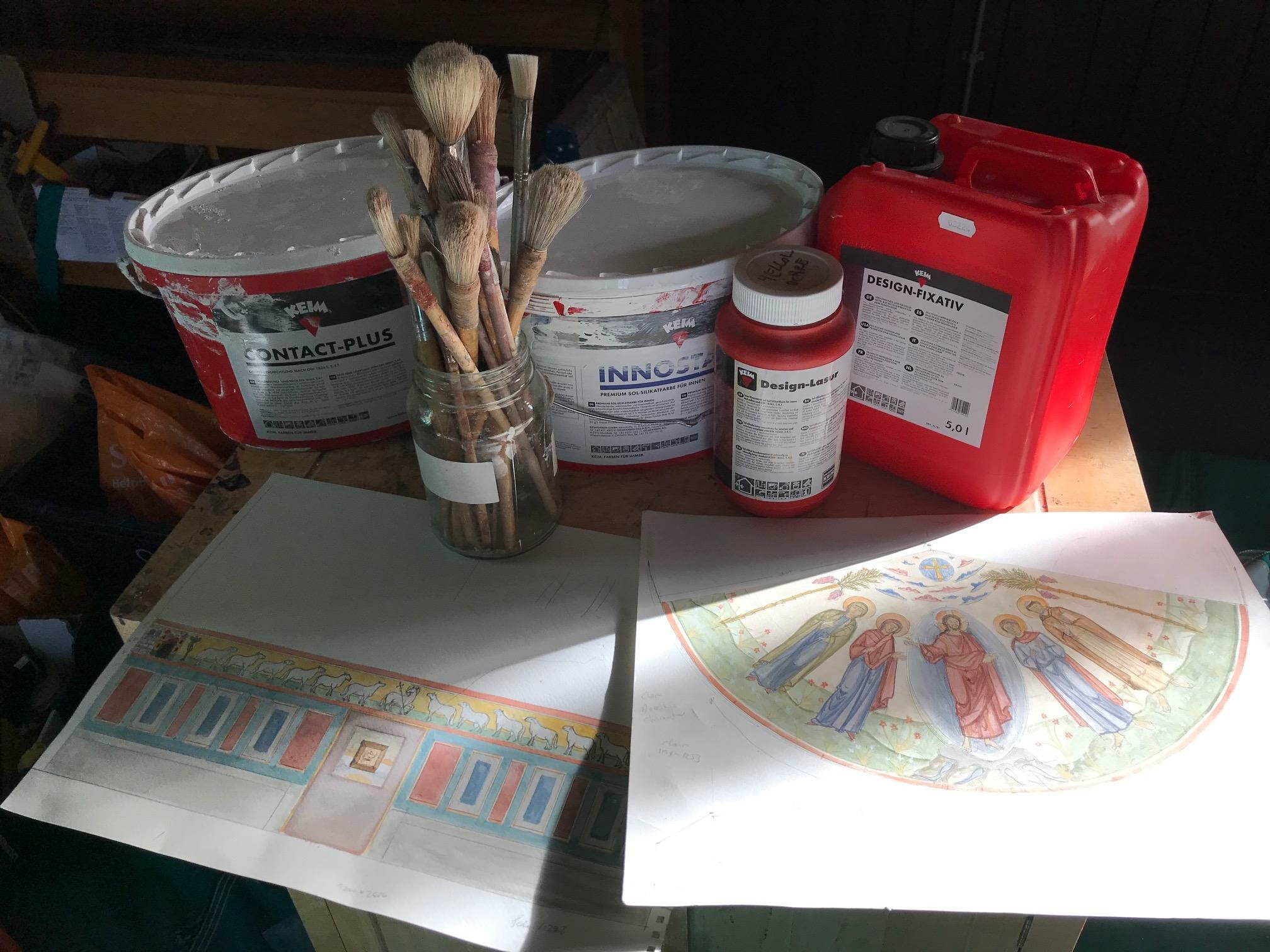
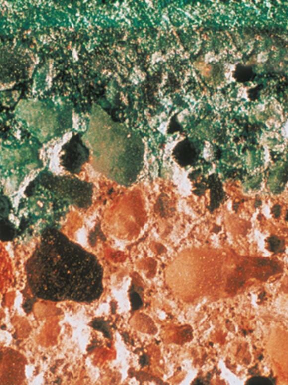
The painting was made using Keim silicate paints. (image 24) This extremely robust paint system was designed in Bavaria 150 years ago to imitate the effect of true fresco but be even more durable. It is based on potassium silicate and does not form a skin, as does for example acrylic, but penetrates the wall and reacts chemically with minerals in the substrate. As the Keim literature states: ‘Silicification results in a secure, insoluble bond between the paint and the underlying substrate (render, natural stone, concrete etc.). The render cross-section below shows the silicification process using dyed KEIM Fixativ (liquid potassium silicate)’. (Photo courtesy of Keim)
Although originally designed to go direct onto plastered walls, Keims has since developed intermediate silicate paints that bond with already painted walls, since these paints usually contain enough mineral for the silicate to react with.
Silicate paints are natural, easy to use, breathable, are quick drying to allow glazes, incredibly durable, and being slightly alkaline they also resist mould formation.
To paint this mural I used the colours provided by the Design Lazur range, all of which are mineral based. Some of these I find are too bright by themselves, so I have to calm them down by mixing in some of the other pigments. Some iconographers, such as Vladimir Grygorenko and Seraphim O’Keefe, are experimenting with mixing their own pigments with the fixative; they have found that some pigments work and some don’t. Brushes are cleaned with water, but the paints are diluted with the potassium silicate fixative.
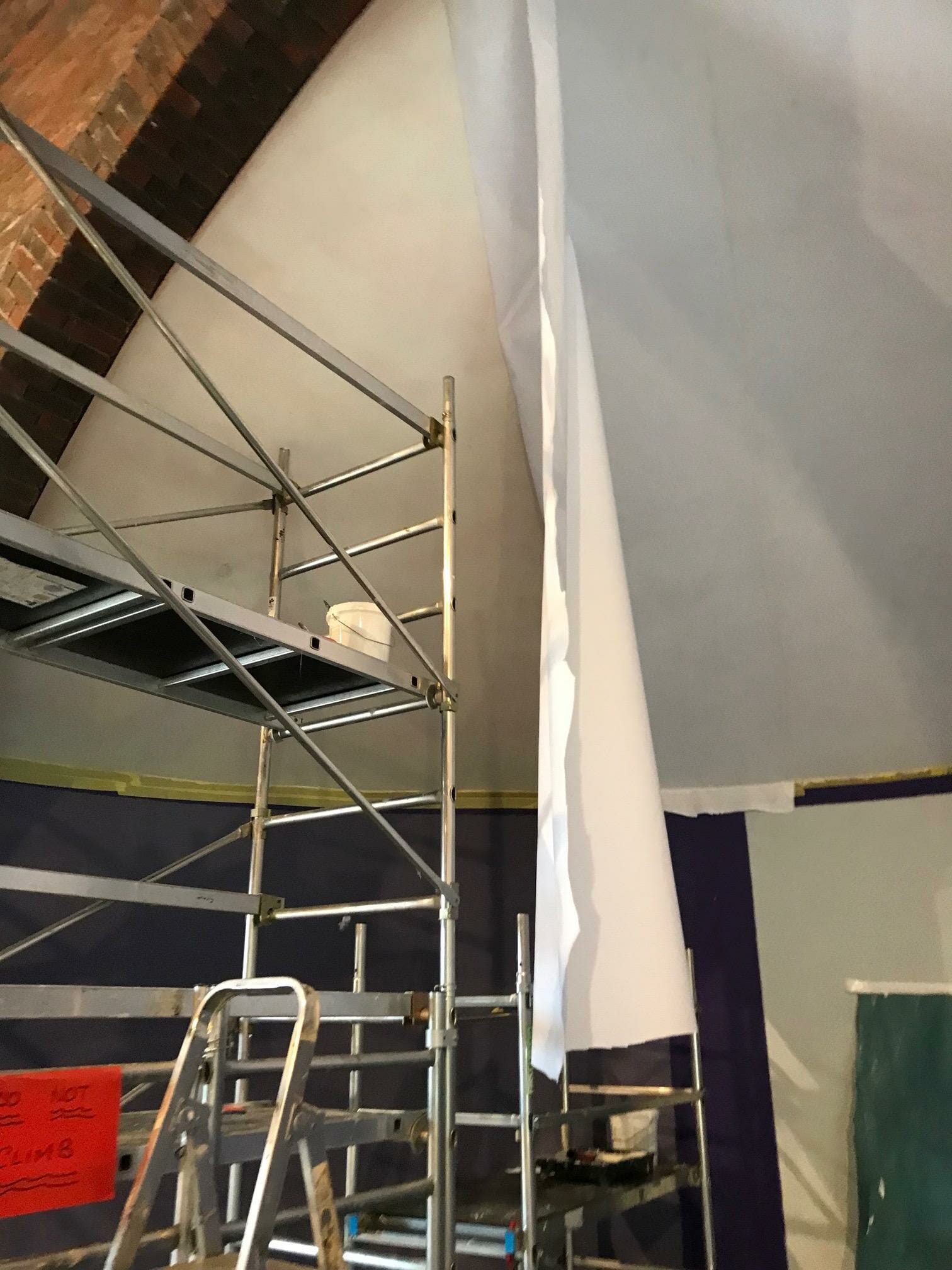
A painting is only as durable as its substrate. Although the wall and ceiling of St Christopher’s were sound, some staining and also hairline cracks along the plasterboard joins were found in the apse ceiling. To counter this, I first sealed the ceiling with Zinnser’s B.I.N Stain Blocker, then glued on a polyester lining fabric (Fredrix Polyflax Lining Fabric 100% Polyester 130in / 330cm) using Golden Soft Gel Matt as adhesive. This was then undercoated with Keim’s Contact Plus, followed by two coats of their Innostar.
The lower apse wall was sound, so two coats of Innostar were applied direct to the wall without any cloth. The mural itself was then painted using the Design Lasur paints.
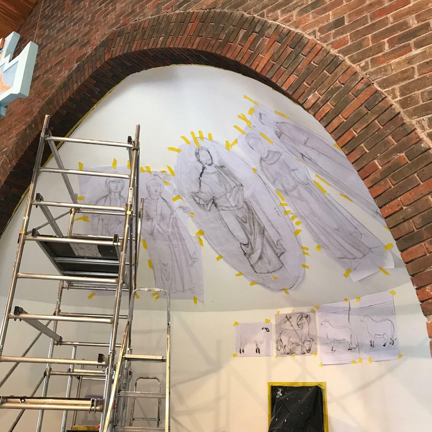
Before painting, I used full scale photocopies of my figure designs to experiment with the best placement. A flat ‘unpeeled’ drawing of a cone cannot reproduce the visual distortion created by an actual three-dimensional cone, so this was the best way to determine positioning and to make any changes to cater for the inevitable parallax. Once the general lineaments had been traced on, I made further adjustments by brush using just umber and water to allow easy erasure and changes.
I added no highlights to the garments because I wanted the work to be unified, without individual figures or garments competing for attention. Instead, the modelling was executed as a monochrome underpainting and then glazes applied, the so-called membrane technique. The light areas of the figures are created by the white base coat illuminating the glaze from behind where there is no or little underpainting. Highlights were added to the flesh areas, however, to give them prominence.
One advantage of working on a large scale is that there is space to employ students and apprentices. It is a win-win arrangement: the student both learns and is paid while learning; the work is completed sooner than if the master were working alone, which is good for the client; the cost can be kept down since students are not paid as much as the fully experienced painters.
I thank Ander Scharbach from Maryland USA, who worked with me for about four weeks and painted Jerusalem and the sheep with great dexterity and calligraphic line. Ander is a current student of the Prince’s Foundation School of Traditional Art (PFSTA) part-time three-year course, and also my part-time apprentice. I thank also Jessica Nightingale, a graduate from the PFSTA course, who worked with great care on Bethlehem and Jerusalem. Thanks also to Paul Jones, a stone carver and another current PFSTA student, who did much of the revetment painting with me. He was very patient with my barked orders during the time-pressured hours required when stippling the panels!
If you enjoyed this article, please use the PayPal button below to donate to support the work of the Orthodox Arts Journal. The costs to maintain the website are considerable.