
Similar Posts
If only we could speak to ourselves from the future! How many valuable insights and skills could we have shared with our past selves! On the other hand, how would we have learned these things if not through the mistakes we make today?
Is there a way to learn without mistakes? We have books, videos, and professionals to teach us—why can’t we just upload knowledge directly into our minds? Iconography, for instance, is not a hidden art. Our predecessors worked in so many countries for over a thousand years, painting thousands of churches and icons. Yet, despite the vast technical resources available to us today, why does learning iconography still seem so difficult?
There are many possible answers to this question. I’ll share the one that I’ve begun to uncover for myself only recently.
All of the above is true—we have an extraordinary wealth of opportunities and tools for learning. Compared to the past, we’re in a privileged position. A 15th-century iconographer couldn’t even imagine having access to the entire visual world at the touch of a button, let alone the vast libraries and resources we take for granted.
And yet, why does looking at contemporary icons and churches (including my own works) rarely offer the kind of uplifting experience that we find in historic works?
Why, even though we know so much, does the problem persist? For over a century, scholars and artists have been studying medieval artifacts and publishing their findings. We read studies like Otto Demus’ work on mosaic decoration, or more recent research by Bissera Pentcheva and Alexei Lidov on the interactivity of church spaces and dozens of others. We absorb these insights, yet the results of our work often fail to live up to the standards set by earlier traditions.
So why is the outcome still so unsatisfactory?
Many people blame our post-industrial civilization and the challenges of our time. But now, I believe the real issue lies in something deeper. It’s in the very system of our requirements; the difference is between what we ourselves are trying to achieve versus what our predecessors aimed for.
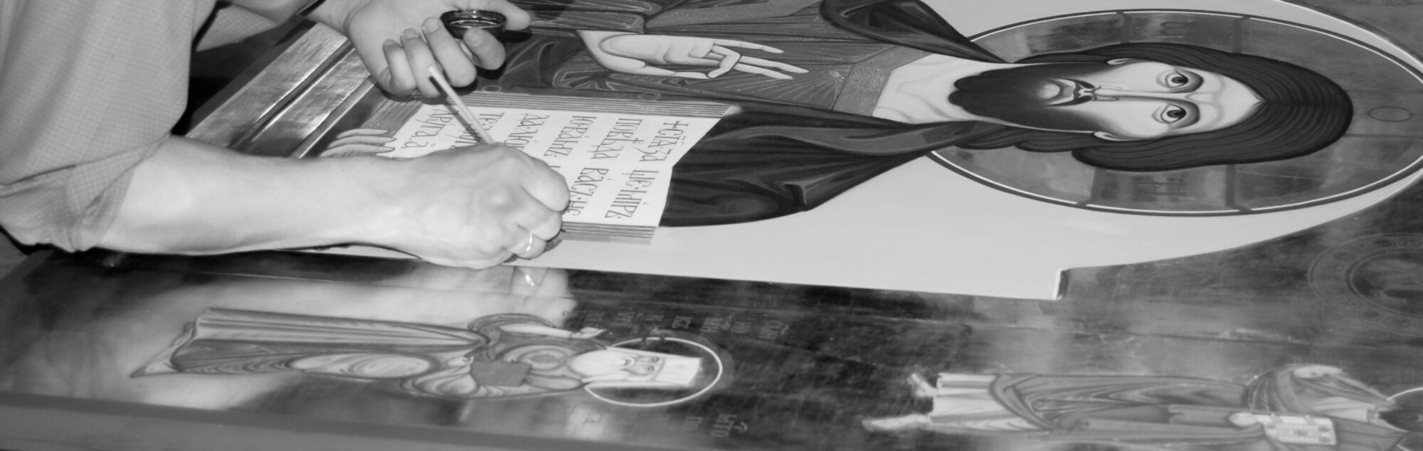
I remember my early years in my dad’s icon studio, when he was teaching me iconography. I was told to take classical 11th-15th-century icons from books to train making freehand drawings with yellow ochre. It was a real challenge, as every half hour, he would come over and always say the same thing: “Not expressive enough.”
I thought I understood what I was doing. I was focused on following models and making my drawings right and precise. But now, I see that those qualities—though important—were just one dimension of the work, not the most crucial one. Sadly, it took me 30 years to realize this, but I hope my experience can be useful to others. And before I delve into the key point, I’d like to express my particular gratitude to Veronica Royal, who introduced me to Roger Scruton’s works and his idea that beauty is something we must bring back into our lives—especially in Christian churches.
I think that what Roger Scruton called “beauty” was actually the aesthetics. I believe he conflated the two concepts because (as he was a philosopher) beauty was for him a philosophical category. In his famous films about Beauty, he seemed to yearn for an aesthetic experience similar to that of classical art and architecture. This is exactly the domain of aesthetics, which concerns how something looks and how it makes us feel.
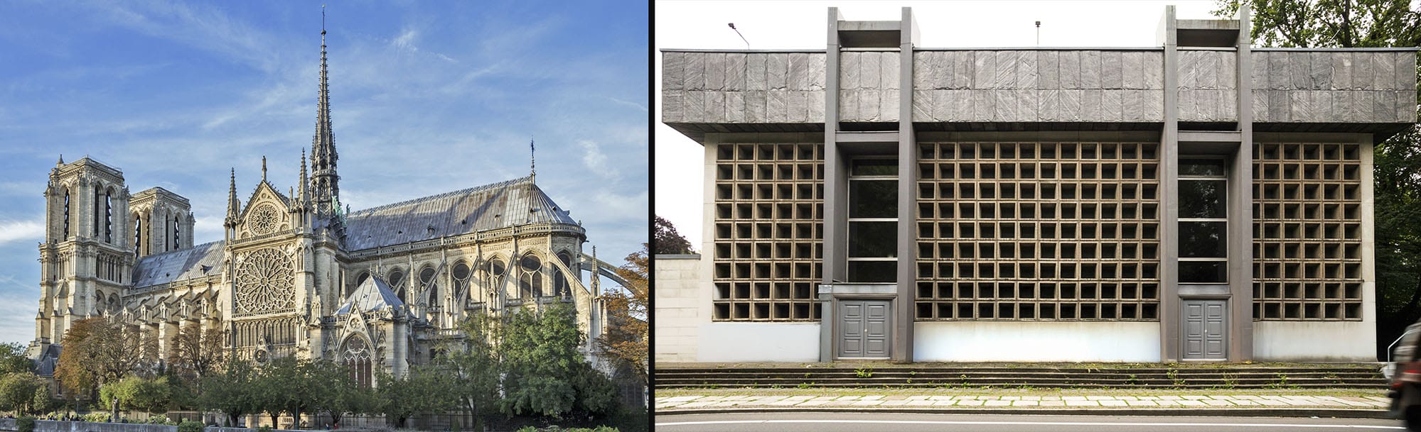
Notre Dame Cathedral in Paris (1163) vs Provost church of St. Trinity in Leipzig (1982)
Natural phenomena and organisms naturally engage our eyes as we unconsciously strive to grasp their unique aesthetic qualities. Similarly, when we look at man-made objects like art, architecture, or images, which were specifically designed to visually engage with the viewer—our eyes make an effort to absorb their aesthetic appeal. This is what Scruton felt was missing in the contemporary world. When he criticized contemporary church design (mostly Catholic, I presume) alongside modern artworks, he said they made him feel uncomfortable. I guess what Roger was actually responding to, was the lack of visual engagement. Very often I have the same feeling seeing contemporary icons, where I easily recognize the iconography type, but doubt if the artist really wanted me to actually perceive the image with my eyes. Traditional art and architecture (let’s consider it to be all art produced before the 20th century) were made to be looked at. Artists and architects used aesthetics to communicate a message through sight, not through conceptual understanding. In contrast, much of contemporary art and architecture simply isn’t intended to be “looked at” in the traditional sense. Scruton felt deprived, as though he were being denied the pleasure of seeing.
I remember discussing this with an art critic friend from the Tretyakov Gallery, who told me that when acquiring new works, the Gallery committee chooses only those devoid of aesthetic qualities. According to her, today’s art market is driven by concepts, not aesthetics, and the museum has to follow the trends.
This situation has been here for a long time. To illustrate, here’s a quotation from Paul Valéry (French poet, essayist, and philosopher):
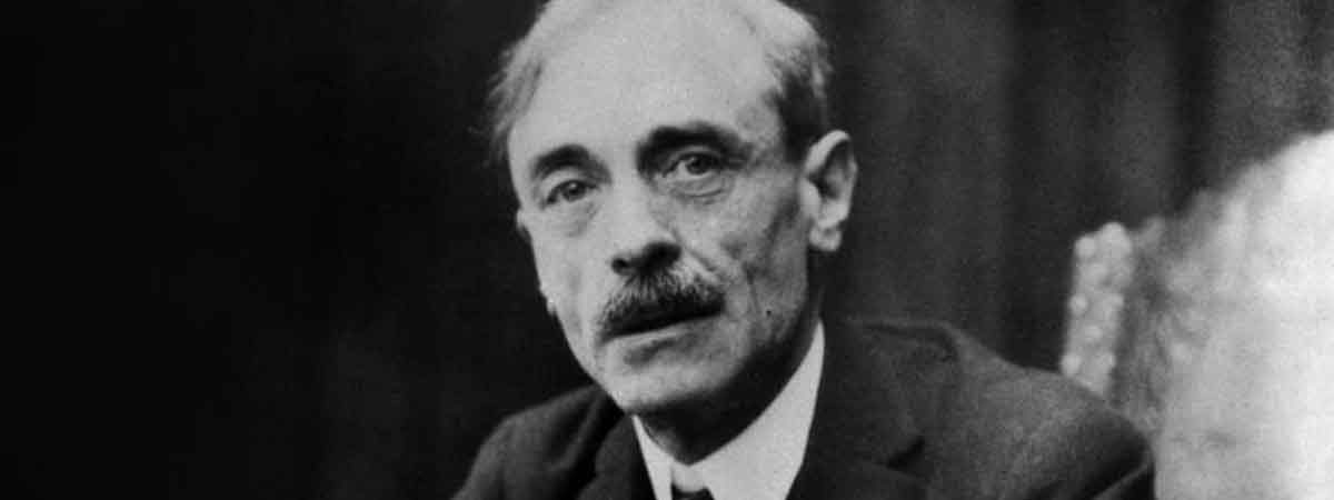
Paul Valéry
“Most people see with their intellects much more often than with their eyes. Instead of colored spaces, they become aware of concepts. Something whitish, cubical, erect, its planes broken by the sparkle of glass, is immediately a house for them—the House—a complex idea, a combination of abstract qualities. If they change position, the movement of the rows of windows, the translation of surfaces which continuously alters their sensuous perceptions, all this escapes them, for their concept remains the same. They perceive with a dictionary rather than with the retina; and they approach objects so blindly – they have such a vague notion of the difficulties and pleasures of vision – that they have invented beautiful views… Why artists are useful: they preserve the subtlety and instability of sensory impressions… That is the gift for seeing more than one knows.”
Introduction to the Method of Leonardo da Vinci, 1894. Translated by Malcolm Cowley and James R. Lawler. Princeton University Press, Princeton, N.J. 1972, pp. 19-21
In this context, I found myself agreeing with Scruton. The idea of an aesthetic-less society embracing an aesthetic-less art became a compelling philosophical question. I had to accept it as a kind of “zero point,” but it wasn’t long before I began to see a path forward.
COVID-19 led me to start filming courses on iconography, which opened up a whole new world for me—videography. I spent some time understanding the technical aspects, and it was rewarding to see how different equipment influenced the final image. What struck me most was the effect of lenses.
We filmed our first course on symmetrical faces using an iPad. While it seemed to work (we could see exactly what we filmed in real time), the image kept changing due to the iPad’s constant adjustments to white balance and focus. I decided to try my old Nikon camera, and that was the moment of truth. Filming with a photo lens with a wide aperture created a cinematic look I fell in love with.
Filming with an Ipad (left) VS with a camera (right)
This became my most significant discovery on this road: almost any image can easily become lovable and enjoyable to look at. This is something that’s very easy to learn—there are countless resources teaching how to use outdated inexpensive photo lenses to capture stunning shots. The tutorials did not turn me into a professional cameraman but gave me an important insight into my work with icons. I realized that if an image—whether it’s a picture, a video, or an icon—is crafted with visual richness and appeal, it will naturally draw the viewer in. If it’s an icon, this will make it easier to pray with and contemplate with it.
This is not just theoretical. Consider these two icons. One (the left) demonstrates lots of technical skills, including the ability to draw straight thin lines, yet, we do not see any connection between the colors, it is lacking visual harmony or connection between the parts and so forth. Our eyes get impressed with the amount of work, but then quickly lose interest in it, as there’s little to engage with apart from the technique.
Icon produced by a skillful iconographer VS an icon produced by an iconographer who wanted it to have a visual message.
The other one (on the right) presents painterly surfaces, subtly considering the amount of visual information, labour, and attention necessary for each part. It’s evident that the artist made thoughtful decisions about how to apply color and tone, creating a richer, more engaging visual experience. Our eyes linger and move across the image, taking in its depth and beauty.
Christian art (as any other art) is not a black-and-white matter. Different schools and styles exist, and each artist brings their unique perspective. But something else struck me recently: I was looking at a print made by Gertrud Nelson some decades ago. And then I saw another version of the same subject she made with a computer. To me, the hand-drawn work (on the left) felt like a classical piece of art, where the artist made most of the material and the medium. The digital version (on the right) looked more like a design piece—perfectly composed but lacking the visual richness that draws the viewer in. It’s a fine illustration of how different approaches affect the way we experience an image.
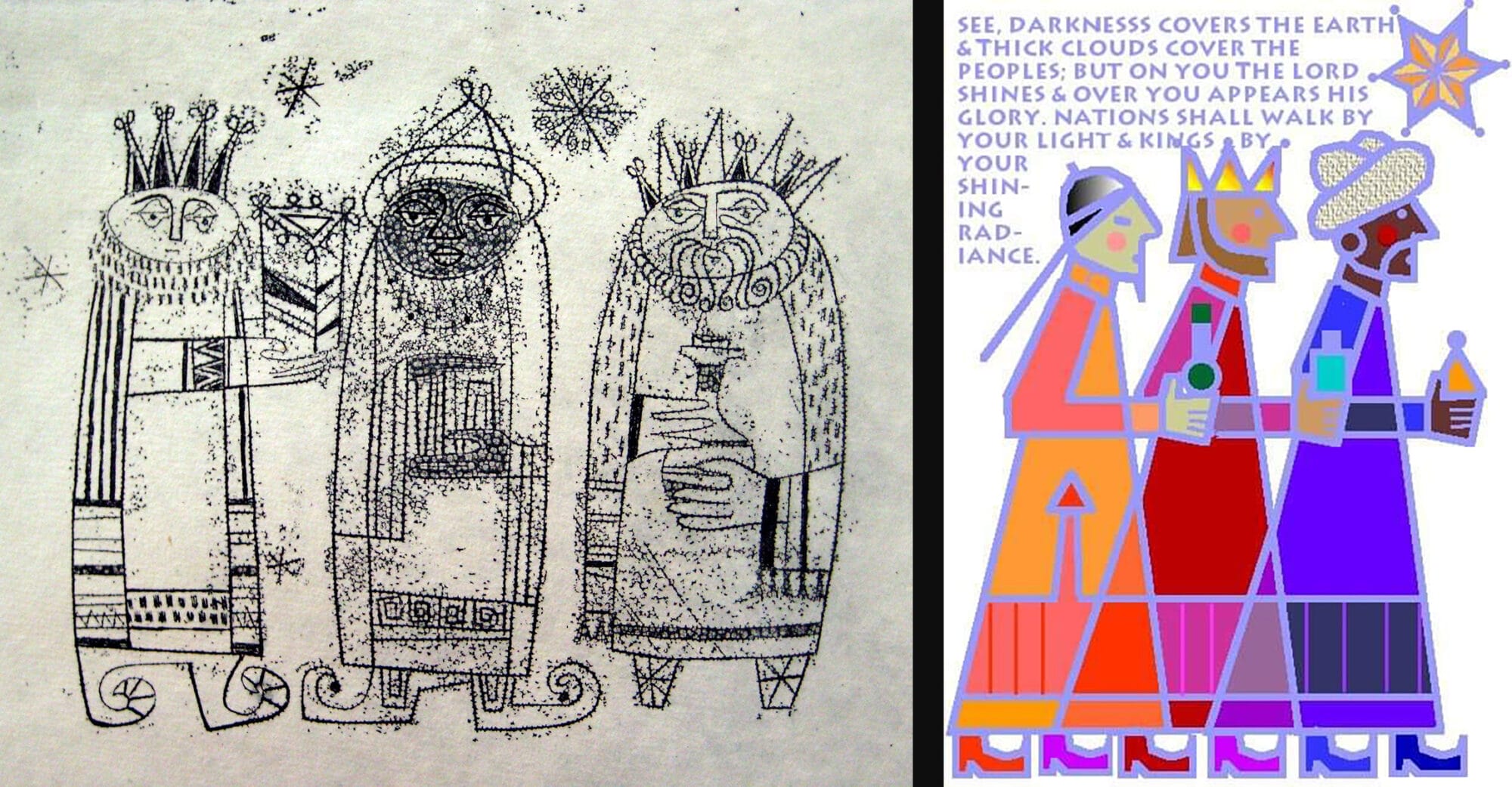
The Three Wise Men by Gertrud Nelson. Print VS Computer Design
Many people view art as mere decoration and some works of art are created purely to please the eye with painterly effects. These works sometimes may win viewers prizes, but it’s a specific type of success. Finding the right balance between content and form is challenging, yet it’s something we all can evaluate on our own, according to our personal visual experience and taste. My point is that when an image entices us to admire its craftsmanship alone, it risks losing its message. I guess now it’s cinematography that took the role of art which once used to be a meaningful means of communication.
In my own work for many years, I was trying to use various techniques to create images that function on multiple levels, striving to make my icons consist of shapes with varying levels of transparency and tonal richness. However, despite this effort, something always felt missing. Even when I learned to execute the technical aspects almost perfectly, the result never felt quite right.
Then we moved to Georgia, and I had the privilege of working with two older artists in Georgia. It was challenging, but their way of thinking and their value system completely transformed my understanding of iconography (and art in general). I had never had close contacts with artists like them before, so I cherished this opportunity to learn, even though some of their principles seemed contrary to my previous beliefs.
At the end, I can testify this: what I learned from Dato Sulakauri and Alexander Kornoukhov resembles the principles followed by our medieval predecessors and what I see in their work aligns closely with the images in my folder titled “Medieval.” But what is this “secret knowledge” or skill they possess? Is it something anyone can attain, or is it a token held by a select group, something you either have or don’t?
I hope this introduction served as a good preface, but now it’s time to speak directly. The first thing I noticed was that both artists almost always began their work with the same phrases, using the same keyword as my dad:
“Do you see this? Look, how expressive!” and “This is so expressive, do you see it?”
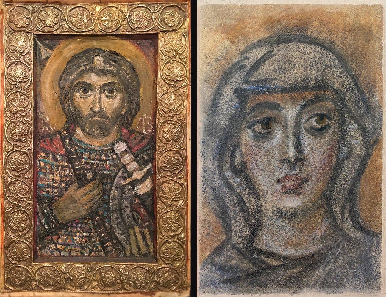
Icon by Dato Siulakauri (LEFT) and an Encaustic image by Alexander Kornoukhov (RIGHT)
It took me weeks to understand what they meant, and it wasn’t a hidden secret at all; rather, it was a different way of seeing.
I used to begin my work—whether on a wall, paper, or any other surface—by seeing the white board as nothing more than a basic backdrop, it’s only value being the light it offered from behind, illuminating the transparent layers of paint I applied.
From Dato and Alexander I learned that since the very beginning we must treasure the visual potential of the background. We should notice its unique character and understand what it invites us to do in order to reveal it. The image should become what the surface suggests, not what our pre-existing ideas tell us to do.
This is why artists like George Kordis (and others) begin their work by creating a transparent “mess” on the surface. I mentioned this process in a newsletter some months ago, but I want to expand on it: we transform an abstracted, blank surface into a visual statement that immediately engages because it is made to engage. These initial brushstrokes establish a meaningful environment, one that can develop into something truly expressive if the artist remains attuned to its evolving beauty.
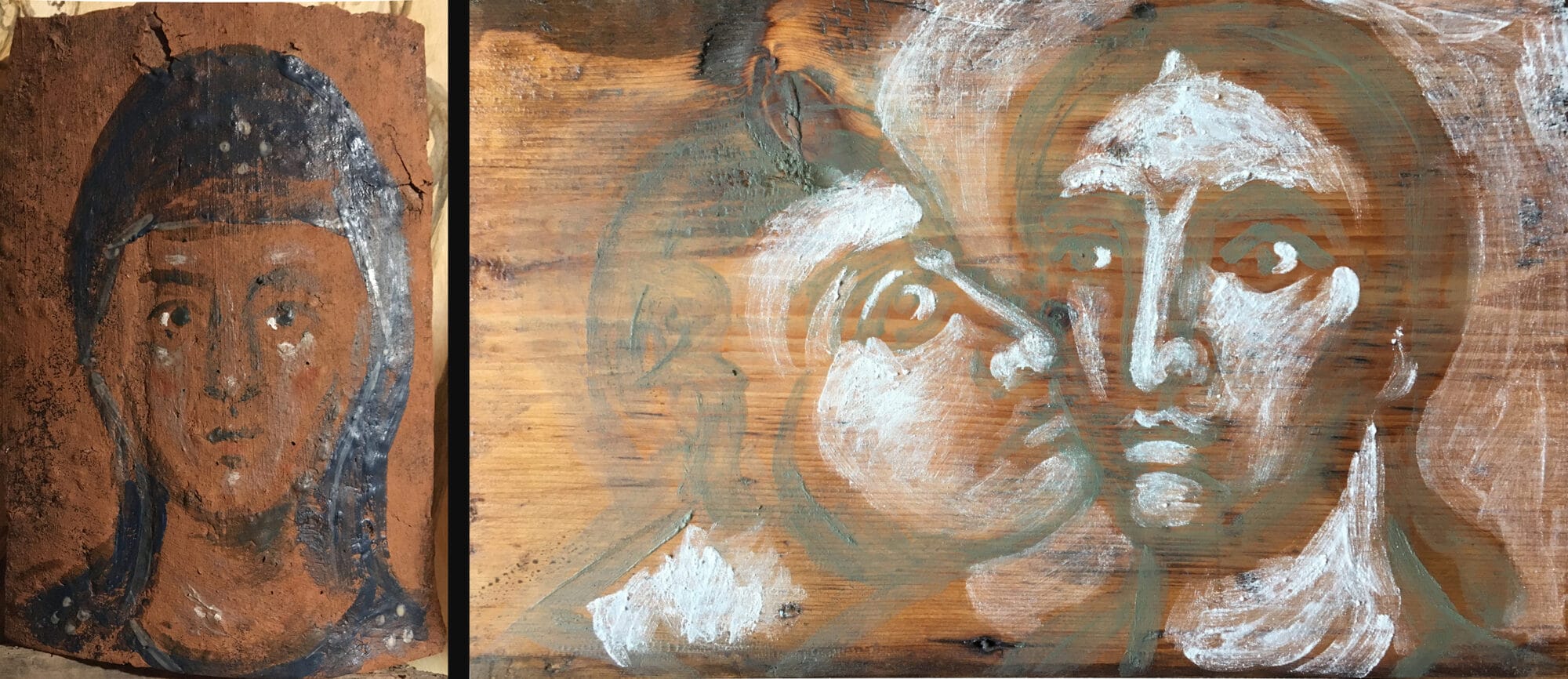
My wife Olga and I enjoy working on old wood, aged ceramic tiles, and other surfaces with natural character. Such surfaces offer a setting that, when treated thoughtfully, can enhance the image. It’s similar to photography: if you take a picture of a friend in front of a white wall, it’s just a picture (though a good one). But if you photograph them against a wall of a special color, texture, or tone—something that resonates with their personality—the image becomes far more powerful. It becomes an artwork, not just a portrait.
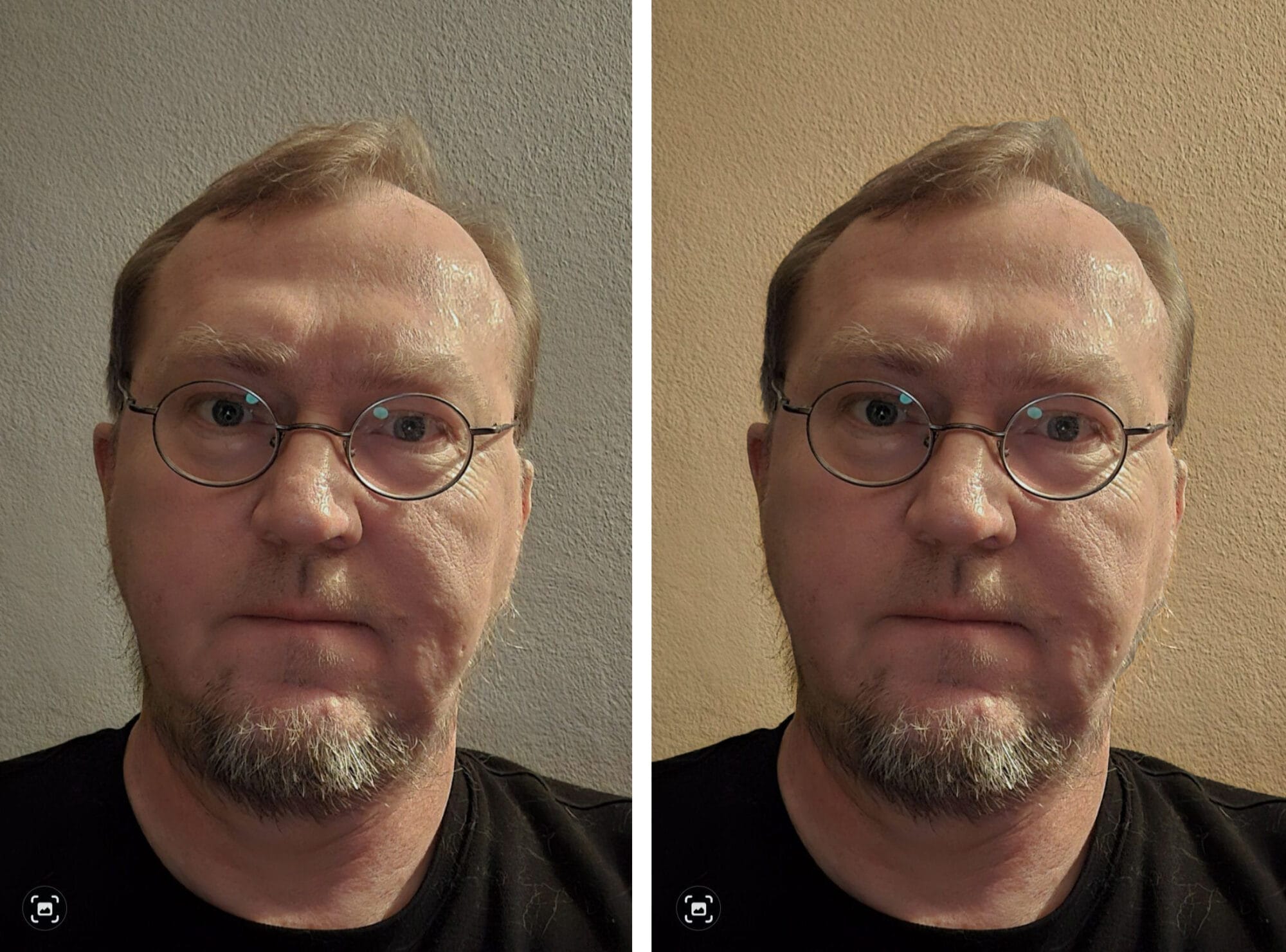
A portrait with a neutral background VS a portrait with a colored background
The challenge arises when we begin to interact with the surface using pencil, brush, or any other tool. Instead of simply following our plans, we must view the surface as already precious and worthy. This makes us consider every stroke, every line, as part of the larger dialogue with the material. Will this action add expression to the existing image, or is it just another mechanical movement we’ve been told to perform at this stage? Does my touch enhance the surface’s inherent beauty, or will it diminish the richness that already exists?
It’s a thrilling, mind-expanding state of mind when you’re constantly reevaluating your image, literally at every moment of the process. Medium starts talking to you and you perform only the actions that align with the image’s current state, building upon what’s already there, “saying” only what is truly worth “saying”. You avoid adding anything simply because it’s what you’ve been taught to do, or because it’s a step in a standard procedure. You stay alert, even from the very first touch, to how each stroke affects the image.
This reminds me of something my father said thirty years ago: “Listen to what the board (wall, paper) wants you to do.”
At the time, I thought it was general advice. Now, I see it as a principle to apply at every moment of work.
Consider even the blank surface in front of you—often white and pristine—as a beautiful piece of art. Treasure its freshness and clarity. Touch it gently and with care (or confidently, if that’s what it calls for). Pay attention to how your brushstroke alters it. Reassess with each action. What you add, what you change, or even what you remove should serve the image’s inherent expressiveness.
Trying to constrain myself applying as little and thoughtful brushstrokes as possible, only where it is really necessary.
I know people who were born with this ability to see. I wasn’t. My path to this vision was long and is still ongoing. But my hope is that my story shows this kind of seeing is a teachable skill.
And now, to the key point: how does humility play a role in iconography?
It’s relevant because, by choosing to work with constant alertness—opposed to following predefined schemes—artists embrace flexibility. They accept what the image suggests, and this allows them to achieve maximum expression, liveliness, and freshness. The image becomes a living dialogue with the viewer, rather than a rigid recitation of learned patterns. This is where humility becomes essential: in seeking to reveal the image in the most expressive and valuable way, not just project one’s own thoughts or desires. This is the method in which artist does not impose their personal vision; instead, they seek what is best and ask God to help them find it.
And when the beholder prays before this icon, the poetry of creative search is transmitted as an inspiring testimony of the authenticity of faith. This is the complete opposite of boredom and longing, which arise when you see that the artist’s main goal was to showcase their technique and how proud they are of it.
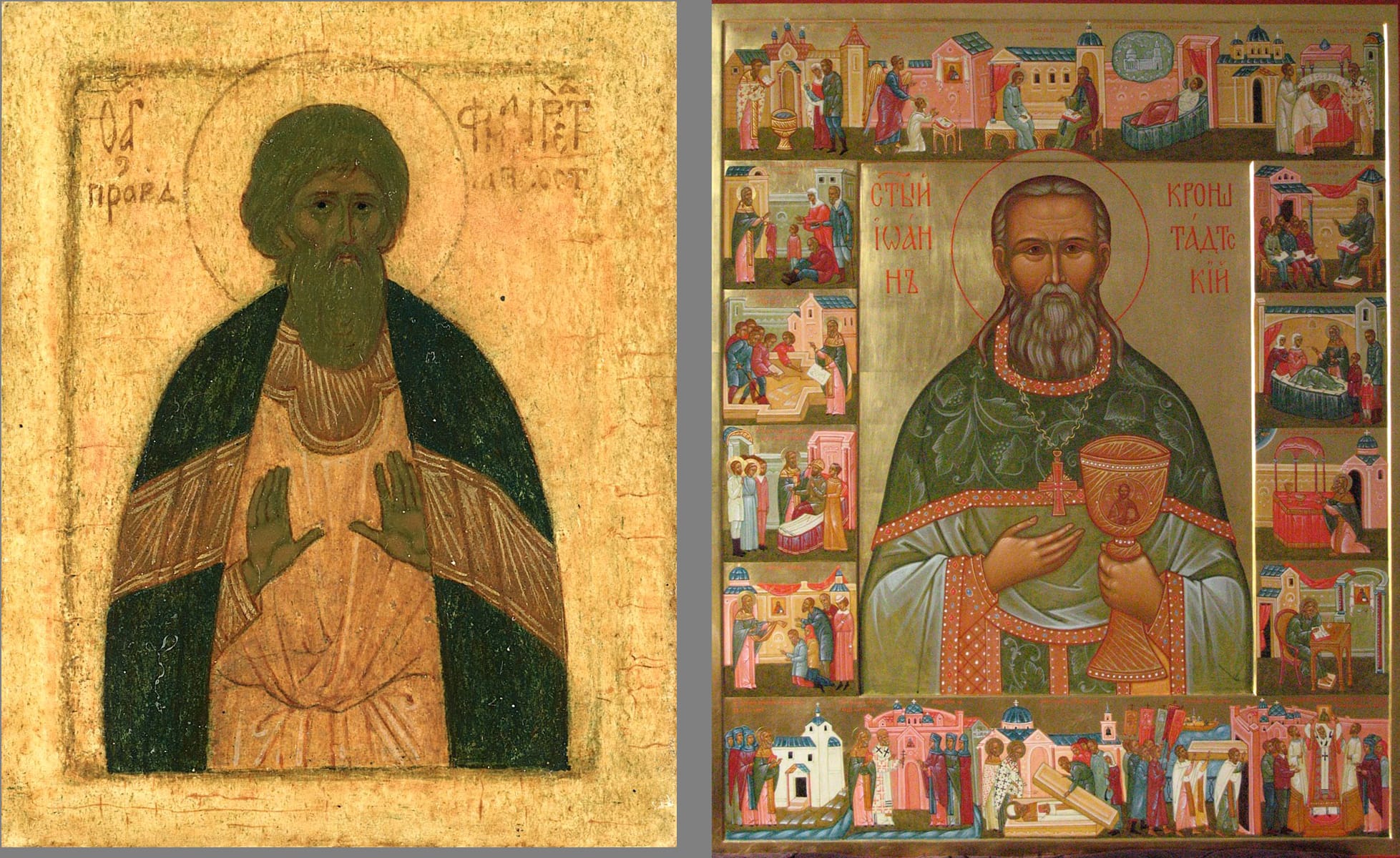
Icon of St Philaret by mother Juliania Sokolova VS an icon of St John of Kronstadt by a student of a school she founded at Moscow Spiritual Academy
Copyright photographs (Creative Commons):
1. Notre Dame de Paris – https://commons.wikimedia.org/wiki/File:Notre-Dame_de_Paris_2009-04-28.jpg
2. Provost church of St. Trinity in Leipzig (1982) – https://www.flickr.com/photos/bwturbex/39174482691/
3. Paul Valery – https://en.wikipedia.org/wiki/Paul_Val%C3%A9ry#/media/File:Paul_Val%C3%A9ry_-_photo_Henri_Manuel.jpg
See the iconography of Philip Davydov and Olga Shalamova at their website here.
If you enjoyed this article, please use the PayPal button below to donate to support the work of the Orthodox Arts Journal. The costs to maintain the website are considerable.
Thank you, Philip! Very deep and very helpful!
You are very welcome! 🙂
Thank you Philip for this wisdom. Every sentence is exactly what I need to hear. I will go to work tomorrow and try to bring this inspiration with me.
Dear Seraphim,
Please, share your experience, – I am thrilled to hear in what you will apply this inspiration :).
Thank you so much for this, very inspiring!
Thank you, Sister Gabriela!,
I will look forward to hearing about your experience then. May God help you on your journey!
Thank you so much for sharing your struggles and enlightenment. I am a Roman Catholic, working on a portrait (not quite an icon, but a sacred image) of Blessed Carlo Acutis, and I do experience this back and forth with the image – though at times I resist its guidance. Your emphasis on humility reaches the heart of the matter. God bless you and your beautiful work!
Thank you, Eileen,
With portraits it’s just another world, similar to iconography, but much wider. Thank you for your kind words!