Similar Posts
What are we aiming to achieve when we choose lighting for an Orthodox church? We need a certain amount of light to see, but lighting also creates an ambience, helps to create an inner state. So what ambience are we seeking to create in our churches? These and other questions face parishes and monasteries when they grapple with what electric lighting to install – if indeed any at all, for so often ‘less is more’.
If we are not asking the essential question about what atmosphere we are trying to create then we need to be. The lighting required for a boardroom, a library, or a sitting room at home will be different from that in a church. If a church community is not clear in its own mind what end result is required, then the lighting designer whom they employ is likely to opt for the default setting of a secular public building. And this is likely to mean lots of light – too much for an Orthodox church which traditionally has fairly low light levels.
This article attempts to outline some of the principles of lighting for Orthodox churches. Each church is different, requiring its unique solution, but there are surely timeless principles which, like icon painting, should inform and set the parameters for each task at hand. Of course many of the principles outlined here will also be relevant to church buildings of other traditions. However, as we shall see, the emphasis that Orthodoxy places on icons does create particular lighting requirements.
This article was prompted by a recent visit to a large Orthodox cathedral. They had commissioned an experienced company to design and install new lighting as part of a major restoration programme. The results would have been impressive if it were a secular building: all the architectural details of the listed building were splendidly illuminated. But this was a place of worship and not a secular building. The bishop and parish felt that there was too much light. They wanted help to find a solution.
To find a solution for the cathedral’s dilemma I realized that we needed to start with first principles: What function does lighting serve in a church, both artificial and natural? The lighting consultants, for all their expertise in lighting secular buildings, had an unclear idea of the special requirements of an Orthodox liturgical space. And the cathedral committee did not themselves have a clear idea in their own minds in order to brief the designer fully and clearly.
It is difficult to get lighting wrong when a church is lit entirely by oil lamps, candles and a little of nature’s sun.
But things get more complicated when we introduce electrical lighting – it becomes more difficult to get it right. We can do so much more with electrics, and can therefore get things so much more wrong. The strength of electrical lights is also their potential weakness. In order to handle this new medium wisely it is essential that we understand the liturgics of light, know what spiritual function light plays in the liturgy. Having understood this, we then need to ensure that all lighting is subservient to this aim.
THE LITURGICS OF LIGHT
Light and faces
On entering Orthodox churches we are made aware through the many icons that first and foremost we are in the presence of Christ and His saints and angels. It is a personal space. The Church is ultimately a community of persons and not a building. Light should therefore be concentrated on the icons, particularly their faces.
Where a secular public building will usually need to be lit evenly all over, and perhaps emphasise interesting architectural details, an Orthodox church emphasises the icons of the saints. Its light should illuminate the personal rather than the abstract.
In a fully frescoed or mosaic covered church the interior surfaces of the building are the ground for icons of the saints. It is these saints rather than the architecture itself which is the primary subject of lighting.
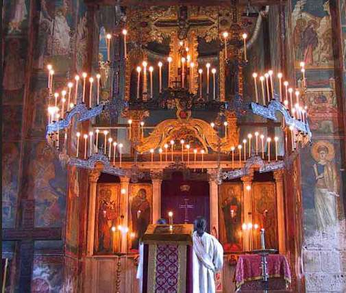
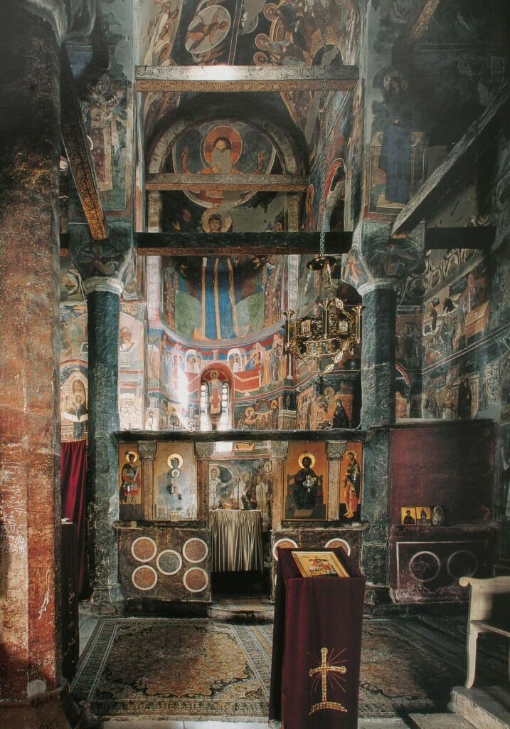
Decani monastery, 14th century, Serbia, showing the emphasis that traditional lighting places on the icons.
The church building can be considered a garment for the worshiping Church, its floor plan enabling the liturgy and its interior surfaces creating a rich array of surfaces for the imagery: the dome for the Pantocrator, the drum for the angels and prophets, the womb-like apse for depictions of the Mother of God and Christ, the pendentives for the four evangelists, and so on.
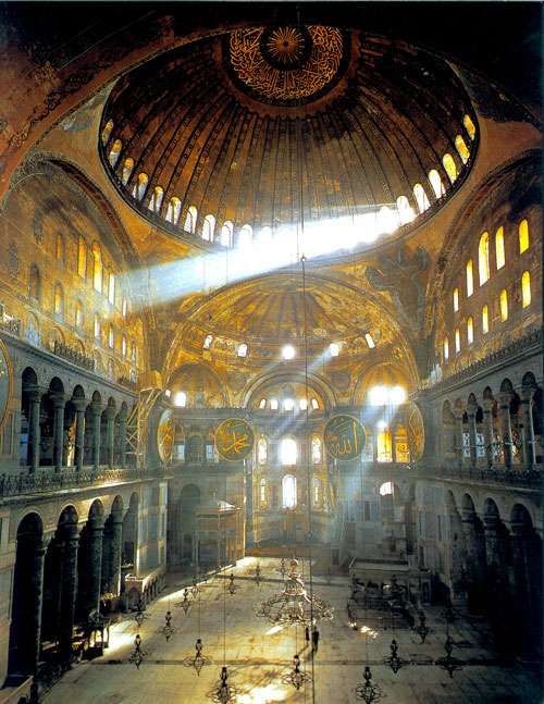
This is not to say that the temple building, distinct from any images it might bear, should not itself be an image of divine realities. Appropriately designed spaces sensitively lit can of themselves create an atmosphere of stillness and prayer. Indeed, the great church of Agia Sophia has relatively few images in the nave – originally it had even fewer – yet it is indisputably an image of heaven on earth.
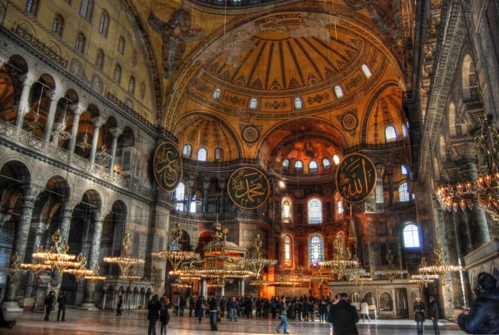
Agia Sophia, Constantinople. Interior, showing the effect of carefully chosen windows and geometric forms.
However, the usual ideal Orthodox church combines appropriate architectural forms with iconography, all supported by sublime lighting.
Emphasis on the holy images happens naturally where the only sources of artificial light are oil lamps hanging in front of the icons. The feeble light given off by the wicks is just enough to illuminate the saints’ faces, and not a lot more. This weakness of oil lamps and candles is precisely their strength. They light just the icon and do not flood the area around.
A logical corollary of this local lighting is that if the church is filled with light – whether artificial or natural – then there is no room left to emphasise the icons. This leads us to the second point: darkness.
Darkness and compunction
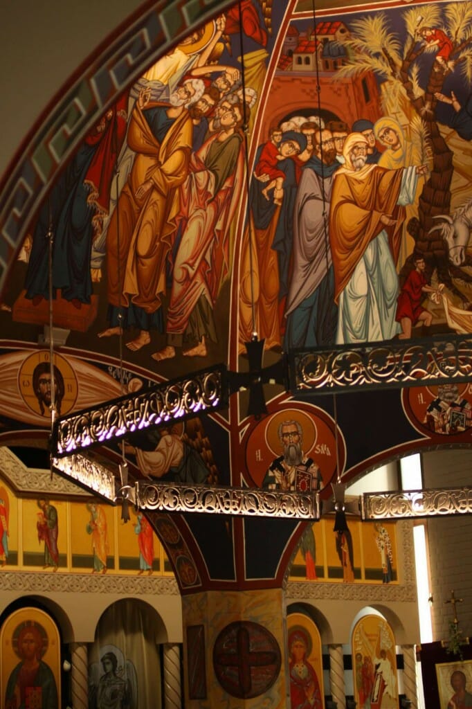
Life in Christ is not so much an ecstasy – a going out and away from oneself – but an instasy, a meeting of the kingdom of God within. Churches should not therefore be afraid of low lighting. Apart from allowing lamps to concentrate light on the saints’ icons and the altar, a mellow level of ambient lighting helps create quietness of soul, a state of compunction and inner attention.
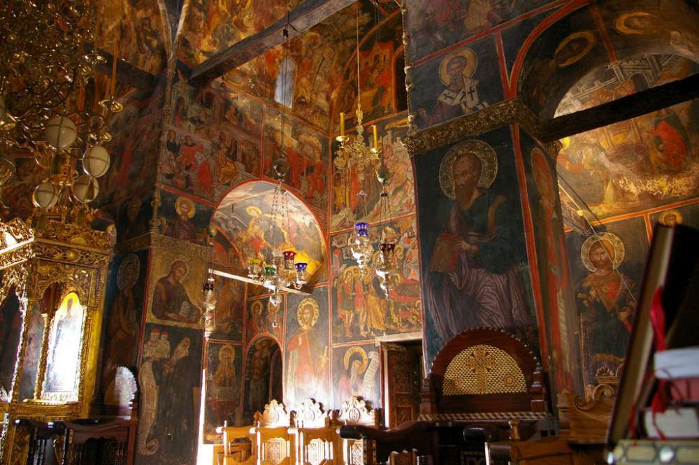
Barlaam Monastery, Meteora, Greece, showing the atmosphere created by a low ambient lighting. Photo by Andrea Kirkby
Our modern age bombards us with visual and audio information. Its advertising pesters us to look outside of our hearts and seek contentment it accruing more possessions. Of all peoples who have existed throughout history it is surely the modern person who needs most to learn the art of stillness, watchfulness, interiority. Low level lighting plays an important role in creating this inner state.
This sense of mysterious depth is traditionally reinforced by the use of blue -black or dark grey backgrounds in wall paintings, and rich but deep ochres for the figures. One might call this a Persian rug palette. Such a light-absorbent background reduces light reflection (which incidentally is a great help with a church brightly lit by large windows) while the warmer ochres of the drapery make the figures stand forward.
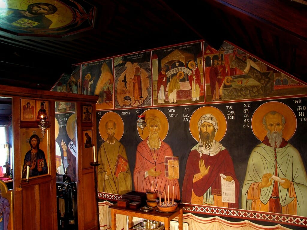
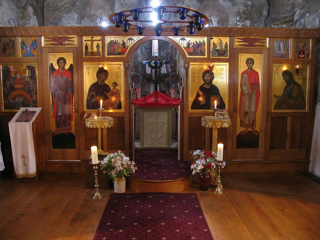
The frescoed chapel of the Monastery of St Anthony and St Cuthbert, U.K., illustrating the quietening effect of a blue/black background.
A place apart
A church interior should give a sense to incomers that this is a special place, a sacred space, not separate from but nevertheless distinct from the world outside. If the lighting inside is as intense as daylight, or is just like a well-lit work place, then we have little reminder that this is a place set side. One can think of low lighting as an evocation of the sepulchre from which the resurrection light breaks forth, or the mouth of a spring from which gushes the water of life to “bring life wherever it flows” (Ezekiel 47:9).
I recall the effect on visitors made by the small frescoed chapel of the Monastery of St Anthony and St Cuthbert in Shropshire, England when I lived there. The hermitage is high up and has breath-taking views, and yet people were invariably moved by the other form of mysterious beauty that they encountered within this small converted barn. Its low lighting, frescoes, wooden mosaic floor, and fragrances of incense and beeswax candles, all set it apart from a normal domestic interior.
From glory to glory
A certain level of darkness also gives time the chance to unfold things gradually. As our eyes adjust to dim light conditions the church can gradually unveil its secrets to us. Metropolitan Kallistos Ware often tells the story of his entering a pitch dark church. He sat down, and as his eyes slowly adjusted he began to see saints frescoed on the surrounding walls. This is like our experience of the fellowship of the saints – at first perhaps a nice idea, but then gradually experienced as reality the more time we spend in prayer.
The two ways of light: manifest and mysterious
While most monasteries will prefer to have darker churches since this is conducive to the inner prayer which they seek to foster, many parishes may well want to have more light, wishing to emphasise the presence of the Holy Spirit as light. They might want a lot of windows, casting beams of light in appropriate places. We could say that the first preference relates to the apophatic way, of saying what God is not, while the second relates to the katophatic way, in which we affirm what is known of God. Both are legitimate.
If a community does wish to have a light-filled church, how does one preserve some sense of mystery and evoke an atmosphere of quietness and prayer?
Many techniques can be used. Windows can be so placed as to transmit light beams at critical times of the day to correspond to key moments of the liturgy. The parish church that I used to go to in New Zealand had one window placed so that, for many days of the year, a bright beam of light would fall across the altar at around the time of the Eucharistic consecration. Windows in the drum which supports the dome usually create this effect.
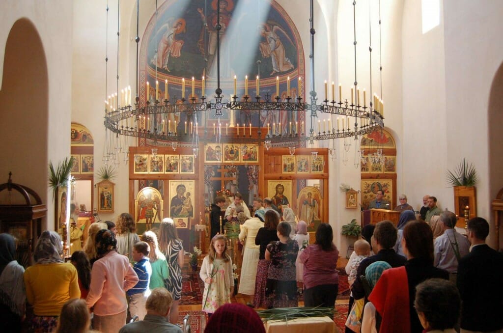
Holy Ascension Church, Charleston, USA, showing the elevating effect of light beams created by rightly placed windows. Photo by Andrew Gould.
The church interior can also be designed to have spaces that are not fully visible from the nave. Even in a brightly lit church some sense of mystery is preserved by this sense of architectural space unfolding itself only gradually. This contrast of single and multifarious space is starkly illustrated by a comparison of the interior of Agia Sophia with the Blue Mosque opposite. The latter, though a clear imitation of Agia Sophia in its exterior, is inside a single space where everything is immediately apparent. All its surfaces are visible.
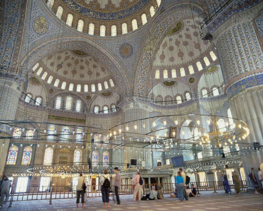
The Blue Mosque, Istanbul, showing how despite its many apsidal recesses all its interior surfaces are visible.
Agia Sophia’s interior by contrast has galleries and aisles and niches whose interiors are only partially visible from the nave.
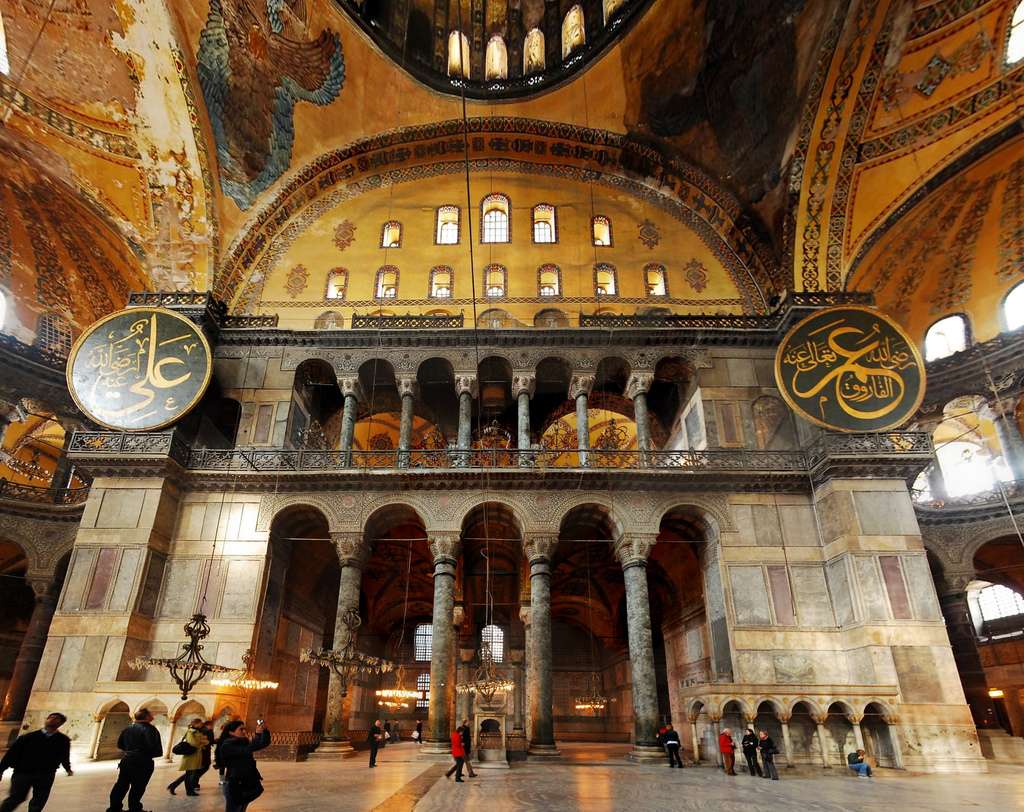
Agia Sophia, showing the sense of mystery created by having many spaces only partially visible from the nave.
A well-lit church can preserve a sense of mystery by playing with contrasts of light and shadow. A complex of curved surfaces and angles will create a choreography of light, a dynamic of unexpected movement. The newly built Russian Orthodox Church of St Mary Magdalene in Madrid exemplifies this. Its well-lit interior is still in its pristine white walled state, and yet the multitudinous curves save it from predictability.
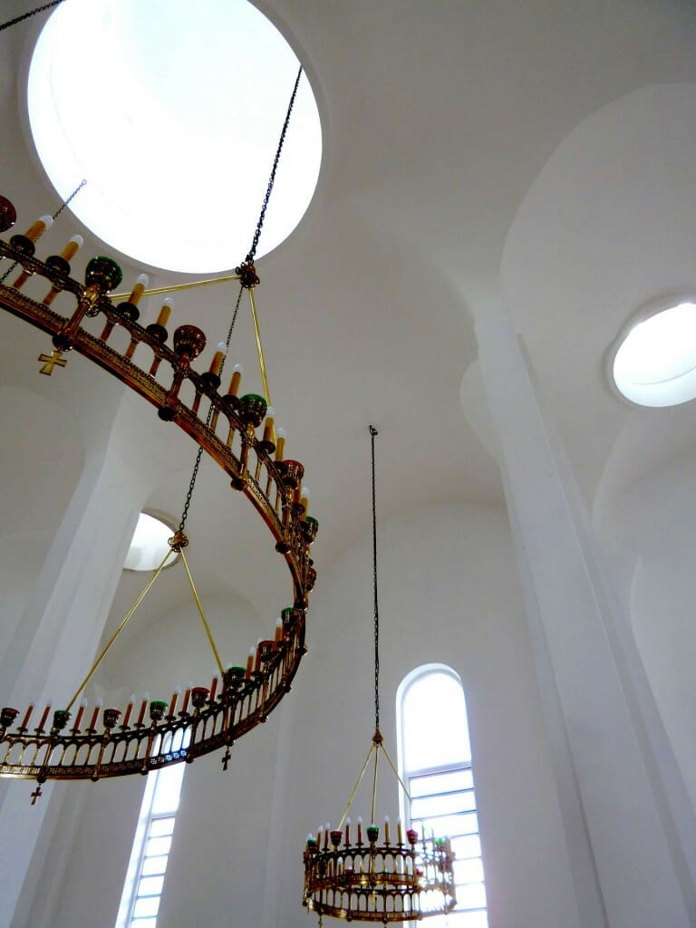
The Russian Orthodox Church of St Mary Magdalene, Madrid, showing how light plays on complex surfaces.
The liturgy of dancing light
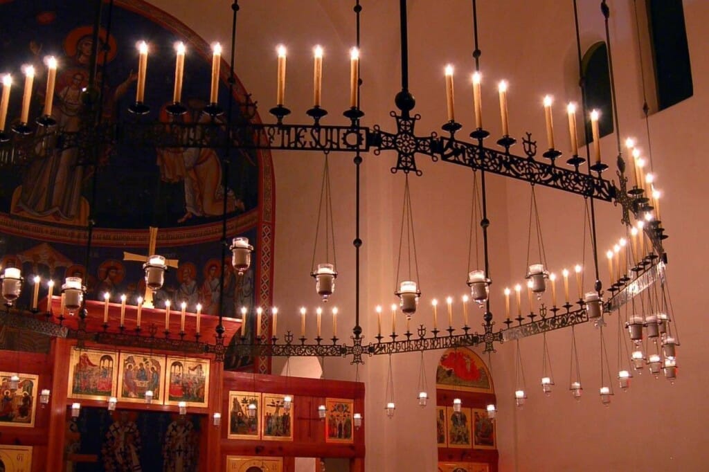
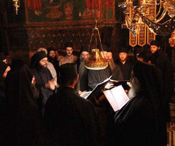
On Mount Athos, where churches have no electrical lighting, the various hanging chandeliers, choroi, and stavroi are lit and swung at key points in festal services, such as at the Praises and the Great Doxology. The choros is supported on eight vertical chains and therefore twists backwards and forwards when swung, whereas the single chained chandelier in the centre is swung in a circular motion, and the stavroi (the crosses) in a straight pendulum arch. At these times one feels that the church is a microcosm, it little stars each dancing their orbits in praise of their Creator and God. You feel the Psalmist’s admonition is being fulfilled: “Praise Him sun and moon, praise Him all you stars and lights” (Psalm 148:3).
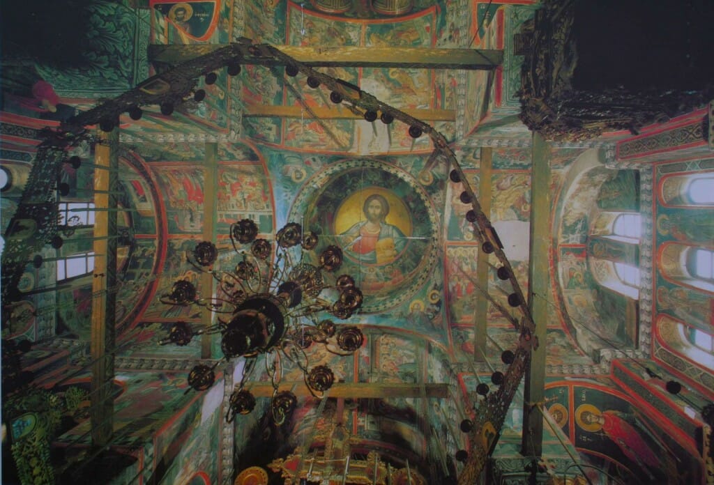
Stavronikita Monastery, Mount Athos, showing the eight sided choros and the single chained chandelier which are swung at key points in the worship.
Light can therefore be dynamic and not static, as is assumed to be the case with most modern lighting which is usually static. So if you are to have any hanging lighting such as a chandelier, ensure it is fixed well enough to take a good swing!
But as well as whole chandeliers moving, on the smaller scale flames themselves flicker and move in response to air currents. Theirs is a living light. This movement of light is enhanced when it is reflected off polished brass and silver, gilded icons and gold mosaics.
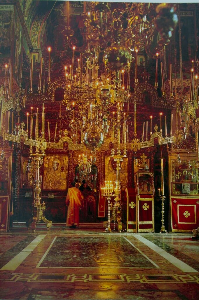
Vatopedi Monastery, Mount Athos, showing how light becomes dynamic when reflected off polished brass and silver and the mosaic floors.
The second century neo-Platonist Plotinus wrote that “beauty is symmetry irradiated by life”. This was interpreted by the Byzantines as symmetry irradiated by light, for light was regarded an image of divine, animating and transfiguring life. But this Byzantine aesthetic of moving rather than static light was ultimately rooted in Trinitarian theology. The uncreated light of divine love is One, but it is also dynamic, moving within the Trinity and moving down to creation. Of course the term moving is a human concept and is ultimately inapplicable to God, who has no need to move from place to place. But the term is applicable inasmuch as it reminds us that God is not a single monad, that God is love because He is Three. Christian beauty is therefore rooted in relationship rather than an abstract and static ideal. And this can be reflected in church lighting.
The colour of light
Anyone who takes photographs will know that light has colour. You can adjust the white balance on cameras to cater for the colour shift of a cloudy day, or for tungsten light, shade, and so on. The light from an oil lamp or wax candle is warm. So if you are to have electrical lighting try to find a bulb type which gives a warm light. LED’s are available which give a specific range of light. The best is an adjustable combination of warm white and cool white (WW/CW) so that you can install the lights and then fine tune their colour balance in situ.
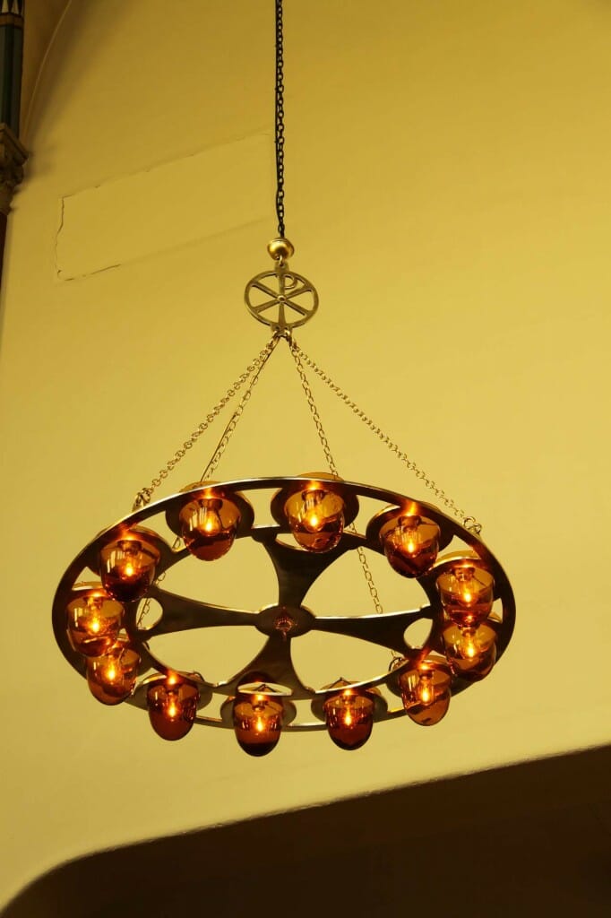
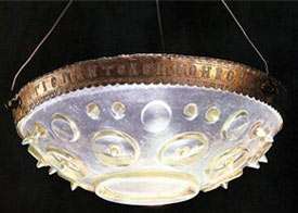
One can also control colour through a careful choice of tinted glass for any bowls you might use for lights. These can be bought, or if necessary one can commission hand-made bowls. I did this with sixteen brass chandeliers commissioned by St Nicholas Russian Orthodox Church, Amsterdam. I had the glass bowls hand blown in India in a honey colour. As long as the dimmable lights are not turned up too high, these chandeliers create a gentle warm light to mitigate the otherwise stark white walls.
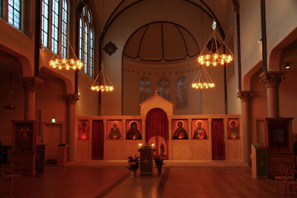
St Nicholas Russian Orthodox Church, Amsterdam, showing the effect of the coloured glass bowls on the lighting.
Windows
The domed Byzantine church typically has much of its light come from above, through windows in the drum which supports the dome. The windows and the visible exterior are themselves not therefore the emphasis but rather the light that enters the temple through them. Indeed, often one can hardly see the windows at all because of the acute angle of view from below. A classical example of this use of light is Moni Chora, Constantinople.
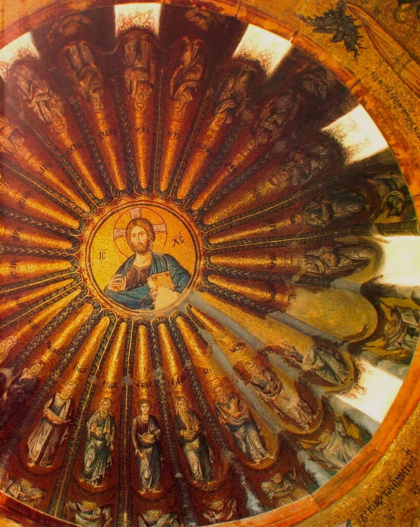
Moni Chora, Constantinople, showing the recessed windows in the dome’s drum, which admit light without the windows themselves being very visible.
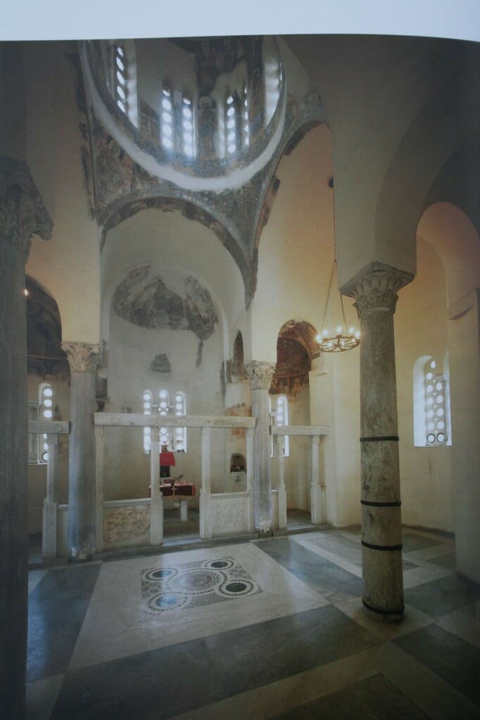
When glass windows do exist low down in medieval churches, these tend to consist of holes cut into stone slabs. This may have been simply because medieval technology could manufacture only small sheets of glass, but it had the fortunate effect – whether intended or otherwise we will not know – that it limited the amount of light transmitted.
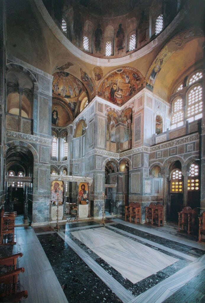
Osios Loukas 11th century, showing the use of perforated marble sheets to control the amount of light entering.
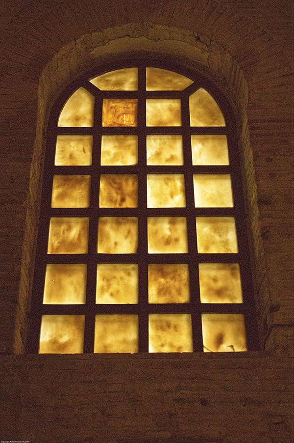
Instead of this system, sometimes sheets of semi-transparent stone were used, most commonly alabaster or sometimes thin marble. Again, this transmitted gentle amounts of light.
Agia Sophia and its lighting
Agia Sophia is unique, and perhaps unrepeatable. Nevertheless its design illustrates some universal principles of lighting that are applicable to all churches, no matter how humble in comparison.
The architects (or to use the Byzantine term mechanikoi – engineers) of Agia Sophia were Anthemius of Tralles and Isidore of Miletus. They were not so much architects as geometricians, specialists in mathematics and optics. Anthemius, as chief mechanikos, placed the windows very carefully to give the maximum theatrical effect.
Clear glass was used for the small windows around the base of the dome, while thin alabaster was used elsewhere to diffuse the light. This alabaster transmitted light without offering distracting outside views.
A central tenet of Byzantine architecture is a union of symmetry and movement, for movement suggests life. We have seen that the Byzantines understood beauty as symmetry animated by light, for light is an image of divine, animating and transfiguring life. So, in accordance with this aim, Anthemius and Isidore created in Agia Sophia a space with a multitude of curves and complexities, such as the dome, pendentives, and apsidal domes, and then covered these in many coloured marble slabs and shimmering gold mosaic. (It should be noted here that these mosaic tesserae have little relation with the flat bathroom type mosaic we often see nowadays, for they were angled to gain the maximum play and reflection of light.) On the one hand the central dome of Agia Sophia creates a sense of stillness, of God being within. On the other hand the multitude of curved forms and the play of reflected light create movement, drawing one’s eyes here and there. Anthemius’ and Isidore’s expertise in geodesy – the measurement of surface area and volume – was united to katoptika, the relationship of seeing eye and seen object.
Reflected light
We have talked above about light sources. Here I cannot help but say something more about reflected light since I am currently making a large mosaic. The medieval mosaicists who made masterpieces such as we find in Ravenna and in the apse of St Catherine’s in Sinai angled their gold tesserae to gain the maximum refection and play of light. The gold tesserae high up in the triumphal arch in St Catherine’s, for example, are tilted an astounding 45 degrees to the vertical.
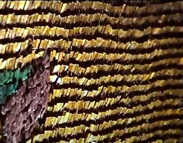
Close up of tesserae viewed from above in the triumphal arch in St Catherine’s Sinai, showing how they are angled downwards at 45 degrees for maximum light reflection.
Certainly absent is the flat set mosaics that we so often find created for churches in our own times.
Apart from mosaics, we have the reflective surfaces of polished brass and silver lamps, and the burnished gold backgrounds and haloes on the icons. They too emphasise the movement of light as flames flicker or the chandeliers are swung. While an icon’s burnished gold background might seem like bling in a brightly lit home or church, in a dimly lit church with oil lamps and candles it is a source of reflected light. And the gold frames the saints, drawing our attention to their faces.
Light and intimacy
A tall building can be made more intimate through relatively low hanging choroi or chandeliers which create a psychological second and lower ceiling. I used this technique in the Russian Orthodox church of St Nicholas in Amsterdam.
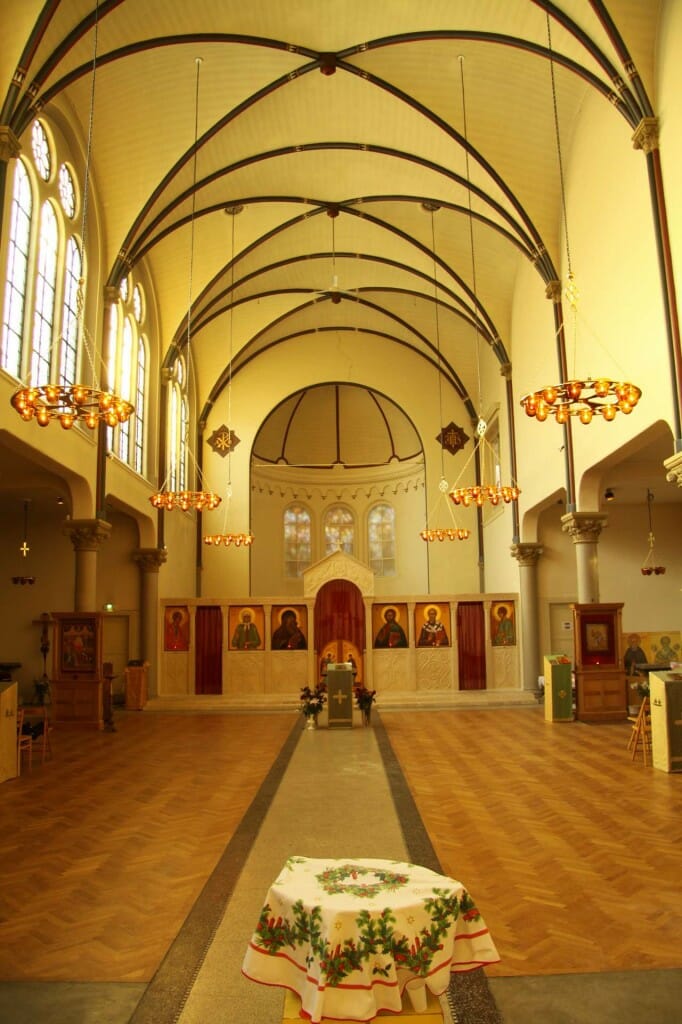
St Nicholas Russian Orthodox Church, Amsterdam, showing how chandeliers can be used to lower the ceiling and so create a more intimate space in an otherwise tall building.
We made six large brass lamps for the nave and ten smaller for the aisles. Apart from supplying light, they made more intimate the otherwise quite large and white space of the basilica. A large single choros has the same effect.
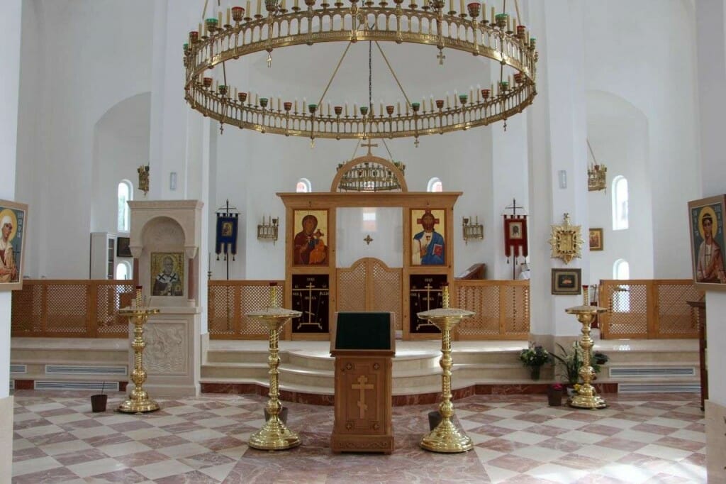
The Russian Orthodox Church of St Mary Magdalene, Madrid, showing how a choros can create a ‘second ceiling’.
Harmonizing with the church
Liturgical worship is a symphony in which each element plays its unique part in a single hymn of praise, each harmonizing with the whole and with its fellow players. So the lighting must suit the particular church, for the church building is itself an icon, one member of the divine-human choir.
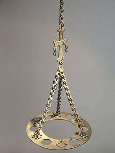
This principle applies not only to the placing and the volume of lighting but also to the design of the hardware, such as the chandeliers, lampartki, and candle stands. If the architecture is of a simple design then a highly ornate chandelier will probably look out of place. One probably wants to add warmth and some detail to a plain white interior, but also keep in mind that beauty is not normally, or even usually, synonymous with accumulated decoration. Elegant and timeless design is better than Baroque superfluity. I have found medieval Byzantine metal ware a good starting point for inspiration. Ideas can be found from their single oil lamps right through to their most complex choroi. The two illustrated silver lamp I made for Iviron monastery was inspired by an 11th century Byzantine lamp, and the brass lamp by another Byzantine bronze work.
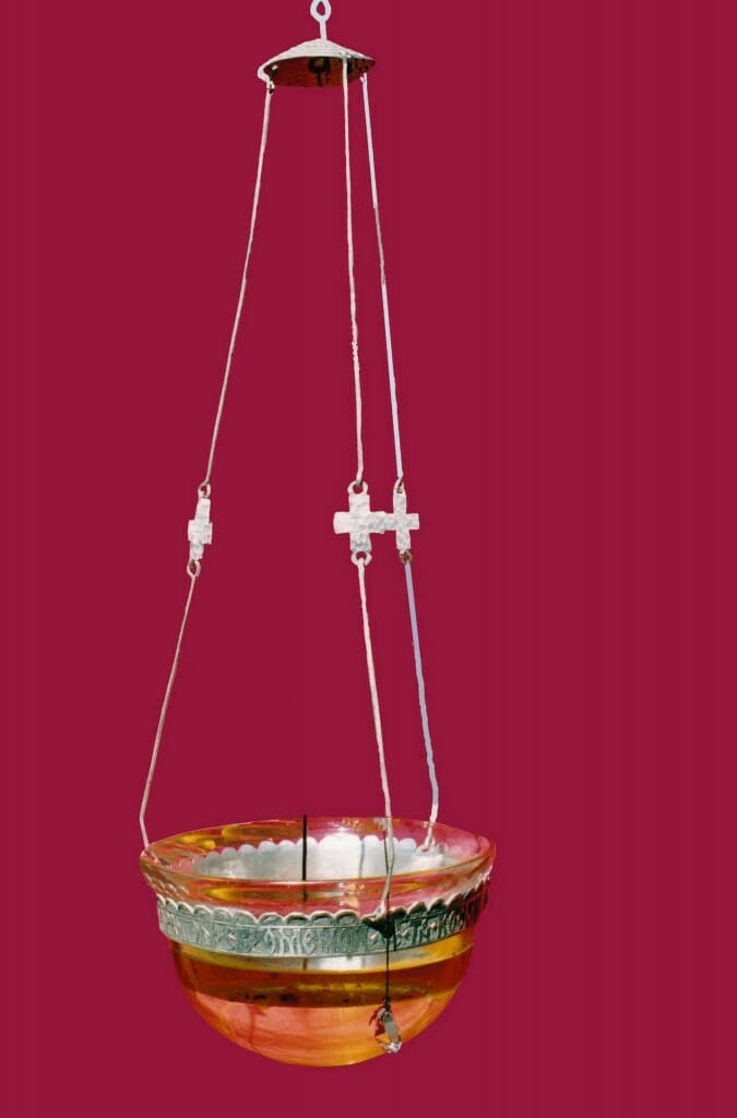
Contemporary silver lamp, Iviron monastery, Mount Athos, made by the author. The design was inspired by the illustrated Byzantine lamp.
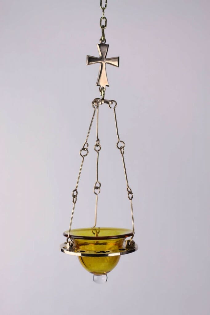
Contemporary brass oil lamp for private chapel, USA, made by the author, with hand blown tinted glass bowl. Design inspired by the illustrated Byzantine bronze lamp.
The Dumbarton Oaks collection in Washington offers many other splendid examples of Byzantine metal ware.
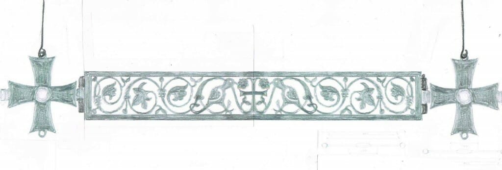
Look around the church for decorative ideas that could be incorporated into the hardware – a capital from the columns for example, or a detail of some stone or wood carving. You might also draw inspiration from medieval patterns – Anglo Saxon, Celtic or Romanesque for example. I have recently made a choros for an Orthodox church in Belgium, and got ideas from early Belgian and Celtic art for the cut-out motifs on the sides.
When looking for lighting hardware, do not assume that the only source is a church furnisher’s catalogue. Most off-the-shelf liturgical furnishings are of poor design, to say the least. They might be called Byzantine, but in fact these usually have more in common with the Baroque taste for superfluous ornamentation. Consider getting something made. The better designs are often simpler and therefore cheaper to make. Costs can be surprisingly competitive, in part because there are no middlemen, and often the better designs are elegant in their simplicity, not depending on excessive and expensive ornamentation. The choros illustrated above is an example in point. This work is 13 feet/4 metres across and cost under $9,000 US, whereas a smaller florid pseudo-Byzantine work (63″/1.60 meters diameter) sells for around $15,000. As long as the design is good, modern manufacturing technologies can be used to help produce bespoke work and so keep the costs down. I had the filigree sides of the Belgium choros cut by laser, the crosses sand cast in aluminium, and everything painted by the very resilient powder coating system.
As well as considering bespoke works, look around antique shops or on eBay. There are for example some wonderful handmade lamps made in India that would not look at all out of place in an Orthodox church.
Spotlighting and shadows
Whenever spotlights are used there is a danger of unwanted shadows, whether from people in front of the icon or from architectural detail. This problem can be mitigated to some extent by placing spots at opposite places so that one cancels the shadows created by the other, or by placing them high enough so that people and objects do not fall within the light cone. Spots must also be placed so that when people are looking away from the illuminated object they are not facing the glare of the bulb. As always, less is more: if you are going to use spots, keep them gentle and soft.
On imitating traditional lighting
There is now available a wide range of electric bulbs which seek to imitate candles, some even flickering. The option is therefore open to have traditional chandeliers but with these imitation candles. What route to go?
There are arguments for and against, and I think both are valid. Those for their use say that, among other things, the electrical candle bulb avoids the problem of candle smoke covering wall paintings and icons, are cheaper to run, and more convenient – there is no time-consuming fuss trimming and lighting lamps before each service. Designed sensitively, using the bulbs of the right lumens and appropriate shape, these chandeliers work wonderfully. The choros by Andrew Gould at Holy Ascension Church, Charleston, USA is a splendid case in point.
See his article here.
These who prefer to shun electric candles argue that it is better to be authentic and not imitate: let electric be electric and don’t pretend it is otherwise. The choros for Belgium mentioned above is a case in point. The original idea was to have electric candles above and hanging glass bowls with small LED lights inside to look like oil lamp flames. The design of the metalwork was agreed, but then some parishioners suggested omitting the imitation candles and oil lamps and use instead LED strips concealed inside a lip around the inside bottom edge of the choros. This is the option we have gone for.
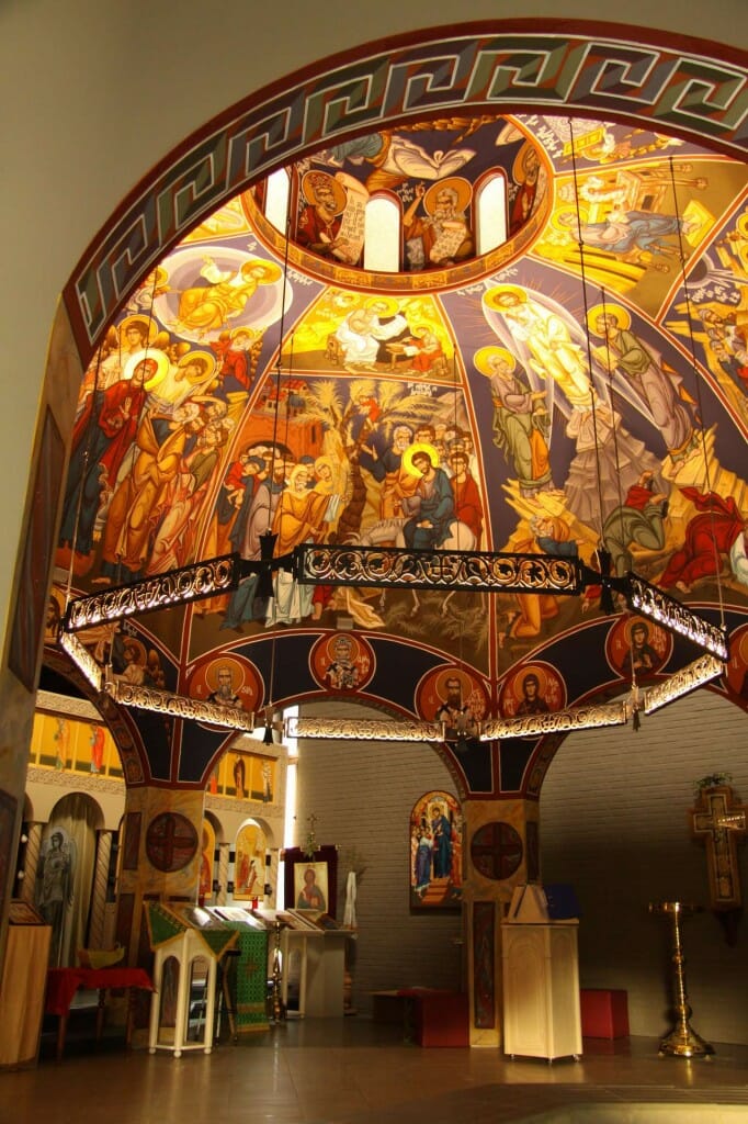
Choros by the author, in St Amandus church, Belgium. 32. Detail showing the concealed LED strip lighting.
Do not automatically assume that your church needs electrical lighting at all. It might benefit from it, but it might not. On Mount Athos and in many monasteries they use only beeswax candles and oils lamps. Indeed, my own parish church in Shrewsbury, U.K. has also gone down this route.
Experiment before committing yourself
Lighting can be expensive, so whenever possible experiment and test ideas with real lights before committing yourself. Although a lighting designer will give you detailed plans, this means nothing to most of us: we need to see actual lights shining on the actual objects to see if the proposal creates the effect we want. Experimentation is not often possible for the ambient lighting but can be done for smaller units. For example, if you are wanting to light a number of kivots and their icons, use makeshift lights to experiment with just one kivot, moving the lights around and trying different intensities until you are happy with the results. Only then commission the electrician to wire up for all the kivots.
PRACTICAL CONSIDERATIONS
Although few would not prefer the living light of flickering candles or the pin light of an oil lamp to the factory electric light, most parishes want some electrical lighting. How can we mitigate its tendency to be too bright, glaring and assertive? Here a few pointers.
- Try to place any spots in places where people are not likely to have to look into their glare. Lights illuminating the soleus and the clergy gathered there might not glare the congregation, but can make the clergy facing west feel they are on a stage being blinded by stage lights.
- Wherever possible use LED’s. Although more expensive to buy than tungsten, neon or filament lights, they are much cheaper to run and the bulbs last considerable longer (changing lights high up can be very inconvenient and even costly).
- Although in general imitation should be a last resort, if one is inclined to imitate candles with electrical lights, shop around. There is quite a variety of electrical candles but some are better than others. But think outside the box before assuming an electrical chandelier should imitate all aspects of a traditional candle chandelier. It is possible to make contemporary designs which harmonize with a traditional Orthodox church.
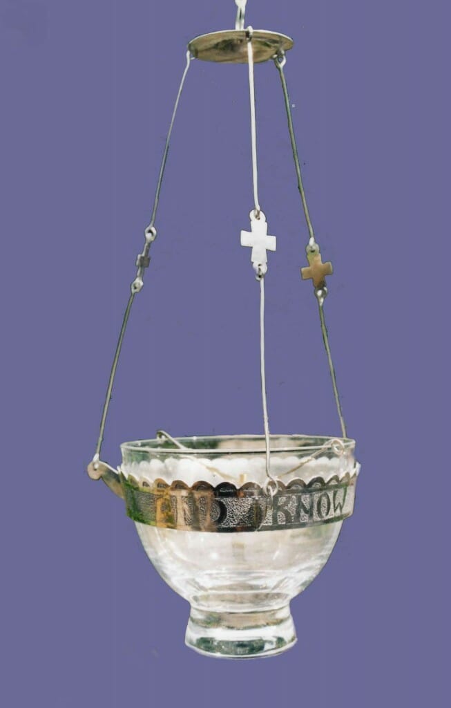
- Oil lamps hanging in front of icons should not obstruct the faces. They are best hung a little above the head. However, this can create a problem with those lamps where the bowl sits atop a metal receptacle since most of their light is thrown upwards and misses the icon’s face. This can be overcome by using a suspended glass bowl which allows the flame’s light to fall downwards as well as up.
- It is common to treat chandeliers and lampartki as mere decoration. Although they give off light, parishes too often regard mounted lights on the walls and ceilings as the serious sources of illumination. But ask first how much lighting is really required to enrich the liturgy. It might be that the chandelier and lampartki create sufficient light of themselves without the expense of complicated lighting circuits. You could save a lot of money and get a better result.
- Before employing a lighting expert the commissioning committee or individual must be as clear as possible in their own minds what effect they want the lighting to create. A professional designer will follow the brief given him or her. But If the commissioners are not clear they are likely to base their recommendations on assumptions applicable to public and commercial buildings but not to churches. They might assume for example that every member of the congregation will need enough light to read, and not understand that there are usually no hymn or service books in Orthodox churches.
- Remember that brightness is comparative. If you want something to stand out more than its surroundings, then consider lowering the surrounding light rather than increasing the spotlight’s strength.
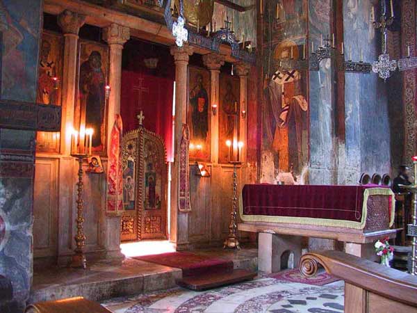
Decani Monastery, Serbia, showing how emphasis can be gained by decreasing ambient light rather than increasing local light.
- When choosing what electrical lighting to add to a church it is a good idea to begin with a tabular rasa – no electrical lights at all – and then gradually add with purpose. Take nothing as given or assumed.
- The choir need light to read the music, but they do not need flood lighting that fills the whole church. The choir director in my parish church made some ingenious – and very cheap – fittings which give directional down lighting onto the music scores but with virtually no light bleeding into the nave. On Mount Athos there are special lights with conical shades which direct light down but not out.
- These lamps are also on a pulley system so that they can be lowered close to the books when required and lifted up and dimmed when not.
- Candles and oil lamps create smoke, which leads in the long term to soot accumulation on icons and wall paintings. It is almost unthinkable to have an Orthodox church without candles for the faithful to light as they enter, so omitting these is not an option. Some churches get around the problem of their sooting up the nave by having the devotional candles in the narthex. It is also possible to install a ventilating hood to transfer the smoke outside. Just make sure that it is well designed aesthetically. However, the disadvantage of having candles in the narthex or back of the church is that the candles are behind the congregation, depriving them of their sight.
- The more difficult question is, in light of the soot created, whether to use oil lamps in front of icons and candles in chandeliers. I think all would agree that, sooting aside, it is best to have living lights in front of icons. The act of preparing and lighting oil lamps is itself a form of prayer. Oil lamps need not give off large amounts of soot if good quality oil is used and the wicks are trimmed properly so that the flame is not overly large. Also, compared to monasteries, parishes have relatively few hours of services a week when the lamps are burning. A good alternative however is to use paraffin wax night lights (small candles in aluminium containers). Paraffin wax burns fairly cleanly, are easy to change, and are not messy.
- Some parishes inherit a church with windows too large, or stained glass windows which they feel conflict with the liturgical space. Some have covered such windows with a semi translucent material – cloth or etched glass for example – in order to reduce light transmission.
- If electrical lights are to be used, whenever possible have dimmable lights. This allows you to fine tune the light intensity. And wire the lights to give as much flexibility as possible, so you can to turn one group off while leaving another on.
Conclusion
Use non-electric sources of light as much as possible: oil lamps, candles, limited sun light from windows. In most cases, a low level of ambient light is best; it helps create an atmosphere of prayer better than brightly lit churches. Avoid lighting hardware which is overly ornate and thereby attracts attention to itself. Arrange things so that the lighting draws attention to the icons, to their faces.

[…] https://orthodoxartsjournal.org/lighting-in-orthodox-churches-liturgical-principles-and-practical… […]
Dear Aidan,
Your article raises several questions for me. Visiting very old churches it has always perplexed me why the iconographers spent so much effort in the frescoes when the church itself would always have been so dimly lit that it was impossible to apprehend the details and qualities of the paintings. Does this dynamic speak of the intricate mysteries of God’s kingdom that we are not privy to? And technically, did they use supplemental light to paint? Also, there seems to be a growing trend for parish walls to be painted with a very light colored background rather than the dark blue/gray you first suggest. My feeling is that light backgrounds are better for contemporary parishes but I have nothing really to found that on yet. Personally I am also curious how it would work for a parish to have an intentionally dark nave with many small children present. I have actually only experienced dark naves at monasteries. Can you or any other readers comment from their own parish experiences? You have hinted at opening up a conversation that I am interested in, namely, do a different set of priorities govern the design of a parish temple vs. a monastery temple, given that a parish will be less inward-focused, i.e. noisy? One last question: I personally don’t like the choros I have witnessed in person very much for use in a parish as it seems to create a kind of no-man’s-land under its circumference on the floor of the nave. It’s an intimidating thing to stand under. If it fell it would slice you! Have you experienced this feeling yourself, and in your view is it good to have this no-man’s land in a parish nave?
You raise very pertinent points. Regarding parish vs. monastic lighting, I think that the choice of church lighting, like preaching, is pastoral. It should be a response to the needs, charisms and aspirations of the people of that particular community. Though not a hard and fast rule, the tendency for monastic communities is certainly to prefer darker interiors since their main charism is intense prayer, a work of the inner heart. While parishioners are also called to “pray without ceasing”, in the words of Saint Paul to the city dwellers of Thessalonika, perhaps their emphasis is more on finding Christ in the hurly-burly of daily life.
Regarding the possible tendency of the choros to demarcate the area beneath as a no-go area, it is a very good point that I hadn’t considered. I will ask the priest of the parish for whom I have just made a large choros if this has been his parish’s experience.
Thank you, Aidan. You have called my attention to a number of things I had not thought of before. And I will read Thessalonians again to try and gain a better understanding.
with your prayers,
baker
I am trying to grow in my appreciation for aesthetics. This article was very helpful. I took the bold step of painting the walls and ceiling in the apse a fairly dark blue in our converted church building while leaving the vaulted ceiling of our nave white. The effect was immediate and moved the space toward a more prayerful ambiance. We especially enjoy using the church for First Hour and evening services during lent when the lumped and offering candles are the primary light.
We are about to move in to a larger existing church building not built as Orthodox space and I will attempt to be more sensitive to the lighting we provide. Thank you again.
Thank you, Father James. Do let me know how things progress with the new church. It is interesting how your present colour scheme has combined the mystery of deep blue in the altar with the manifest glory of a lighter colour in the nave. This corresponds somewhat with what St. Maximus the Confessor teaches, namely that a church building is an image of the human person, the nave (what he calls the Temple) being the body, the sanctuary (what he calls the Holy Place) being the soul, and the Holy Table symbolising the nous. As you know, he says that with the body/nave the Church expresses moral philosophy (moral action), with the soul/sanctuary natural contemplation, and with the nous/alter mystical theology. So the emphasis of the nave is the application of God’s will through a visible life of virtuous action, while the sanctuary emphasises more inner and hidden contemplation. The two together make the fullness of life in Christ. Your colour scheme combines the two perfectly! I tried to do a similar thing but in a slightly different way with a chapel that I frescoed in Greece (see http://aidanharticons.com/sanctuary-agia-skepi-2/). The nave had a greenish background and images of standing saints amidst trees (representing their active life int he world), while the sanctuary had a deep blue.
In Christ, Aidan