
Similar Posts
In preparation for our patronal feast, at the Monastery of St. Dionysios the Areopagite, we ran into the problem of our unfinished, blank iconostasis. What could be done for the occasion in order to make it more presentable? First, as is common, we thought of speedily acquiring temporary icon reproductions to fill in the empty areas. I cringed at the prospect of random, incongruous and out of scale reproductions glued into place. As most readers would know by now, I’m not particularly fond of icon reproductions, but, giving the constraints, I went along with the plan. However, it so happened that the icon reproduction vendor I contacted for the job was not able to meet the deadline requirements. So an idea came to mind. I proposed to our abbot, Archimandrite Maximos, that – although a challenge – I could get preparatory drawings done on time, within a couple of weeks, and install them as temporary icons for the feast. Through the grace of God it all worked out and the drawings were finished in two weeks and a half, just in time for the feast.
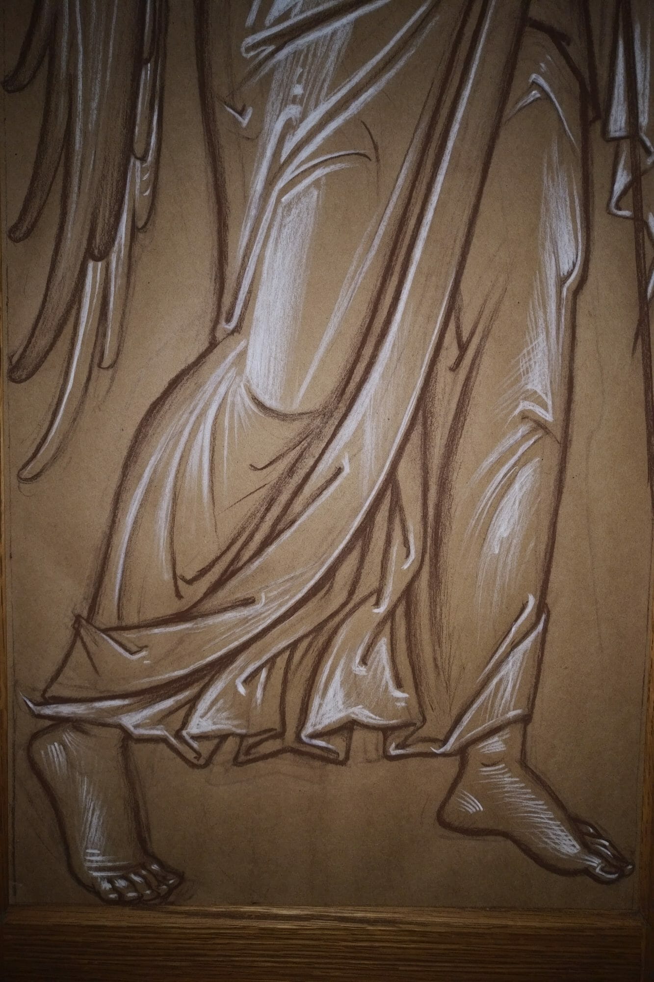
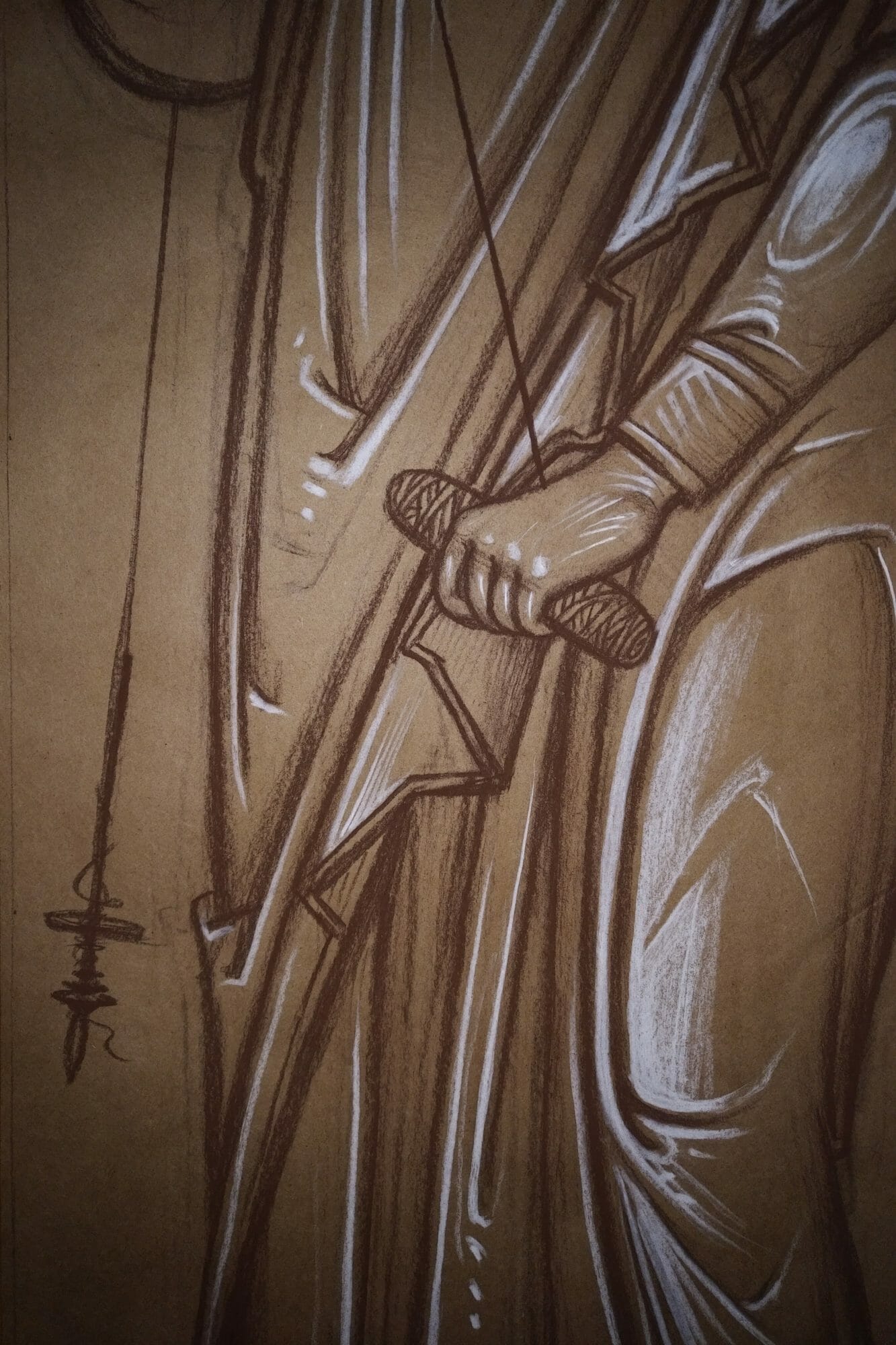
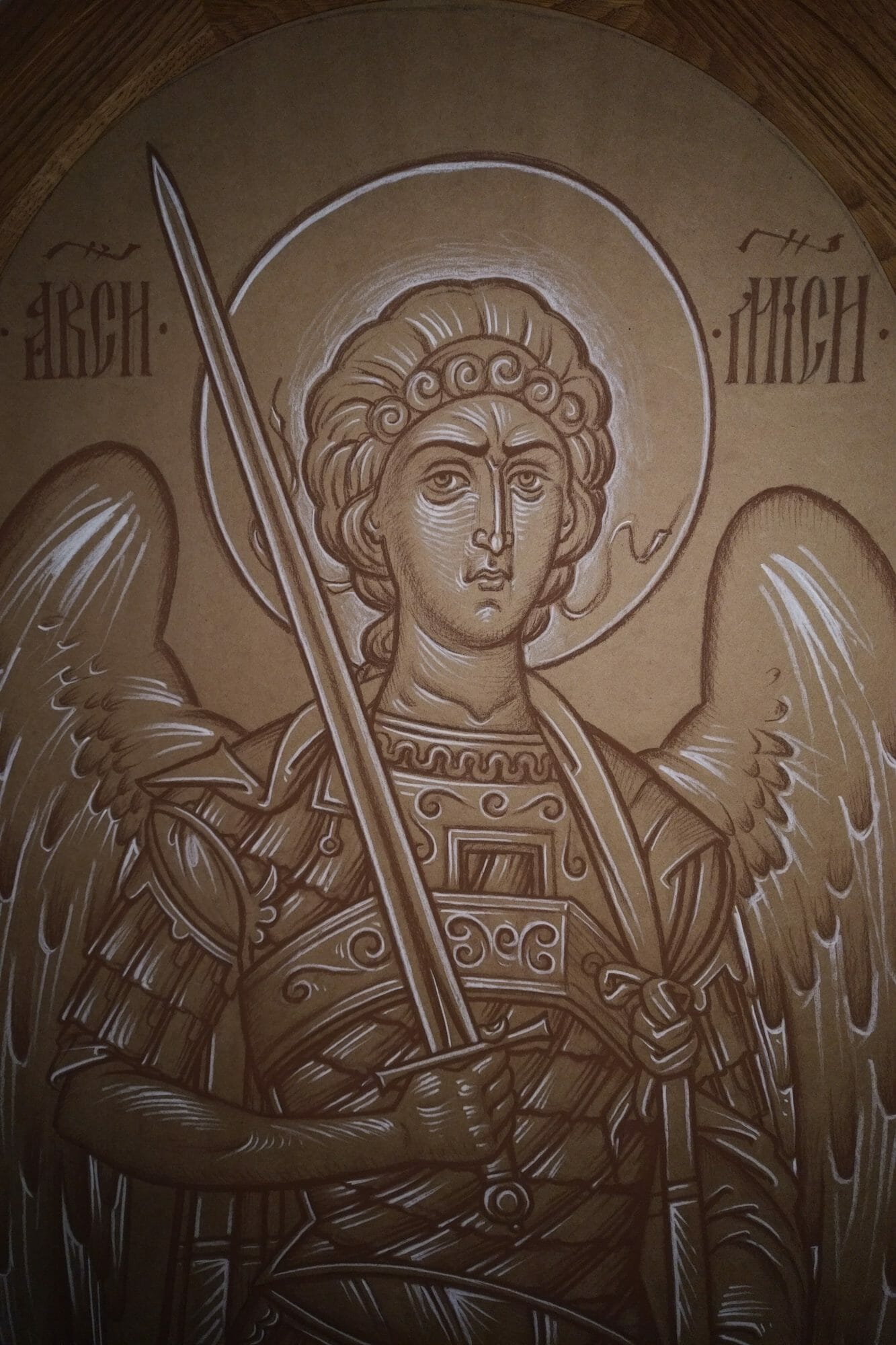
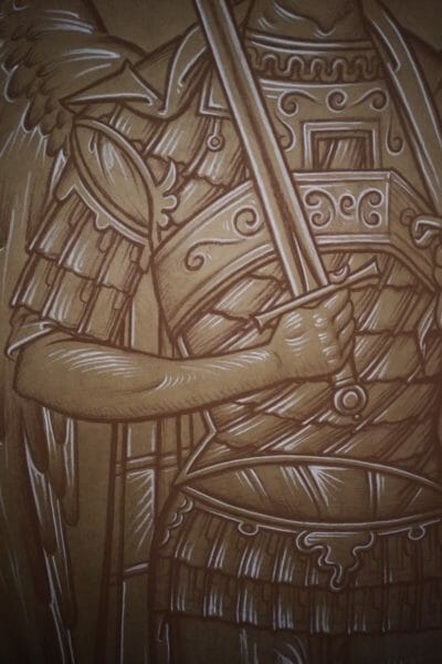
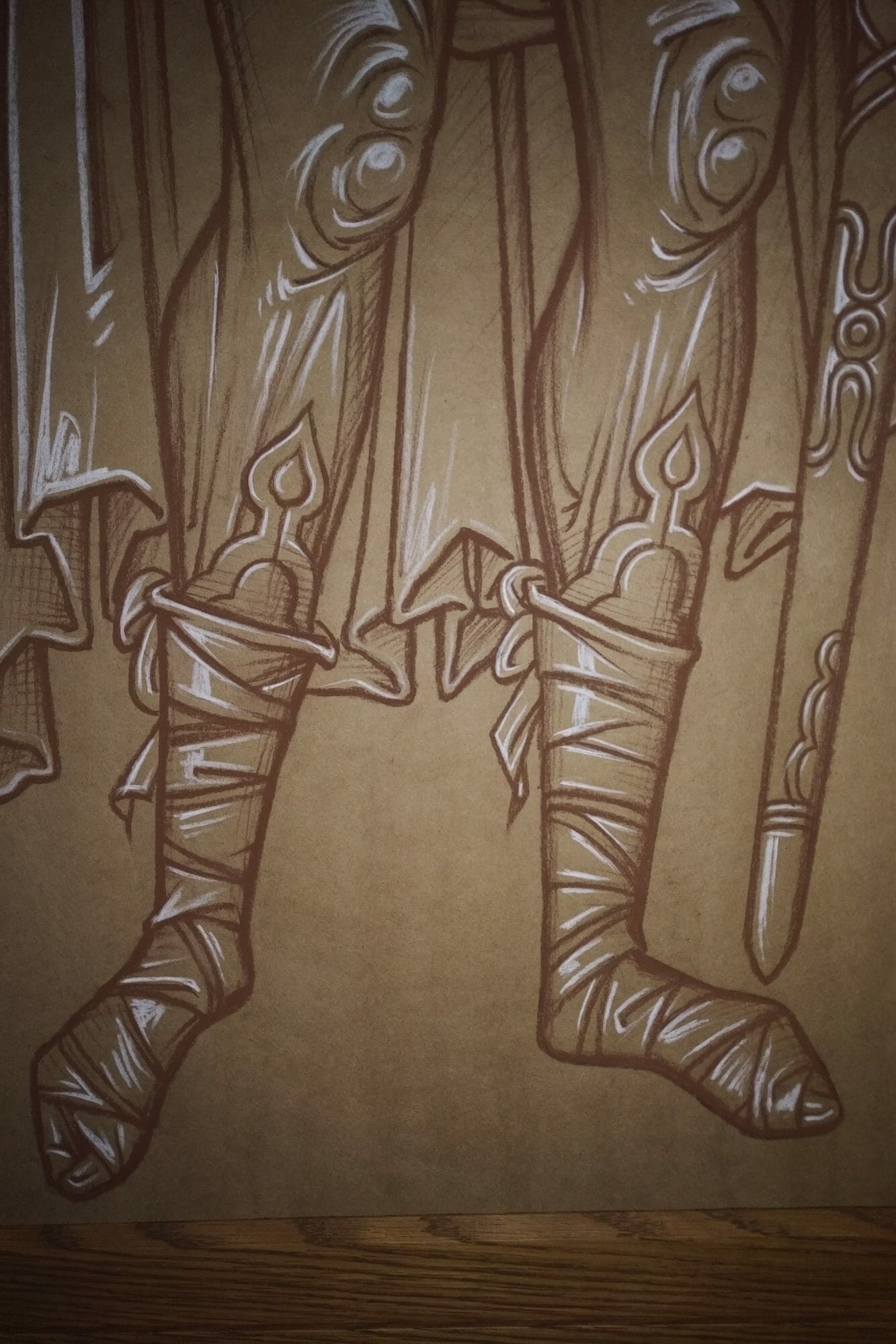
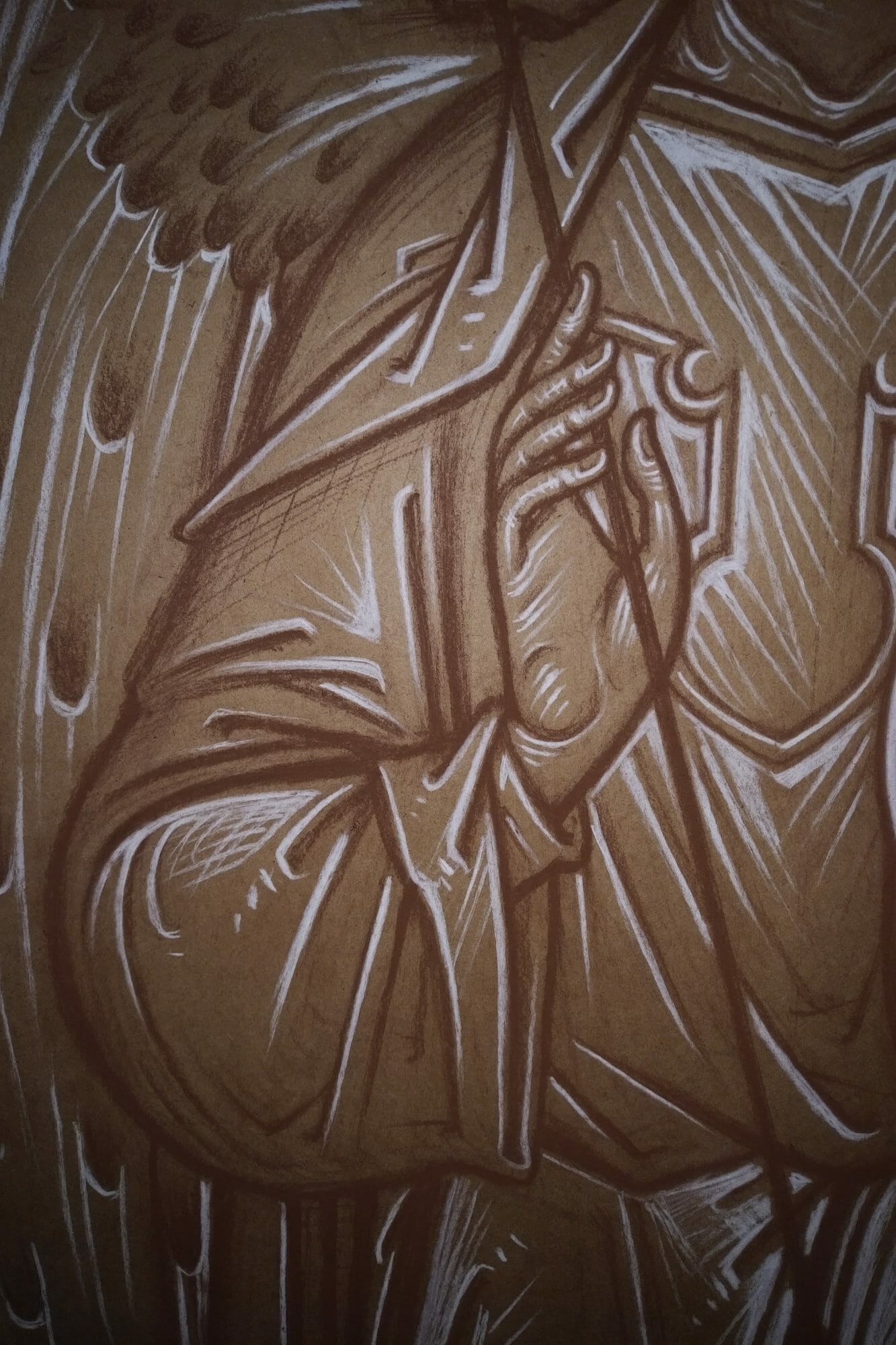
The drawings are sepia and white Conte on toned wrapping paper (due to expediency, but also as a way of not getting bogged down with perfectionism). They focus on the elaboration of form as was commonly practiced in Renaissance workshops. The paper was toned with pigment, the drawing was executed with silver point, ink or chalk, and later heightened with white gouache or chalk. This method renders abundantly rich results within what is ultimately its straightforward formal structure.
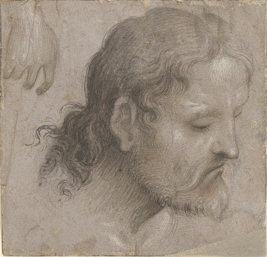
Lorenzo Costa (1460 – 1535), Head of a Bearded Man Looking Down to the Right, and a Hand , 15th century, brush and gray-brown ink, heightened with white gouache, over metalpoint, on gray-brown prepared paper. The Morgan Library & Museum, IV, 6.
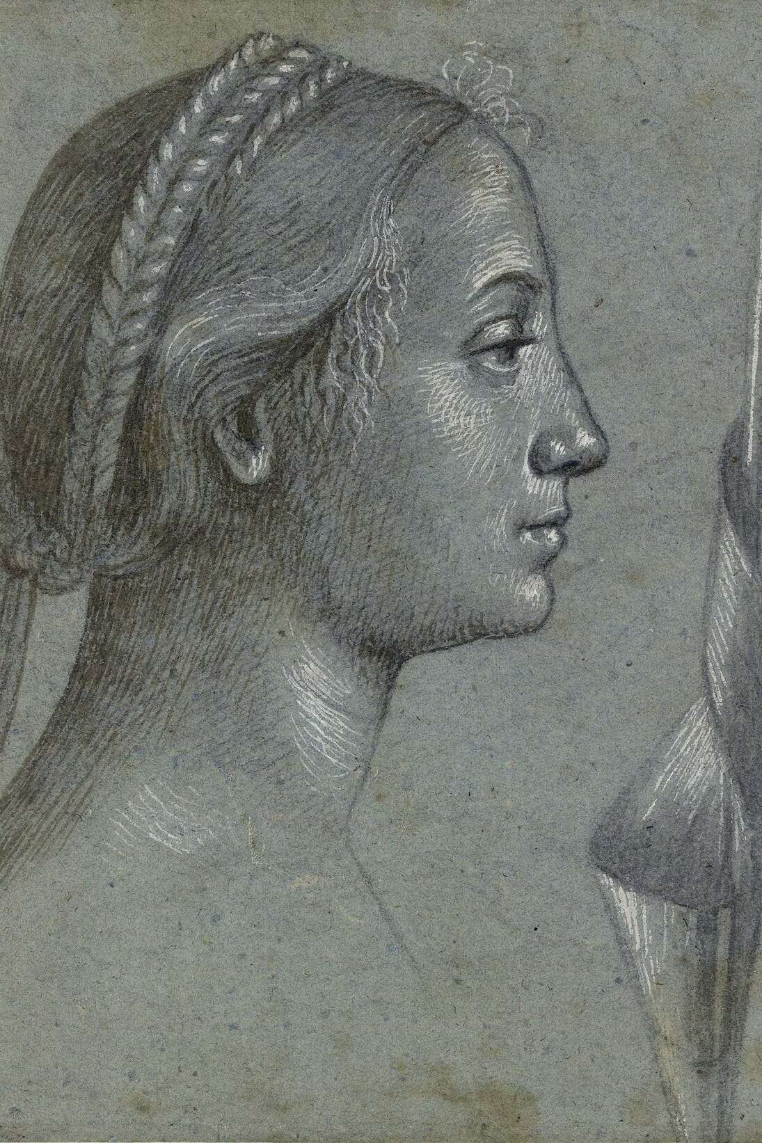
Vittore Carpaccio (c. 1460-66‒c. 1525-6), Studies of female heads (double-sided sheet), Black chalk, pen, wash and white highlighting on blue paper, 23.8 x 18.4 cm © Ashmolean Museum, University of Oxford.
Good examples of its mature development can be found in the detailed drawings of A. Durer. And its graphic parallel can be seen in 16th century Italian and German chiaroscuro woodcuts. In icon painting a similar elaboration of the use of light and form in monochrome is to be found in the work of Theophanes the Greek, in particular his frescoes in the Church of the Holy Transfiguration in Novgorod. As these examples show the basic structure of a toned drawing can be stretched out to render very divergent results, from laconic and abstract, to abundantly detailed and almost photographic stylistic renditions.
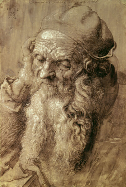
Durer, Albrecht, 1471-1528. ‘The ninety-three-year-old man’, 1521. Brush drawing on dark violet primed
paper, heightened with white, 420 x 282 mm. Vienna, Graphische Sammlung Albertina.
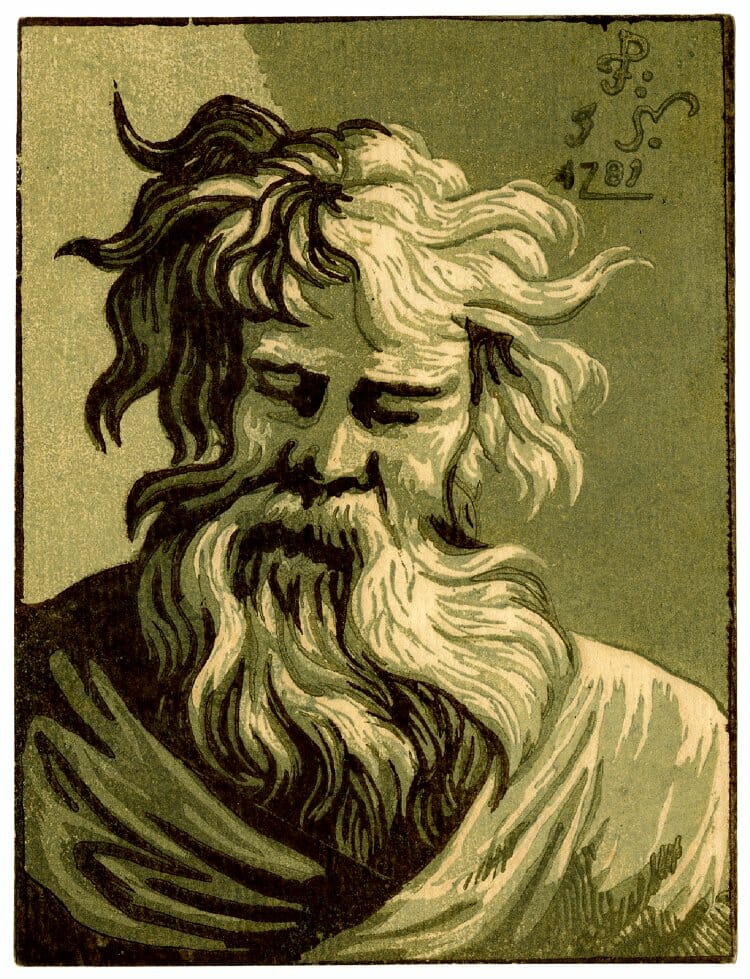
Bust of bearded man, facing front, looking down, his beard to right, eyes closed; after Parmigianino’s picture, now in the collection of Mrs A C Rayner-Wood. 1781 Chiaroscuro woodcut from four blocks in green and black.
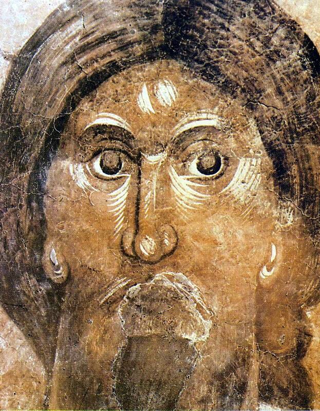
Christ Pantocrator by the Greek, 1378. Church of the Transfiguration of the Savior, Veliki Novgorod.
It seems to me that this can be turned into an alternative solution to icon reproductions for missions, parishes and monasteries, in need of something temporary until they can afford the realization of a full cycle of hand painted icons. Among other advantages, the preparatory drawings are done in the actual scale and format intended for painted icons. A cheaper and more aesthetically pleasing alternative to stylistically incongruous, out of scale and haphazard reproductions. What follows are photos of the preparatory drawings.
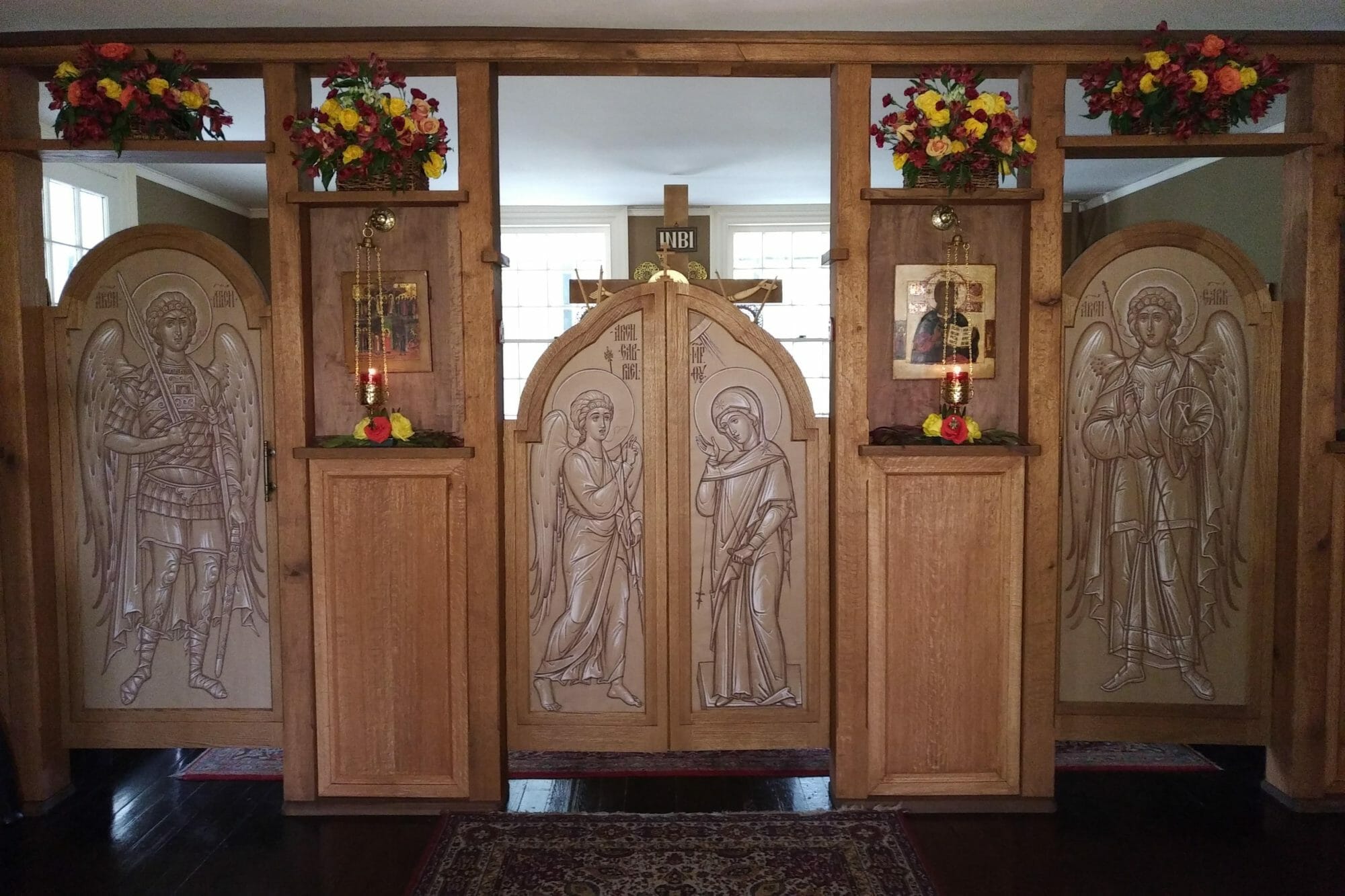
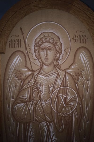
Preparatory drawings by Fr. Silouan Justiniano, as currently installed on the chapel iconostasis of the Monastery of St. Dionysios the Areopagite. The icons of the 12 feast cycle will be later installed in the empty spaces decorated by flowers for the patronal feast.
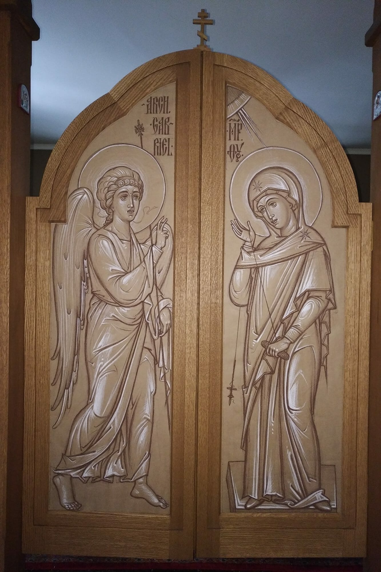
The Annunciation by Fr. Silouan Justiniano, 2019.
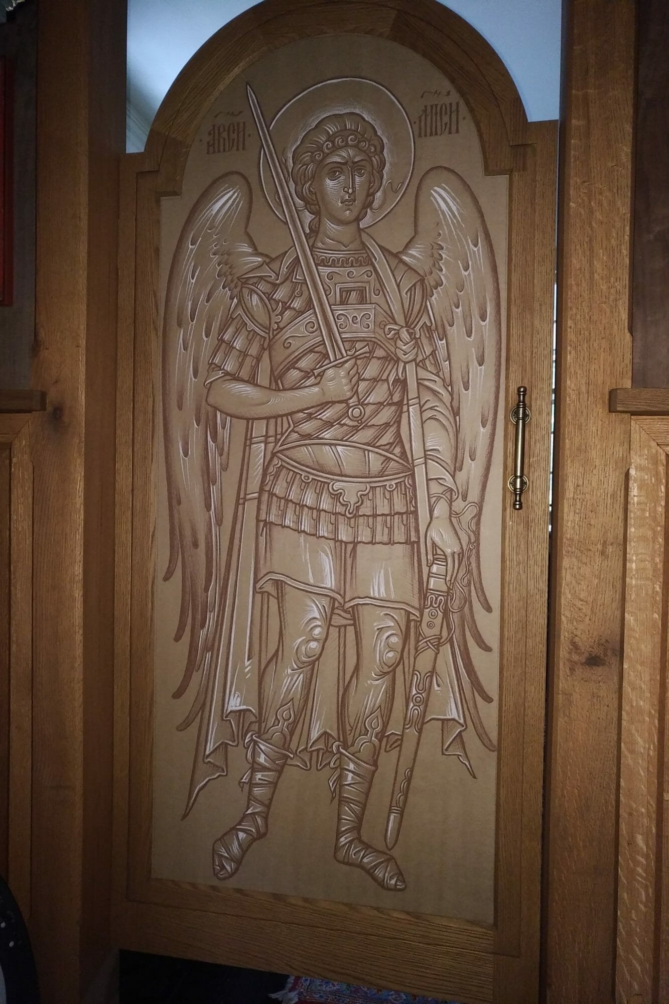
Archangel Michael by Fr. Silouan Justiniano, 2019.
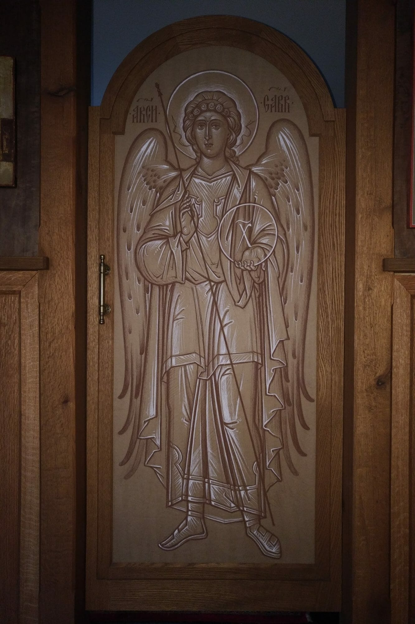
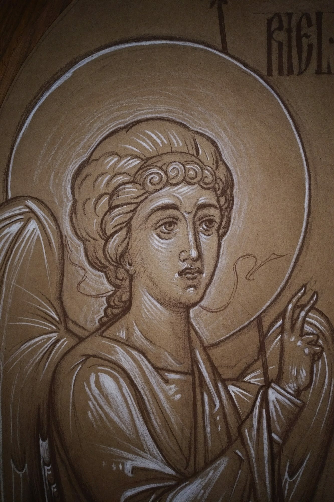
Archangel Gabriel by Fr. Silouan Justiniano, 2019.


Beautiful work, Fr Silouan, & what a novel idea!
If only all preparatory drawings were as beautiful as yours!
Your work has beauty that I don’t often see in icons of this type.
great work! I’ll publish this article on italian website iconecristiane.it
This is beautifully done, and certainly much better than printed icons. The idea works for wall murals also. I remember that at St. Seraphim in Santa Rosa, Fr. Patrick Doolan brushed out a sepia preparatory drawing on the dome. This remained for many years until funds were available to plaster over it and repaint it in full color (true fresco). In the meantime, the sepia brush drawing was highly satisfactory. It was also useful to Fr. Patrick, as he was able to adjust some proportions in the final painting from what he had learned looking at the first draft.
It also comes to mind that several of the ancient churches I’ve visited in Russia have old frescoes from which the color and highlights have worn off, and little more than the underdrawing now remains. But these drawings have great life and value of their own, and such frescoes are highly treasured. Color is nice, but it’s not what makes it an icon!
Fr. Silouan, your sketches are looking way better than printed “icons” used for “expedience and affordability” – great work!
I would also suggest to try making them on wrapping “craft” paper with China ink, white Gouache and watercolor. When made with some restraint and simplicity, it can also help with establishing composition and be a good practice.
I remember that we have used full size, lightly colored sketches like these in the iconostasis at St. Seraphim in Dallas back in 2000, for the the similar reason – there were not enough time to finish all icons before the Cathedral needs to be consecrated. These sketches were staying in the second row of the iconostasis for a few month after the event, and I have replaced them one by one with real icons.
I wish that practice would become an alternative for cheap prints, and hope this article would help in that.
Thanks Vladimir for the technical suggestions! I’m glad to hear that you did something similar at St. Seraphim’s.
These are beautiful – what a wonderful solution! Thanks be to God.
These are truly beautiful and powerful as Icons. What a lovely solution and how effectively they blend with the iconostasis. Very powerful in their own right! Thank you for posting this.
Wonderful drawings, Father.
Could you explain how you mounted the drawings into the iconostasis?
Are the drawings detachable from the support without causing major damage to them?
Did you prepare the paper to receive silver point?
Hello Brian,
The doors are built as “frames” for the future icon boards. Hence right now they have very thin pieces of wood paneling, the thickness of Mosonite, screwed in place from the back . The drawings were simply taped into these boards with masking tape along the edges. The edges are covered by the overlapping lip of the doors, as it would function in a frame. I hope that makes sense. So yes, the drawings can be safely removed in the future.
The drawings are not silver point, so no treatment for the paper was required. The medium used was sepia and white Conte pencil on brown packaging paper.
Nice work, lively in their own right leaving plenty of room for creativity in the future finished works.
Beautifully done.